This year, owing to the global COVID pandemic, my husband and I did not head to our beloved island community of the Abacos, but instead have stayed at our permanent home here in Portland, Oregon. One important thing that came out of our staying in Portland for the winter under COVID conditions, is that I have the opportunity to participate in winter art courses.
In the art course I am currently taking called Creative Colors and the Luminous Landscape sponsored by the Oregon Society of Artists, our instructor Michael Orwick is encouraging us to experiment with color using recycled cardboard as our canvas.
Because my husband and I live part of every year on an island where there are limited stores, our island art community often uses beach junk and throwaways as well as natural products such as leafs, fronds and vines for art projects. It was a pleasant surprise to hear that they use throwaways and recyclable materials here in Portland as well.
Given our current use of delivery services for groceries, home staples and art materials during the pandemic, we all have plenty of extra cardboard around. Prior to this art class, I had already started using cardboard as a readily available cheap canvas for my oil and acrylic painting exercises. I don’t worry so much about how the painting is going to turn out, but play with the art scene instead, knowing that my relationship to this canvas is “temporary.”
This week, I gessoed some cardboard, taped it up into various sizes of squares and started experimenting with colors. At first, I played with the basic four or five colors we will be using in this course as our basis for mixing an essential palette.
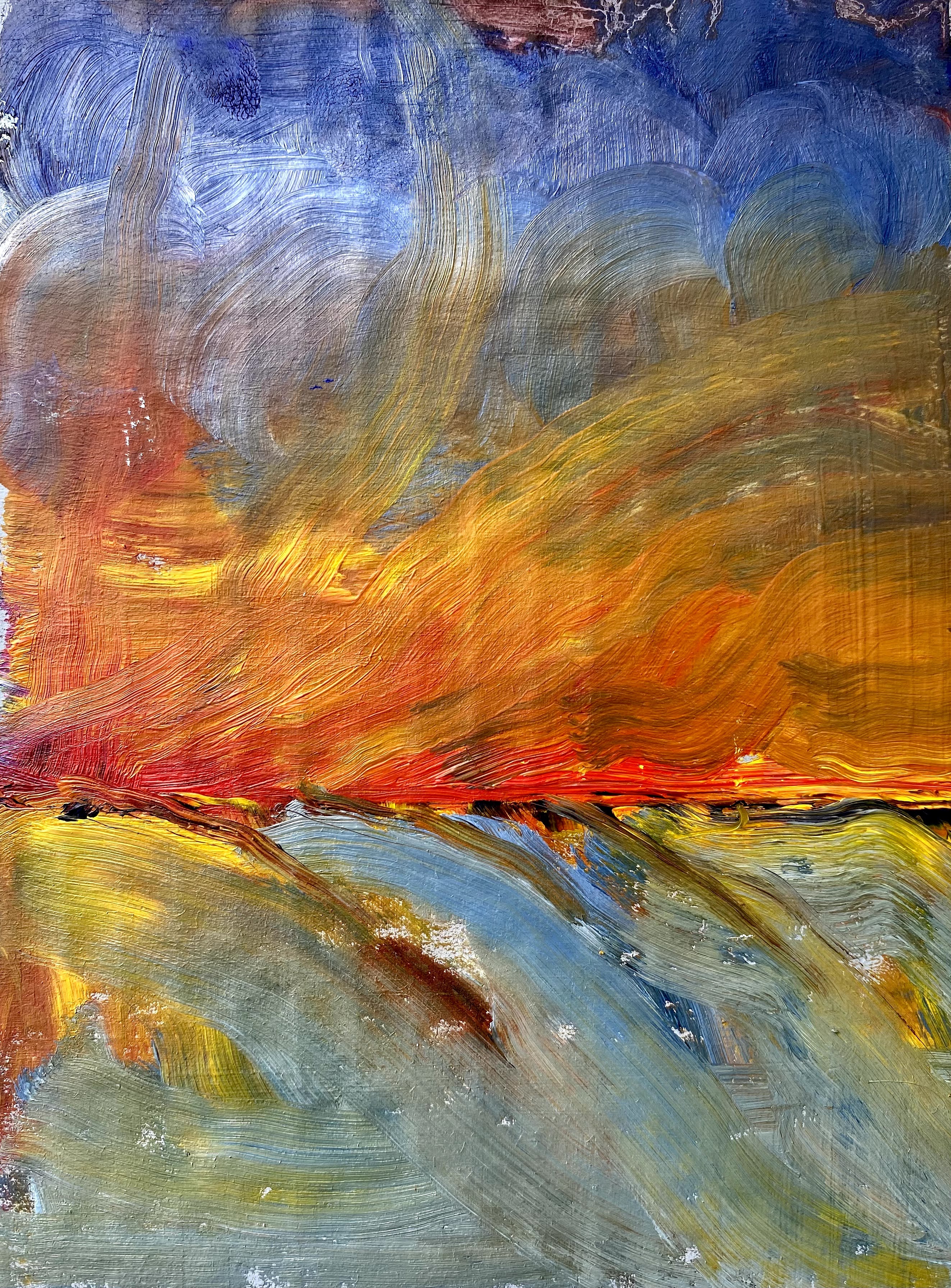
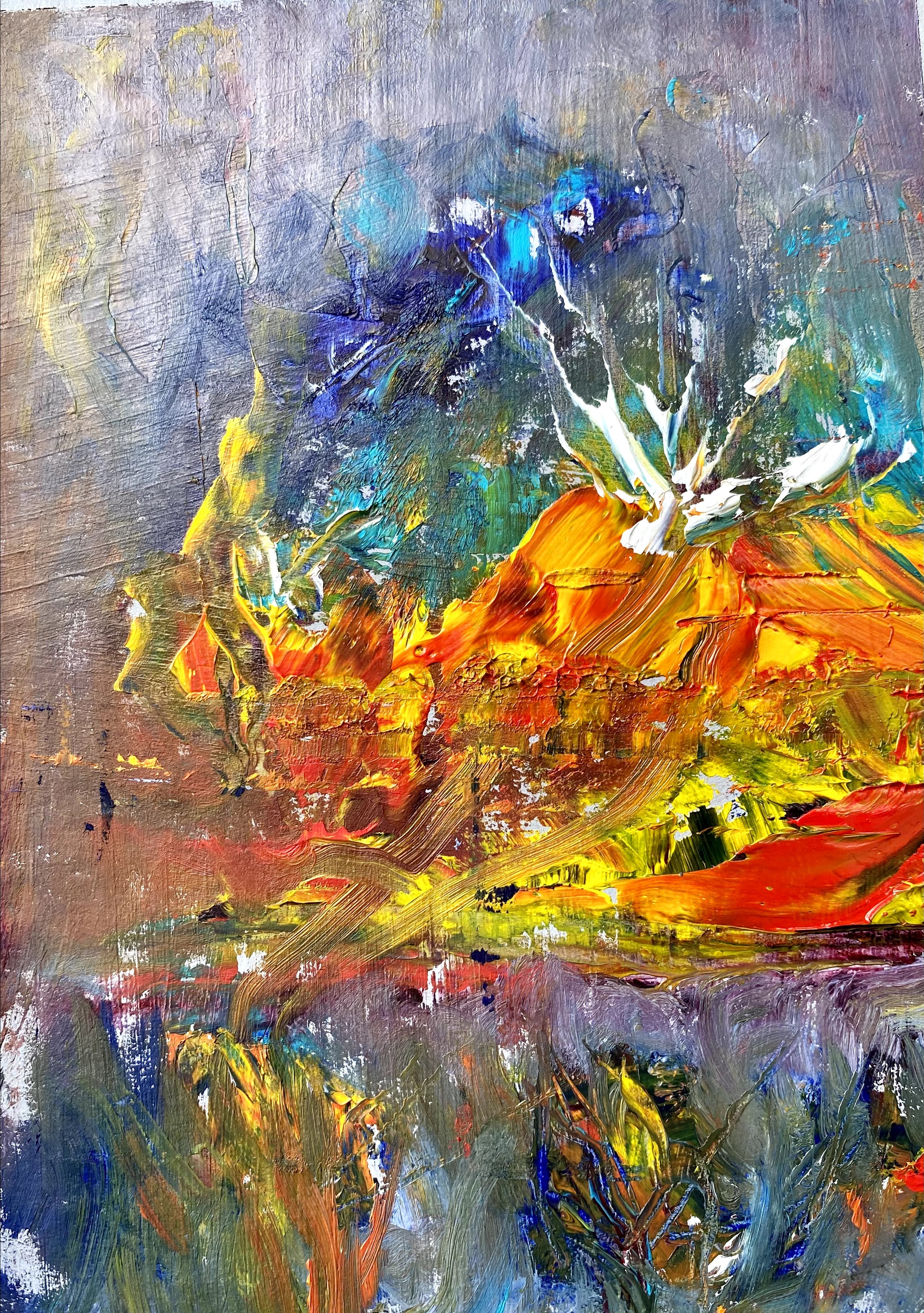
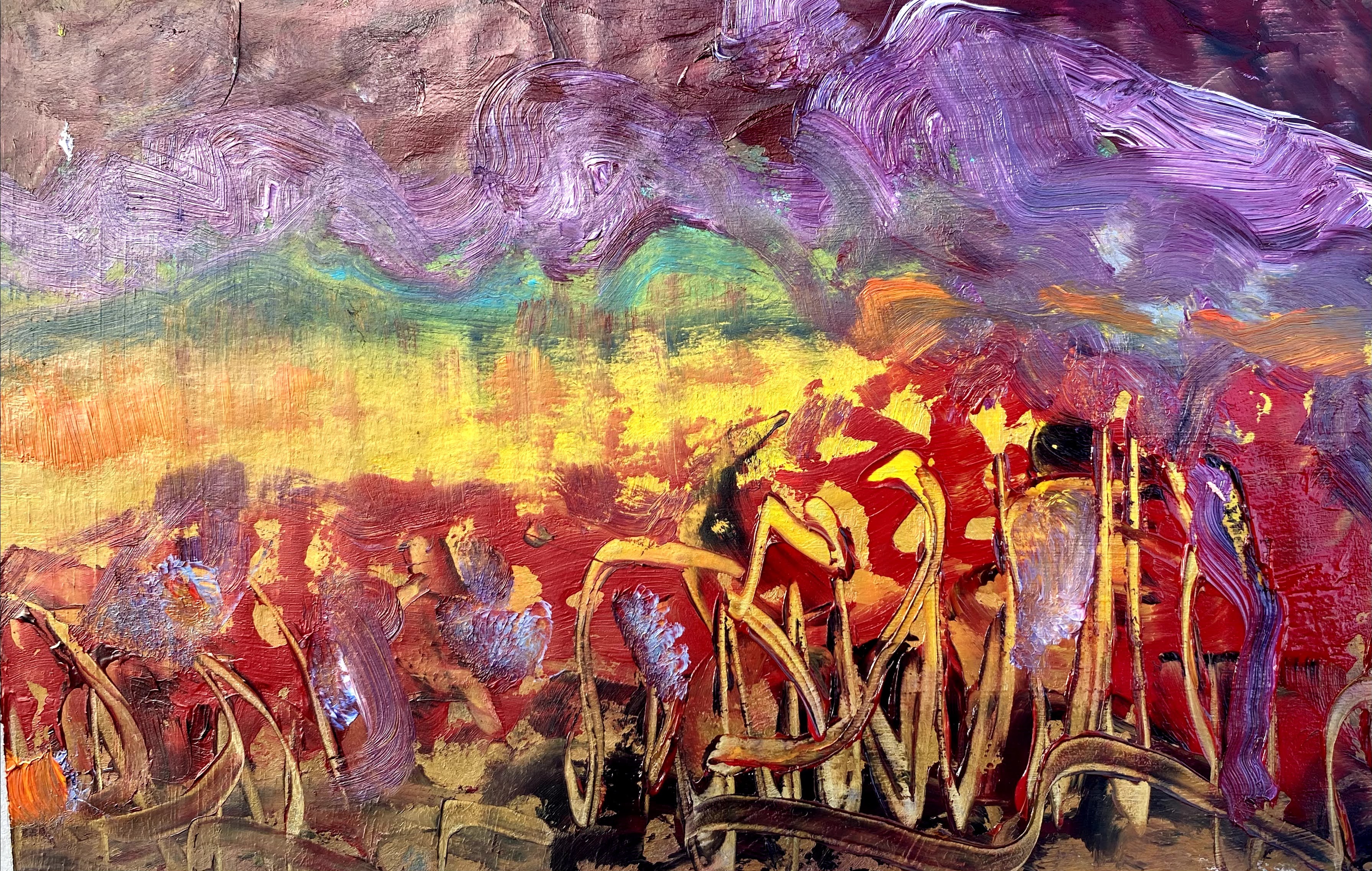
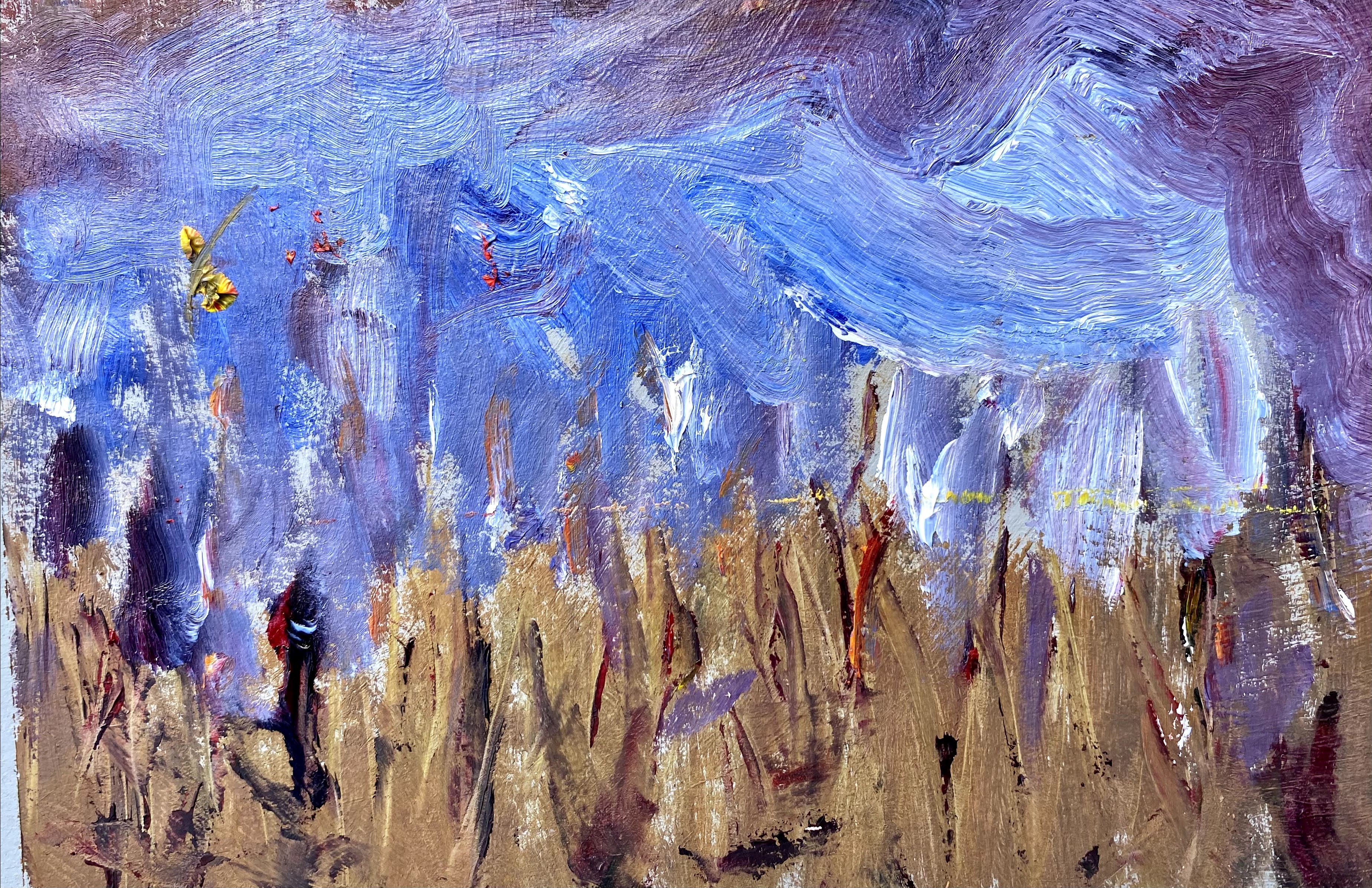
Here are some warm-ups where I played a bit before getting down to work on the course assignment.
In our assignments for this week, we prepared a variety of color wheels while experimenting with color palettes and mixing and matching capabilities. I found that using cardboard, again, made my color wheels more playful and I tried out moves with my brushes that I could not have done were I preparing something more formal.
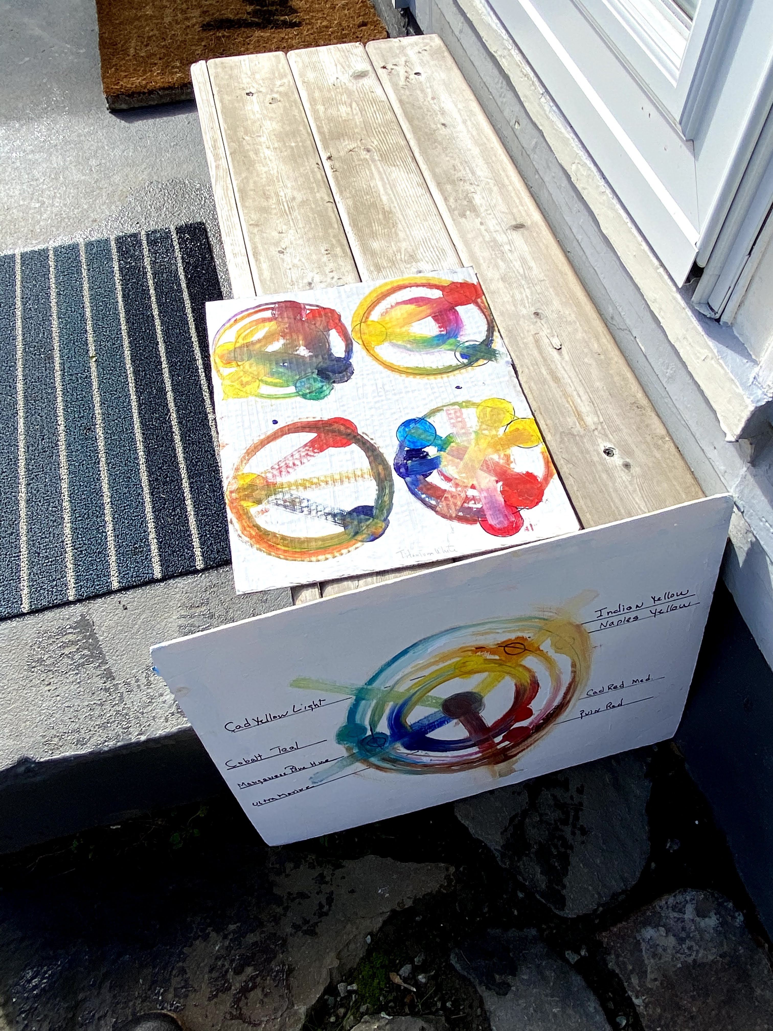
It didn’t really matter what kind of crazy ideas I had, or what mood I was in, I could tape another piece of cardboard and keep on going. The final results have made me think more about what I expect to get out of this class.
I need more practice mixing a set of basic oils into a wider palette of colors using four essential colors: Cadmium Red Light; Cadmium Yellow Light; Ultramarine Blue; and Titanium White.
Similarly, I need more practice mixing three additional colors of Magnesium Blue Hue; Indian Yellow or Hansa Yellow; and Quinacridone Red into the basic palette.
Thirdly, I have a personal preference for three additional colors (Cobalt Teal, Naples Yellow and Earth Red) that I want to add to the mix for those special moments that appeal to me. I prepared one color wheel adding them in, as an extra color wheel thought.
This is probably enough color experimentation to last me for the next several years, if not a decade or more, and I will work hard to push these colors to their limits. It seems that there is going to be a lot more cardboard in my life as I mix and play with colors.
This creative color course is encouraging us to use the colors that we have and mix to get what we want, rather than trying to purchase each specific additionally desired color.
For sure, under such constraints as painting on an island, or during en plein air sessions, it is better to carry fewer paints. Improved paint mixing should greatly enhance color options under such constraints.
In this class, I hope to address a number of questions, for example, how close can I get to the color or hue I want through mixing basic colors? How pure and clear can a color mix be? Which colors blend in more easily with the colors around them? How do I avoid over-mixing and killing a color; is there a way to reverse a color that has gone astray? Which colors shift easily across a variety of palettes, which ones offer soft entries and exits into specific palettes, and which ones really need to stand alone? Also, I hope to unleash some additional power through a greater understanding of transparencies and opaque colors.
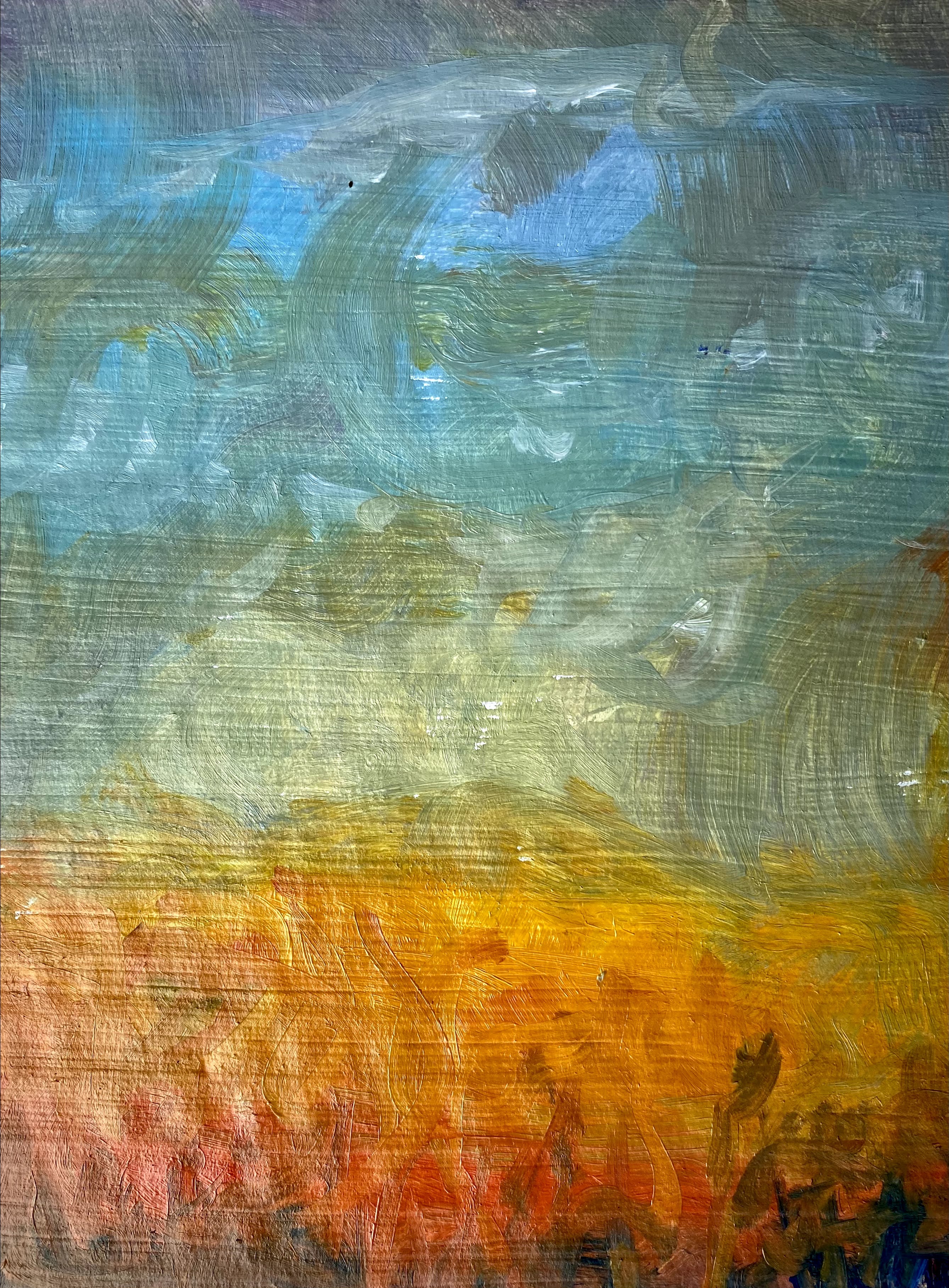
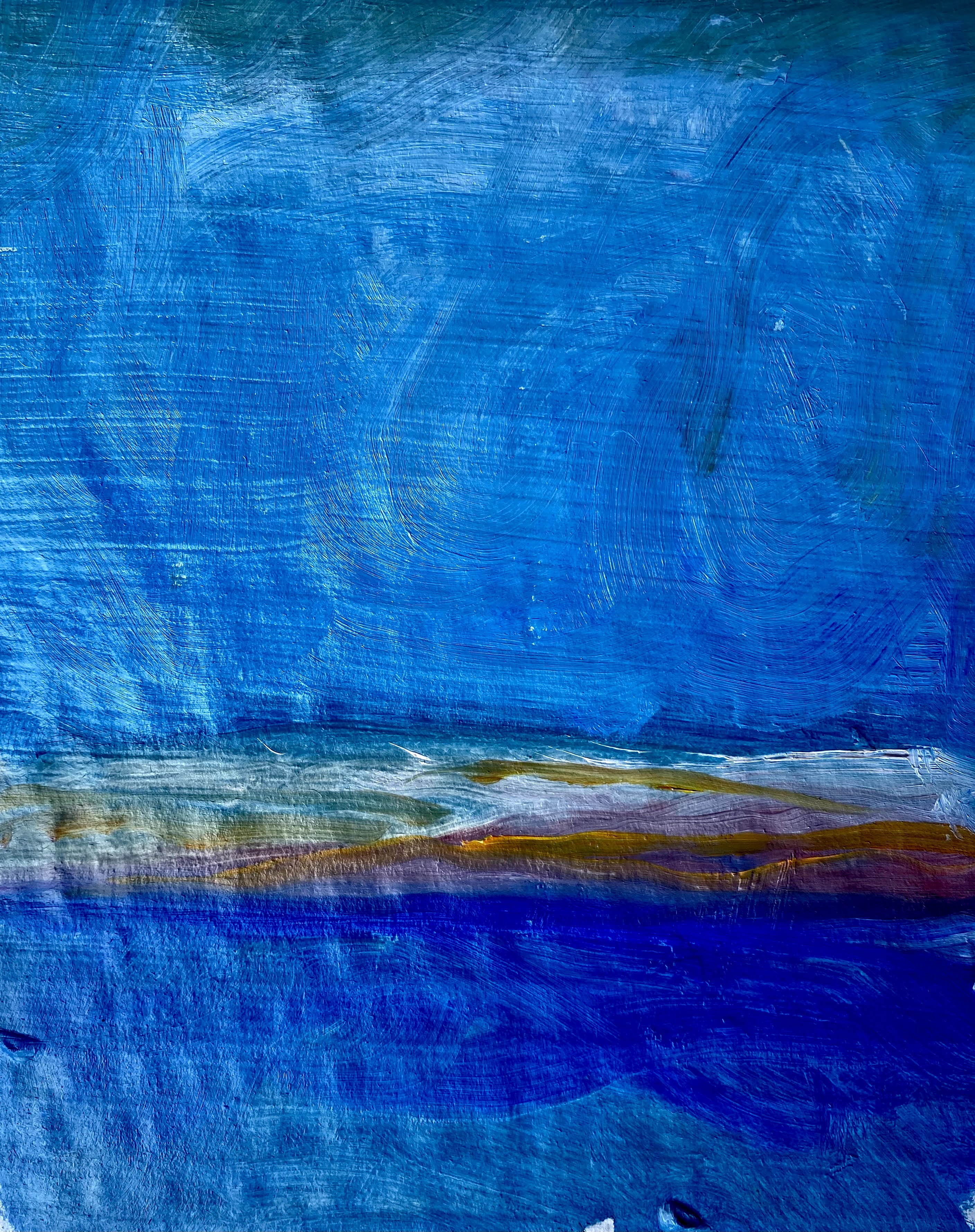
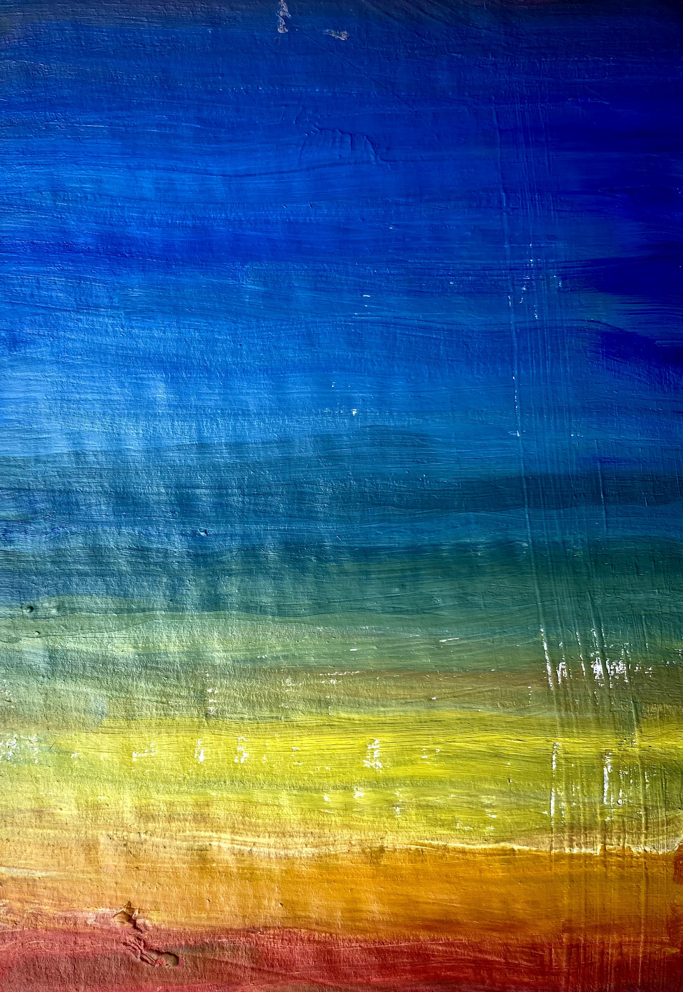
In addition to experimenting with variations in color wheels, I also am mixing colors for skies using the traditionally expected color transitions as well as some imagined ones. Since this was also part of our assignment this week, I played with a variety of variations in sky colors and they are shown below.
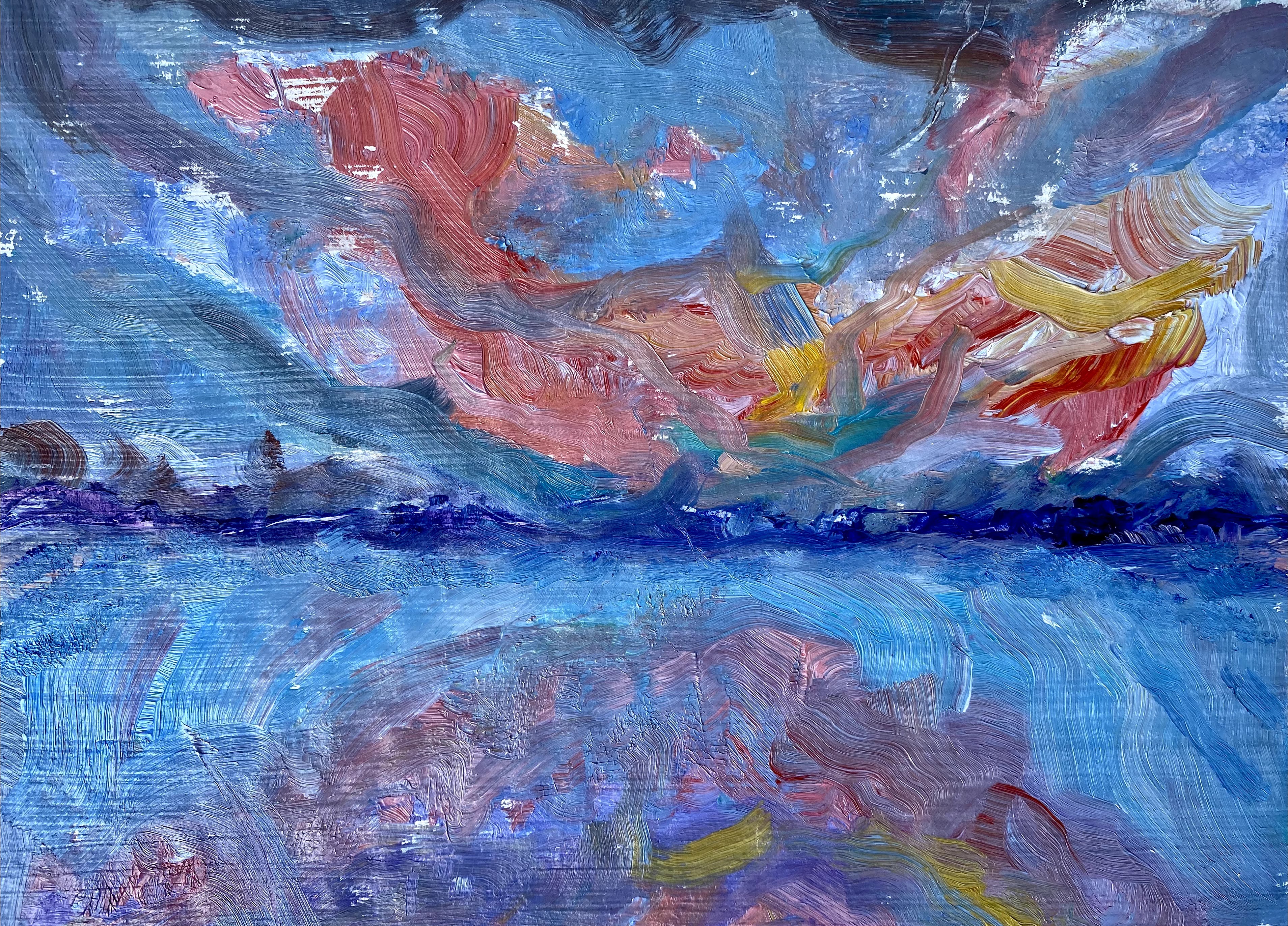
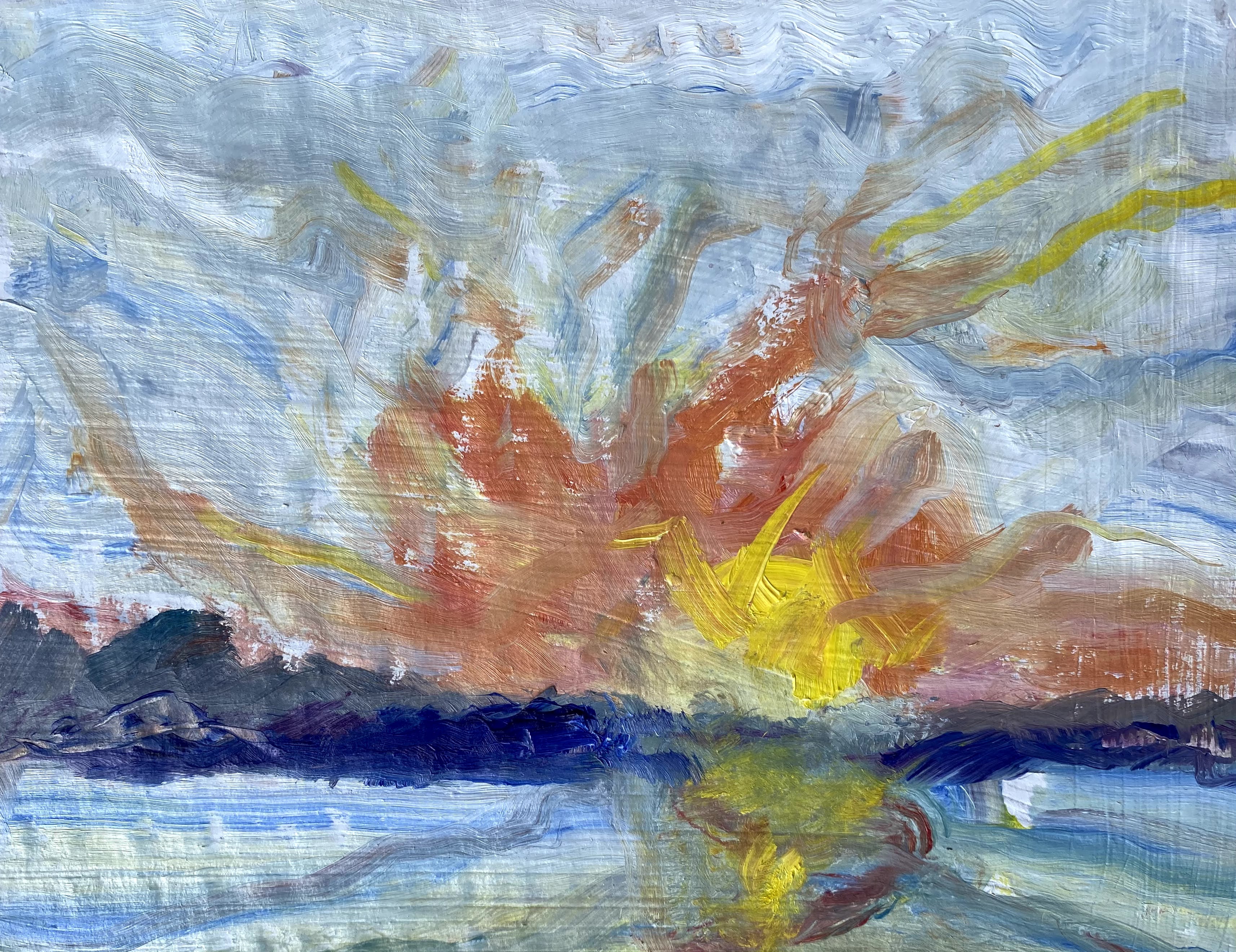
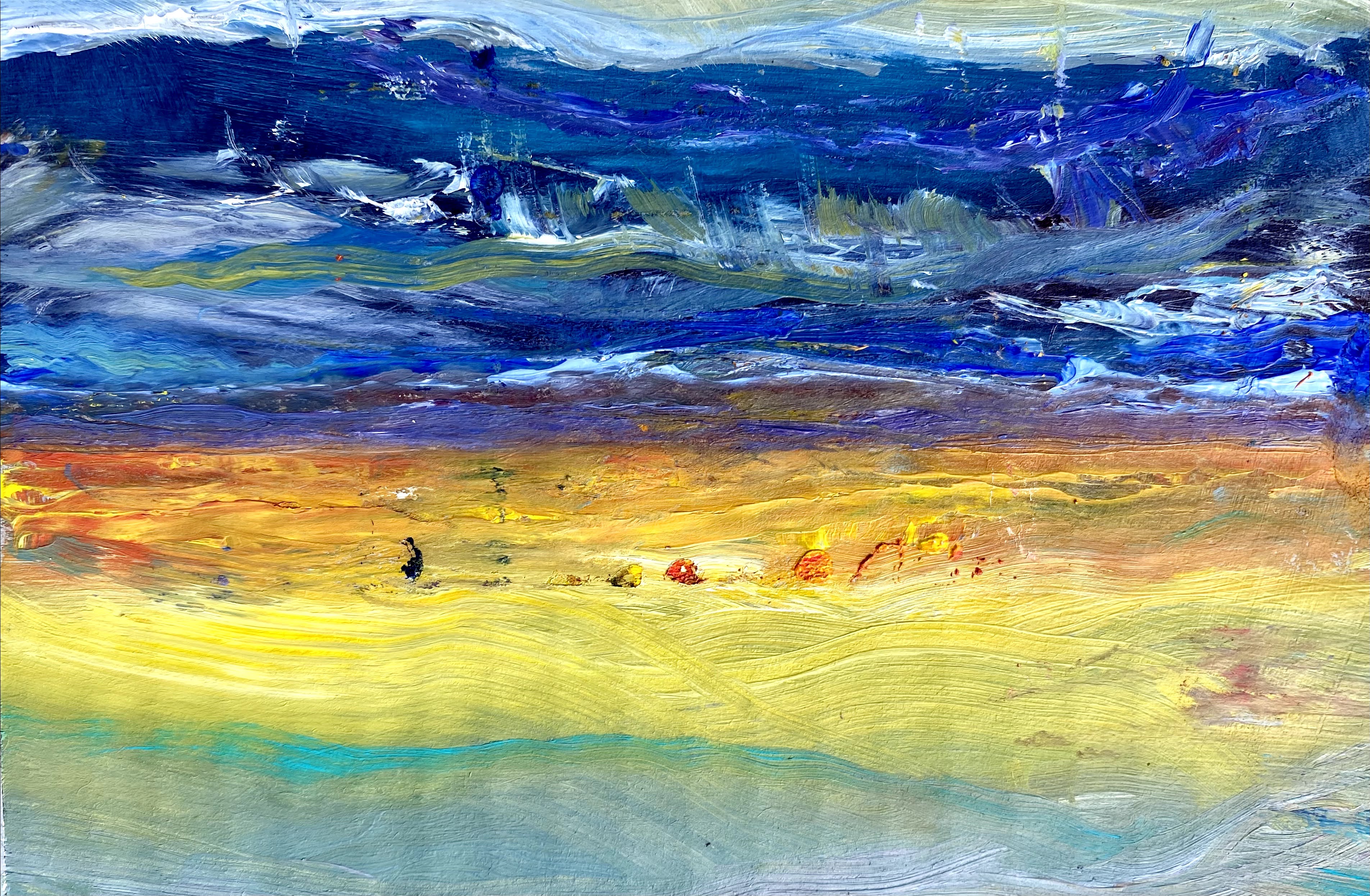
Breaking basic principles of color into building blocks offers increased opportunity for creative exploration and experimentation.
I think that we have a busy six weeks ahead of us. This should be fun.

Wow! Wow! Wow! I love everything about this post. Your musings. Your experiments. Your cardboard canvases. Your colour wheels. Everything! Thanks for the inspiration
Thank you so much. I am glad that you enjoyed the post.
Colors are bold and who would have thought using cardboard .good job ?
Get Outlook for Android
________________________________
Thanks! Actually, a good piece of cardboard makes a pretty nice surface for acrylics or oils. If you start by painting the entire cardboard surface that you plan to paint on with a black or white acrylic paint, or with what is called gesso, and let it dry, it makes a very nice painting surface. It is also the right price!