There are two important switches we have in life. On and off. Birth and Death, for example. Or, act and don’t act. Then, there is go or stay. Try or quit. And the list goes on. Any computer specialist, however, will tell us that even binary decision-making can get pretty complex in a hurry. When one adds up all the many possible “do’s” and “don’ts” they might even be contradictory or lead to circuitous results.
In situations where life has gotten very complicated, it is useful to go back to thinking about simple switches. And along with that, we must learn to turn off complicated and ridiculous choices that do not have to take place.
There are times when it may be best to be in the middle ground, somewhere between on and off, or yes and no. Shades of gray. This means yes, under the following conditions; or no, if this happens.
How do we know which button to push?
Most of us come up with a set of policies or understandings to decide what to do now, some based on previous experiences, some part based on what we are doing right now, and some part of it based on what we expect to do in the future.
Then there is this.
We are not alone pushing buttons. Others around us are pushing their buttons too. This makes decision making even more complex.
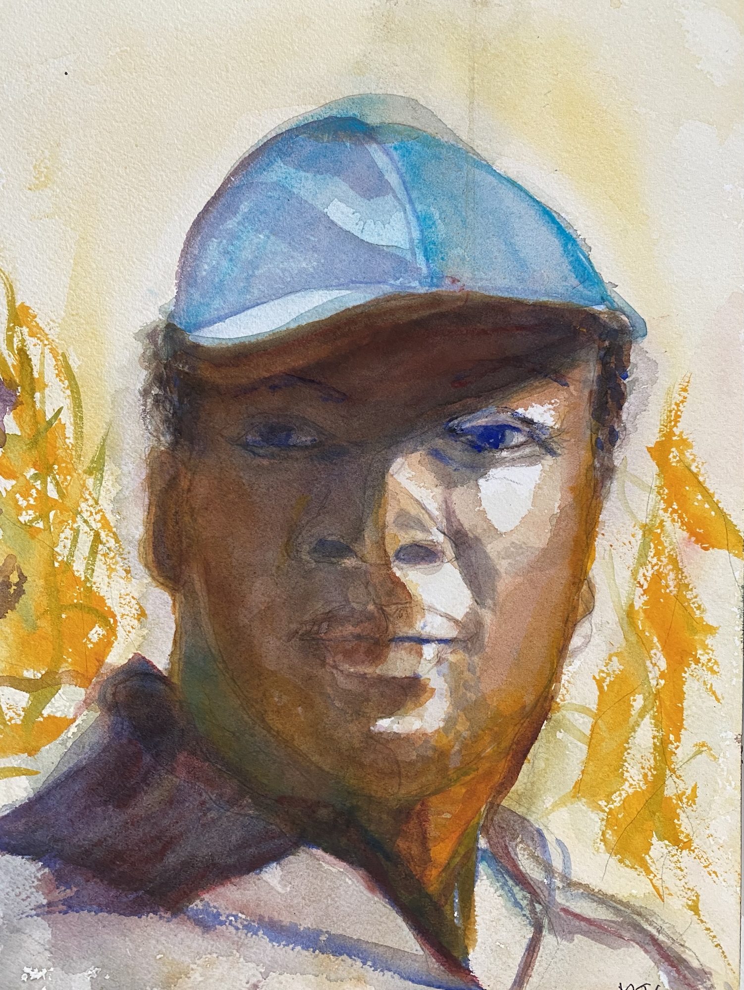
When I reach this point, I often take out a pen and a paper and start writing my choices, listing what I think is important. If I am not ready to do that yet, then I draw, or take a walk or go outside and do some gardening.
Artistic expression and exercise, in my opinion, is an important aspect of decision-making, giving the mind pause and space to think through.
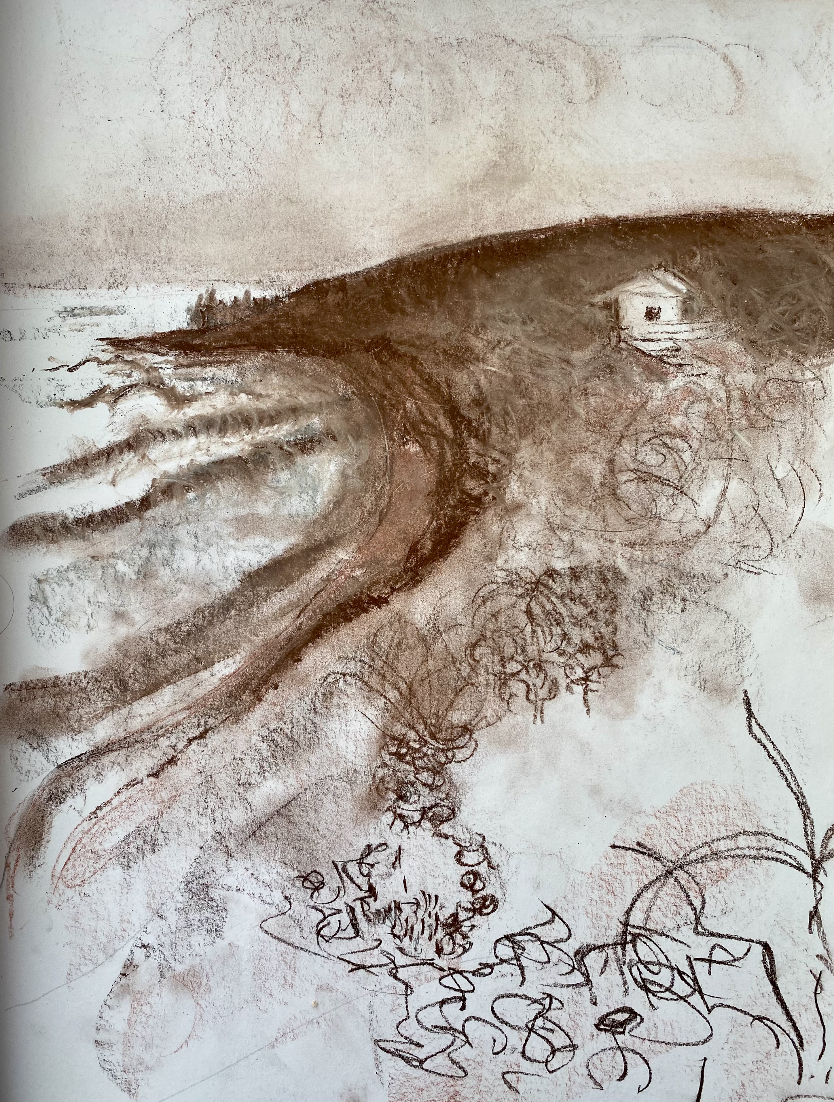
 Oregon Coast