This is the second week of our course work held with Michael Orwick on The Value of Design offered by the Oregon Society of Artists. We are still focused on design and are now using a minimal set of oil colors. Our attention this week is on values, that is the lights and darks that will be used in our paintings. Our emphasis is not color. I used four recommended oil colors, that is Earth Red, Ultramarine Blue, Titanium White and also used some Indian Yellow in the preparations of the following “underpainting” to show my intended values.
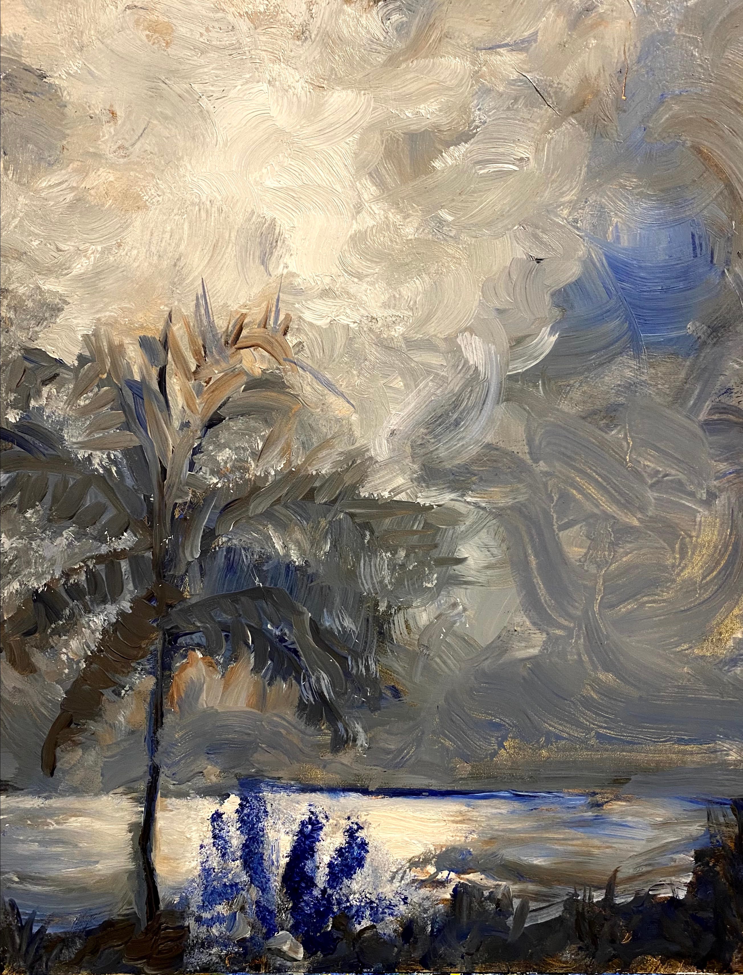
For the first painting above, I used a small piece of composite board, 8″ x 10″. My goal was to show the moonlight and how it is reflecting on the ocean in front of our winter place. The light of the moon strikes the water in the early evening.
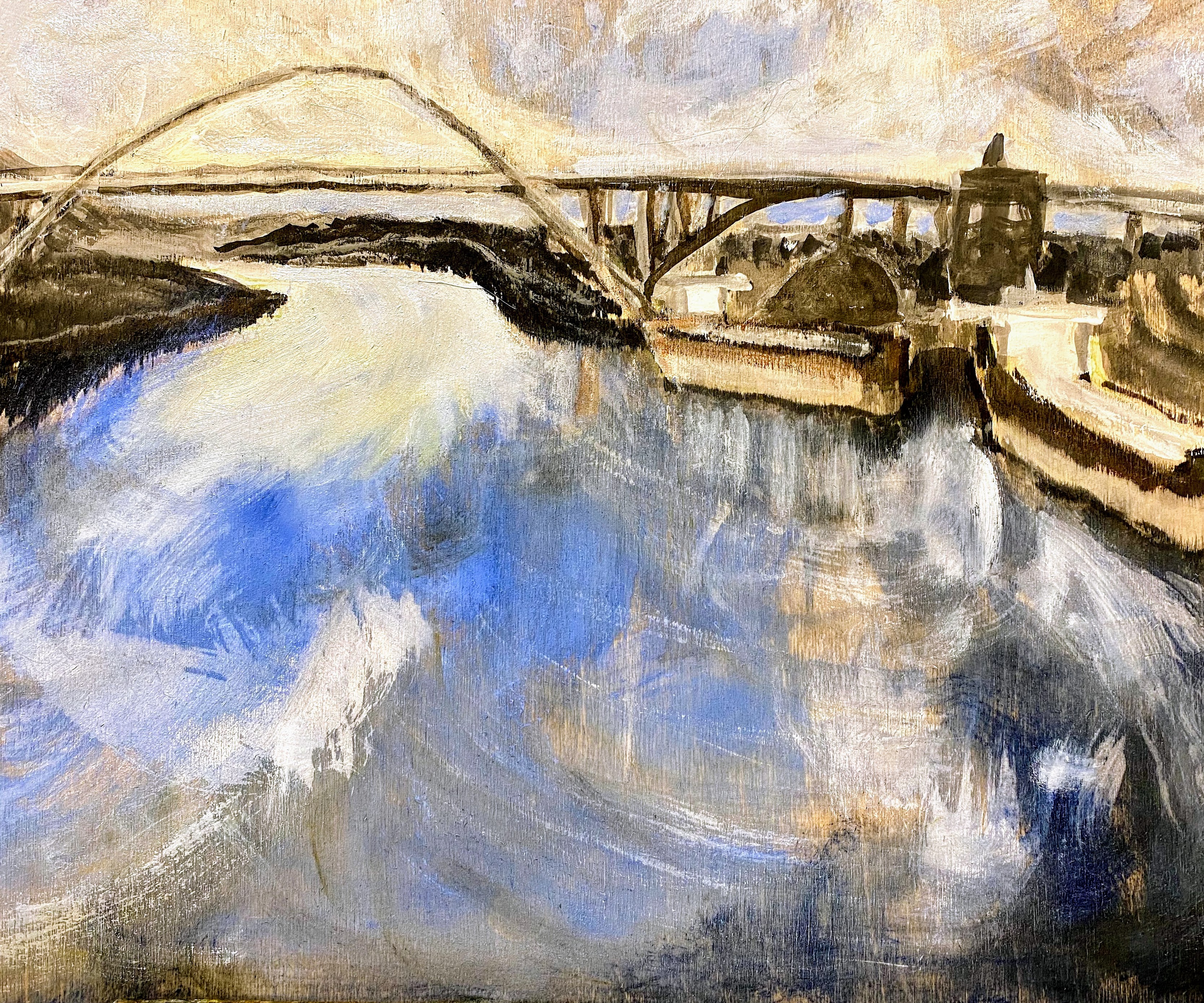
In this second painting, I used a two-part approach on a wooden birch board. First, I sketched the setting using black ink and a brush. Then I gessoed in the light. Once I thought I had what I wanted, I used oils to suggest additional values that I would like to paint in to the picture. This is closer to my more natural way of thinking of paintings.
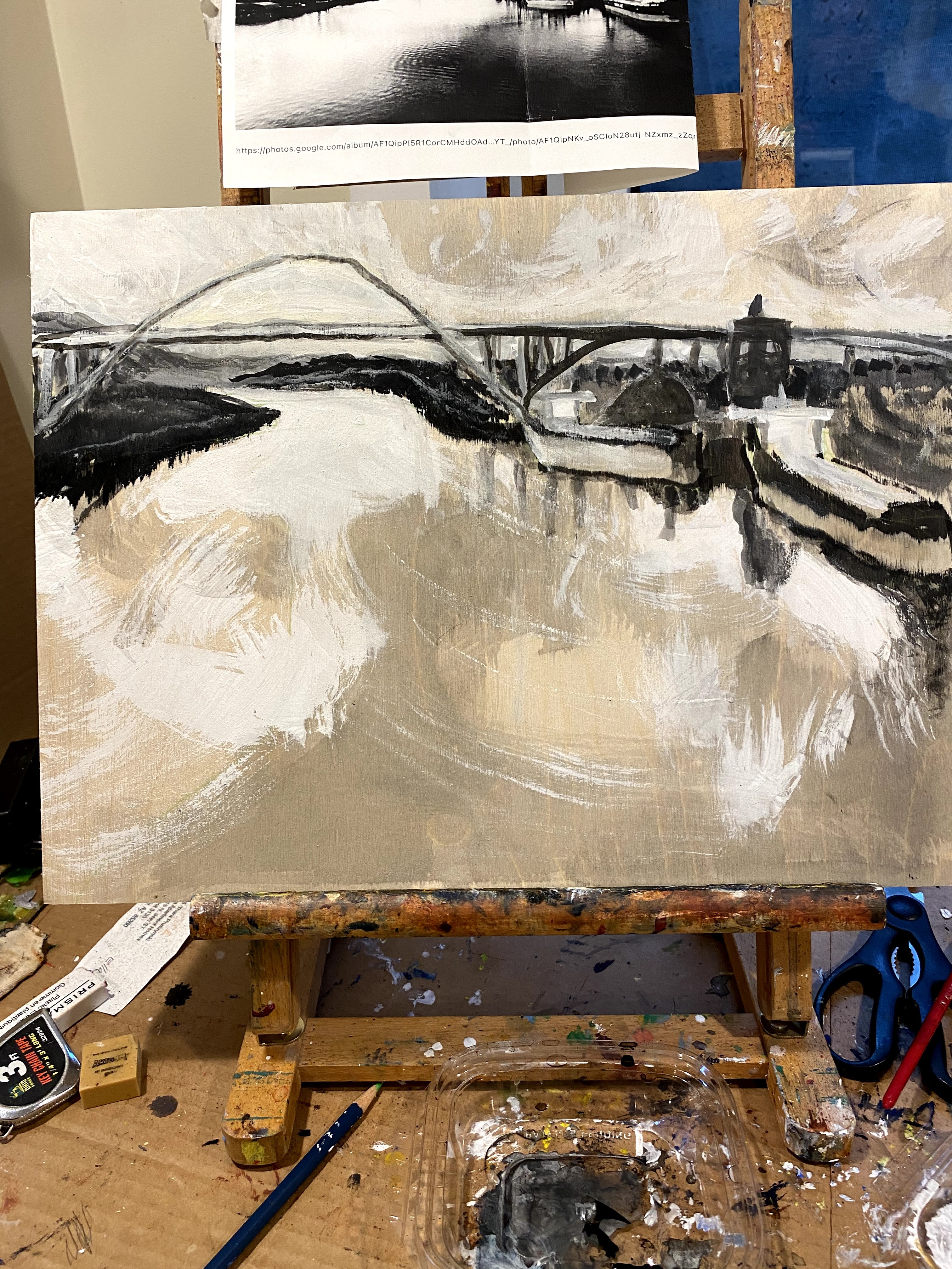
The earlier ink and gesso looked like this.
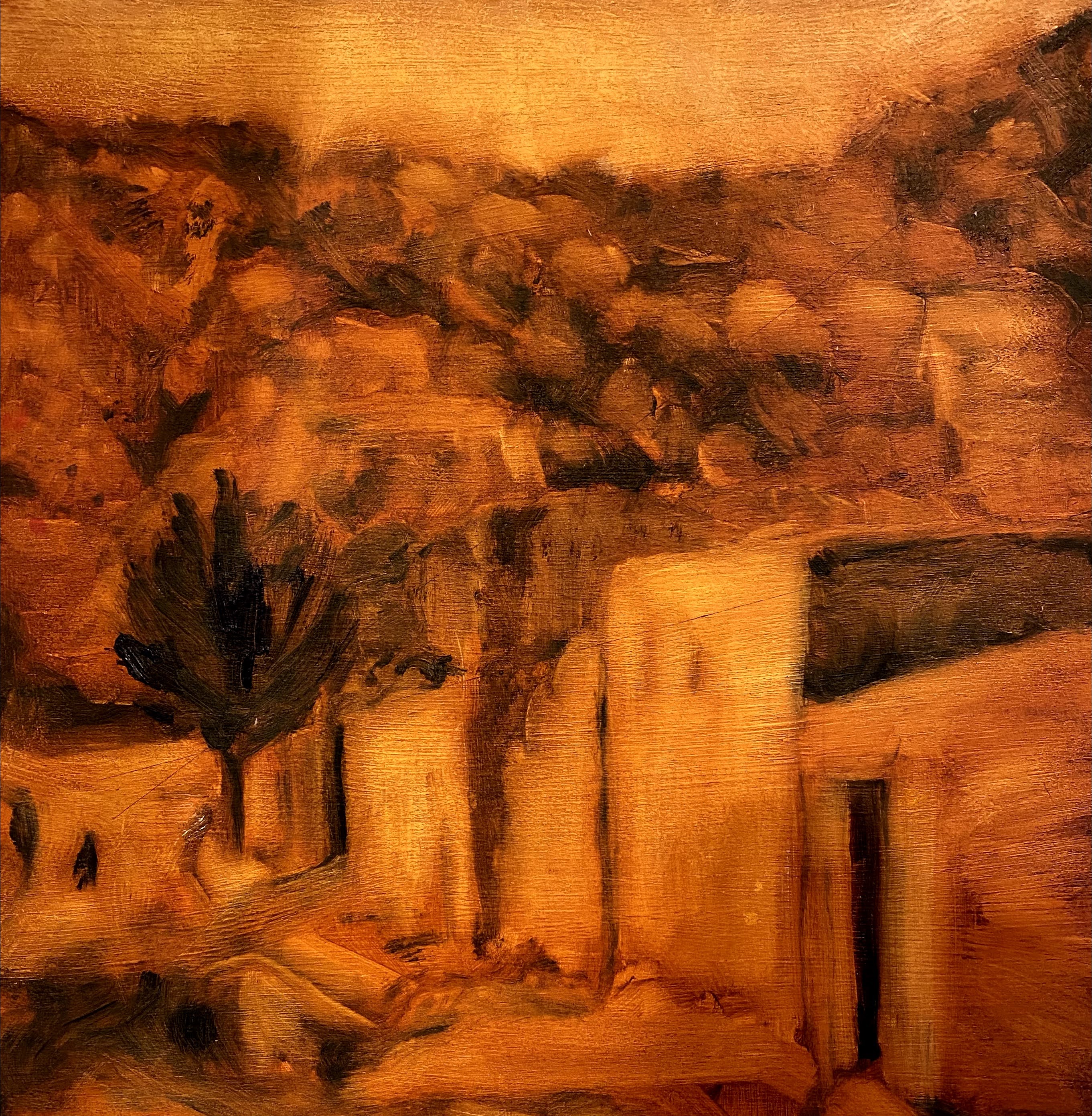
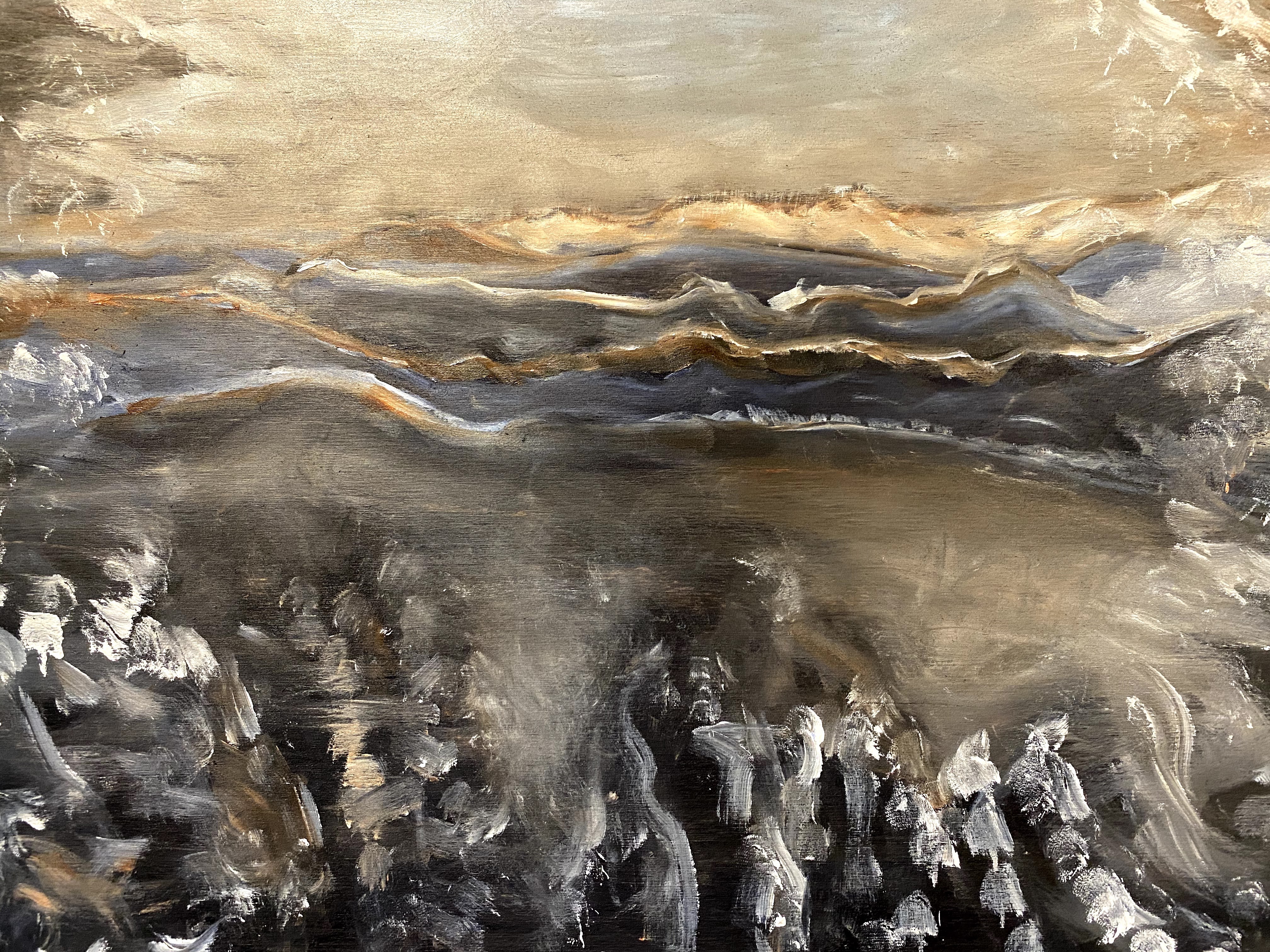
The third design, shown above, is based on the Afghanistan photo and focuses on light and structure while using what is a rather complicated photograph of a settlement in Kabul for my inspiration. In this case, I started with earth red and added blues, as needed. It will be fun to consider how I will paint over this to emphasize the necessary details without overburdening the painting.
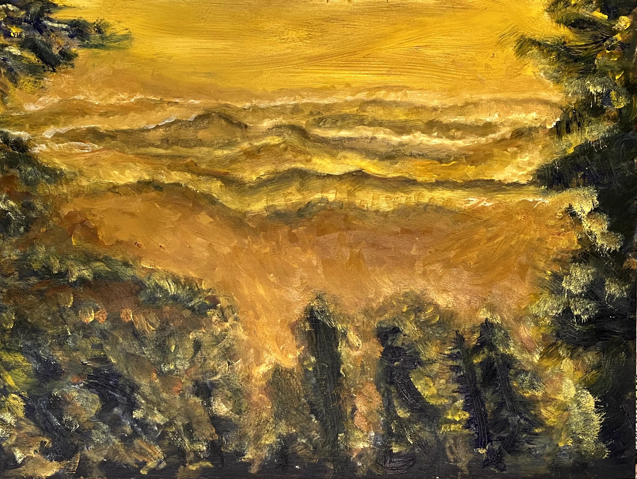
This fourth painting, based on a photo that I took while hiking Mt. Hood, Oregon, is the one that started out as an H design and is now modified in a larger U-shape to focus almost exclusively on the light and shadows of the background mountains, while still hopefully implying that the observer is tucked away into the woods and hills, looking out at the mountains.
This painting has frustrated me the most. I may still ditch it, but am following through for now since I am doing this for a class session and am supposed to be learning from it. My frustration stems from not being perfectly happy with the design. I prefer, in many ways, an earlier sketch that I made and may go back and paint it from this other perspective. Or maybe I will end up doing both?
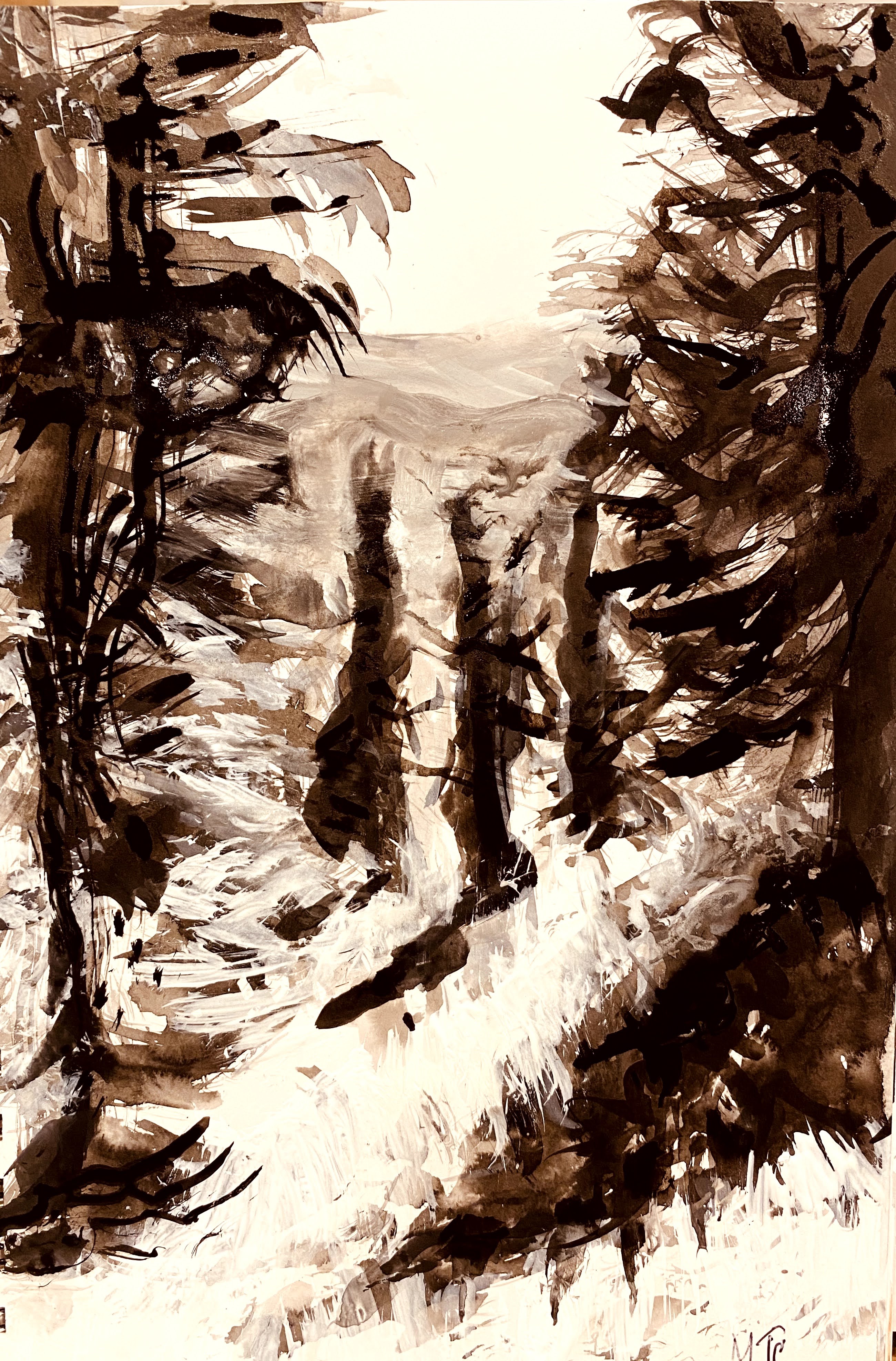
In all fairness, however, I would like to add that I do not think that the design that I am painting is necessarily the problem. I may have to go back and capture the light better, like I was doing when I started off. I lost some of the spirit of the painting when I moved to “adding” colors while shaping the mountains. Below shows how my underpainting started off, prior to my adding and painting in earth red. I prefer this to the final underpainting that I made. Perhaps Michael might help me figure out where I fell off the rails with this one?
To summarize, I experimented with several things while working on my underpainting and emphasizing value and structure.
- I changed the emphasis on the oil colors chosen for the value paintings, to see whether it will help me focus on the values rather than the colors;
- In some cases I used what Michael Orwick calls a subtraction method of taking paint away to set values; in others, I used addition by adding values to base paint, putting in darks and lights as needed. Although both ways are effective, I personally found the subtraction method more interesting;
- In the case of the bridge painting, I experimented with using ink to sketch the drawing and gesso to define the light, then painted oils over this design, using additional oils both brushed and rubbed on to the surface, as needed. I really enjoyed working on this as a way of emphasizing light and reflection.
- Fourth, and finally, I am doing several paintings at once to encourage me to keep looking at the design and to not get too involved in finishing the painting.
It is helping me to go slowly through these exercises and to remind myself what I am doing at this point of the painting. I am focused on structure and value. This approach is a bit like doing physical exercise, where it is usually helpful to take some time out and consider one’s physical positions while doing the exercise, rather than simply aiming to finish, come hell or high water.
In all, I am finding this to be a whole lot of fun.
End of second week.

Pictures are very nice
Get Outlook for Android
________________________________
Thank you, very appreciated.
I am so impressed with all the work you are doing and how you are pushing yourself and your comfort level in a smart and systematic way.
Your courses are an inspiration.
Thank you. I am inspired by observations that you gave us in an earlier course when you told our class that you were always learning about art while teaching the basics to your students. I figured then I should try learning from every painting, every time, as well. Plus, zoom is actually a very helpful tool as we get the privilege of seeing you work, up close. So glad that you are teaching this class on design as it is providing a superb learning environment for us all.
[…] and design a plan, to envision our painting. In the process we tried out different perspectives, shapes and structures to express our point of view. We learned that this is a journey, and when we slow it down a bit and […]