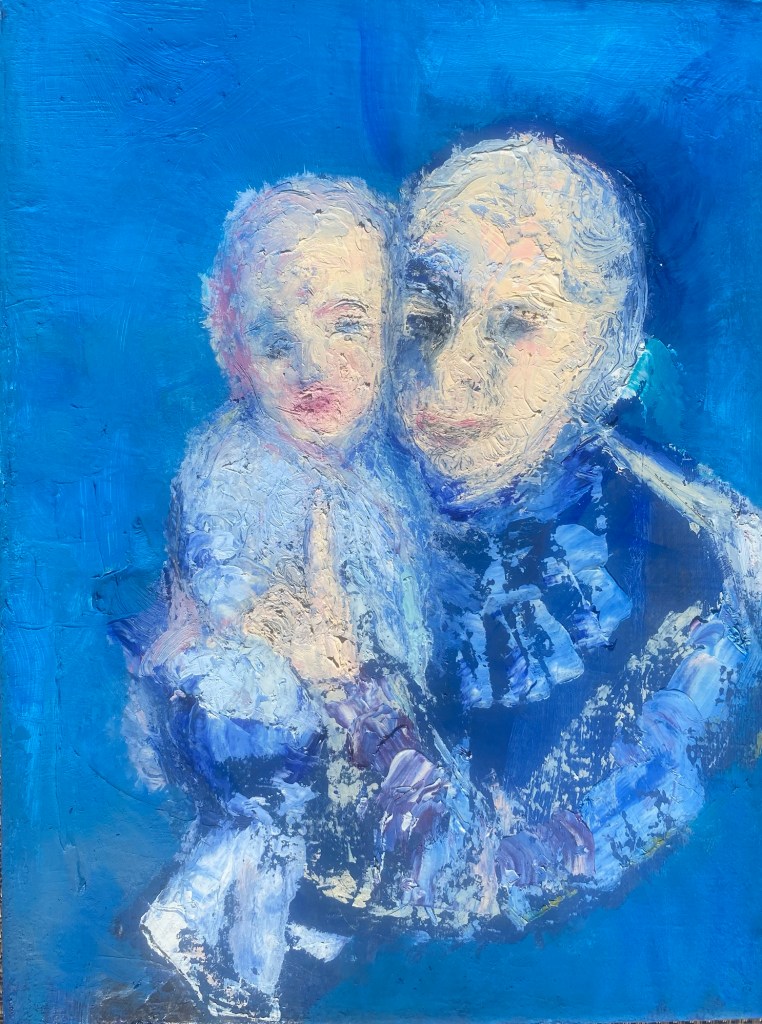
I wanted to paint the quiet emotion I saw between a grandmother and her granddaughter. What I visualized in painting them was peace, identity, pride and love, expressed in shades of yellows, blues and pinks, surrounded by soft, fractured textures. It felt best to carve out their contours and shapes with oils using a palette knife, showing their presence, their intensity, their closeness as a bright splash onto blue backgrounds. This was quick work, often described as “alla prima”, but in fact, also using photography to remember some little details.
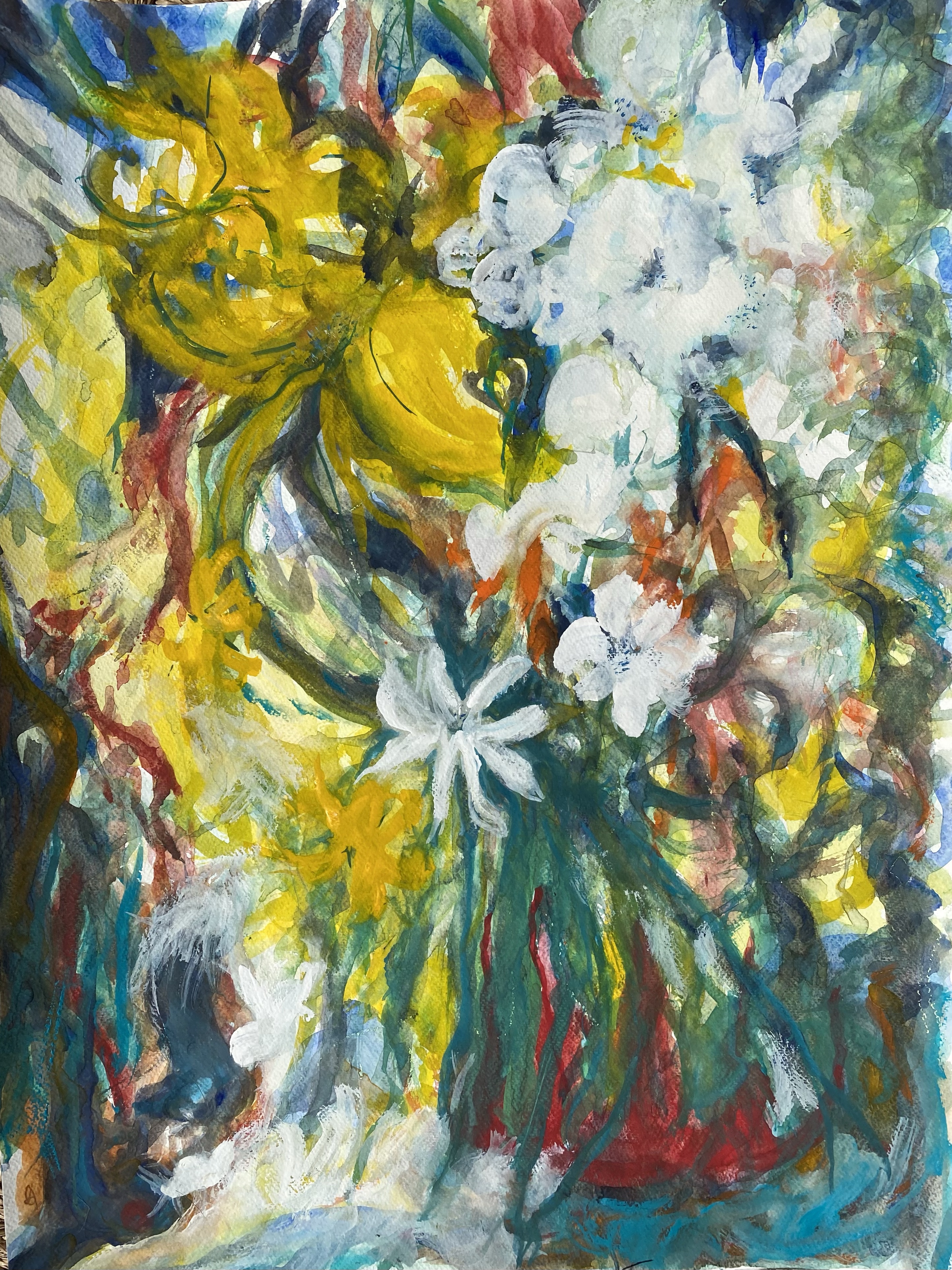
Watercolor, with one big brush on a large piece of paper while thinking about a garden image that plays repeatedly in my head. A small amount of detail was put in toward the end of the painting overlaid with a second, smaller brush with special attention to white flowers.
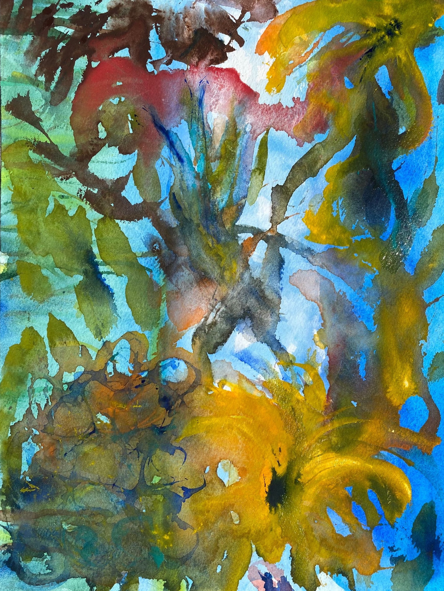
The idea behind this piece is loosely defined mostly by brush movement over multiple watercolor layers with drying times in between.
In the process of doing this larger painting, I also completed a smaller garden piece where I paid more attention to some fine detail, even using a single hair from the larger brush for some of the painted lines in the second piece.
Variation 2, Watercolor 6″ x 9″
I am not completely sure where I am going with these variations, but am mostly working colors with brush, while varying access to water, and holding an approximate structural thought.
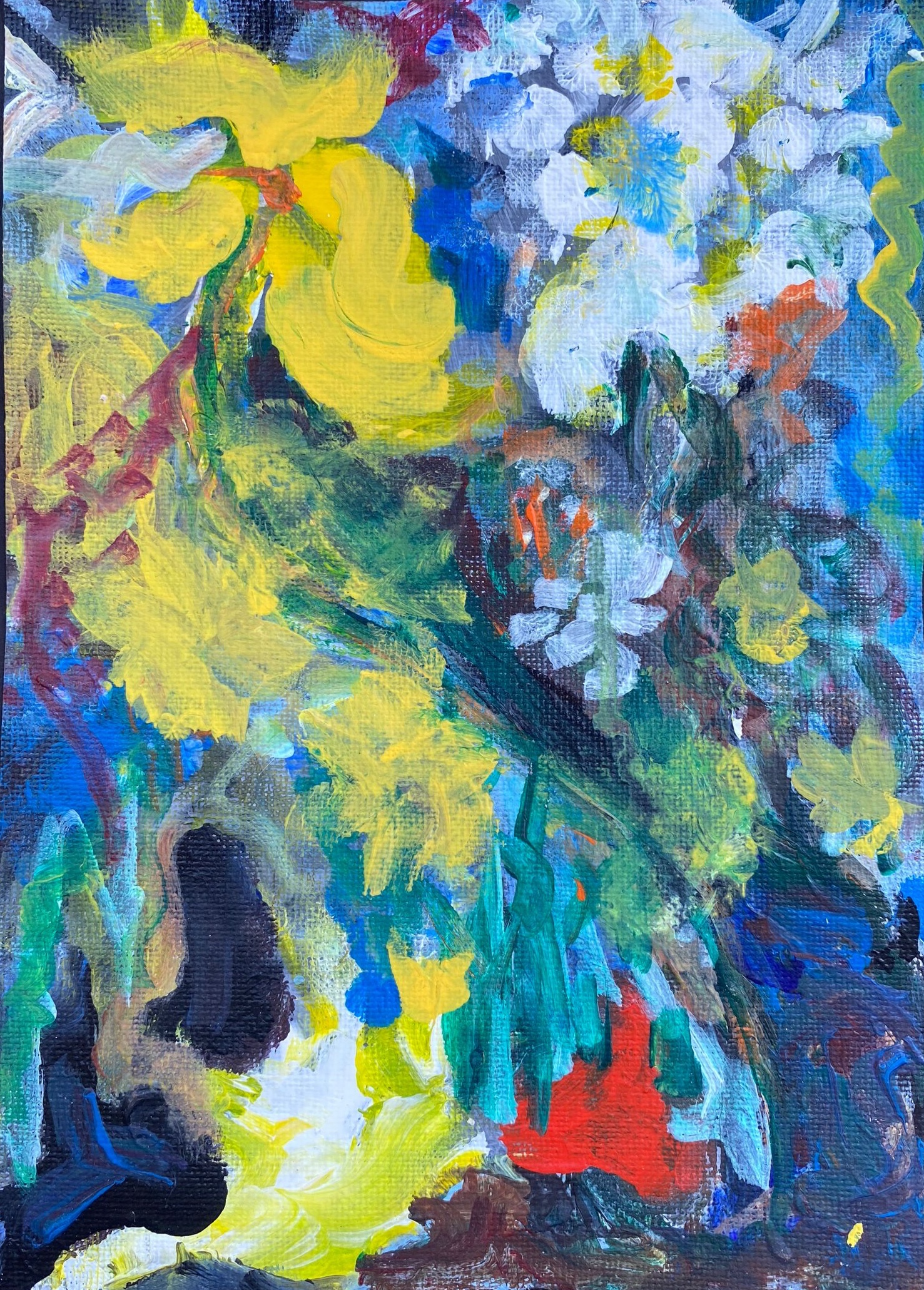
Below, is the first one that I completed in acrylic. It was done on a black background which does seem to highlight colors well.
Variation 3, acrylic, 6″ x “9
This project started because I wanted to learn what would happen if I were to try repainting this acrylic painting (Variation 3) that I had done earlier and liked, into a larger abstract watercolor (Variation 1).
What have I learned from the project? Paintings are moving targets. Each has its own character and wit. Even when I think that I am repeating myself, I am not. Variations of a painting are a wonderful way to experiment with technique, while holding a longer thought regarding the structure.
Since the beginning of the year I shifted from oils to watercolors. I am currently staying on an island in the Abacos, Bahamas and while painting, I am trying to to use as few chemicals as possible for cleaning up in order to minimize damaging the fragile environment.
What I love most about this island it it’s natural beauty and am personally hoping to disturb it as little as possible with unnatural chemicals, turpentines, gamsols and other chemically derived substances that are hard to remove from water systems.
When I shifted to watercolors after working in oils and acrylics, it felt like going from using a lot of make up on one’s face to going without wearing any. It takes a while to figure it out. But once figured, interesting results do emerge.
In watercolors, I find that not doing something is often planned way ahead of time and may make a stronger artistic statement than doing something. Less may be more. Soft touches and the timidity of watercolors can sometimes offer big results.
I think this may be why transparency watercolorists try so hard to maximize their use of the paper they are painting on by using the pure color of paper white. It is because they are trying to maximize interest in the painting through the things they do not touch.
Oil painters, on the other hand, enhance their paintings substantially by adding plenty of paint for depth of color, texture and brushwork. This may leave little empty canvas behind, with nothing untouched, to tell the artist’s story. In this case, the paint is the story.
My expectations have had to change when I shift to paper and watercolors. It is a different temperament to work in.
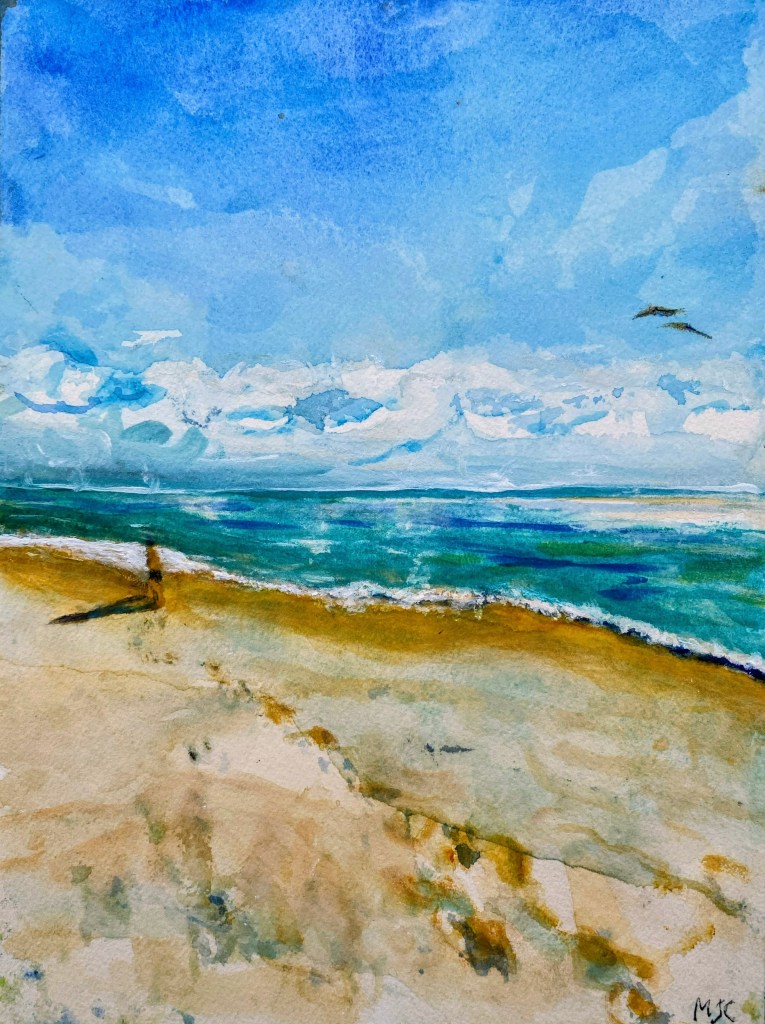
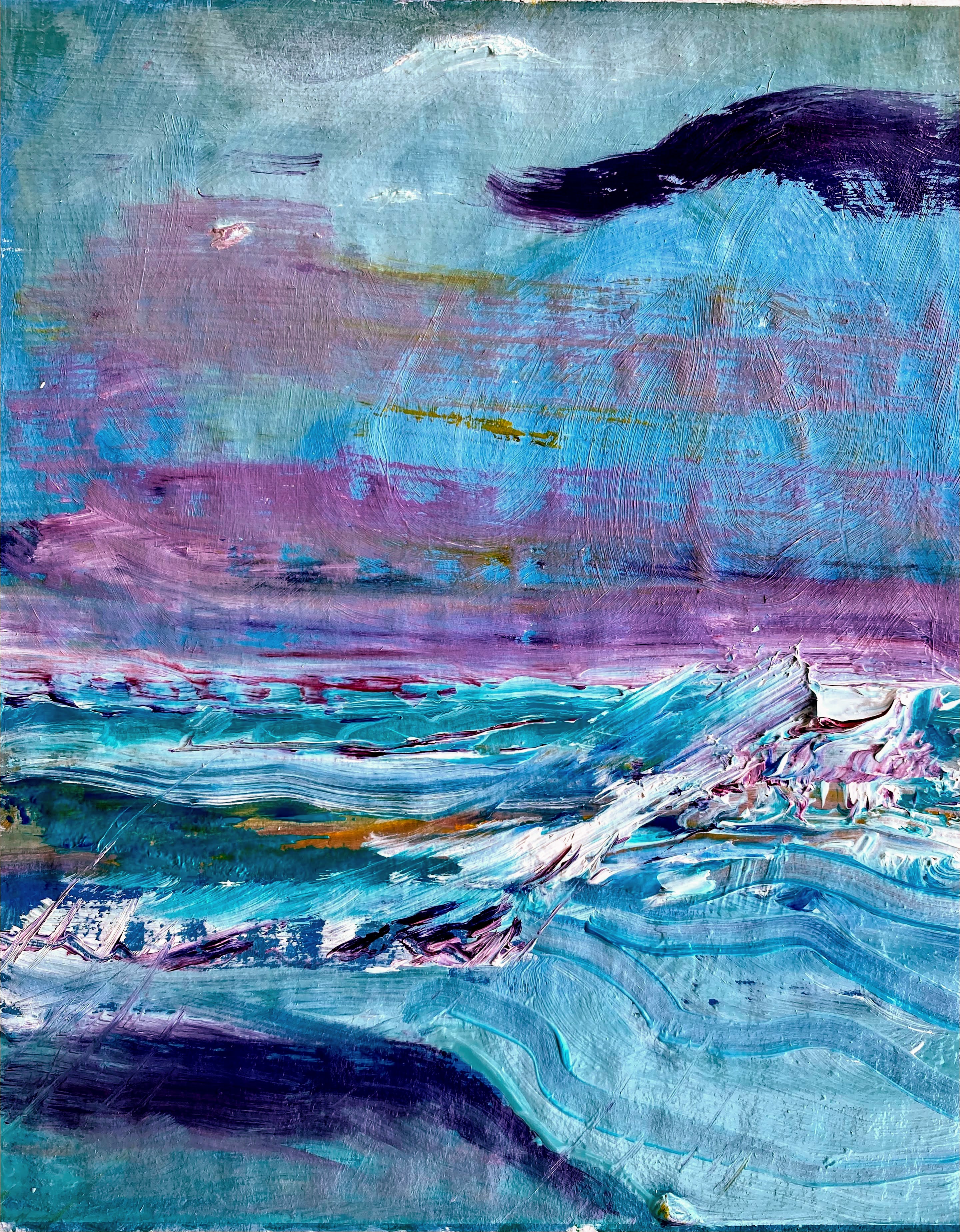
Beach Blue, a watercolorStorm Coming, watercolor
The other challenge is that on our island, the constantly shifting combinations of water, atmosphere and light makes one feel a unity, a oneness about them, that may not necessarily be felt so as vividly in other environments. Here, distinctions between sky, the ocean, and that of light may be blurred, leaving the mind completely boggled by the sudden shift felt in moods and color emphasis of the whole arrangement.
Colors can jump into gear on a second’s notice.
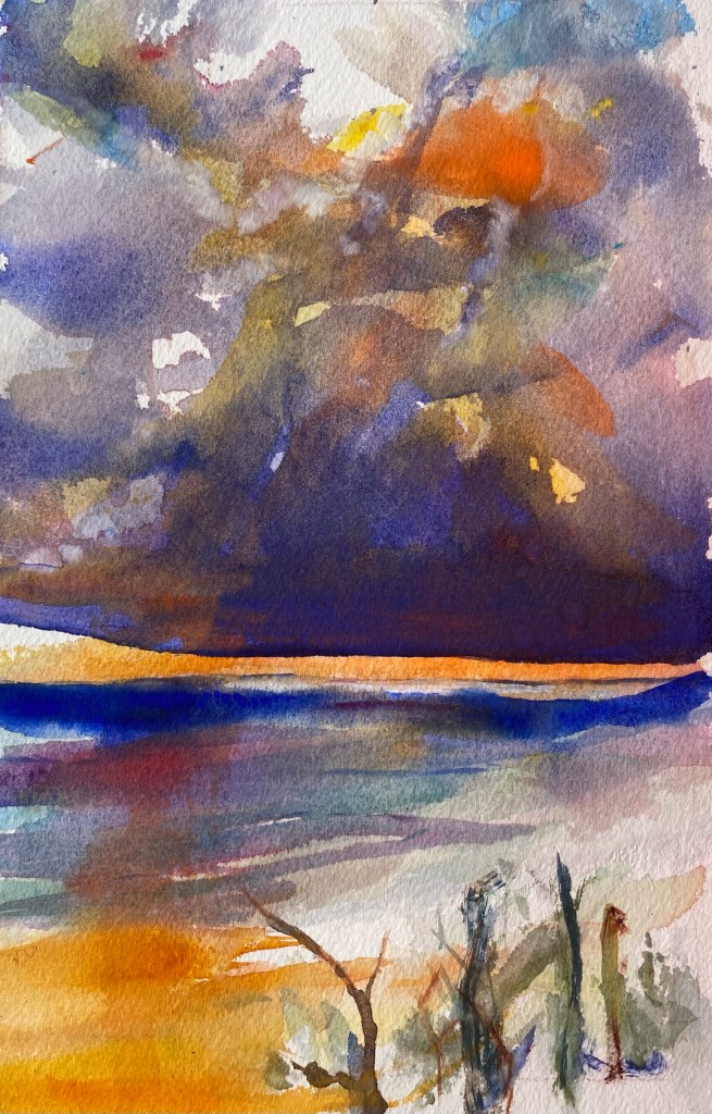
Storm Leaving, watercolorFront Yard, watercolor
Common scenes are rearranged by nature’s dynamic, moods are shifted through rapid transitions in light and humidity, our observations bouncing about from rising and lowering tides and winds. This whole sense is ephemeral, further feeding into our awe of all the temporary beauty.
Here I am, with my watercolor paints, brushes and paper, reflecting on this.
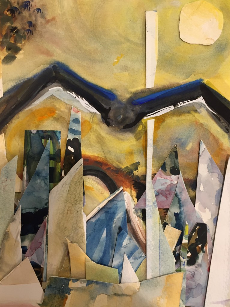
Water color collageCut up pieces of watercolor art glued on poster board
Some time ago when the Global Pandemic was first announced and before there were Covid vaccines, we were in our home for long periods of time. I started taking some zoom art classes. One very enjoyable zoom class was conducted by the artist Poca Kim and was offered through the Oregon Society of Artists.
Painted over with acrylic
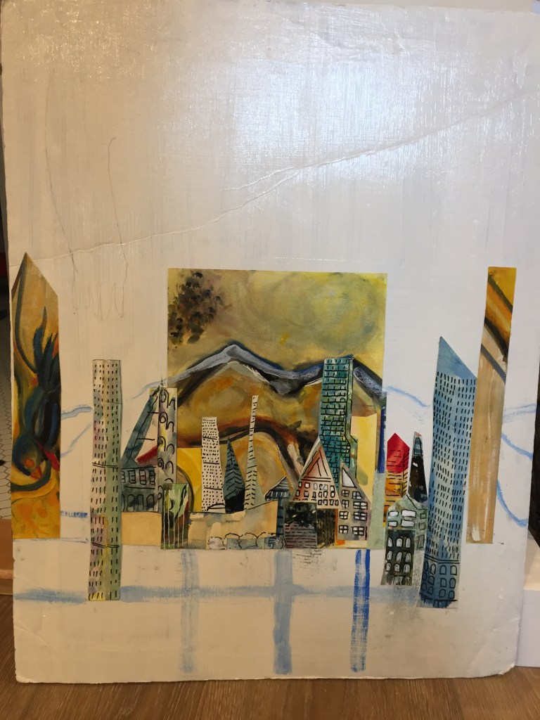
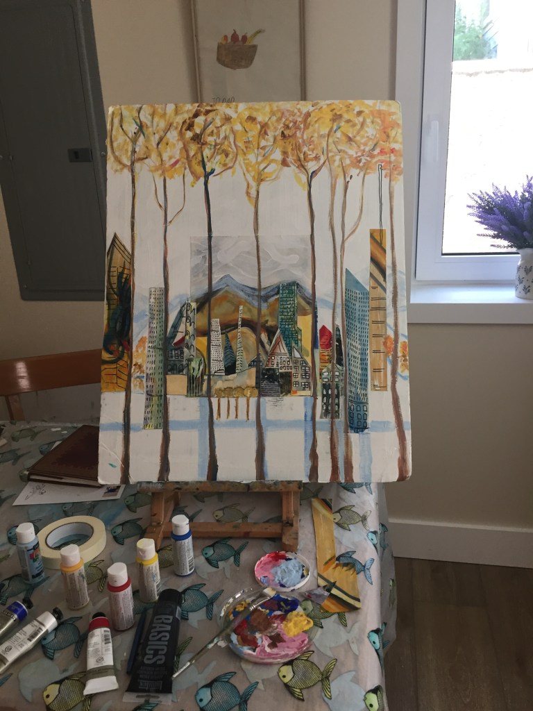
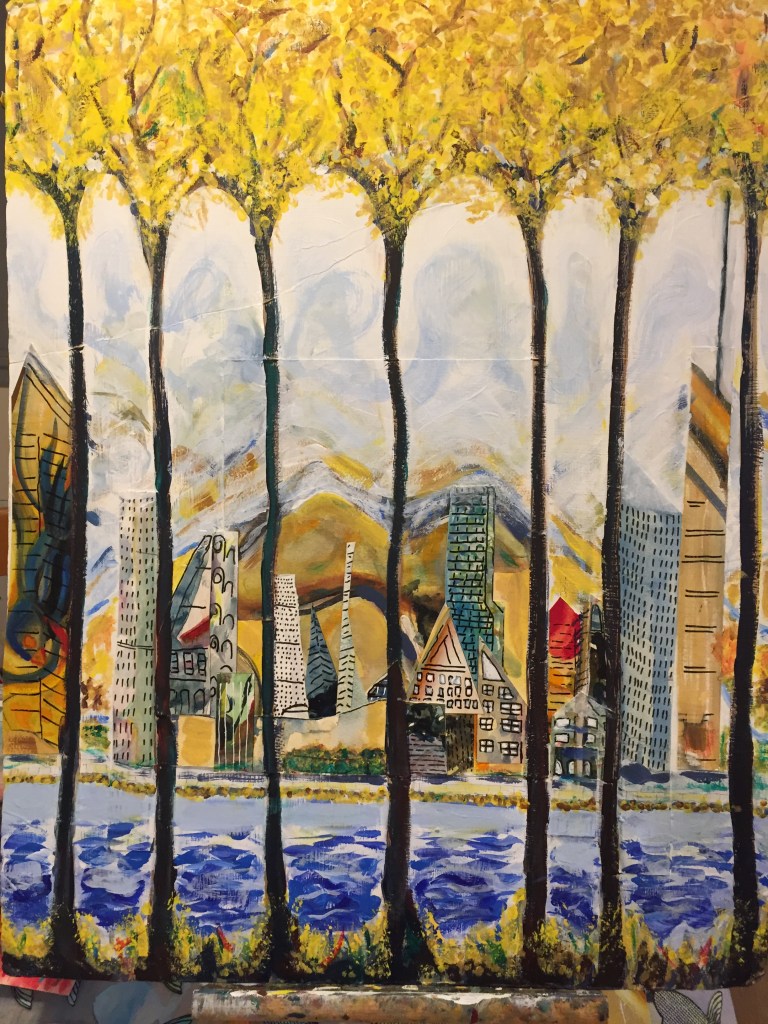
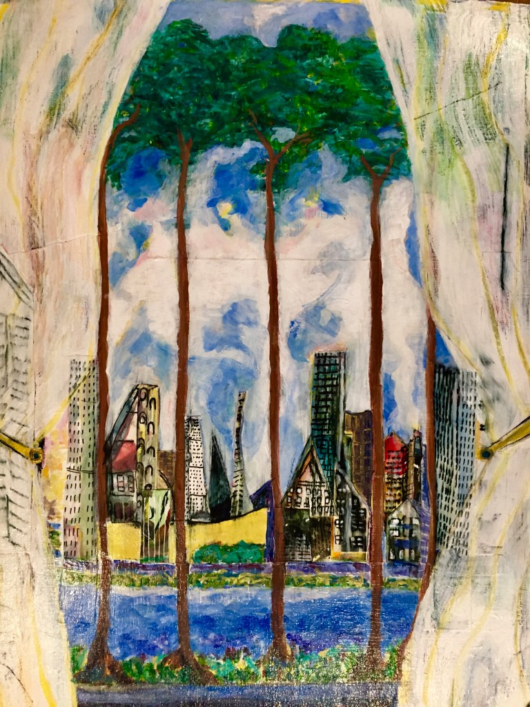
Through our zoom meetings, Poca Kim introduced me to the idea of cutting up old watercolor and acrylic paintings to inspire new paintings. I made a number of collages using old paintings that I had no intention of using. I imagined myself peering into cities from what might be a prison, but also might be tree trunks.
At the time that I did these collages, I thought that I was viewing the city from the perspective of the safety of nature. Looking back on these photos, I now see that I was also indirectly messaging the idea of viewing the world from a sort of prison-like setting of a Global Pandemic.
Much like a diary, old paintings tell stories too.
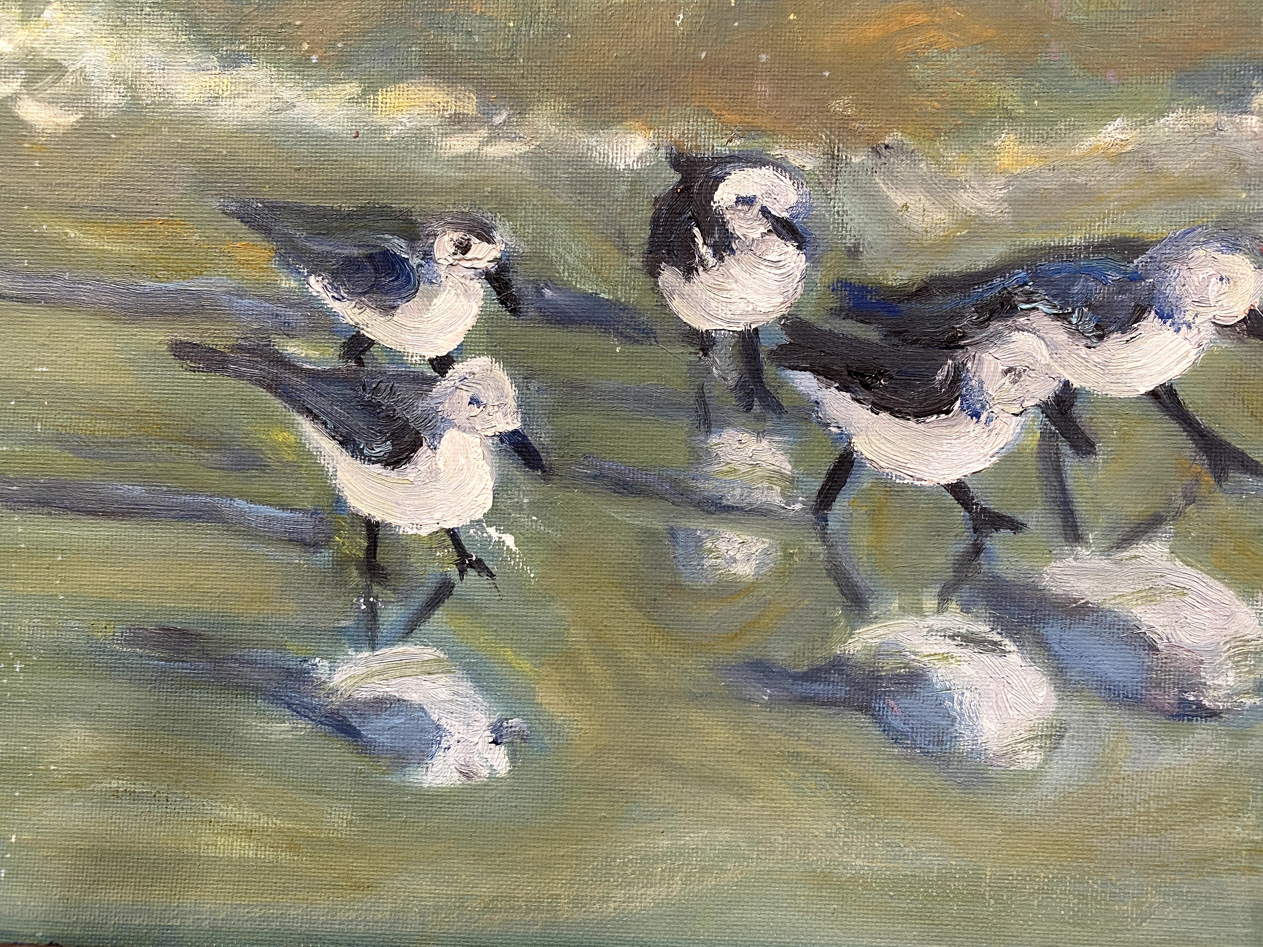
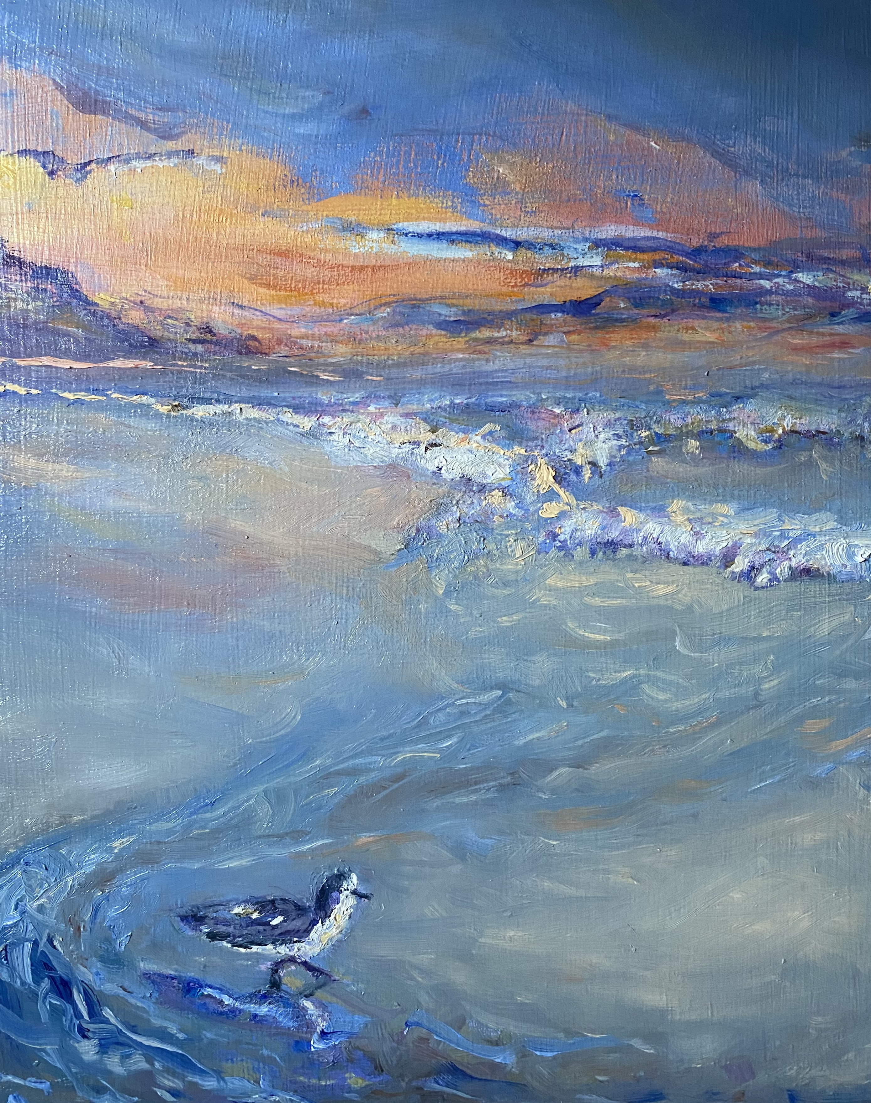
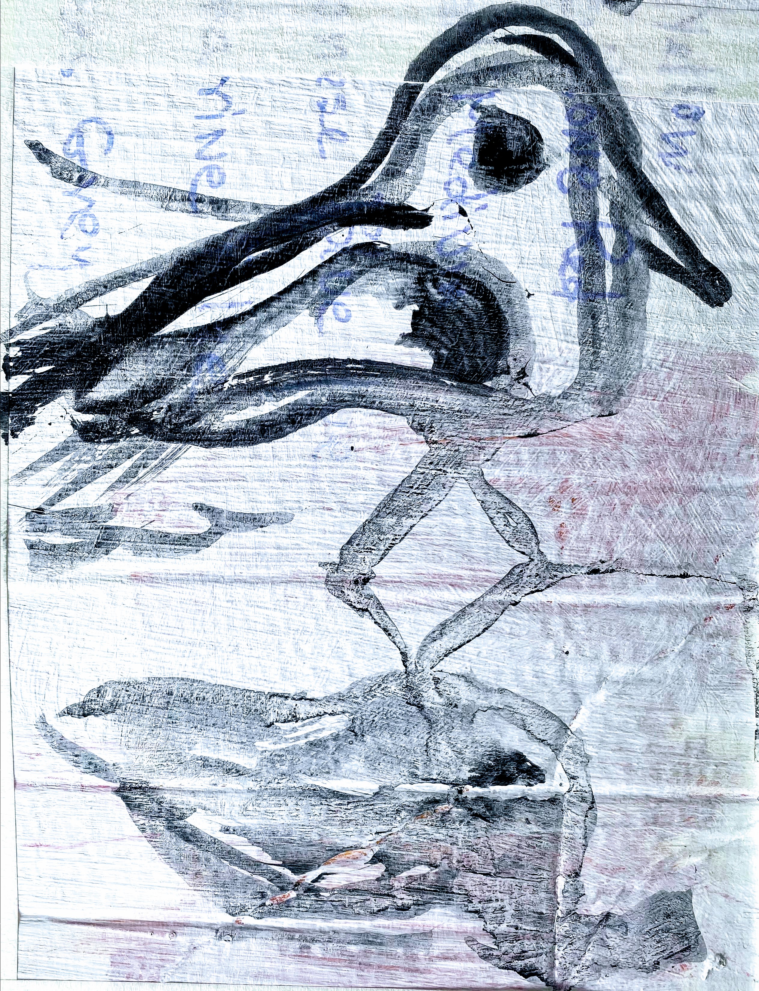
This watercolor painting, The Flight, was completed as a two-step maneuver. First, I laid out the background to the painting as wet-on-wet watercolors, so that the ocean, beach sand and light would move back and forth as a series of reflections. Once dried, I superimposed the birds in flight, using a combination of watercolor and ink.
In my earlier attempts to paint these birds, I figured out their positions and got them arranged and interacting with the water in useful ways, but still felt that there was more to do than simply positioning. Somehow, the division between birds and water held and I wanted them to be more intertwined. I wanted the birds to be in transition to flight and to represent this by mixing the various approaches to water, the concept of time, the colors of reflections, making it more chaotic. This time, I feel that I got the movement back into the painting as I had initially wanted.
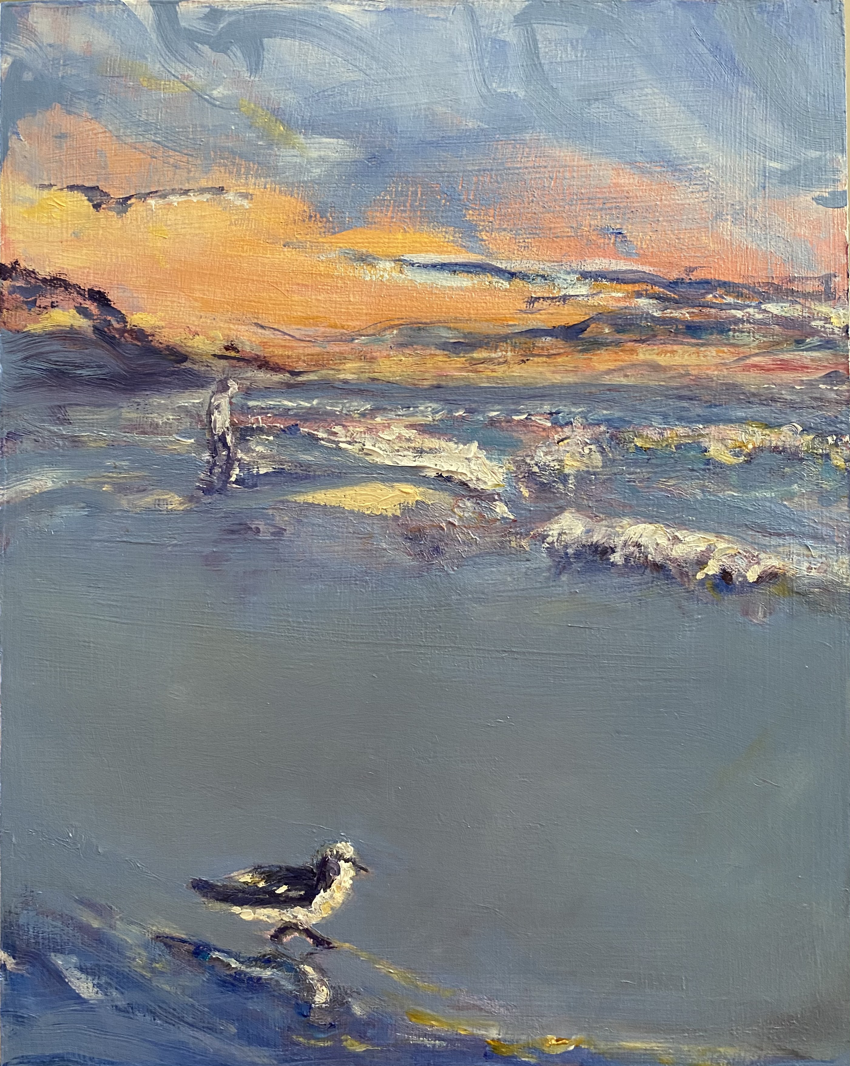
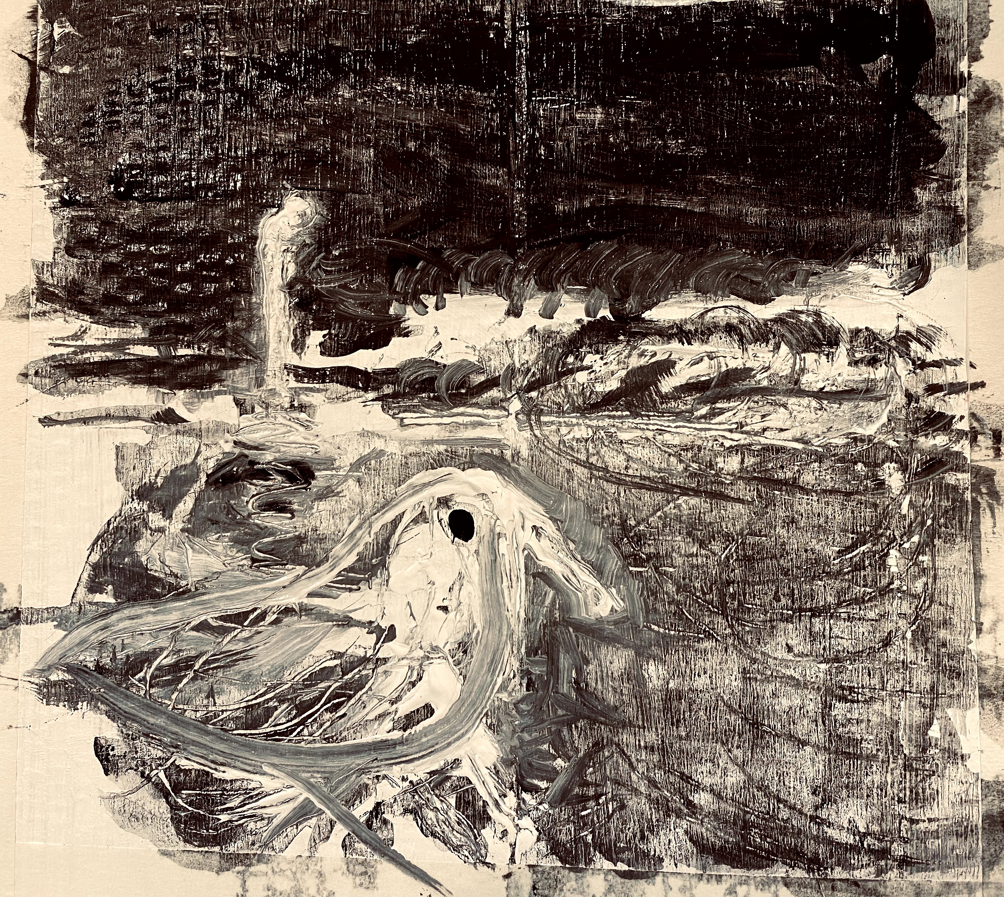
Using this same technique of wet-on-wet followed by ink, I also painted the birds in a more regal way, as they stand, pre-positioned in the water for flight, but not yet moving. The colors of the background are less agitated with reds, and the birds are positioned more stably in the water.
Feeding Time Watercolor and ink
What did I learn from this exercise? I learned that it takes patience to incorporate new techniques into paintings.
I feel that I am finally back on track for painting with my natural style, but with the privilege of understanding some new techniques recently learned from exchanges with other painters. Taking lessons and studying under other painters both digs up new ideas, and also dredges up old habits, allowing these new ideas and old habits to interact, creating new opportunities, but also feelings of frustration.
I am happy to continue working across these two major zones of learning and intuition with new paintings, and am thankful for the lessons learned.
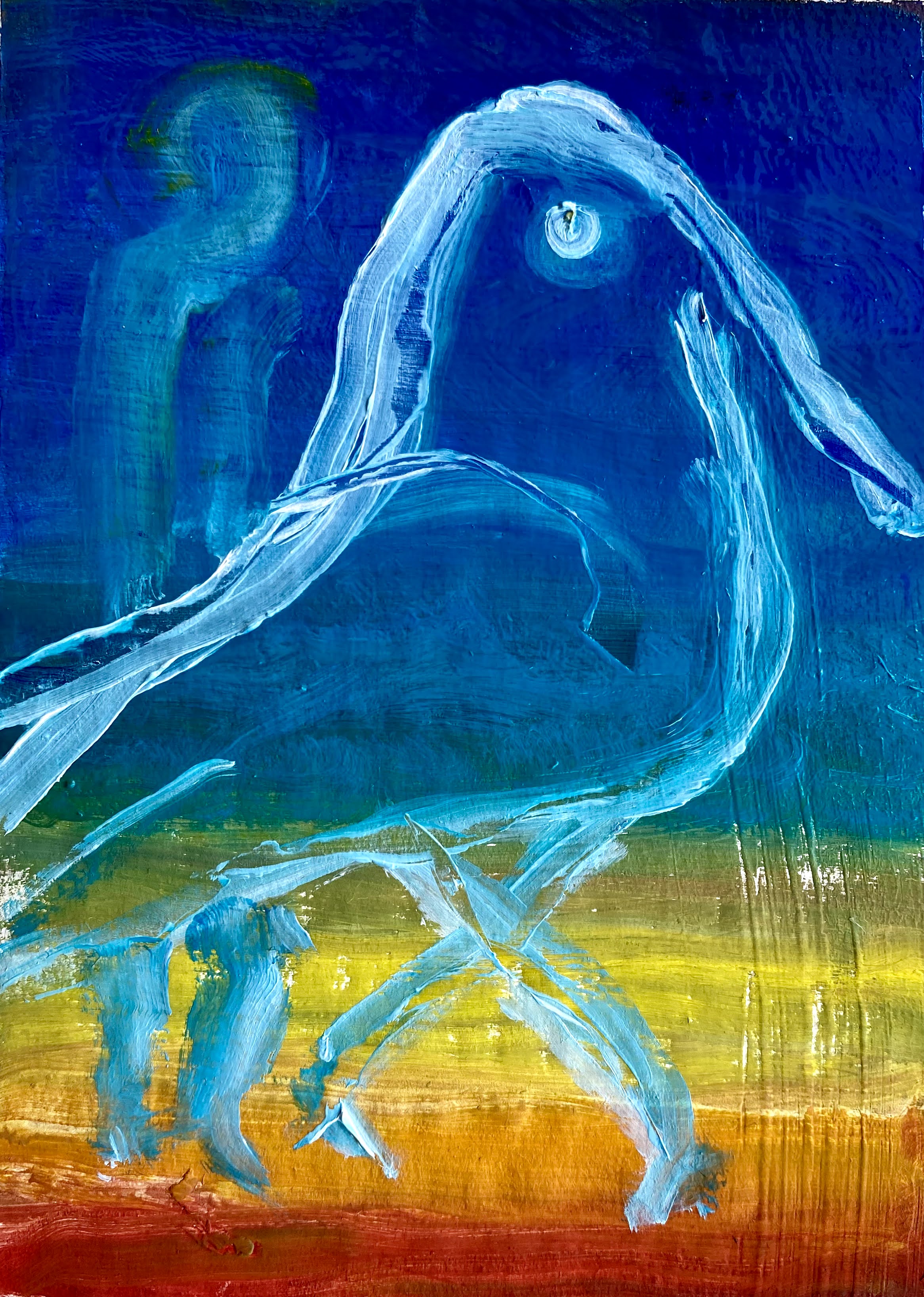
It wasn’t so long ago, but almost forever and a day, before the sun fully lifted into the sky.
The light broke, and now Freely into Blues.
Together alone
Variations of the same oil painting while playing with glazing and color mixing on birch wood.
Oil painting variations were completed during the period of time that I participated in an art class called Painting on the Edge taught by Michael Orwick, offered through the Oregon Society of Artists.
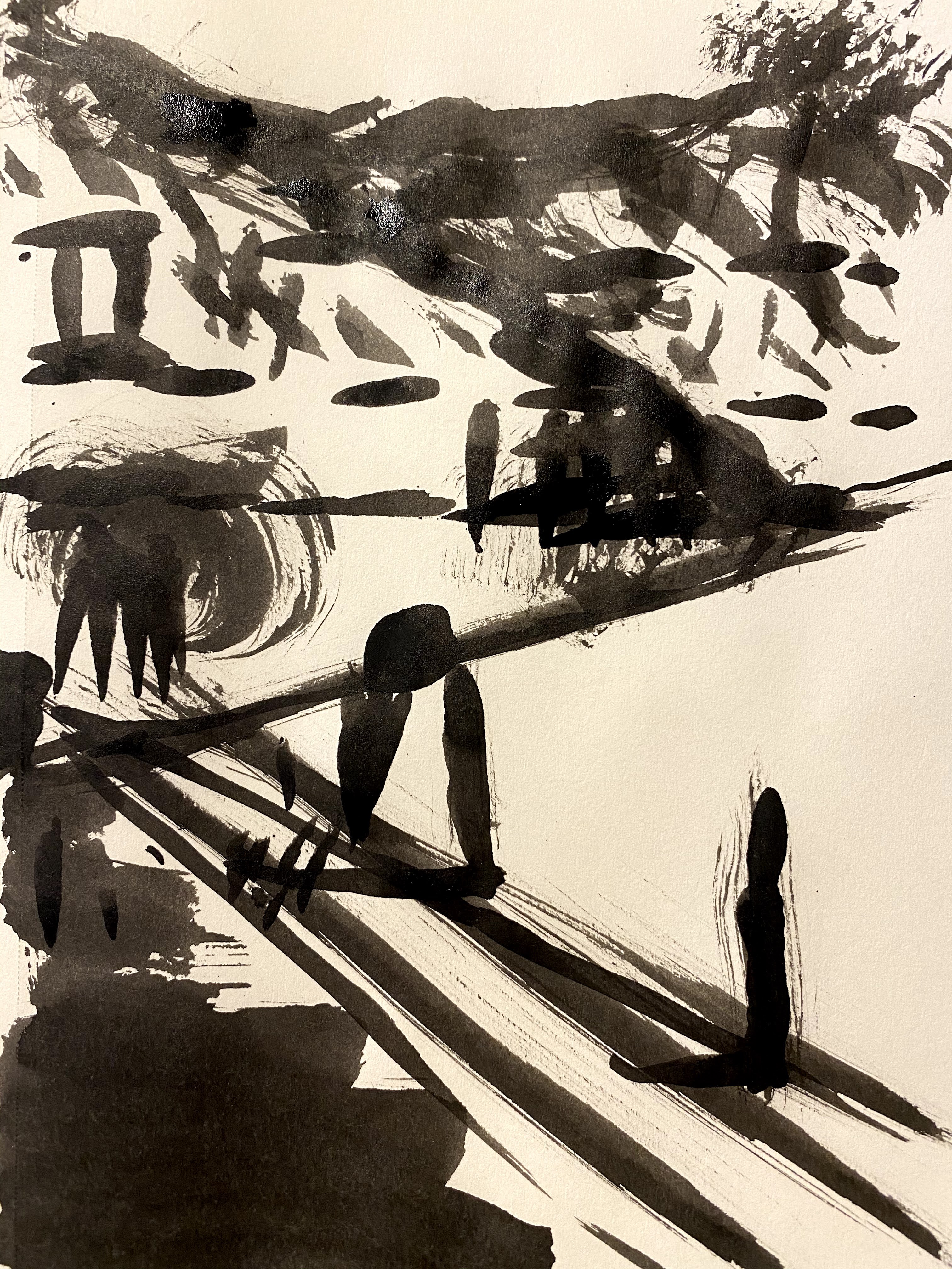
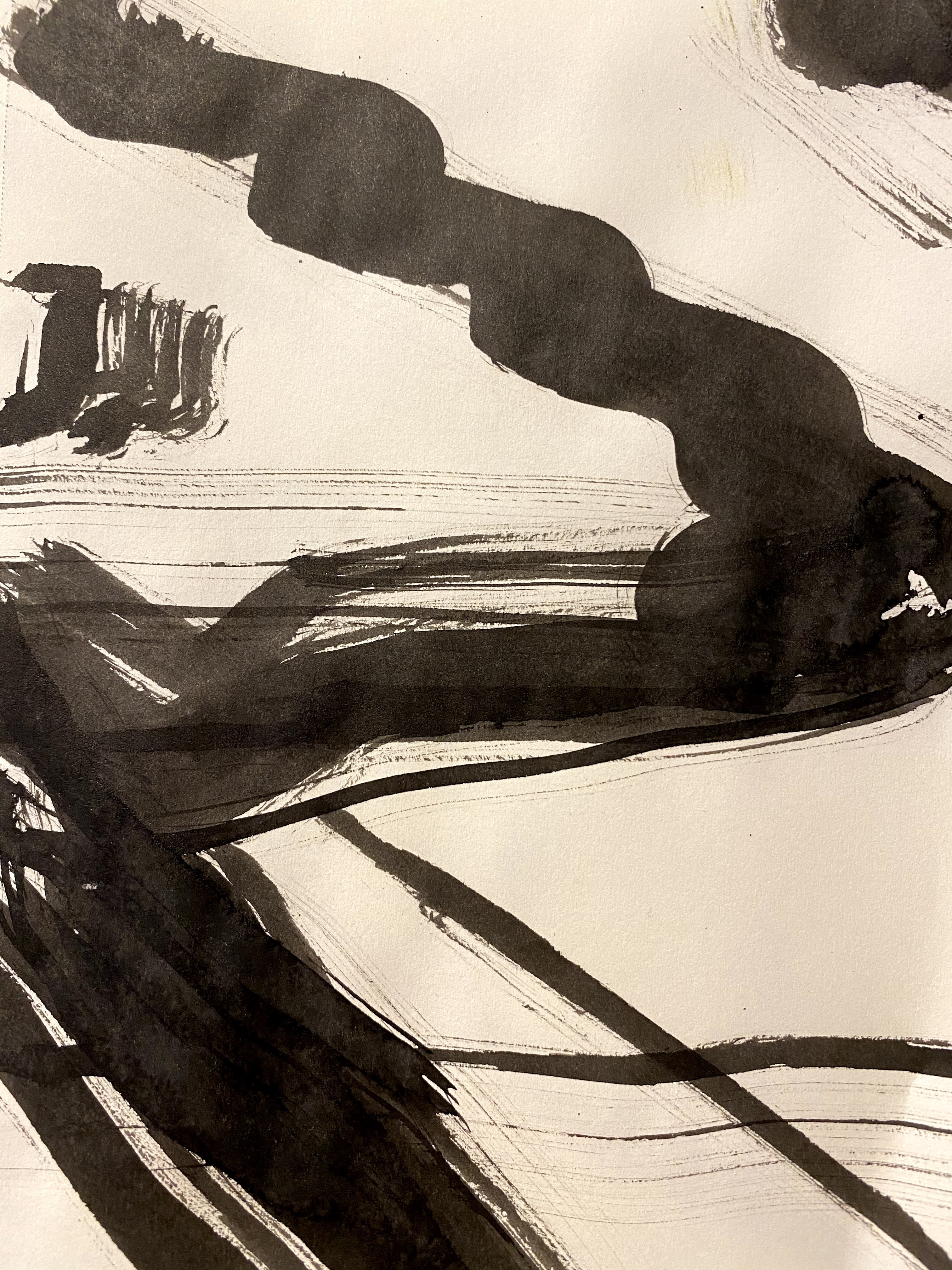
These sketches are notes prepared for planning a future painting. In the process, I play with brush marks and edges on cardboard, first in black and white and then adding some more abstract color perspectives.
I am thinking about a simple painting of a person and a bird on an ocean beach, and am wondering what direction to take.
Where should the person and the bird be positioned? Should their lines be hard edged and realistic or might these objects be better depicted in a more abstract and reflective way? Should they stand out and burst with color or be more tonal in nature, positioning themselves smoothly between water, sky and beach? When and where should the sky, and the water erupt into being? How does light run through this?
These sketches on cardboard are for me, a form of meditation.
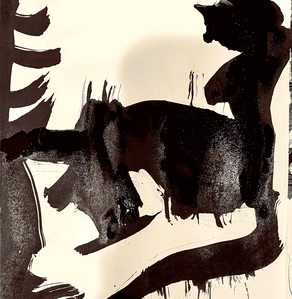
They are a kind of warm up where I roam about the gessoed cardboard with ink, some acrylic and finally oils, while playing with shapes and soft edges, varying the texture to see what affect it has on the person and the bird.
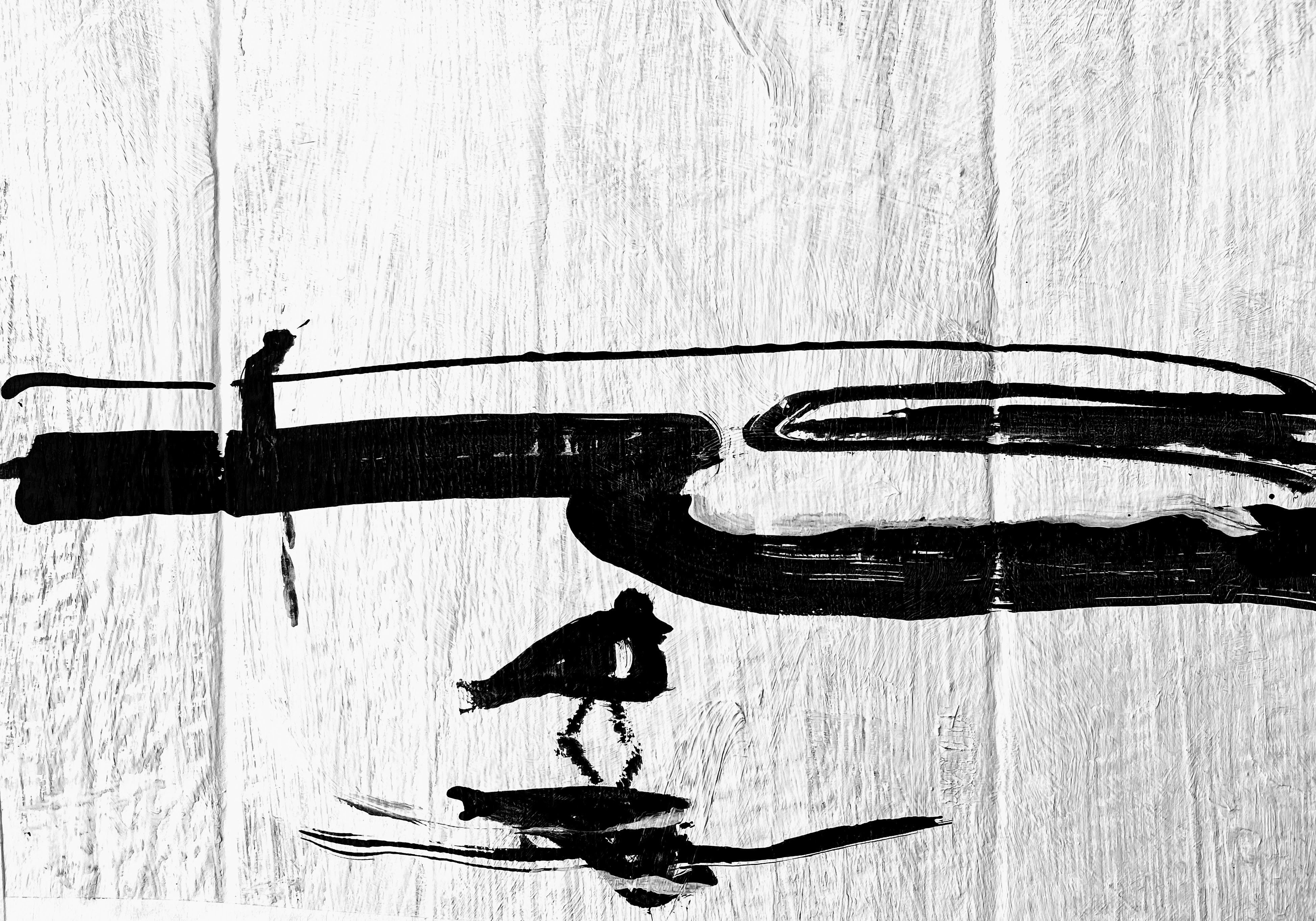
Person and Bird, Acrylic on cardboard
How important is this bird?
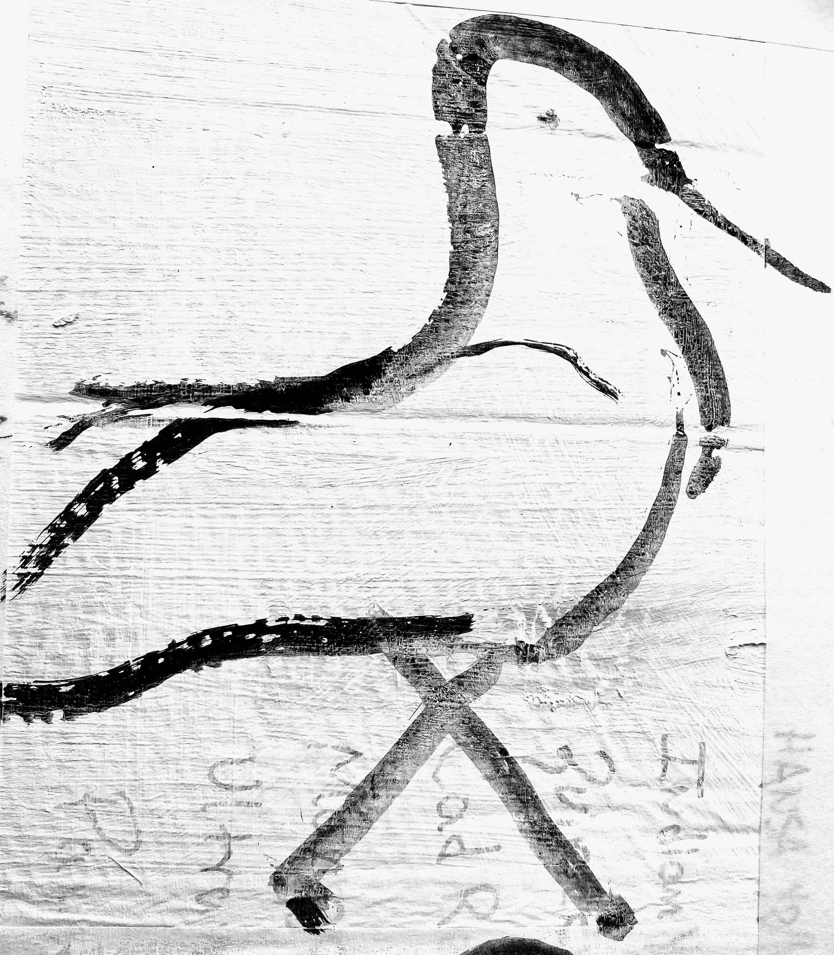
Water Bird, acrylic on cardboard
What about reflections, and of what?
Water bird with reflection I, acrylic on cardboard
Playing with water reflections and edges.
Water Bird with Reflection II, more abstract, acrylic on cardboard
Let’s try mixing it up a little, who has the sharp edges and who is soft and fuzzy?
Sketches for future painting called Alone Together, acrylic on cardboard
A person and bird on an ocean beach, with greater emphasis on the bird.
How complex should the textures be when sketching the bird and person? How about varying brush strokes and types of edges and how these variations create differential emphases on the sky, beach and ocean? How much color should I add?
There are five parts to this simple painting: bird, person, waves, beach, sky, However, this bird seems to be taking over.
Person and Water Bird, (oil paint on cardboard)
Shifting to color when thinking about the horizon and light, I paint some potential perspectives on the background.
Abstract I, Oils on cardboard, hard horizon
Abstract II, oil paint on cardboard, soft horizon
How to depict with horizontal lines, those beautiful shifts in color, the blended statuses that occur, between sky and the imagined ocean horizon; repeated when ocean waves become still waters and beach sand?
Abstract III Oil Painting on Cardboard
And how would it look if it all turned out in blues?
Abstract IV, oil paint on cardboard, lines upon lines
These are early thoughts about edges and brushwork that I might use while preparing a future oil painting of a person and a bird, positioned on the soft and often merged horizontal lines between water, beach and sky.
Time will tell how this all turns out.
These sketches were completed during the period of time that I have been taking the art class called Painting on the Edge taught by Michael Orwick, offered through the Oregon Society of Artists.
Below are photos, sketches and paintings that I prepared for our class called Creative Color and Luminescence taught by Michael Orwick offered through the Oregon Society of Artists.
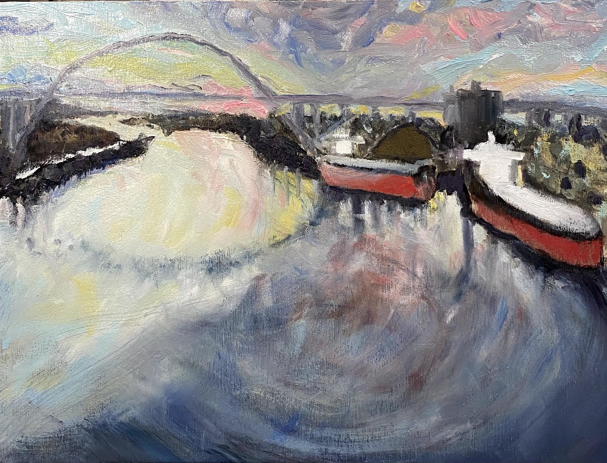
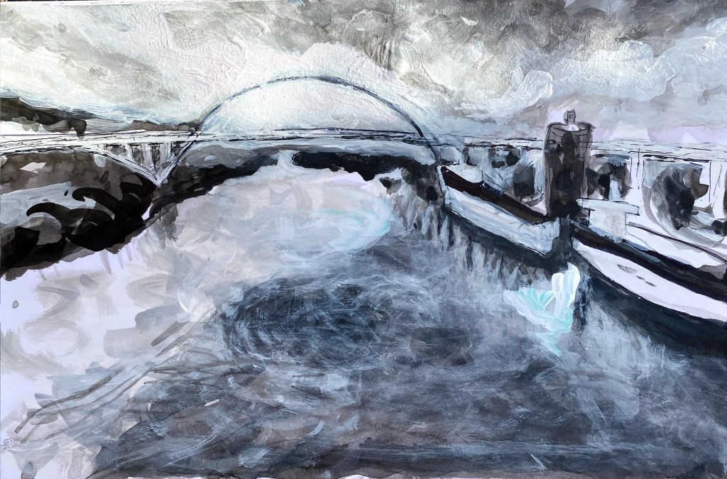
This is an unfinished painting. I have ideas how to soften the red water on the right side and want to do some glazing to smooth out certain parts. For now, I am not touching the painting because it needs to dry a bit before proceeding.
This painting is of a Portland bridge that I started sketching back in January when I prepared ink sketches of it for variations in Michael Orwick’s earlier course on design and composition. I have now carried these earlier sketches into the current class on Creative Color and have begun painting it using oil paints on a birchwood panel.
Portland Bridge, unfinished oil painting on birchwood panel
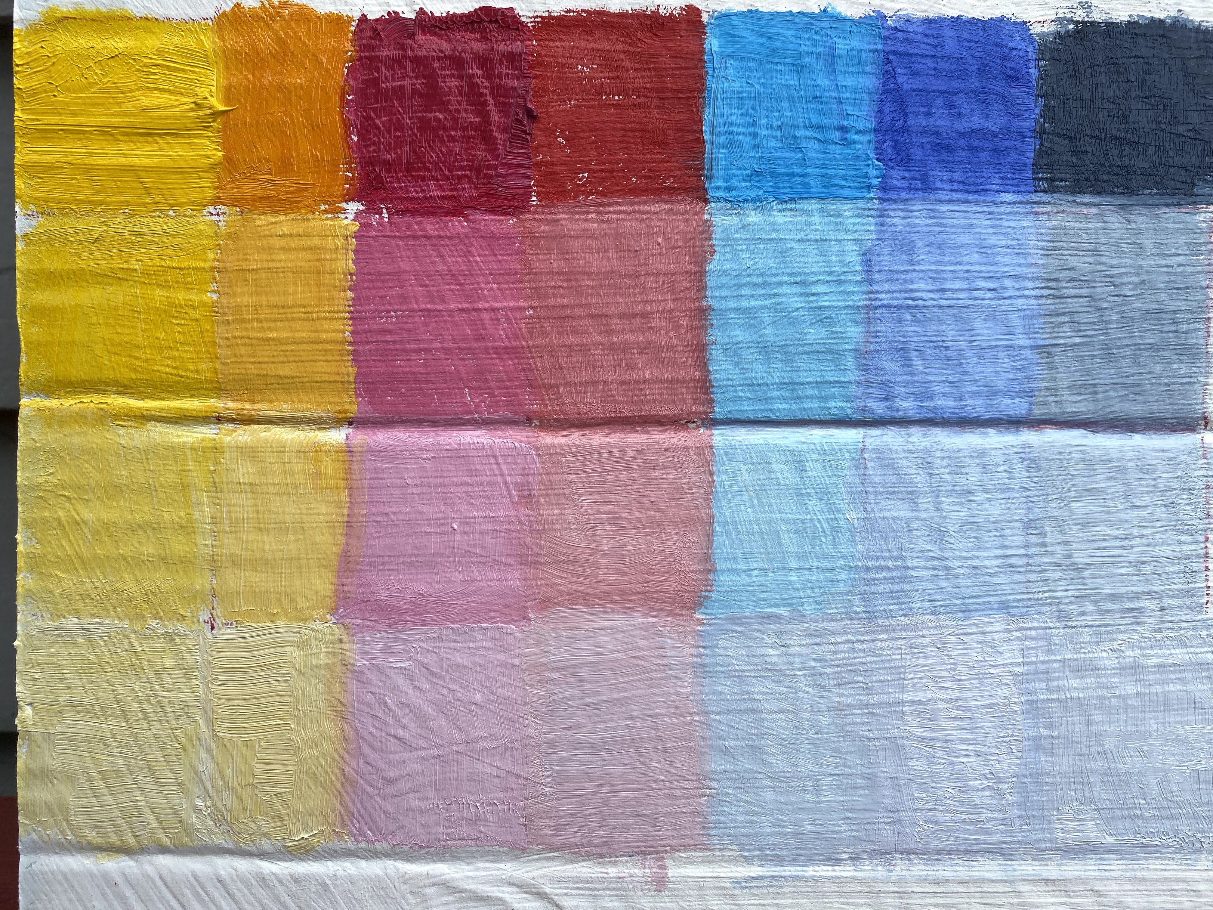
This week we turned our attention to color value and as an assignment, we broke down colors on our palette into gradations between very light and very dark values of the same color. We also began painting color perspectives of our planned composition. Michael Orwick spent three hours with us on zoom, detailing ideas and illustrating color value. It was a very good explanation and I learned a lot.
He asked us to summarize our aha moment and here’s mine.
In landscape paintings, clouds are a big part of the sky’s atmospheric infrastructure, bending light and casting shadows altering colors and their hues. Similarly, on the ground, trees, buildings, hills and mountains are important parts of land’s infrastructure again bending light, casting shadows, altering colors and their hues. Paying attention to the horizon helps to illuminate how these big natural infrastructures interact when light is infused into the picture.
We use our paints to sculpt and make textures while also measuring brightness and shadows. The system of mixing colors for specific purposes may create moods, alter reflections, enhance shades and encourage brightness and may intentionally create feelings of harmony or disharmony, as needed. We spent time considering how color does this, by shifting values, varying brushwork or color marks and color mixing. Here is my takeaway from this week.
Color is all about perspective.
Colors may have value which can be deepened or softened according to whether they are:
in the sky;
their proximity to the horizon;
how light is being infused (i.e. angle of the sun); and
according to the shapes and angles of objects around them.
Understanding this about color, we ask as we plan a painting:
Where is my horizon;
Where is my light source;
What is my color harmony (could be seasonal, time of day, mood, feeling.; and finally,
What is my mother color? Reference to mother color summarizes the predominant color of a perspective.
If I understand correctly, the mother color is not a “true” color based on the facts of an observation. It is instead, the color we might choose to mix in all the other colors of the palette while painting, to encourage harmony. In the case of my painting up above, I consider purple to be the mother color. I mixed up all the colors in this painting to see what color I would get, and here it is. This would indicate that I will get soft shadows from the palette I have chosen. It is late afternoon in this painting, and the soft purple light over the Willamette River pervades.
Learning to use color in a painting is like learning how to drive a car. One’s beginning understanding may be that we must know how to turn on the car, stop, go, and turn the steering wheel. With time, we learn the necessity of checking our mirrors and estimating angles of the car to comprehend where we are and how moving our car will impact on others and their locations.
Color, like design and composition, complicate art in the most wonderful ways. It is much the same way mirrors complicate driving…but also improve the experience.
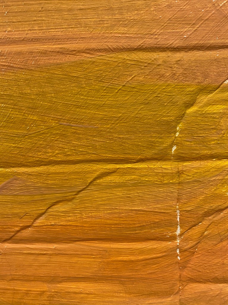
I expect to add glazing to this painting for harmonizing colors and will prepare some speculative drawings for figuring out options on the glazes.
Sketch paintings and glazing options appear below. I have prepared them on on cardboard since I do not plan to keep them, except for this planning stage.
Color options for painting
Color options for painting
Below, is the graph that I prepared for the class showing four possible variations in color value for each color in the palette.
Illustrative example of color value changes prepared for the course as an assignment.
It is turning out to be very useful that the same painting ideas I chose for the first course are being carried through the next course, so that I continue to work on the painting across the big art concepts that we are being taught. We did not have to do this, but I chose to, as a learning experience and I would recommend doing it again.
These are my notes for paintings that I am working on in an art course on The Value of Design taught by Michael Orwick through the Oregon Society of Artists
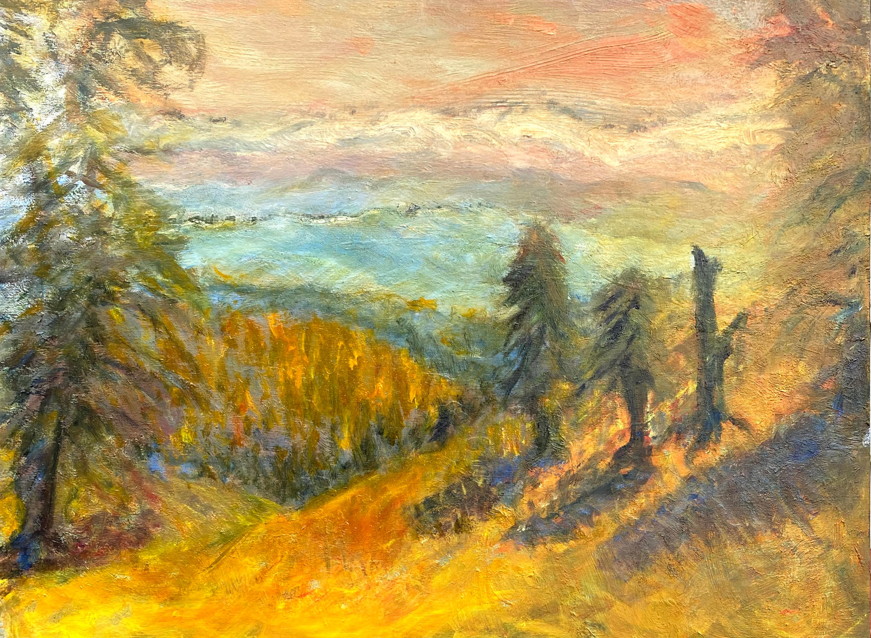
I started this fourth week by finishing off a painting of the Oregon mountains, using a tonalist style. I liked working on tonalism and decided to continue using this style for our next assignment.
Our goal is that by the end of the fourth week of this class to complete a painting while going through all of the steps we have learned thus far.
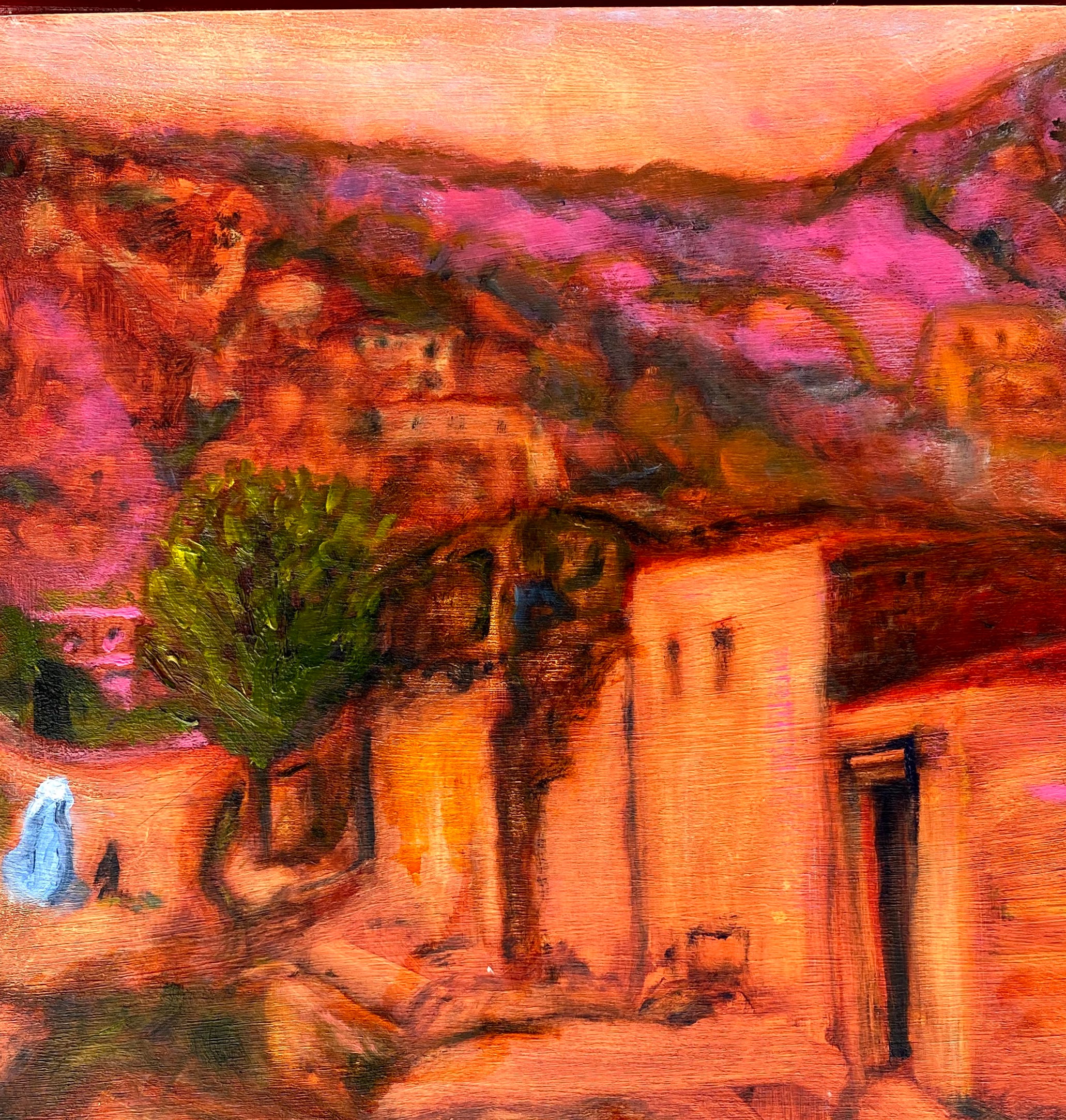
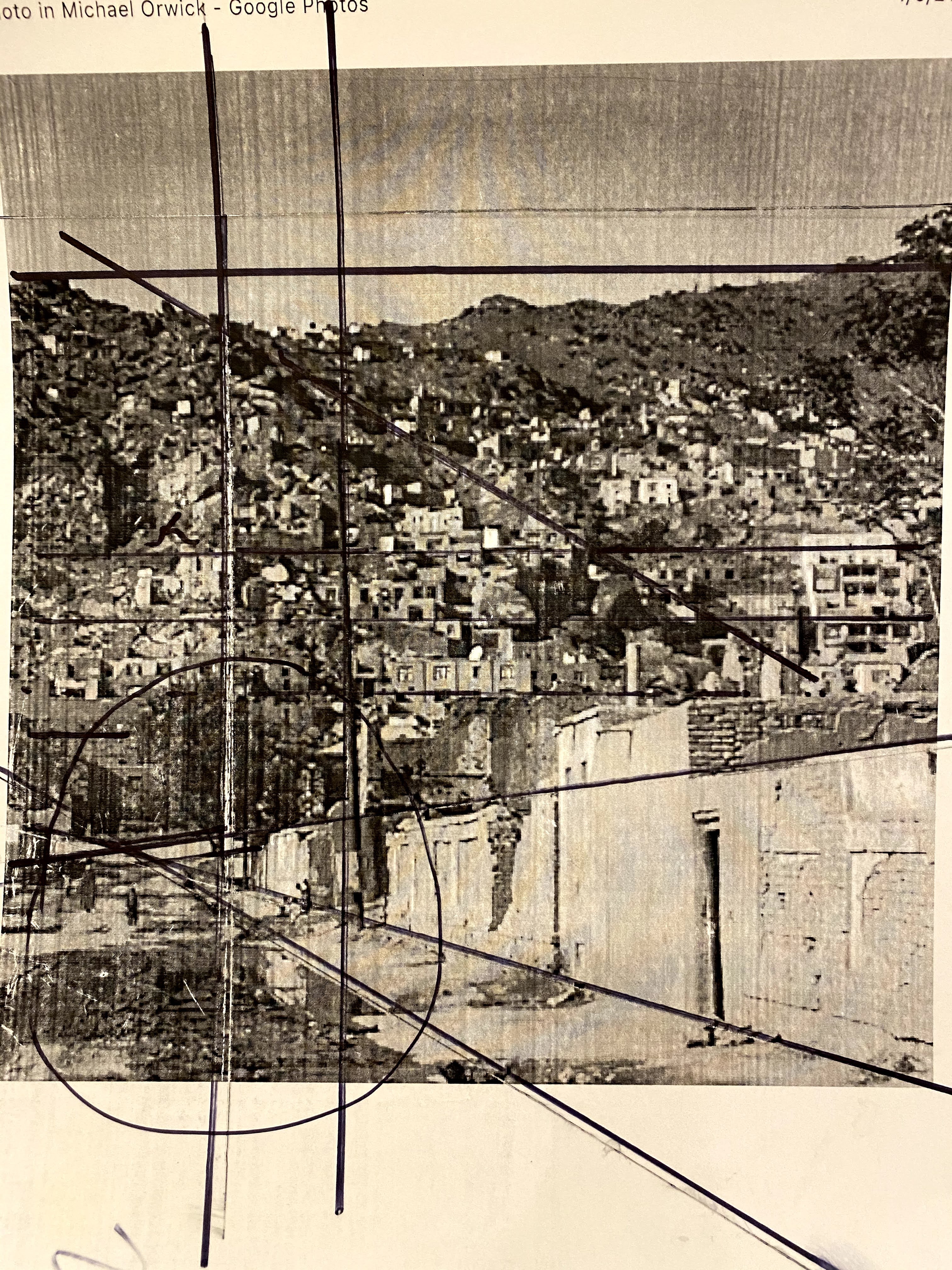
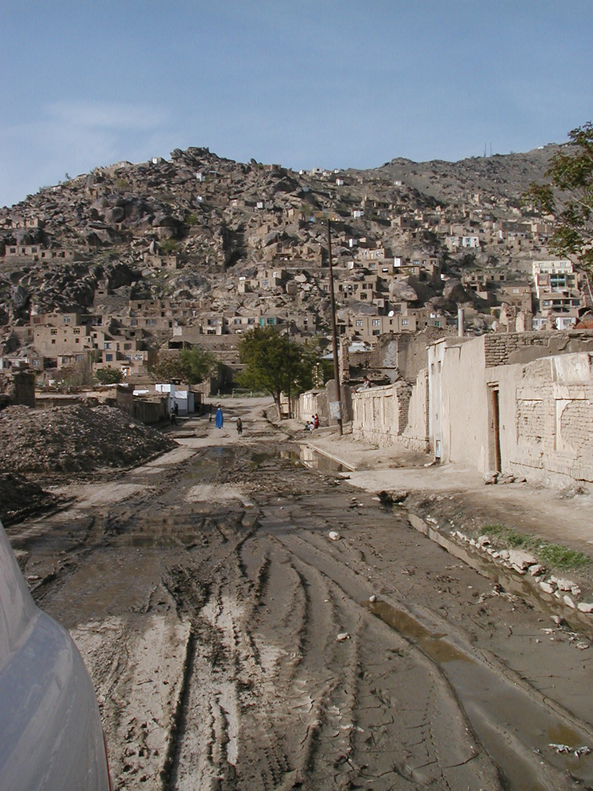
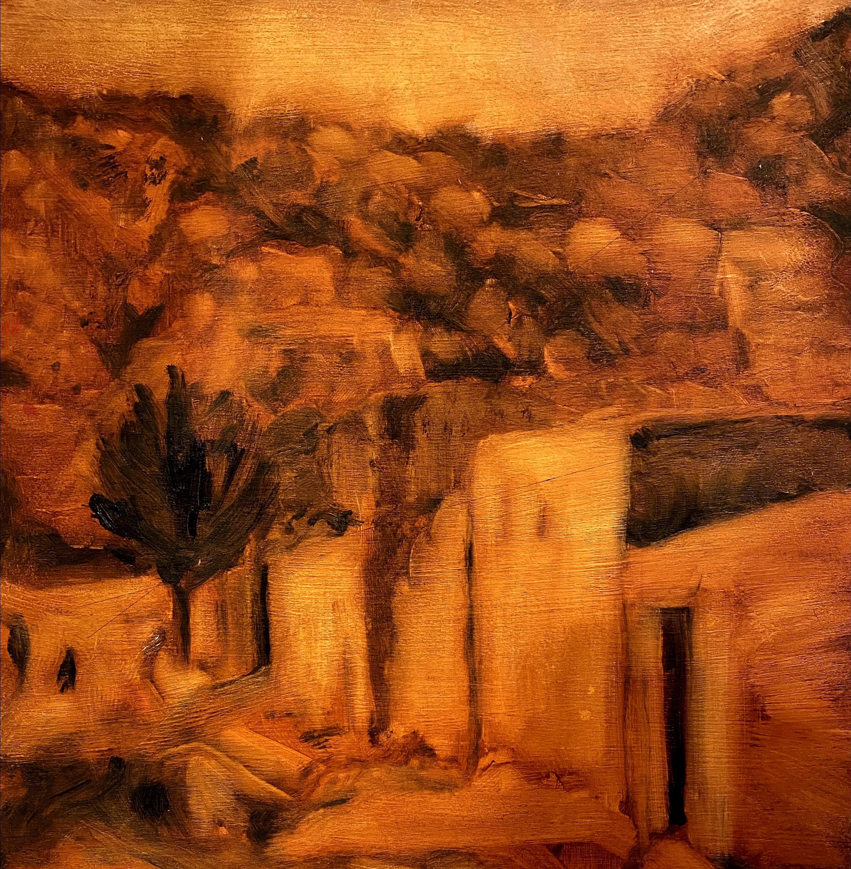
For this assignment, I choose a landscape photo that I had taken while in Afghanistan for my next painting.
In May 2003, I led a United Nations statistical mission to Afghanistan in order to review a proposal for a census program for the war-torn country. Our team worked on this project for several weeks. The team was comprised of national statisticians from a number of countries, staying in a relatively secure location, but still very aware that we were in areas where heavy fighting occurs. It was a complicated mission, with difficult decisions, yet we could not but look up from our work and around at the ancient beauty of this city, this country, gateway to Europe and Asia. Kabul is a city of many languages, many ethnic groups, many years of sophisticated history.
It is worth noting that the earliest example of an oil painting was found in Afghanistan in caves near the ancient Buddhas that were recently destroyed by the Taliban. Scientists confirmed that some of the paintings were completed in as early as the fifth century, long before any other civilizations used oils for painting. The art history of Afghanistan is long and fascinating.
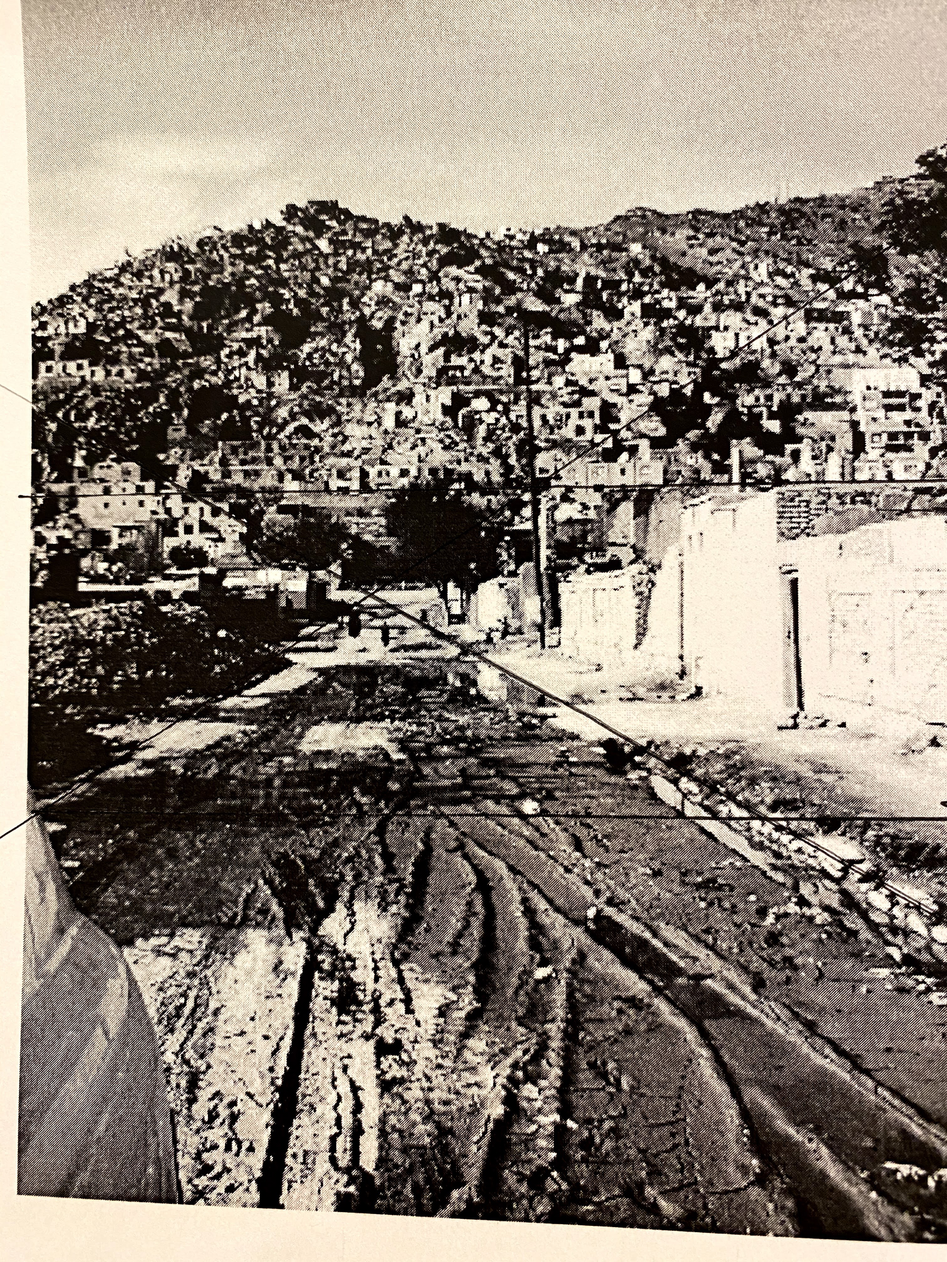
Looking up into the foothills surrounding Kabul, I cannot tell where the housing stops, and the hills begin. The soft tonal colors of the boulders up on the foothills mix with the angular shapes of homes. Higher homes have been hastily built as safe havens from street fighting occurring below. They are built at times without the privilege of electricity or septics, some with only walls up, windows and doors still hollowed out. Homes, to hide in, to tuck away in, as war and street-fighting have torn at this nation.
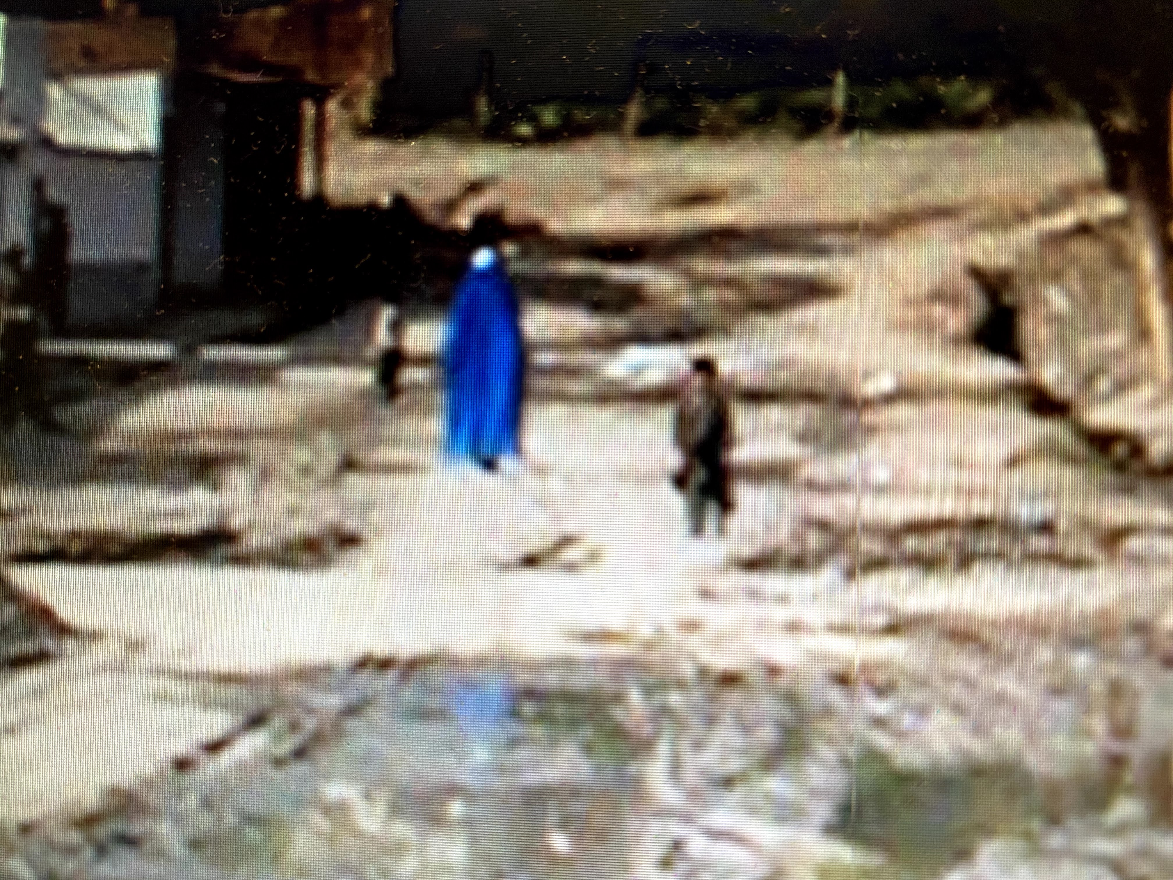
Our class has been discussing the art of tonalism, and since I wanted to paint a landscape, I decided to try working on a picture of an Afghani settlement in the foothills of Kabul. The soft pastels that of Afghanistan’s hills and valleys are often dotted with the bright blues of women’s robes (burkahs) as the women often wear them when walking outdoors in public. Soft greens of trees and fields are seen in the valleys of the Hindu Kush Mountains, often cut by a moving mountain stream flowing through. If one sees soft beige, slight pinks and purples, the observer is probably looking slightly upward at the foothills and the homes made out of a combination of handmade bricks, soft grey-brown mud, and some cement often sheltered by grey and purple foothills. The shockingly high mountains are differentiated mainly through varying shades of white snow, which I was not going to depict in this painting.
In a previous blog where I sketched out my plan, I decided to name this painting “Upwards”. I chose that title because upwards seemed to be where everybody was going. I thought I should photograph the two distinct kinds of urban settlements we mainly saw. There were those that were settled into the valley, and those headed “upwards”. We needed to learn as much as we could about Afghani settlements, as census-taking, world-wide, still includes the ancient science and art of counting and recording characteristics of every household and individual in a country.
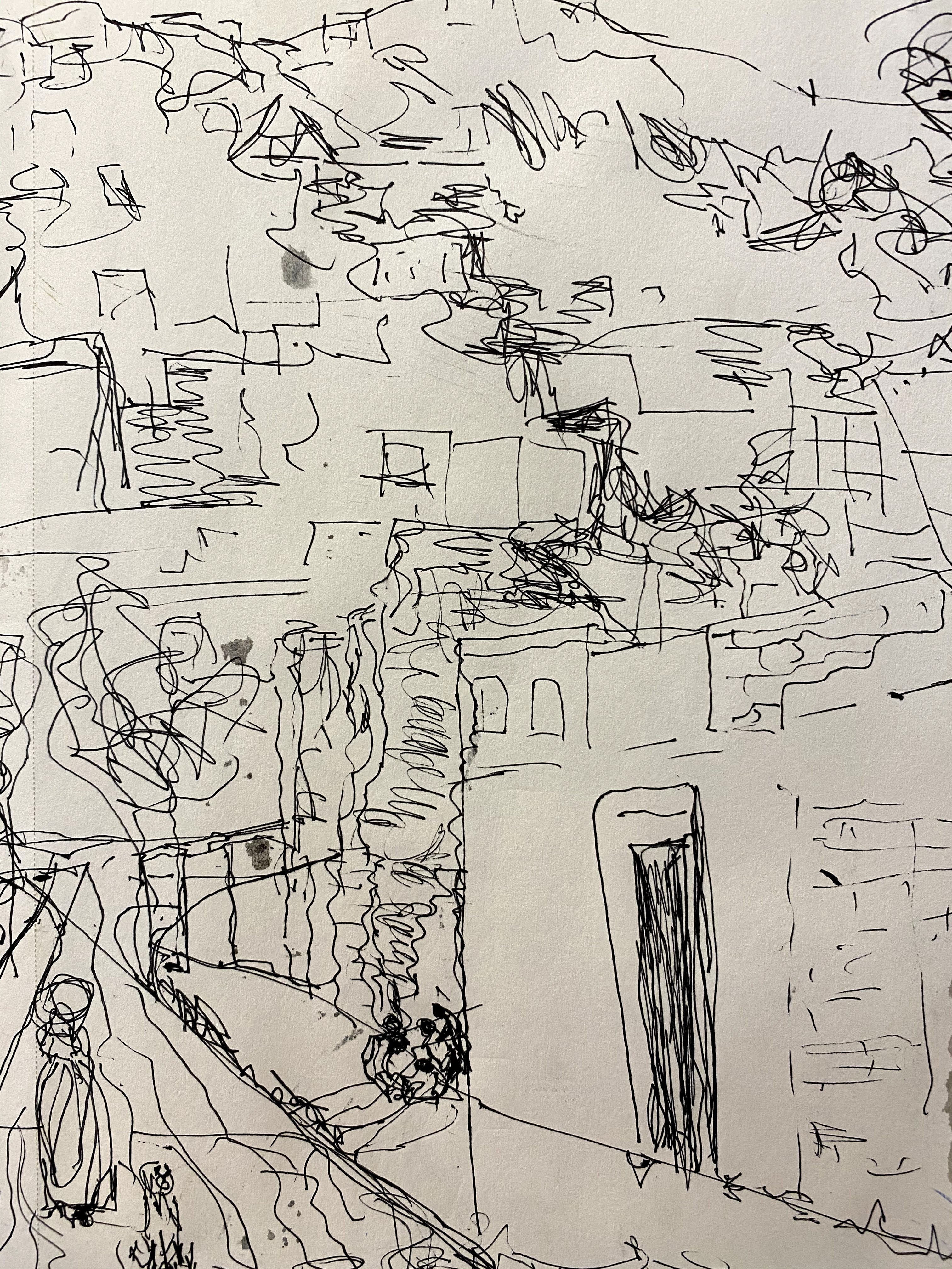
I started with a copy of the uncut, unedited photo that I used for my inspiration for the painting, I do not plan to follow the photo in its entirety, but wish to use it as a reminder of how I felt at the time. My husband Joseph and I had lived in parts of south and western Asia for a number of years, and this place felt familiar, and welcoming to me. It is an amazing amalgam of a number of nearby cultures from the ancient lands of Persia to the Bay of Bengal.
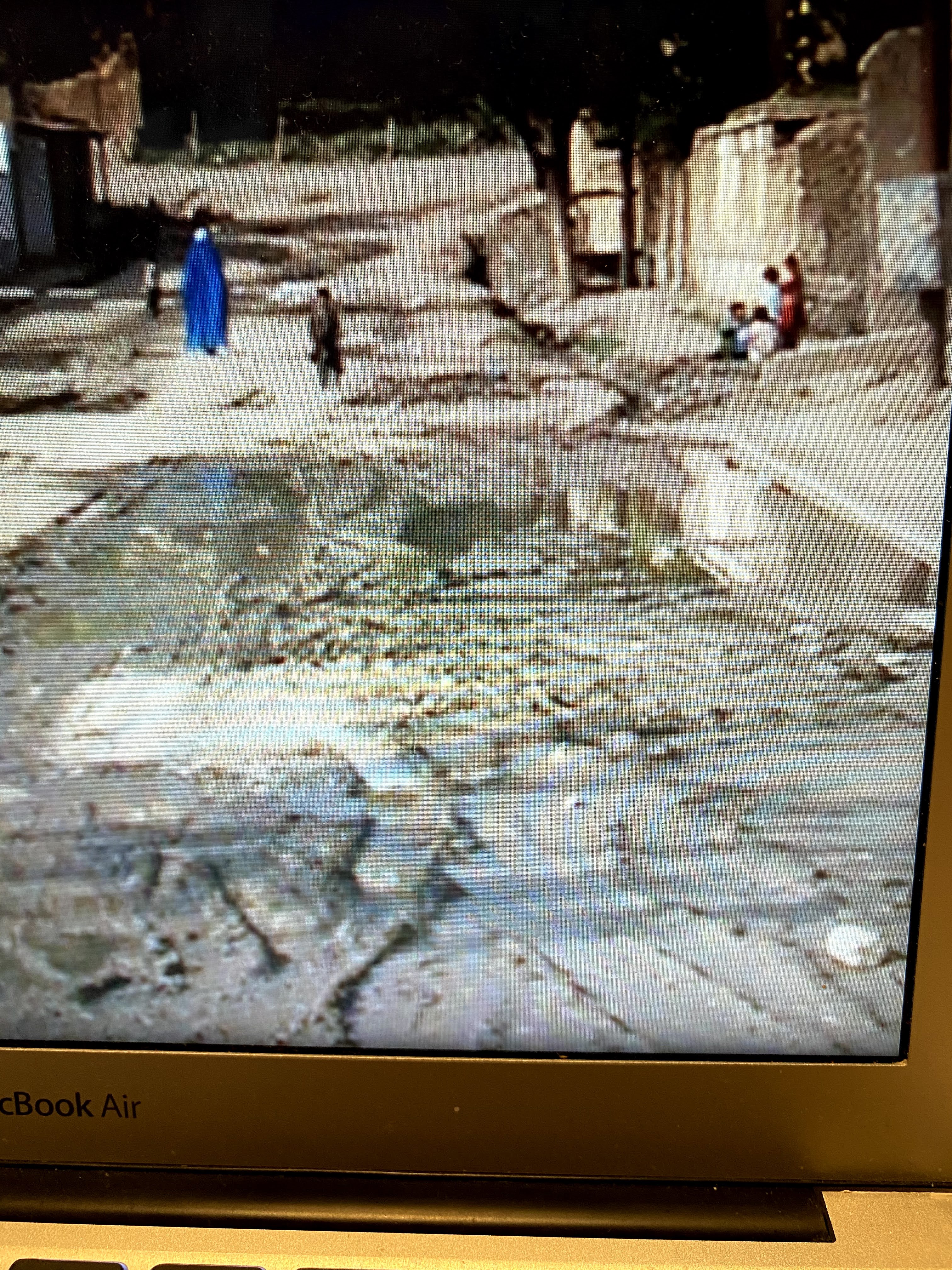
In the process of deciding what aspect of these settlements to paint, I played around with photo cropping and sketching in order to see the big shapes and values better. I also hoped to highlight an Afghani woman walking with a child, her bright blue burkah flowing around her. It is always such a contrast with the softer colors of the streets.
Had I chosen to paint the entire photo, I would have used a diamond shape as my big shape, as seen in the slide show above. But instead, I placed the woman and the little boy off to the side, letting the light come to them. This made the larger shape of the painting more like a Z.
The spilled water on the road was a challenge and I wondered how to include it pouring down the open gutters and into the street, leaving reflections of nearby buildings, rather than the usual flowing rivers that slip through natural landscape paintings.
I started by sketching a variety of scenes, from a simple notan to short sketches of what I hoped to paint. From these sketches, I began to see a clear pattern of shadows highlighting hill homes and big boulders that cover the sides of the hills. I feel that it is important to simply this picture while still keeping the feeling of what it was like to be there.
At some level, I liked it so much I didn’t feel like adding any more paint. But, given that this is a learning device, once it was dry, I proceeded to the next step of adding oil colors over the sketch. I am hoping also, to keep the wood grain of my birch wood canvas showing in the painting, when it is useful to the scene.
Using the method we had earlier learned of placing transparent paint onto the canvas and then using rags or paper towels to remove some of the paint to leave big shapes and values, I ended up this this sketch for my intended oil painting.
“Upwards” oil painting,
This is as far as I got with the idea this week. No doubt, I will work on it some more after it is completely dry. I am interested in trying out various glazings, perhaps an earth red and a mixed blue-grey, to soften some of the bright pink hues of the foothills.
“I learn faster by making big mistakes, while paying attention.”
Michael Orwick
This week in our art session with Michael Orwick’s class on the Value of Design sponsored by the Oregon Society of Artists, we all scrambled to take notes. This is because Michael took the time to show us how design and composition are linked with many other things, such as color, temperature, brushwork and edges.
One thing that he emphasized, is the importance of feeling free to make mistakes, and to experiment. He said that when we choose our colors for our paintings, we should work to make it sing our song. The song we sing and our color choices are our own. We will decide on the mood or atmosphere we hope to achieve.
Through pre-mixing of colors, we can think about what the five or six big colors that we hope to highlight in our painting. There is no right or wrong, but there are guidelines available to help us reach our goals.
He introduced us to a number of techniques for preparing our paintings, including framing; selection of canvas or wood; how to use gesso or acrylics, or other mixes for preparing the canvas; pre-mixing techniques; glazing techniques; transitions encountered while painting, choosing under colors to top colors, starting from dark to light, or light to dark.
My head was spinning at the end of this session. It was just what my head needed. I realized the only way out of this dilemma of “too many choices” was to make some. And that would mean making some mistakes. The important thing, I hope, will be to learn from them.
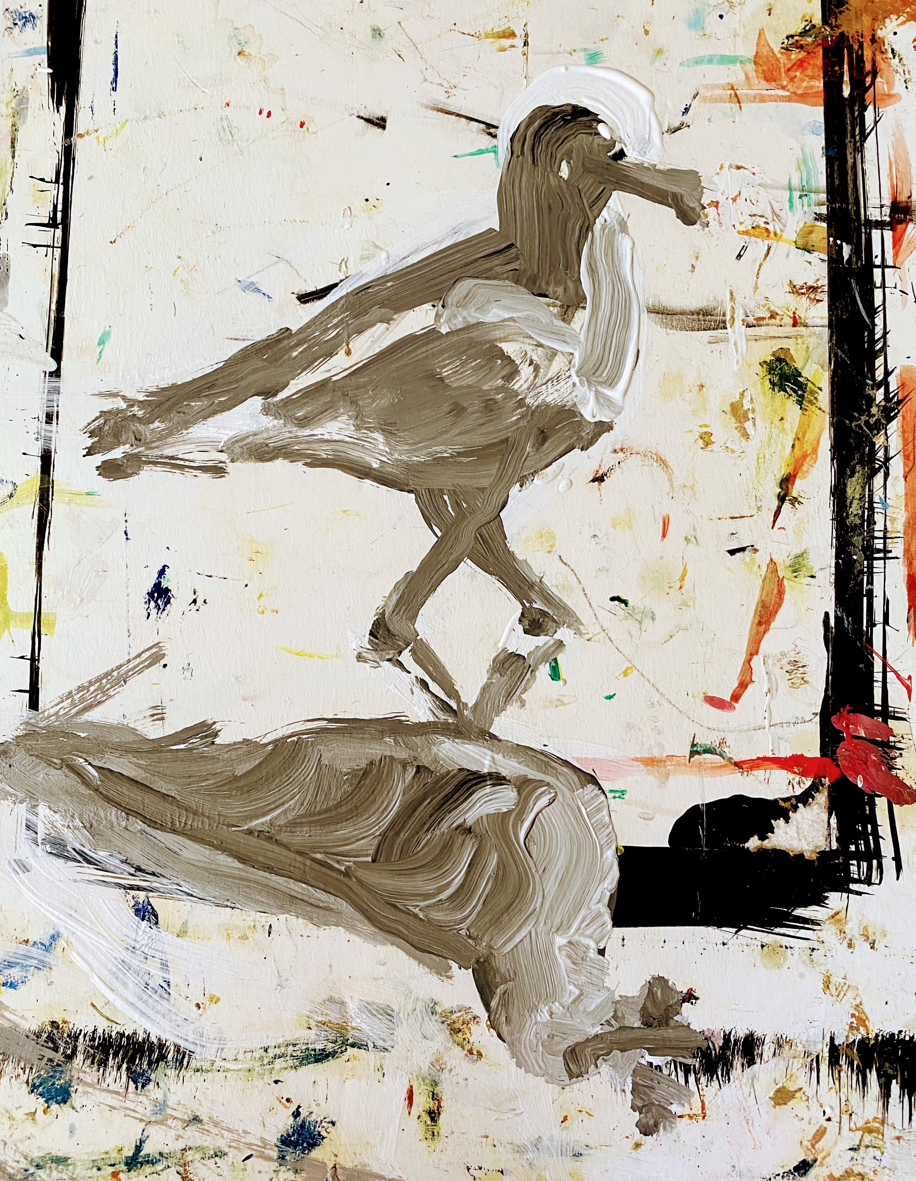
Briefly, I chose two old paintings that I never hung up because I was not completely happy with them, as experimental pieces for trying out glazing techniques. The first one I chose is an oil painting of birds on the beach.
Learning How to Glaze
The birds that I started with were painted with ultramarine blue, with some various yellows mixed in to suggest beach sand colors. Through glazing, the birds were shifted to brighter, softer tones, more in line with the colors reflected off the ocean beach waters. As I worked with the same painting, I first tried glazing the birds with earth red tones. Then I wiped that down and tried glazing them with lemon yellow and manganese blue mixes added in. In each case, the entire mood of the painting changed. It startled me to see how much influence these techniques and decisions had on the painting’s mood and atmosphere. Below, is the painting that I started with.
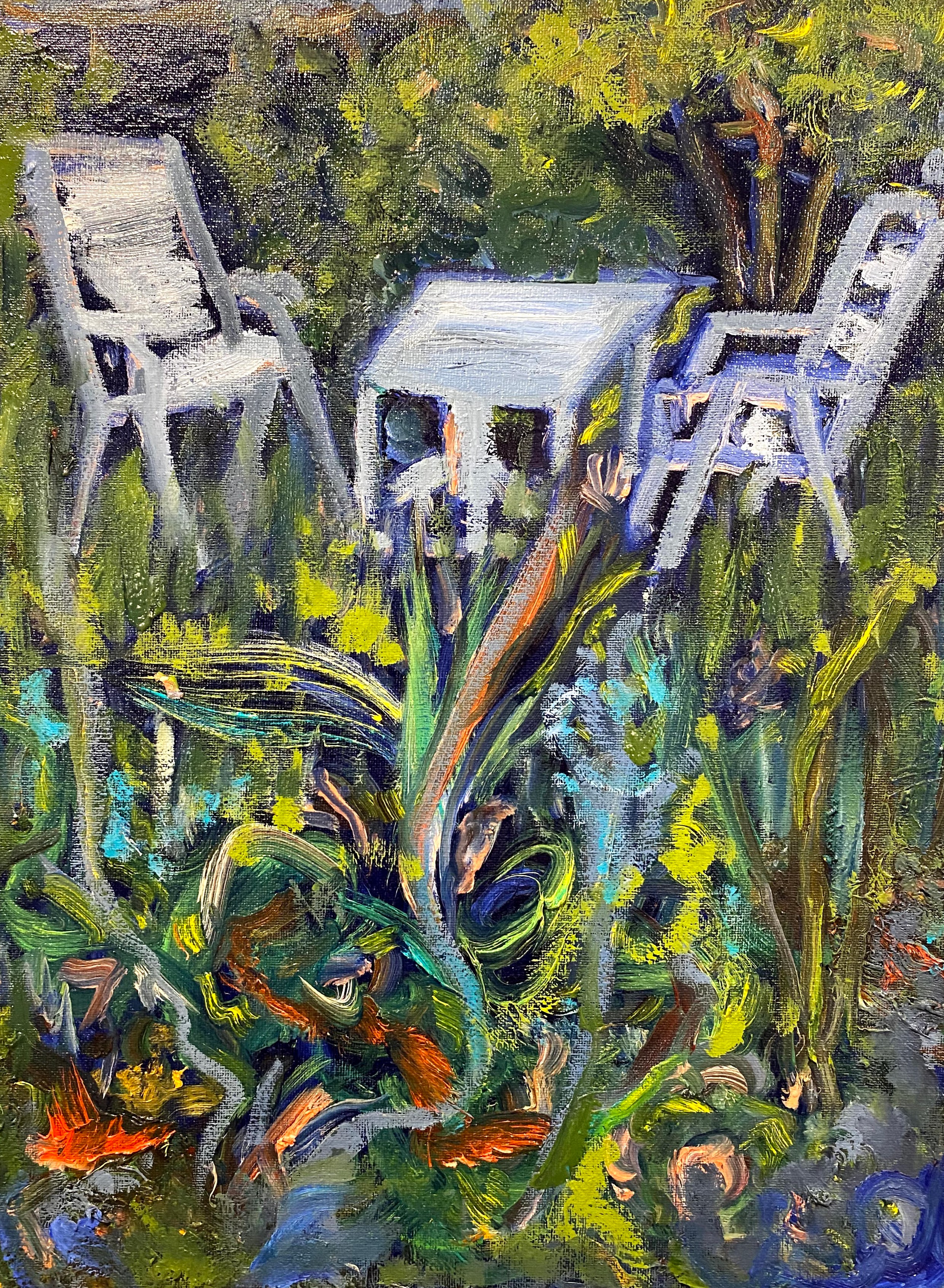
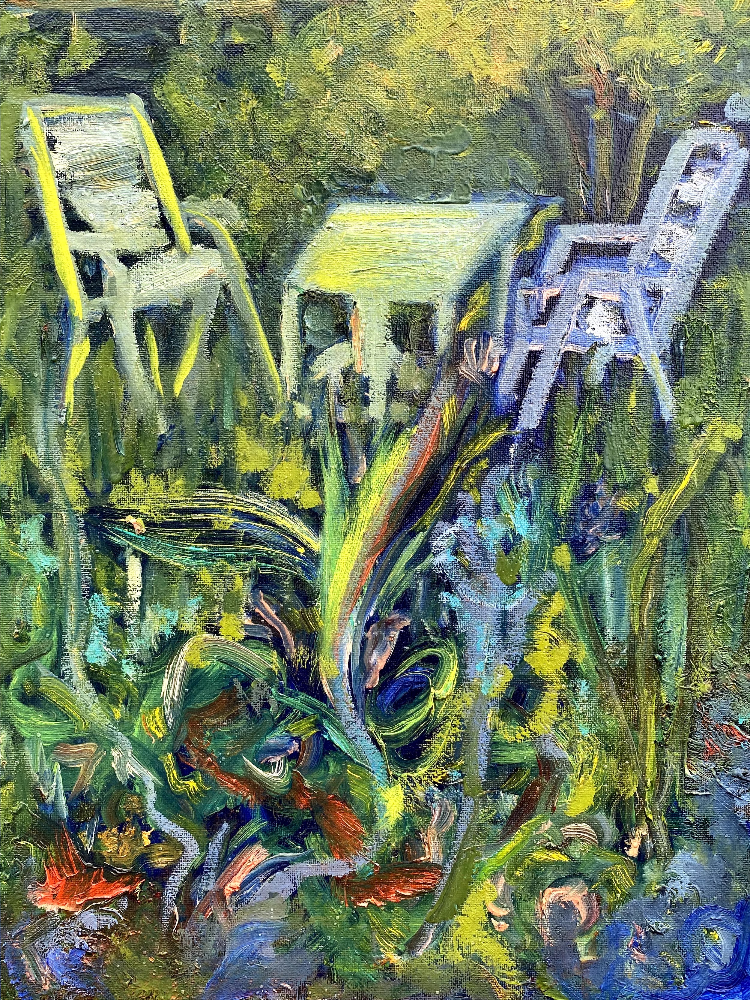
I then switched to an old painting of our backyard that was too dark, but I couldn’t figure out what to do with it to get it to feel like spring, that time of year when light hits young plants and the garden starts to go wild. I tried the same glazing technique to this painting, then added some lighter yellows to the left chair to make my point about how the sun was filtering through.
Early Spring, oils, unglazedEarly Spring, oils, glazed with lemon orange and cad red
Is seems to me that if I continue to work on this old painting of our garden, using further glazing and some follow up on lighter colors, I am headed to where I wanted to originally go with it.
After these two experiments with old paintings, I chose one of my recent ones for some trial work on how color might affect the mood of this painting. As a reminder, I was trying to go from “Notan” to rough sketches, to underpainting of a mountain scene.
Earlier sketching and underpainting of mountain view
Now that I am at the point that I am supposed to paint this mountain view, I am still torn by what design I should be using for it, and what colors to emphasize.
Here comes my spectacular big mistake.
I tried glazing this painting before it was sufficiently dry, and ended up having most of the painting slip away. So, I used this failure as an opportunity to consider what my options are regarding color and mood for the middle part of a larger painting.
Searching for the right mood of this painting with oils, same painting, different glazes
I started with the under painting showing trees on the sides and front. The trees are now gone. At this point in the life of this mountain painting, I am working from this one:
What have I learned from these trials? For one thing, I see that I have a great deal of latitude at every step of the way. I think what I want to do is to put a soft blue glaze over these mountains, after it truly is dry, to give the middle mountains some uniformity. I think I want to return to some trees in the forefront.
Somewhere in the future, I know that there is a painting of mountains in my life, highlighted with a few carefully selected trees in the foreground. I still have design issues to work out before I can commit to painting this. Ah well, back to the drawing board.


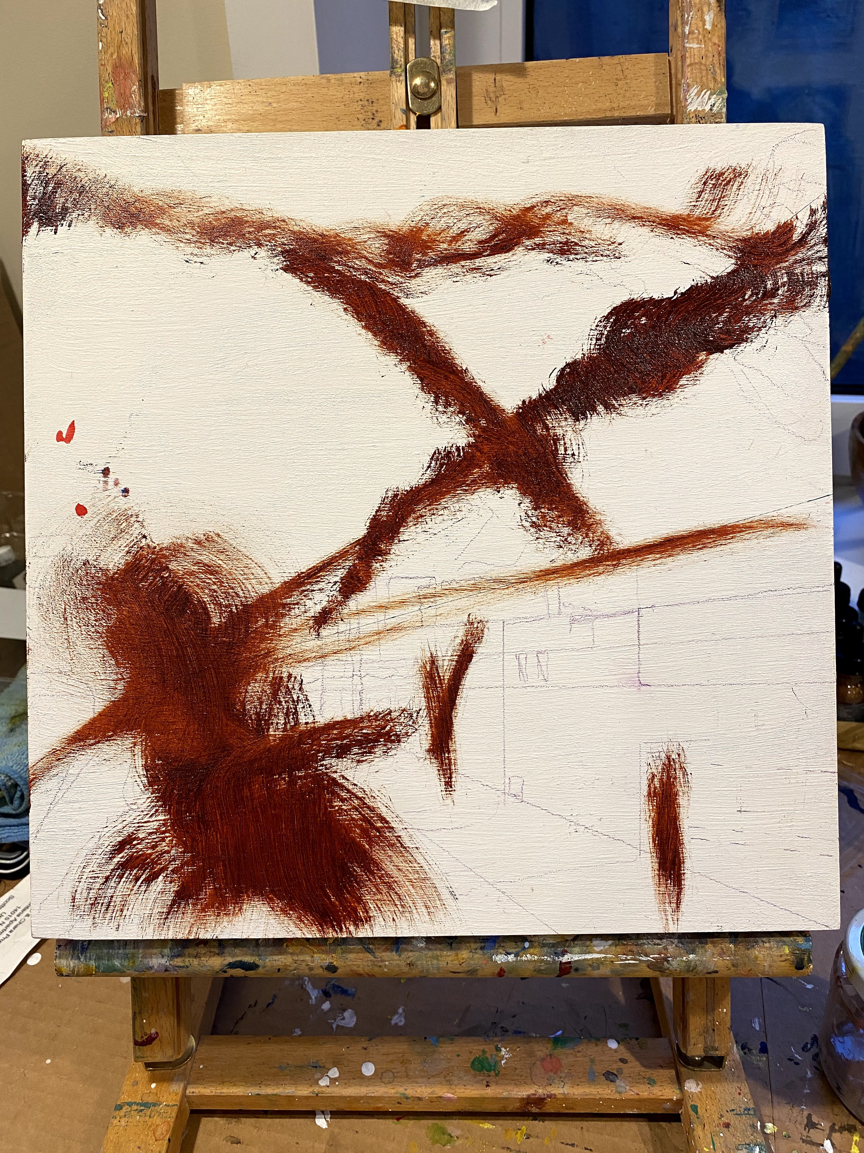
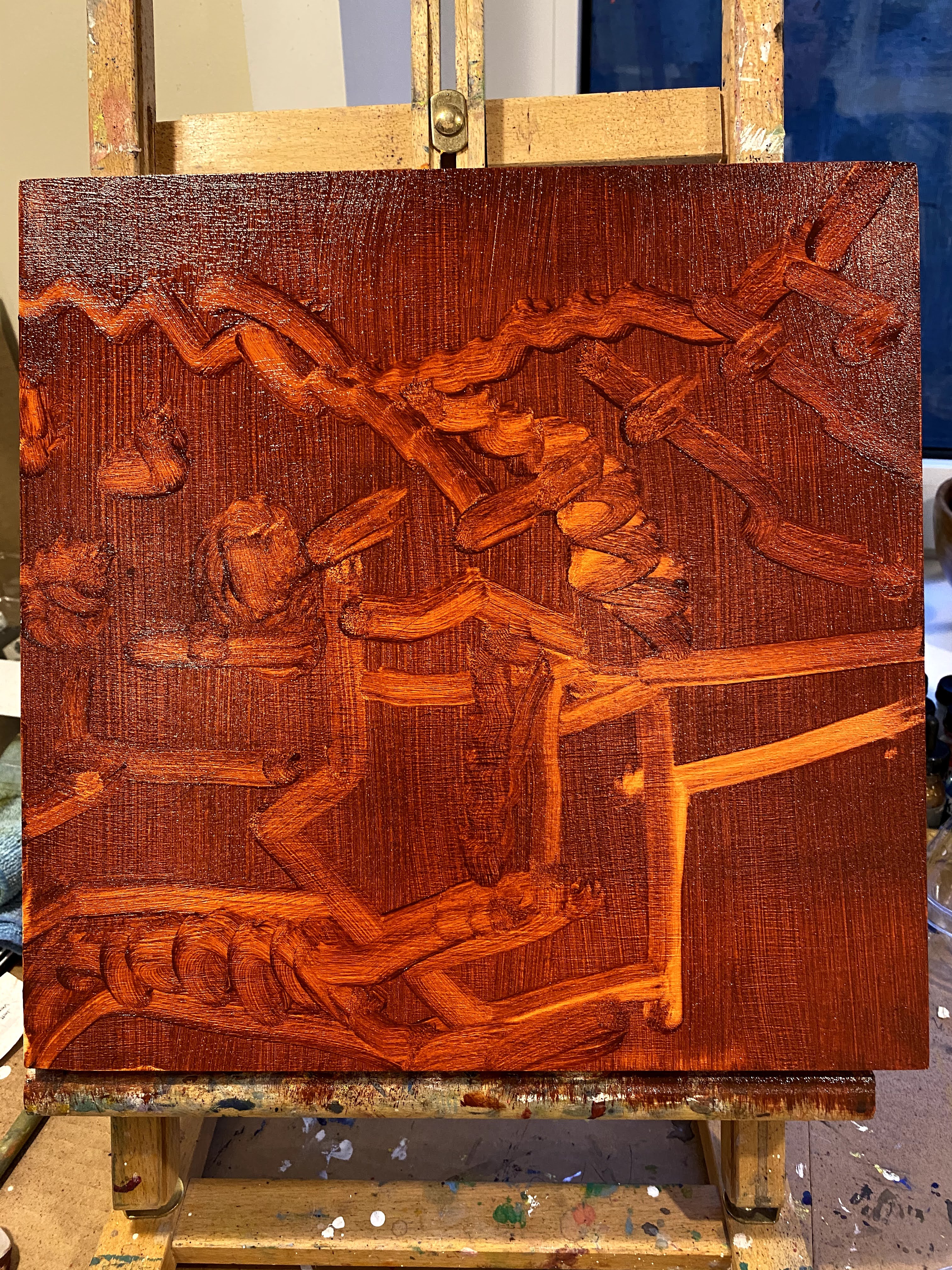

 Using the method we had earlier learned of placing transparent paint onto the canvas and then using rags or paper towels to remove some of the paint to leave big shapes and values, I ended up this this sketch for my intended oil painting.