Sometimes it is nothing but a thought, a short poem or quick sketch. It is a dream of days past, under different circumstances, long ago.
Spring is a time for dreaming.
Posted in Art, tagged #Artist Mary Chamie on March 18, 2025| Leave a Comment »
Sometimes it is nothing but a thought, a short poem or quick sketch. It is a dream of days past, under different circumstances, long ago.
Spring is a time for dreaming.
Posted in Art, tagged #Artist Mary Chamie, #Experimenting with art#, #Fine Arts #The Study of Art #Color and Luminescence on March 3, 2025| Leave a Comment »
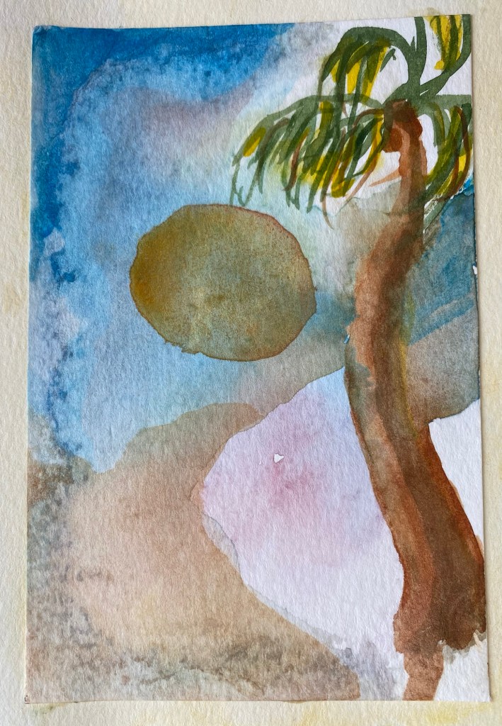
Our island is a gift of many precious moments, one of which is sunrise.
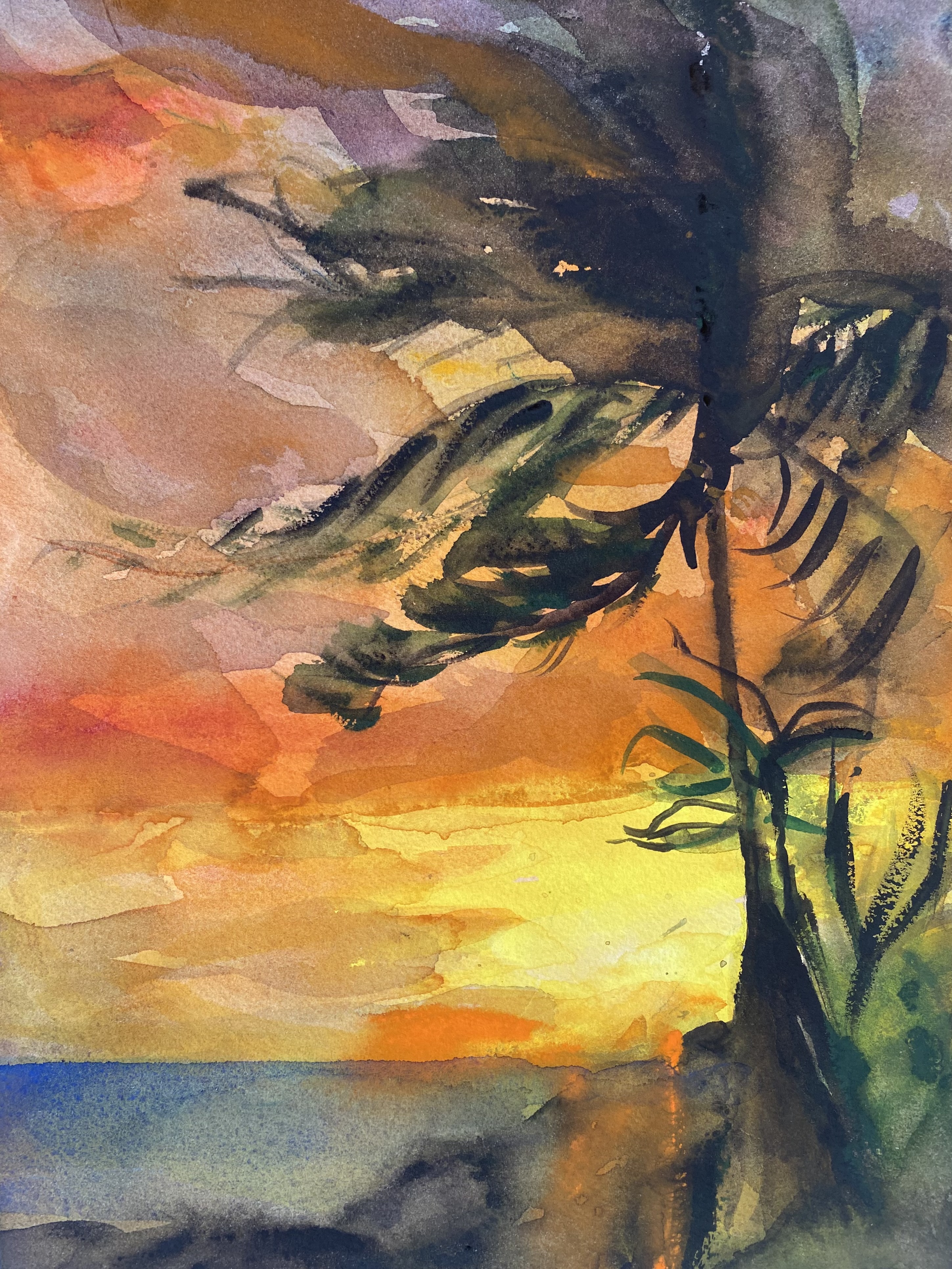
Watercolor and gouache, by MJC.
Posted in Art, tagged #Artist Mary Chamie, #Experimenting with art# on March 1, 2025| Leave a Comment »
Here are two different watercolor perspectives that I painted of a person living on our island.
He is a yard cleaner and gardener, hard worker and an immigrant to this island.
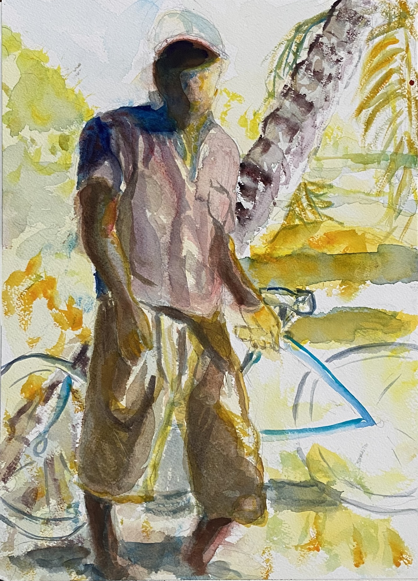
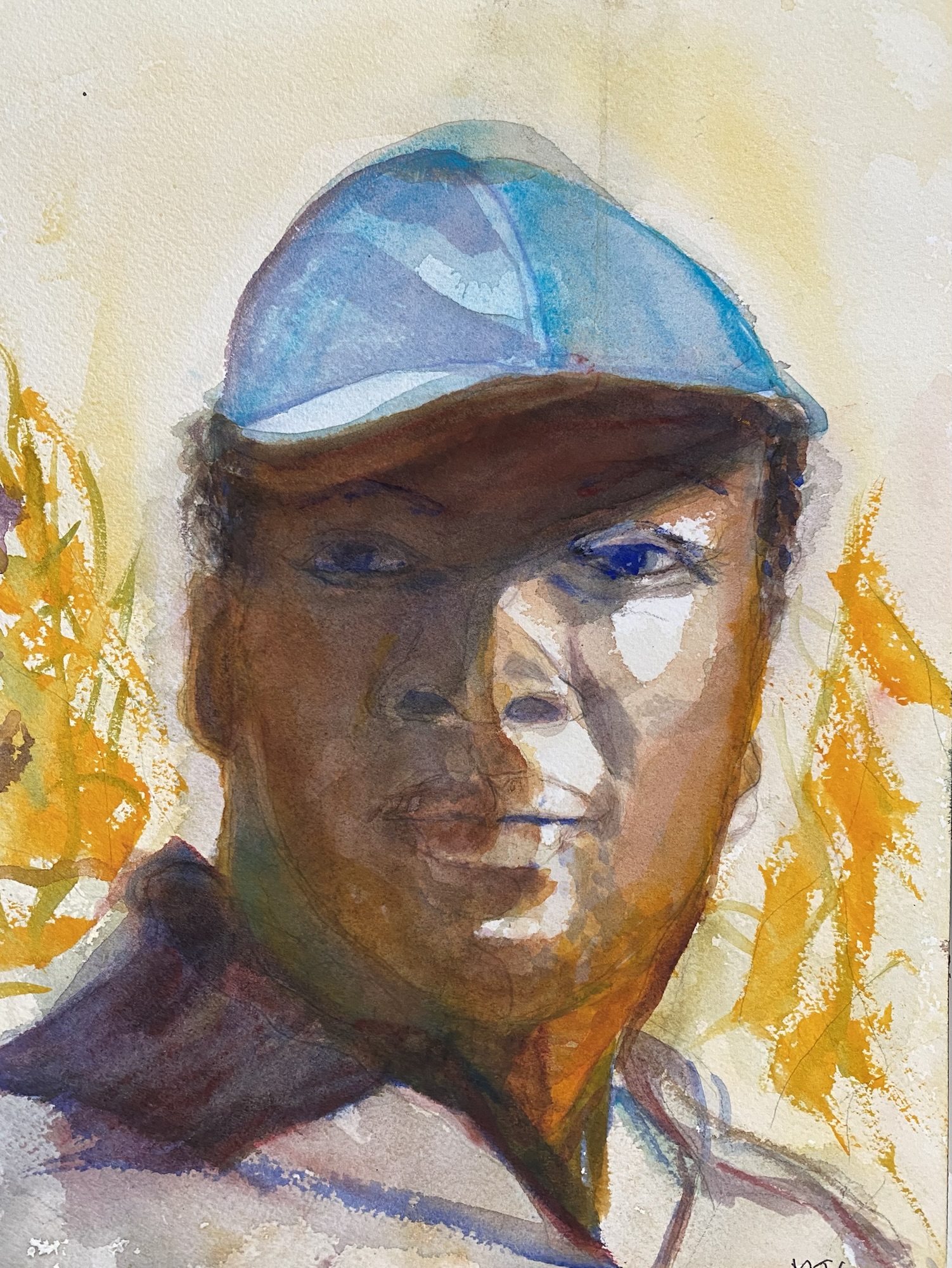
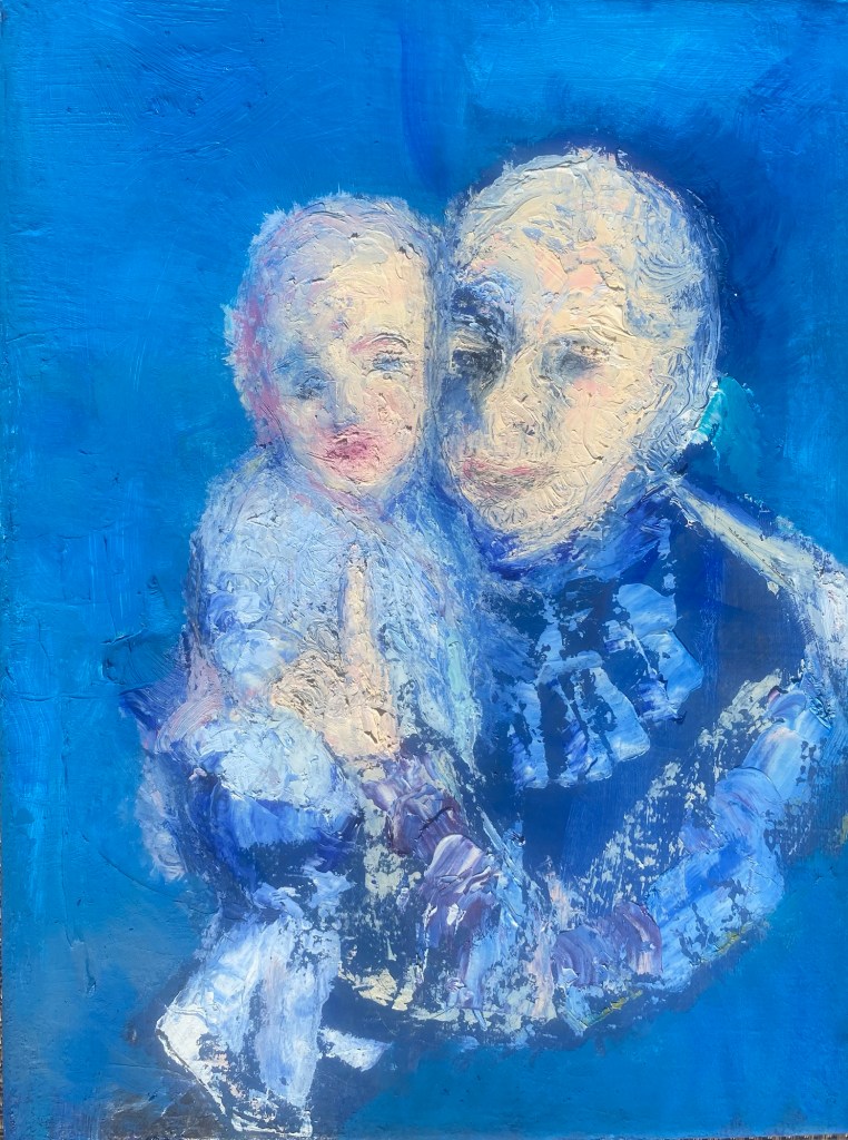
Posted in Art, tagged #Artist Mary Chamie, #Experimenting with art#, #Fine Arts #The Study of Art #Color and Luminescence, #Oil painting, #Oregon Society of Artists on August 16, 2024| Leave a Comment »
I wanted to paint the quiet emotion I saw between a grandmother and her granddaughter. What I visualized in painting them was peace, identity, pride and love, expressed in shades of yellows, blues and pinks, surrounded by soft, fractured textures. It felt best to carve out their contours and shapes with oils using a palette knife, showing their presence, their intensity, their closeness as a bright splash onto blue backgrounds. This was quick work, often described as “alla prima”, but in fact, also using photography to remember some little details.
Posted in Art, tagged #Artist Mary Chamie, #Experimenting with art# on March 11, 2024| Leave a Comment »
There he is, standing tall, legs ready to run if threatened. Who wouldn’t want to sketch him? Part of his value, is all those shapes and colors. He is a diagram of colored blocks and fluffy feathers. And such skinny legs.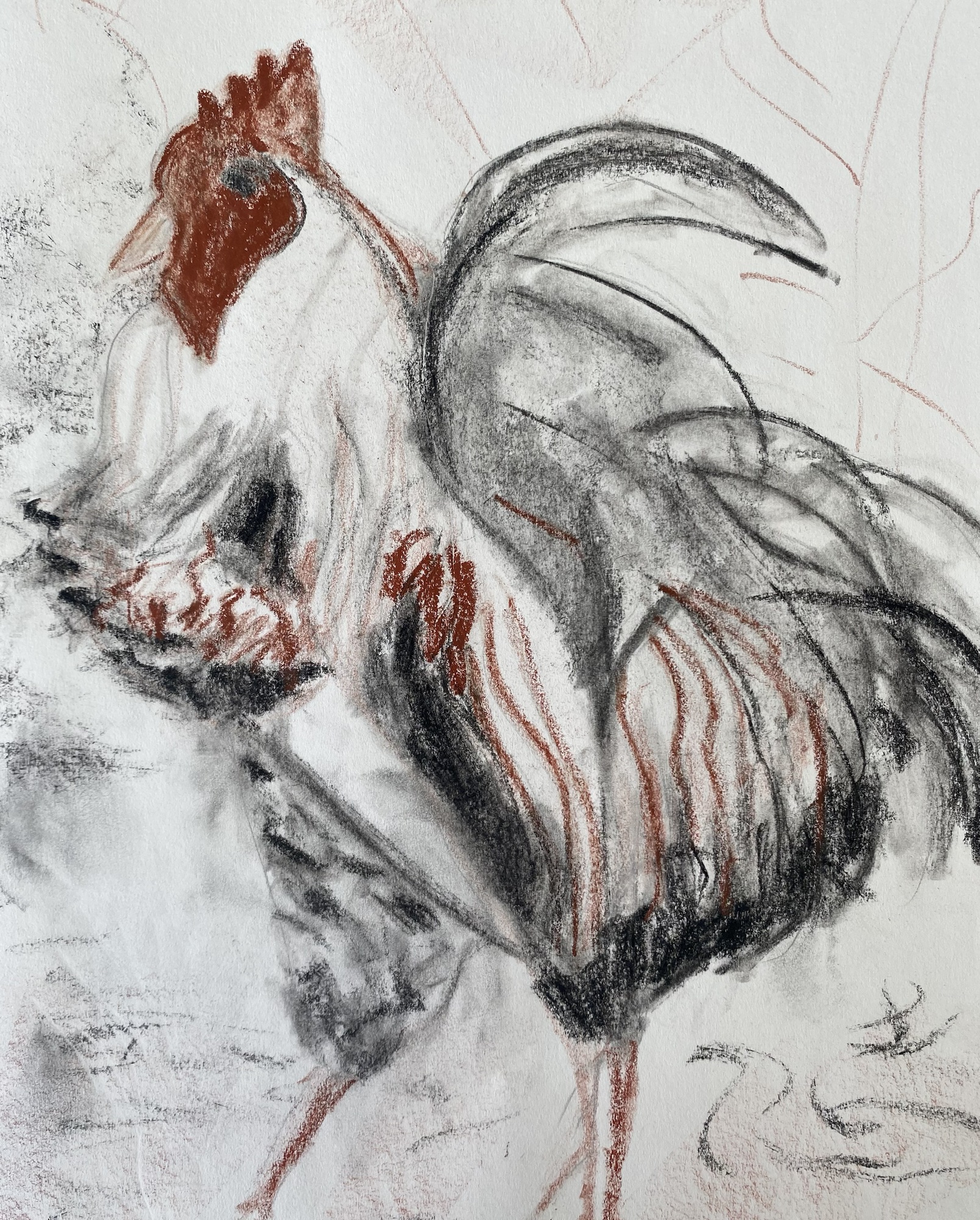
Rooster, crayon sketch, MJChamie
Posted in Art, tagged #Artist Mary Chamie, #Experimenting with art#, #Fine Arts, #Writing about Art on March 6, 2024| Leave a Comment »
Sketching in the field with crayons, imagining how the heron feels and looks, quickly using pencils and erasers while on the fly, is fun. Below, are three renditions of the same bird that I keep in my sketchbook for planning a larger oil or acrylic painting at a later date.
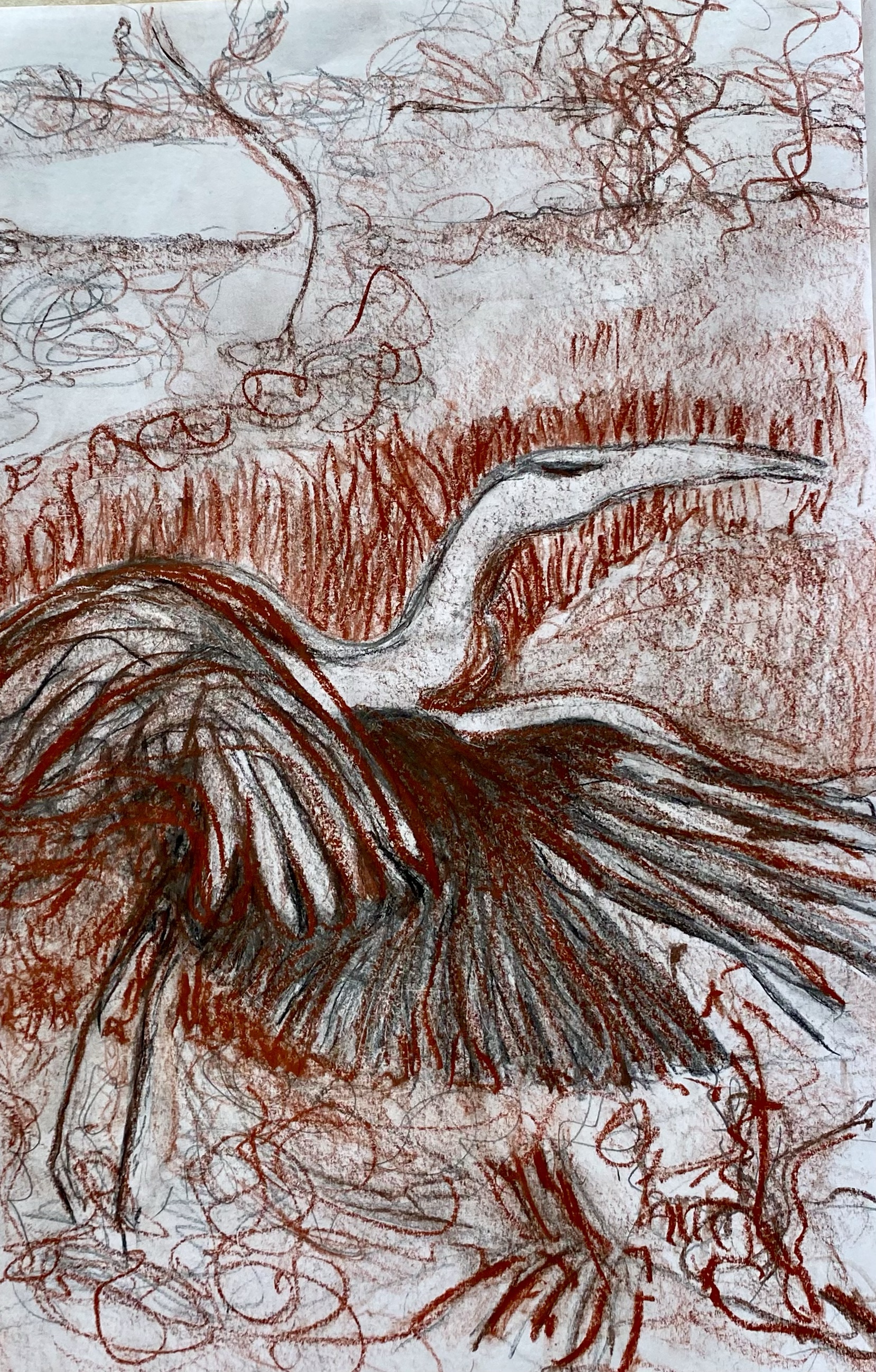
The bird was flushed out of the marsh as we ever so carefully approached her. It is so exciting to see her wings flowing into flight, as she flaps her way out of the grasses and winds her way nearer to the water and farther from us.
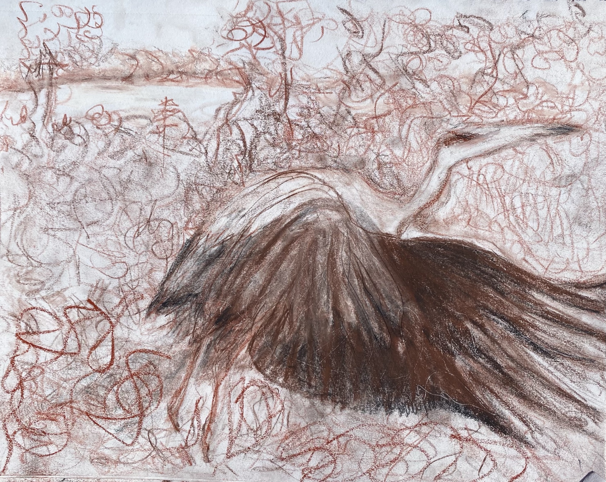
How can I emphasize her majestic wings? How do the textures of a marshland get depicted so that she fits comfortably, seen and hidden at the same time?
There she is for that brief moment then up into the air and away. What did I see? What did she sense as she fled her surroundings for a quieter place?
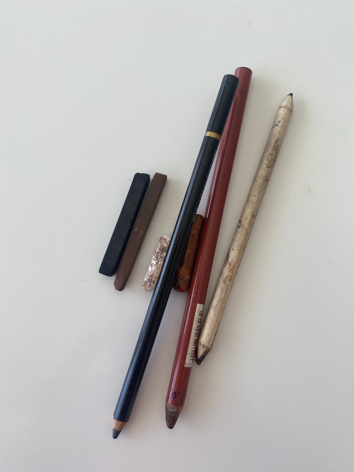
Sketching tools
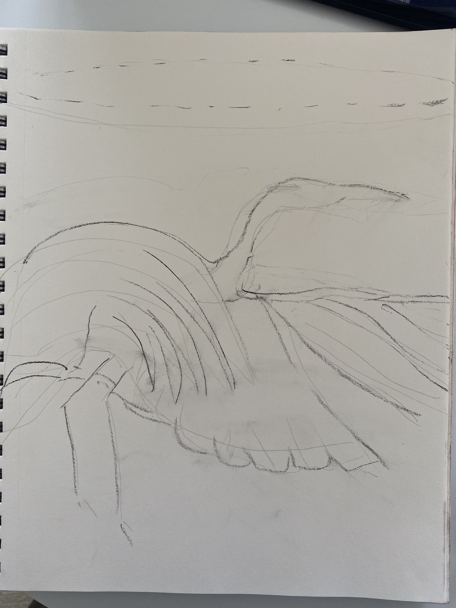
First lines – Structure
Such a beautiful bird. And now to reveal the idea of her in a painting. She will linger in my memory for quite some time.
Posted in Art, tagged #Artist Mary Chamie, #Experimenting with art#, Abacos, Sketching for art on February 29, 2024| Leave a Comment »
This winter I have completed a series of sketches with pencil, pen and crayons on plain paper. The idea is to try to make my point while using limited art supplies.
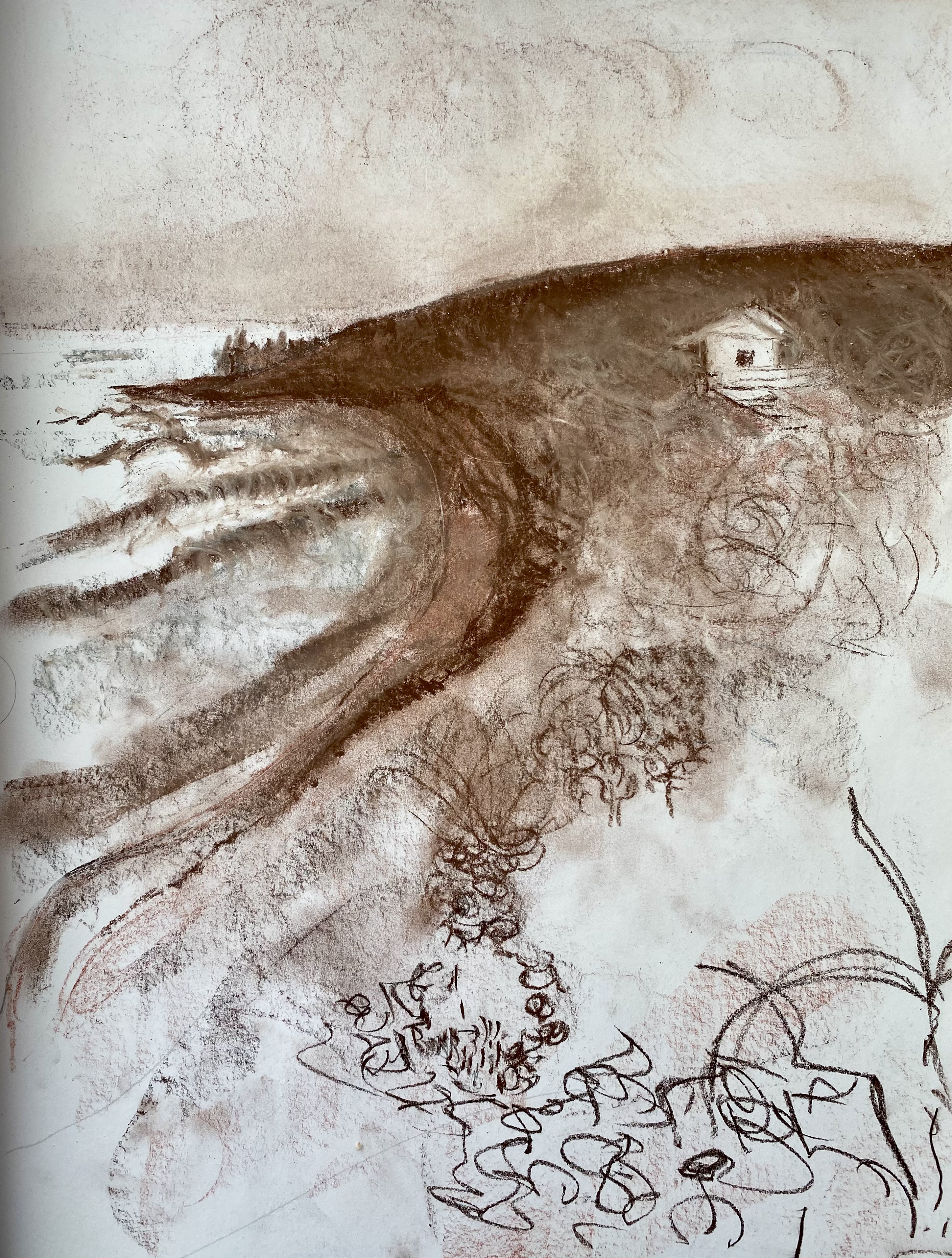
“Alone”, sketched with Conte crayon, MJChamie
Part of the fun of this kind of sketching is playing with gestures to imply what one sees. For example, in this sketch, I highlighted the broad sweeping curve of the land against the ocean with a single stroke, while also implying the island plant life in the lower right corner using what I call caligraphic gestures.
All sketching done with just a few tools.
Posted in Art, tagged #Artist Mary Chamie, #Experimenting with art#, #Fine Arts #The Study of Art, #Writing about Art on February 27, 2024| 1 Comment »
During the last six months, I have switched from oils and watercolors to graphite/clay/charcoal pencil and ink pen for my artwork. My goal in switching to these simple and readily available and cheap tools is three fold:
First, I am searching for environmentally safer ways to do art;
Second, I want to focus attention to shape and form, density and texture for art expression rather than on myriads of color as a way of sharpening my drawing skills; and
Third, I like that any and all paper may be used – no expensive specially prepared, high absorptive papers or textured canvases are required when using these simple tools.
Just grab a pen or pencil with a good eraser, and get to work on a piece of note paper.
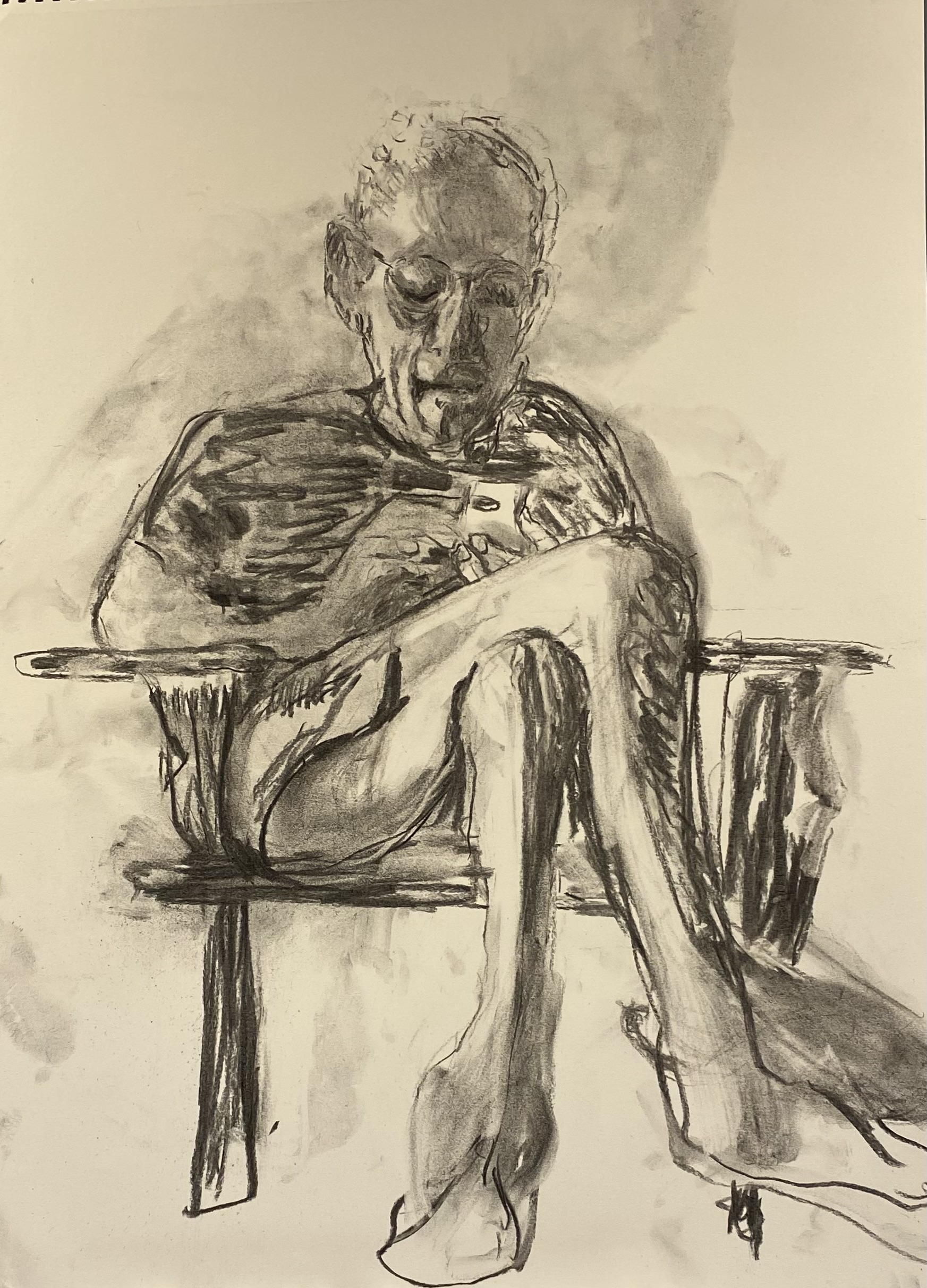
Lost in Thought, charcoal drawing, MJChamie
Posted in Art, tagged #Artist Mary Chamie, #Experimenting with art#, #Fine Arts, #Fine Arts #The Study of Art #Color and Luminescence, #landscapes#, The Study of Art on September 5, 2023| Leave a Comment »
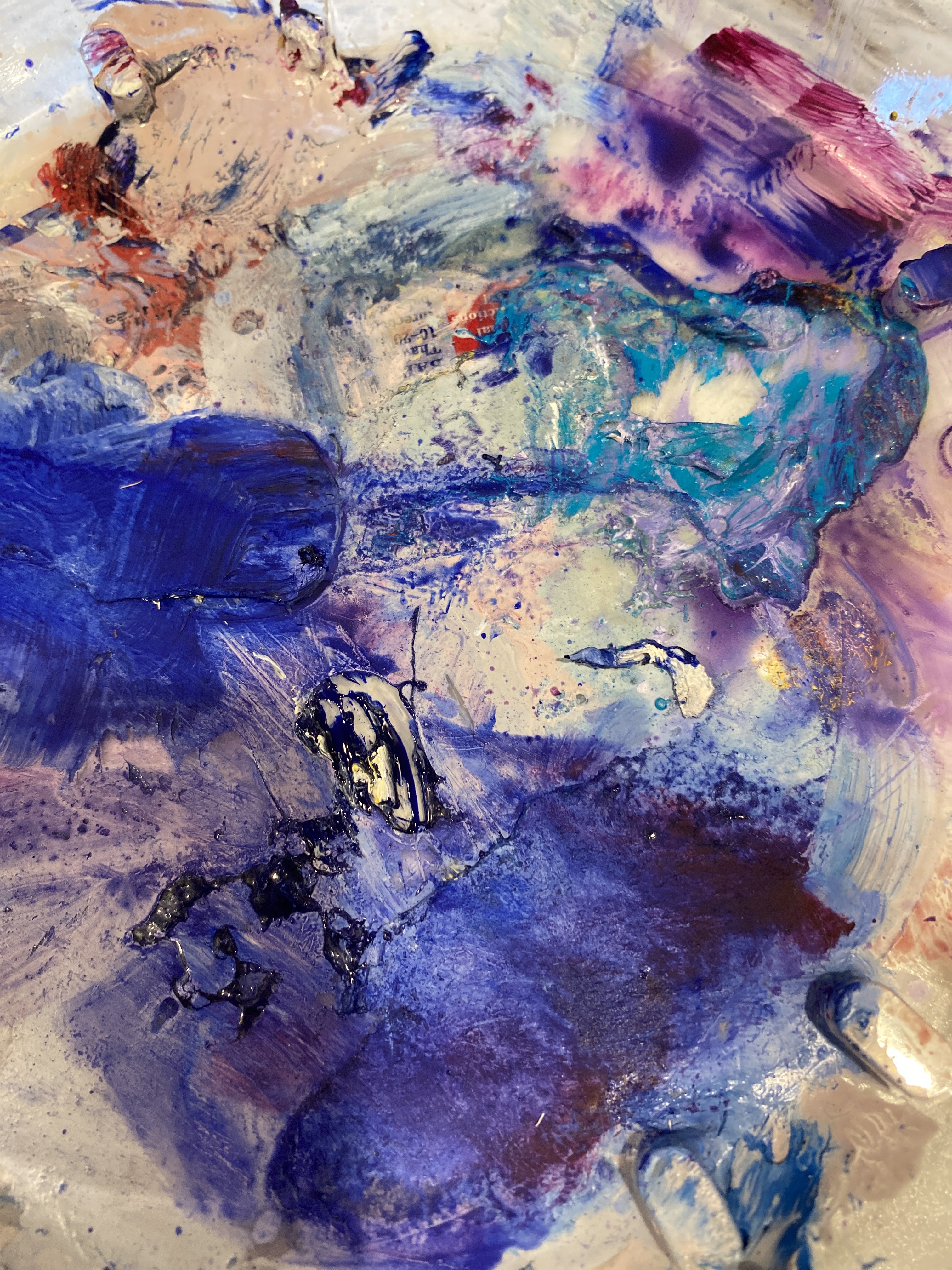
Part of the palette
This is the to be continued story of my painting exercise on an old canvas where I shift from idea to idea and technique to technique while “holding that structural thought.” Currently, I am playing with a painting of ocean and atmosphere and considering their shared emergence into the sense of horizons.
I find the choices in painting horizons to be infinite. Much like a snowflake, each depiction of a a horizon is unique, yet somehow we continue to recognize the horizon for what it is.
We may continue to sense the horizon even when we cannot really see it.
Horizons do not need to be depicted as straight lines across the canvas. Some artists have horizons that are shown via diagonal slopes. Here is an example painted by my sister, Elizabeth Rose. I like the sense of view that she is approaching the mountain from the sky rather than viewing it from the ground.
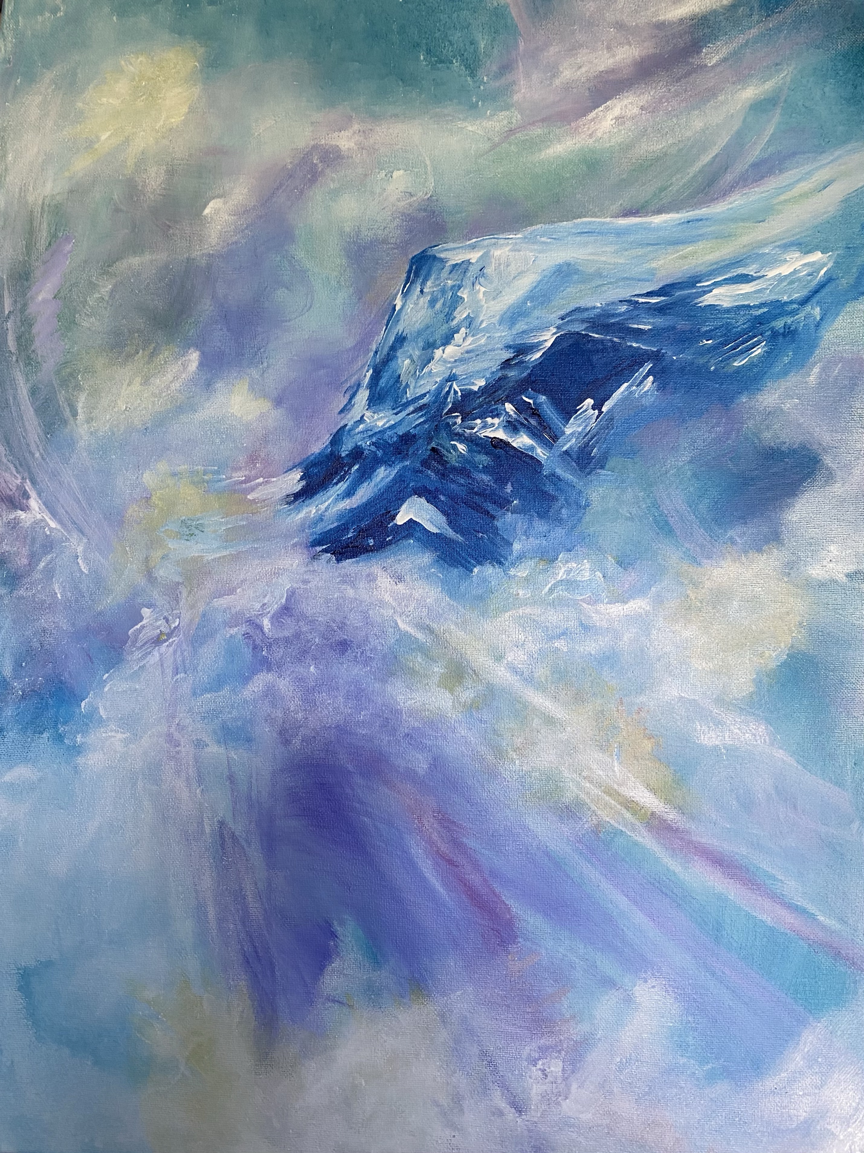
Elizabeth Rose, acrylics
My sister Elizabeth and I both paint and we enjoy sharing our paintings and styles with each other. She paints in her living room. I have an art studio in my basement. We both reach for new understandings through painting. We both have grandchildren who enjoy painting and sketching with us. It is a wonderful way of relating.
In Elizabeth’s case, she is painting a kind of revelation that reaches awesome thoughts of clouds and light trajectories across majestic mountains that seem to reach beyond our planet and out to the universe.
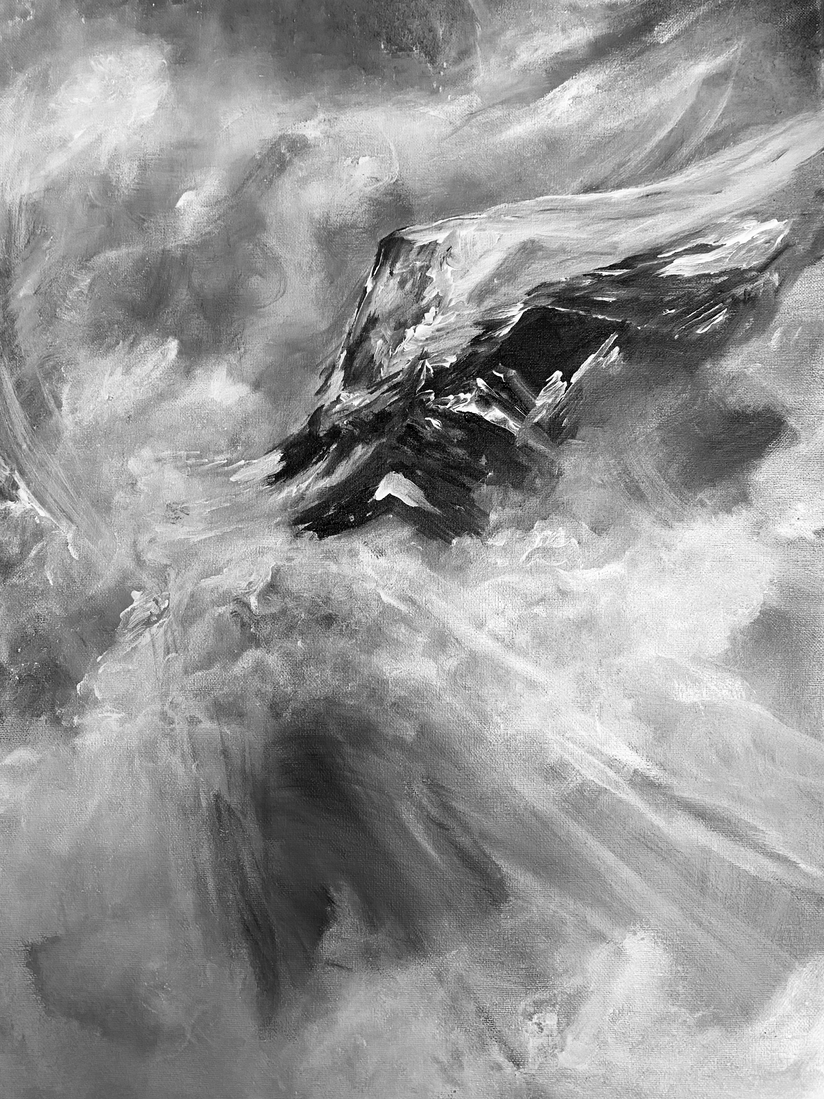
I show her painting in black and white to emphasize the point of motion and shifting light.
In my experimental painting, I am imagining an early morning sunrise out in the ocean on an island, where color, reflection and time are all blurred or merged into a single multi sensory, abrupt experience
I started with this roughed up canvas using white and black for the emphasis of light and dark areas (Canvas A).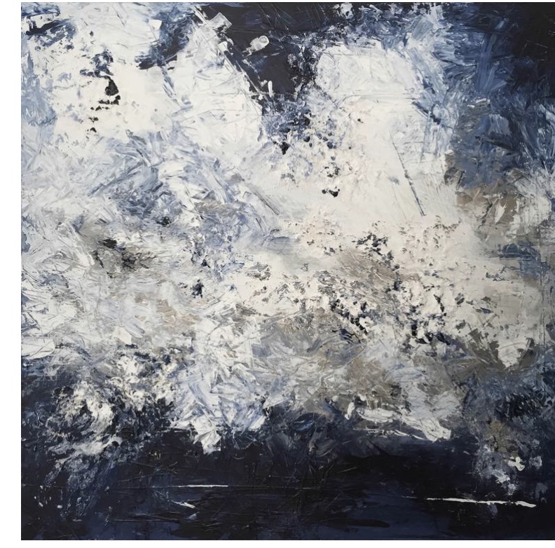
Then I prepared a kind of Notan design that suggests motion as well as balance of light and dark (Canvas B). 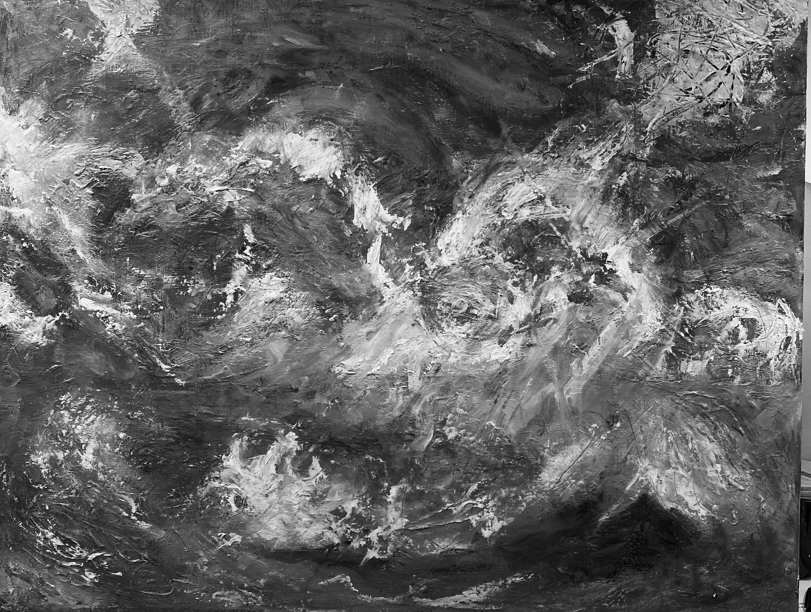
Then I shifted to the underlying pastels of sunrise ( Canvas C).

Canvas C
This was followed by the over-slap of bright colors put on by palette knife and softened by brushes to be reflective of the split-second deeply bright shooting sunrise itself (Canvas D)
And as it looks today, I have worked on grasping the abrupt brilliance of those few split seconds where sunlight takes over the morning skies and water reflections
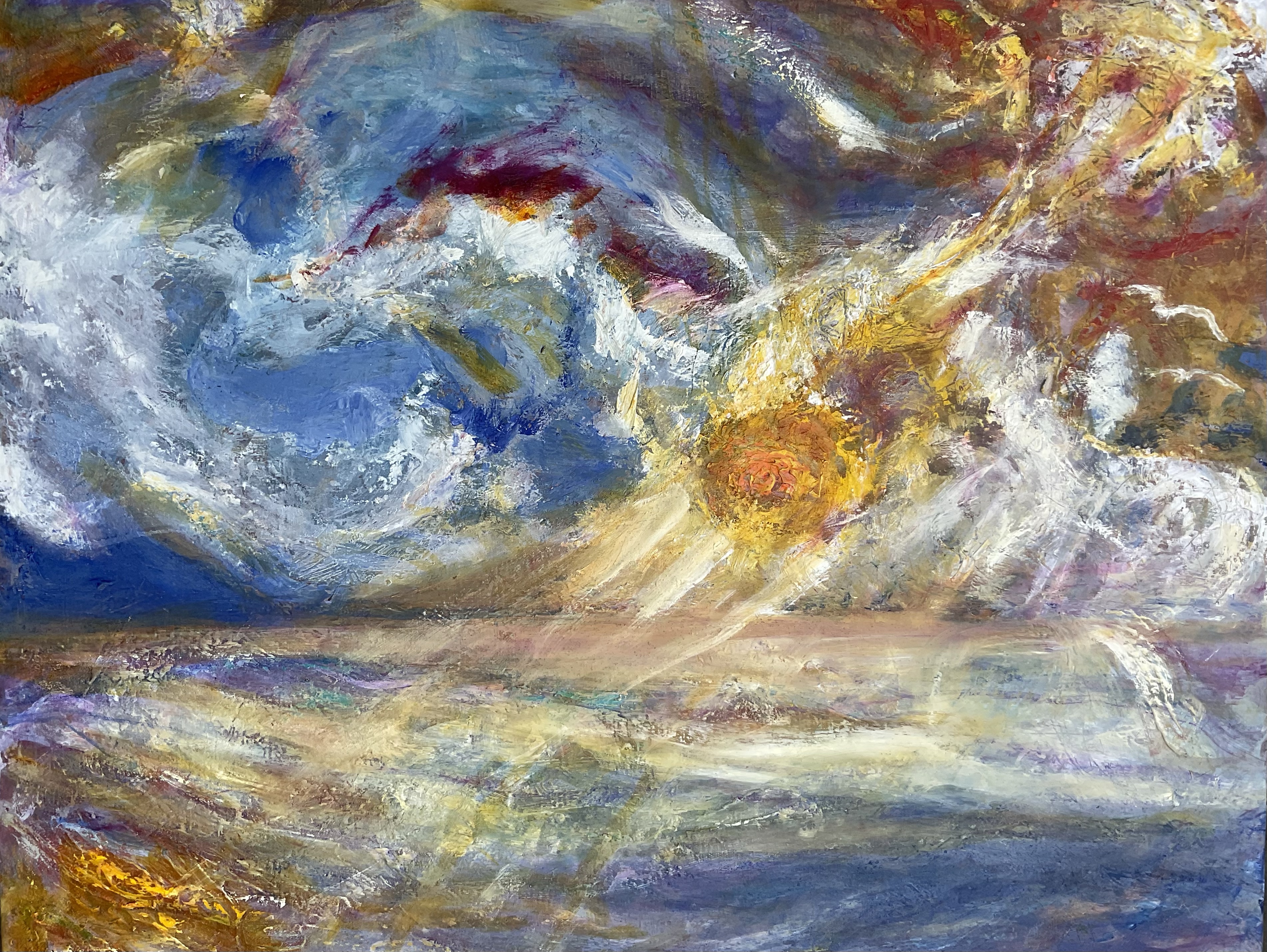
Canvas D. Early Sunrise, Oils
In conclusion, much like life itself, all present paintings have pasts and futures to contemplate. Horizons are moving targets just like everything else and our sense of timing and judgement of their emphasis is an artist’s prerogative.
I now take a moment to hold that thought.
Posted in Art, tagged #Artist Mary Chamie, #Using a palette knife on September 3, 2023| Leave a Comment »
The Bench, oils, 9”x12”
I have found that using a palette knife encourages the scraping and texturing of oil paint, allowing edgy, personal marks to be made on the canvas. The results may be almost calligraphic, or signature-like in their appearance jutting out in different directions over a baseline surface of color.
Or when I scrape or define flat surfaces using the long blade of the palette knife, it helps imagine the many possible reflections and castings of shadows seen on solid matter, such as those observed on a garden bench.

