“I learn faster by making big mistakes, while paying attention.”
Michael Orwick
This week in our art session with Michael Orwick’s class on the Value of Design sponsored by the Oregon Society of Artists, we all scrambled to take notes. This is because Michael took the time to show us how design and composition are linked with many other things, such as color, temperature, brushwork and edges.
One thing that he emphasized, is the importance of feeling free to make mistakes, and to experiment. He said that when we choose our colors for our paintings, we should work to make it sing our song. The song we sing and our color choices are our own. We will decide on the mood or atmosphere we hope to achieve.
Through pre-mixing of colors, we can think about what the five or six big colors that we hope to highlight in our painting. There is no right or wrong, but there are guidelines available to help us reach our goals.
He introduced us to a number of techniques for preparing our paintings, including framing; selection of canvas or wood; how to use gesso or acrylics, or other mixes for preparing the canvas; pre-mixing techniques; glazing techniques; transitions encountered while painting, choosing under colors to top colors, starting from dark to light, or light to dark.
My head was spinning at the end of this session. It was just what my head needed. I realized the only way out of this dilemma of “too many choices” was to make some. And that would mean making some mistakes. The important thing, I hope, will be to learn from them.
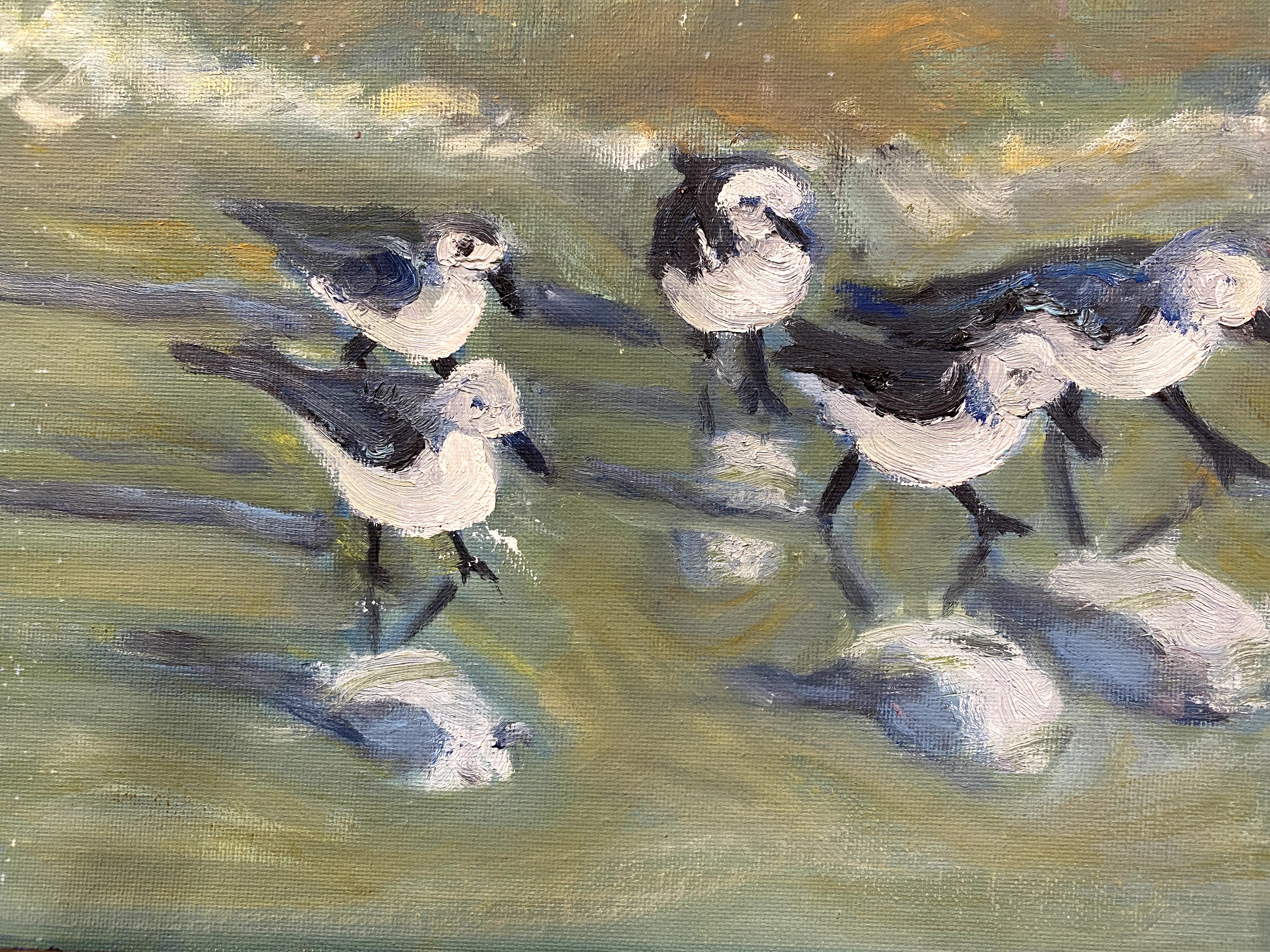
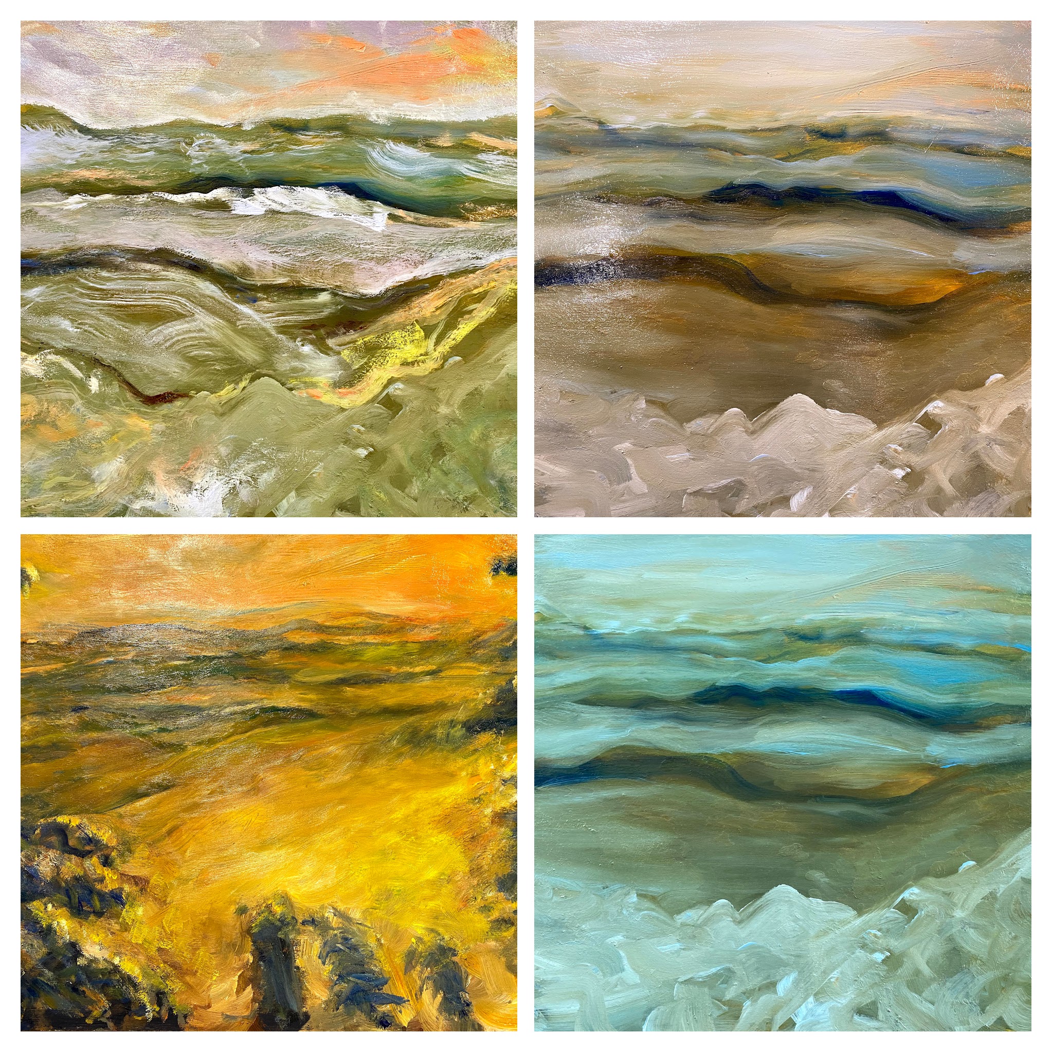
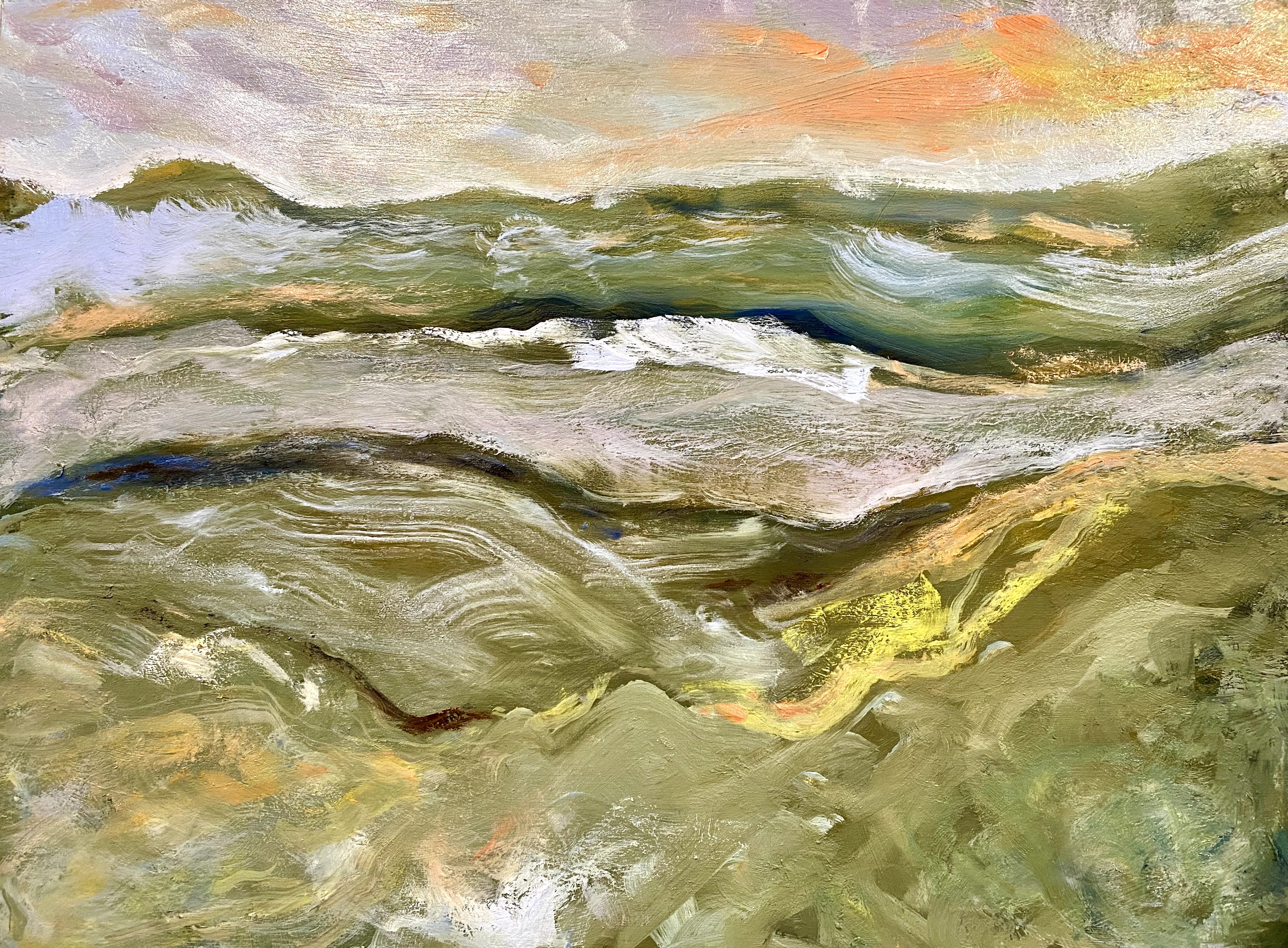
Briefly, I chose two old paintings that I never hung up because I was not completely happy with them, as experimental pieces for trying out glazing techniques. The first one I chose is an oil painting of birds on the beach.

The birds that I started with were painted with ultramarine blue, with some various yellows mixed in to suggest beach sand colors. Through glazing, the birds were shifted to brighter, softer tones, more in line with the colors reflected off the ocean beach waters. As I worked with the same painting, I first tried glazing the birds with earth red tones. Then I wiped that down and tried glazing them with lemon yellow and manganese blue mixes added in. In each case, the entire mood of the painting changed. It startled me to see how much influence these techniques and decisions had on the painting’s mood and atmosphere. Below, is the painting that I started with.
I then switched to an old painting of our backyard that was too dark, but I couldn’t figure out what to do with it to get it to feel like spring, that time of year when light hits young plants and the garden starts to go wild. I tried the same glazing technique to this painting, then added some lighter yellows to the left chair to make my point about how the sun was filtering through.
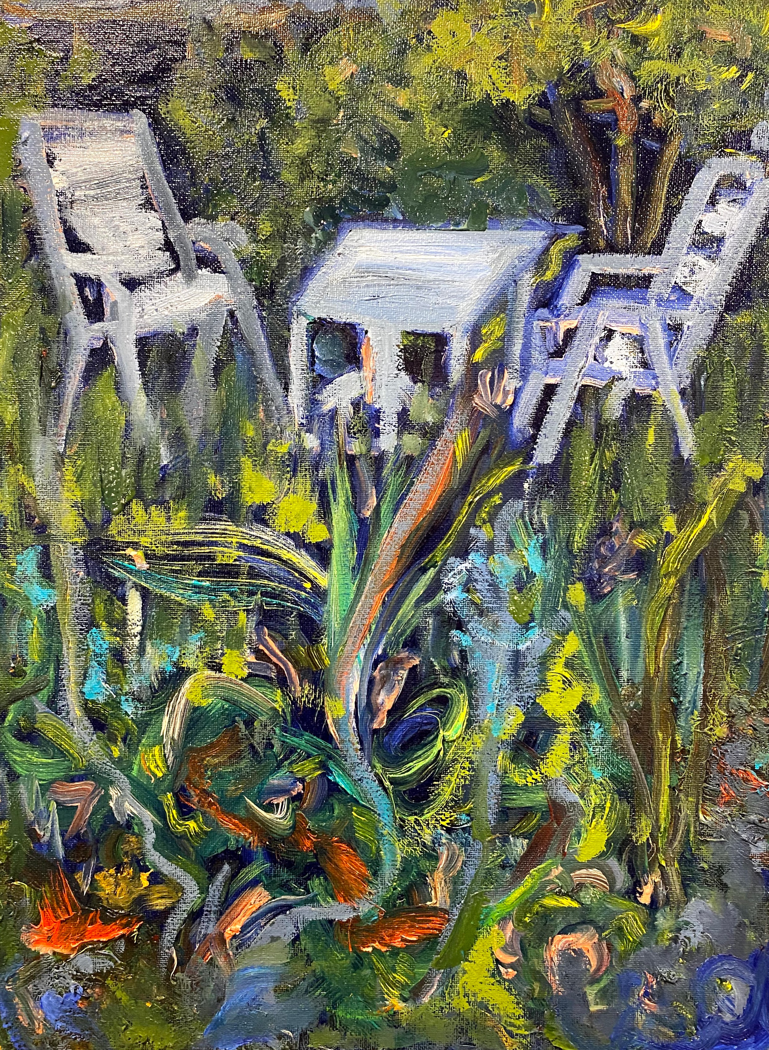
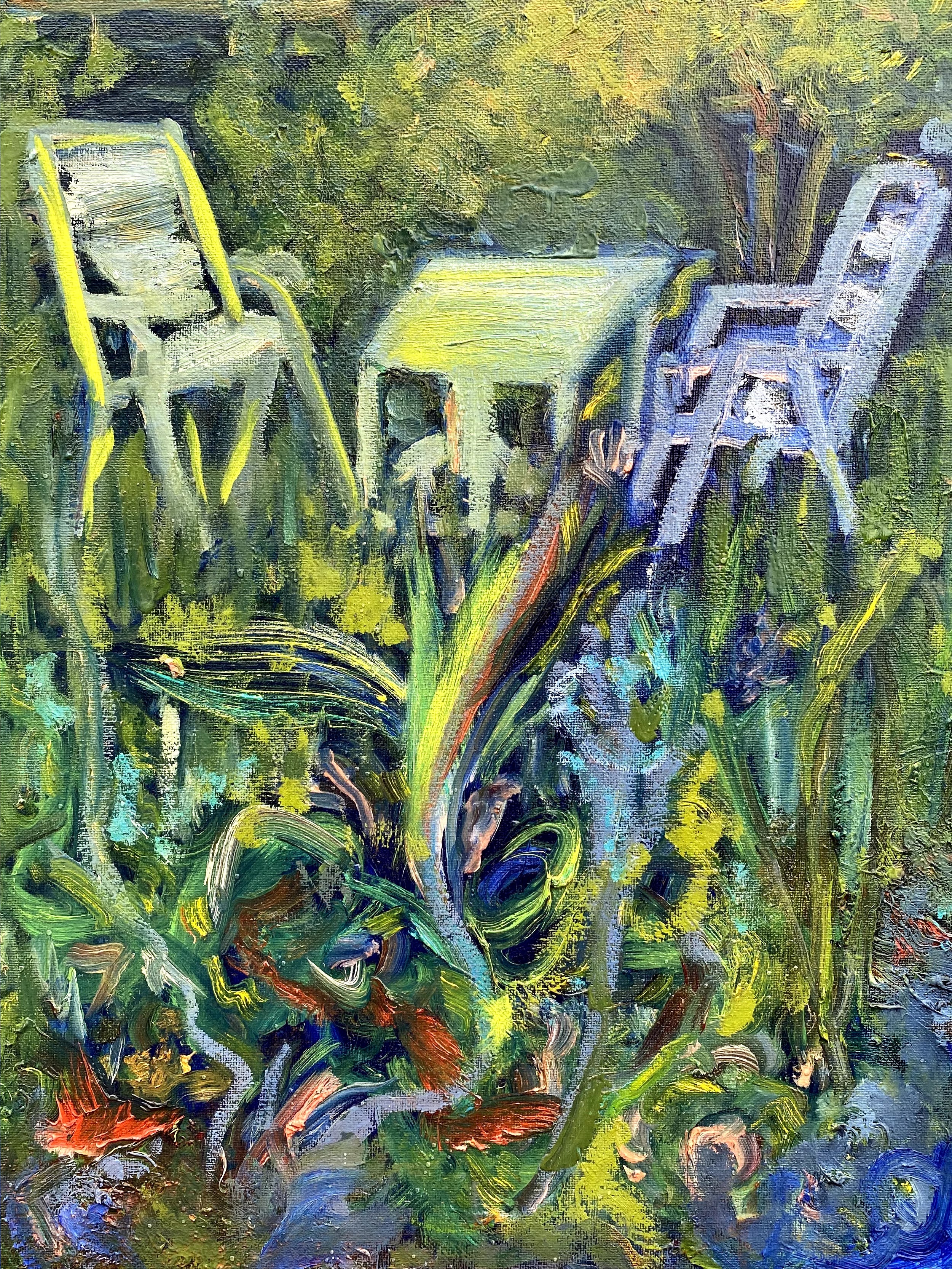
Is seems to me that if I continue to work on this old painting of our garden, using further glazing and some follow up on lighter colors, I am headed to where I wanted to originally go with it.
After these two experiments with old paintings, I chose one of my recent ones for some trial work on how color might affect the mood of this painting. As a reminder, I was trying to go from “Notan” to rough sketches, to underpainting of a mountain scene.
Now that I am at the point that I am supposed to paint this mountain view, I am still torn by what design I should be using for it, and what colors to emphasize.
Here comes my spectacular big mistake.
I tried glazing this painting before it was sufficiently dry, and ended up having most of the painting slip away. So, I used this failure as an opportunity to consider what my options are regarding color and mood for the middle part of a larger painting.
I started with the under painting showing trees on the sides and front. The trees are now gone. At this point in the life of this mountain painting, I am working from this one:
What have I learned from these trials? For one thing, I see that I have a great deal of latitude at every step of the way. I think what I want to do is to put a soft blue glaze over these mountains, after it truly is dry, to give the middle mountains some uniformity. I think I want to return to some trees in the forefront.
Somewhere in the future, I know that there is a painting of mountains in my life, highlighted with a few carefully selected trees in the foreground. I still have design issues to work out before I can commit to painting this. Ah well, back to the drawing board.
Big mistakes, big learning environment.

Hi They look very nice Keep it up ?
Get Outlook for Android
________________________________
Thanks for your words of encouragement.
[…] Through these classes, I learned a lot. […]
Mary, I love this post. When you say ‘glaze’ do you mean that you paint a layer over the whole painting or do you use it more selectively over smaller areas?
Margaret, Thank you. In this particular case, I glazed over the whole painting of the birds. But in other cases, I have glazed selectively. For example, I only glazed parts of the garden in the other painting in this blog. It can be used over small areas to improve reflections, or to highlight certain areas, etc. I hope that this answers your question.
Thank you, Mary. I have in fact tried out a bit of glazing on an abstract to cool some areas down and I shall use it more in future!