Feeds:
Posts
Comments

Posts Tagged ‘#Value of Design’

Art is my muse. From art, I receive an endless supply of inspiration.
While I like to think that I an in charge of the creative process and am inspiring the painting, I am finding instead that the creative process of art is actually inspiring me.

Here is an example.

The idea of painting a bird series started when I was doing a small watercolor on one of those commercially produced blank watercolor cards that I planned to send to a friend (Perspective 1). Unexpectedly, this small watercolor painting on a greeting card became a source of inspiration for an exploratory series of paintings experimenting with alternative media.

At first I asked, how might this painting have looked if I had used oils instead of watercolors?

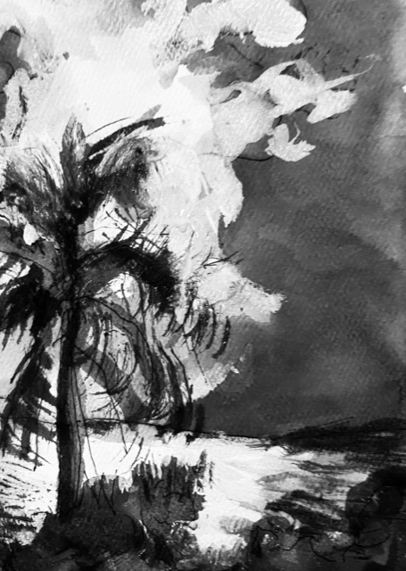
Perspective 1: Watercolor and ink, 4” x 6”

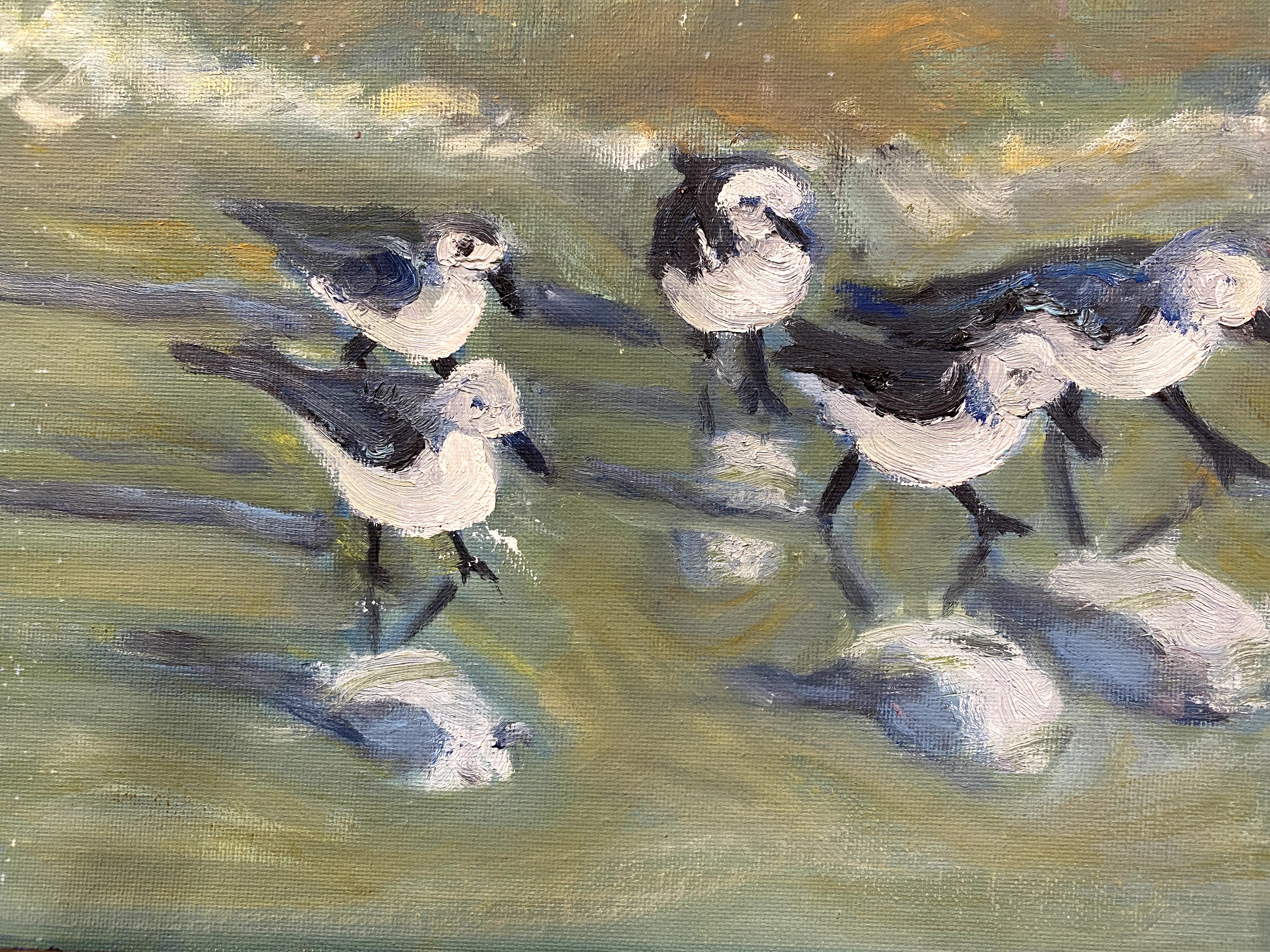
When I first noticed the birds, they were running as a glorious team in front of ocean waves softly rolling into the beach, the birds hurriedly capturing their meal of tiny fishes and bugs from the sand as the waves rushed back to the sea.

It was a few hours before winter sunset on the Abacos islands. The birds and I were standing on the beach in the sharp shadows and strongly contrasting light of early dusk. As I stepped closer to them, the birds fearlessly continued to shift back and forth with the waves, their legs moving quickly and in unison. It was fascinating to watch them perform with such measured uniformity of step. When I walked a bit too close for their comfort they started to skitter away.

And it is that particular moment, when they shifted their attention, that I wanted to paint.

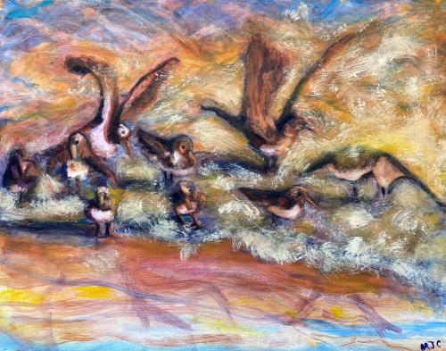
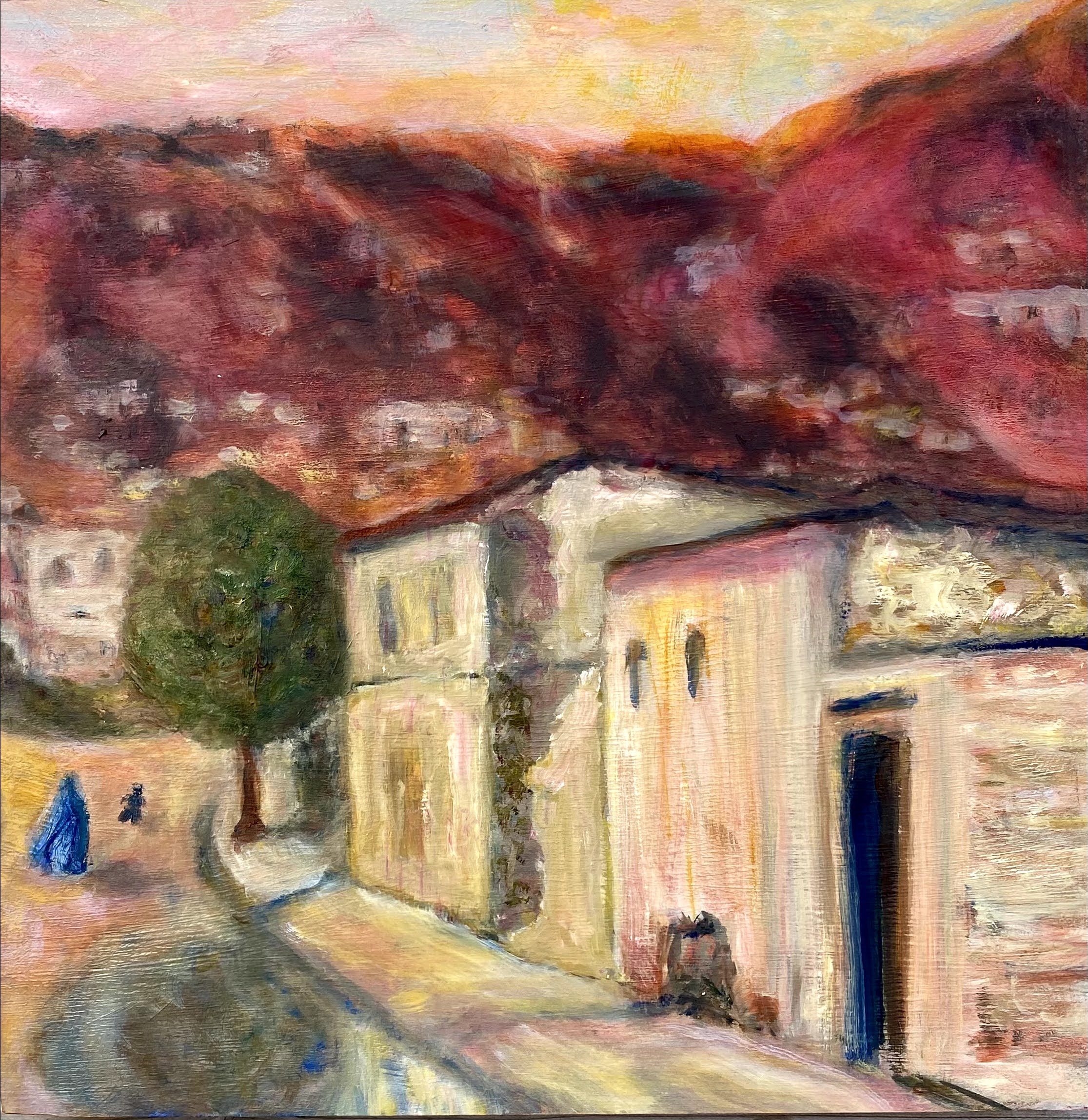
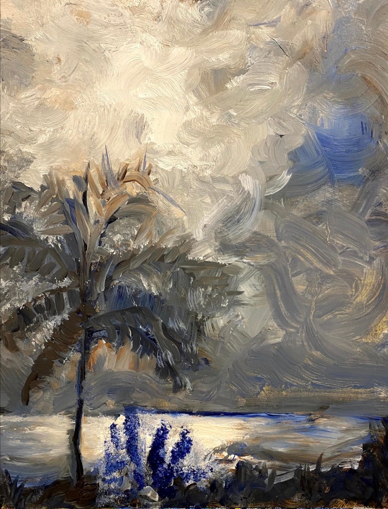
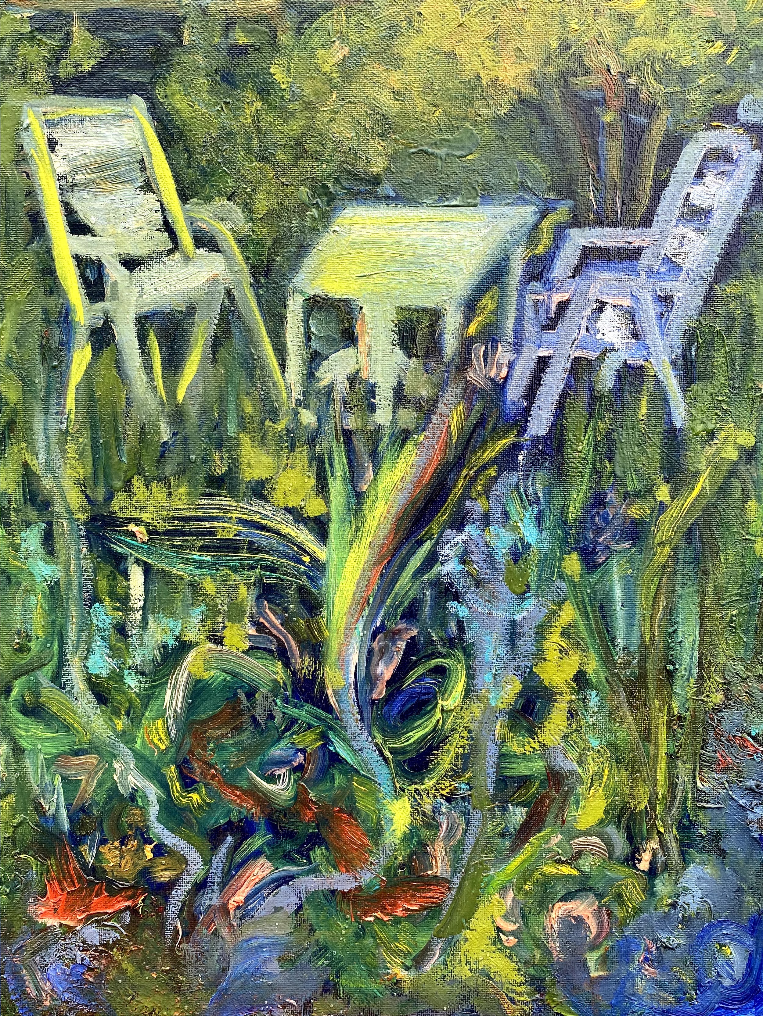
Perspective 2: Oil painting, 22” x 28”

After completing the small watercolor sketch (Perspective 1), I decided to try again in oils on canvas, this time with greater attention to the late afternoon ocean colors, but still using a similar structure for the painting, resulting in Perspective 2. This oil painting reflected more stillness with most of the movement being from the waves washing against the shore while the birds stayed in position enjoying feeding time while small waves washed over them.

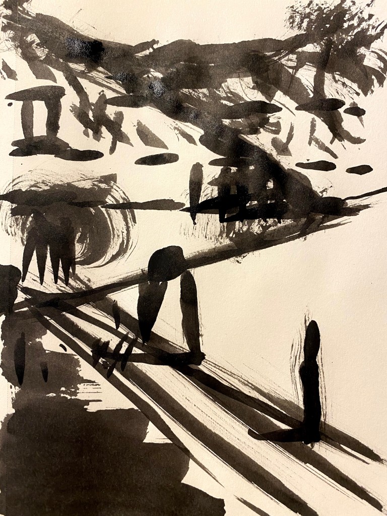
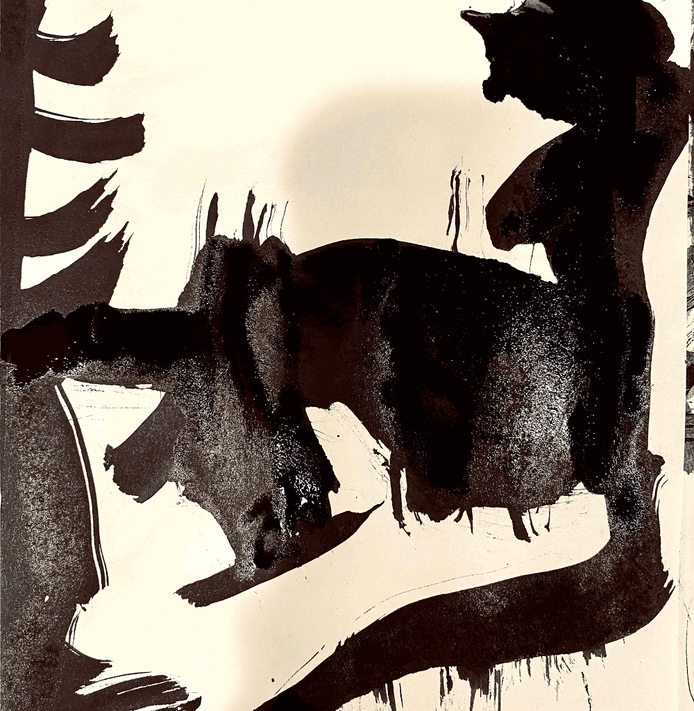
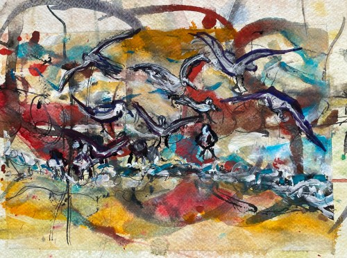
I decided to try the painting again and increase the commotion in the picture.

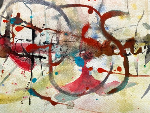
Wet- on- wet background in watercolor

To do this, I started by preparing a background of wet-on-wet watercolors on paper. Once this dried, I then watercolored over it and also used ink to complete the painting. The resultant painting called Perspective 3 is below. It did have the desired feel of commotion while also adding new lines and shades of interpretation.

.

Perspective 3: Watercolor on paper, 8” x 11”

Moving on, I tried again, this time asking, can I replicate this painting using a digital arts package such as Procreate?

I started by using a photo of the same wet-on-wet watercolor background that was used for painting Perspective 3 and super-imposed graphics over it. The birds were superimposed over the photo as were shades of color and selected lines. This was experimental on my part and was a first attempt at actually using digital arts for a painting . Here is what happened (Perspective 4).

Perspective 4: Digital Art using Procreate on an I-Pad

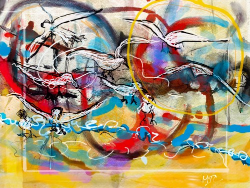
It struck me as odd that the only way I could produce Perspective 4 was to print it out, or I would have no physical evidence of my art piece. But that is the nature of digital design.

I also did one piece that was digital only, just for fun and it is Perspective 5. This time I focused attention to the birds’ positioning, letting the motion be implied by the waves .

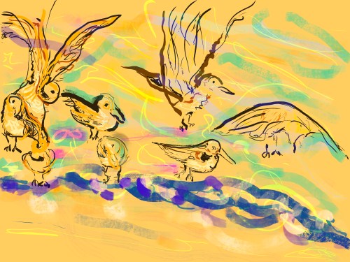
Perspective 5: Digital Art

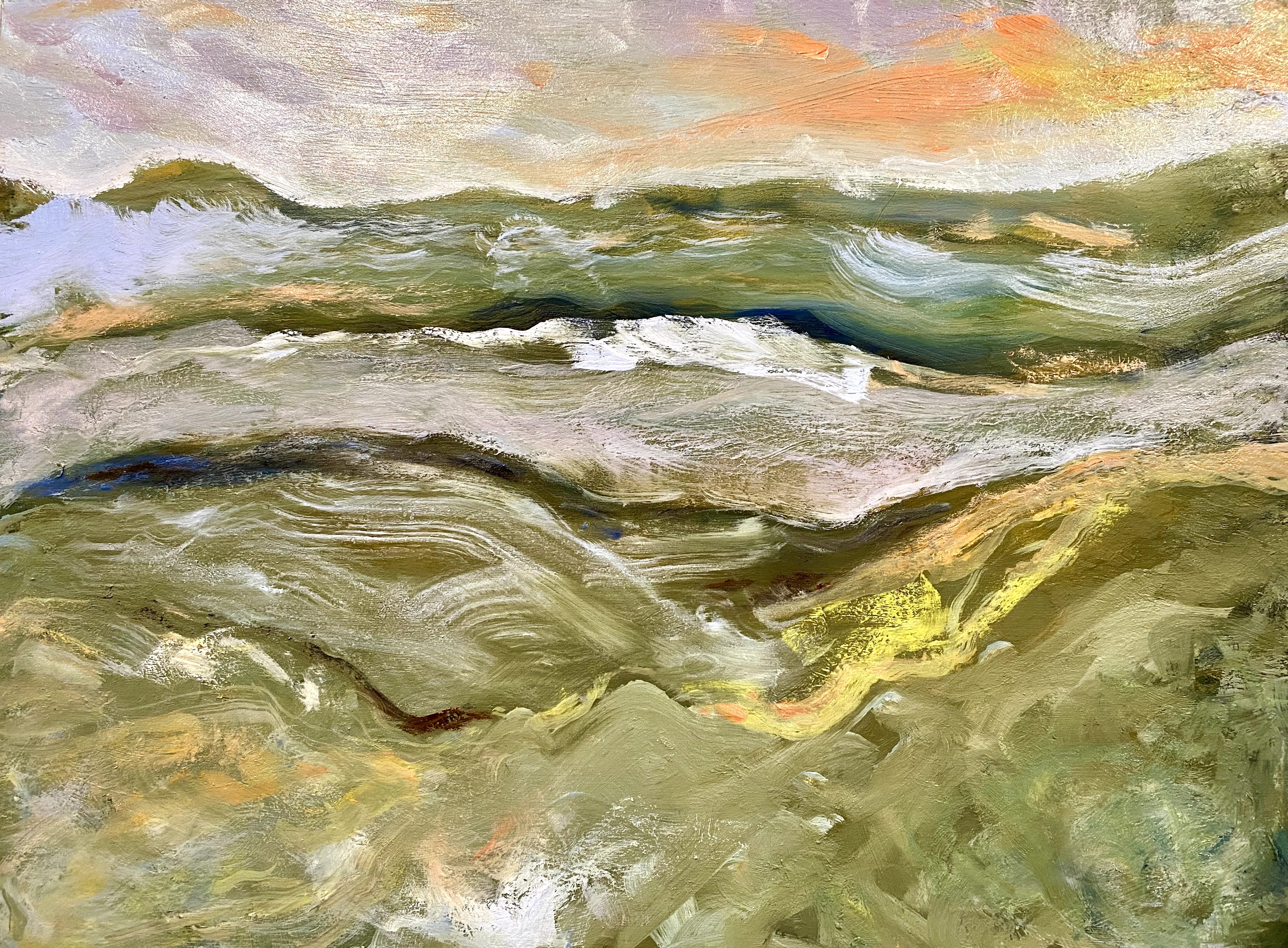
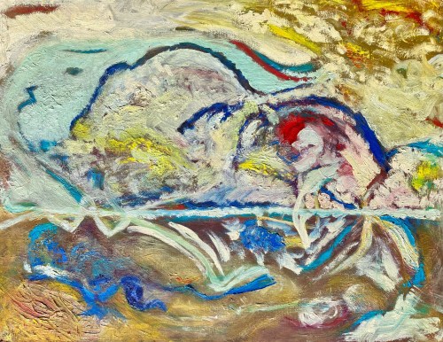
Finally, I returned to the physicality of oil paints and canvas and tried the same idea as an abstraction and this is what happened.

I continued to keep a similar structure in my mind while attempting to tell the story of the birds through color variations, brush movements and paint textures. My goal was to leave the feeling of moving water and birds without actually painting them as objects, resulting in Perspective 6.

This was also a challenge for me as I have struggled to reach all the way to abstraction and beyond impressionism. This time I think I made it.


Perspective 6: Oil painting on canvas,” 22’ x 28”

What did I learn from all these variations on the same painting?

What I learned is that the perspective that I take affects the outcome more that I ever might expect, even when the goal or intention of the painting is roughly the same.

As an analogy, if I were writing a story and I choose to write it in the first person, or the third person, it changes the orientation of the story. If I choose this actor or that actor to play the part in a play, or make a remark, the perspective of the story subtly shifts. If I choose these words over others, the entire mood of the short story may change.

The resultant stories that we tell or write have their own lives, independent of the writer’s or the story teller’s original intention. This is true, as well for art.

I believe that this is why it feels so daring to paint and why sometimes people may initially shy away from trying it. It is because each piece of art has a life of its own. It is because of what we may reveal in the process and may not necessarily expect. Perhaps we don’t even initially know this is going to be the painting we have in mind. But now that it is completed we see it as a real and independent construct that may, perhaps, be scrutinized by others, reinterpreted and possibly shared in new ways.

It is very daring to go through this creative endeavor, almost always resulting in further development and inspiration.

Art remains my muse.

Read Full Post »

I call this oil painting “Beginnings”.

It went through several iterations and is part of a project that I am working on.

Beginnings, in oils on canvas, 22” x 28”

There is a feeling of satisfaction and a type of introspection going on in my head when doing a creative study such as this as I freely put up the colors and textures where I want them, adding them with a joyous sort of freedom.

This is the first abstract I have tried that I sense is complete. It is a complete thought, an idea that I envisioned using a brush and some paints.

I don’t want to touch it.

No mini maneuvering would improve it for me. It is a new beginning, unexplained and free.

Read Full Post »

Learning the value of design


This last week, I completed an art course taught by Michael Orwick through the Oregon Society of Artists .

“Upwards”, Oil painting

From this excellent course, I learned that design, once achieved, allows an artist to paint more freely and expressively.


Although it may take more time initially to design and structure a painting, in the long run it saves time and frustration. As our instructor Michael Orwick said, you can paint a painting in an hour, or you can take 30 hours; it’s your choice. Without some preparatory thought about where one is going, it is possible to spend extra hours trying to clear a path on the canvas through a maze of ideas while struggling with too many shifting parts, be they lighting, perspective, color, value, shape or design.

We learned in this six-week course, to take our time and design a plan, to envision our painting. In the process we tried out different perspectives, shapes and structures to express our point of view. We learned that this is a journey, and when we slow it down a bit and enjoy the trip, it is a whole lot more illuminating and interesting. When we get to the actual painting, we are familiar with our territory and can enjoy the painting’s execution more fully.

Through these classes, I learned a lot.

I learned that painting without a design is a bit like driving through a forest without a road. Eventually, one might arrive where one wants to go. But with some advanced planning, one might reduce the amount of time and energy needed to set a path through the trees. This allows greater time for the sheer enjoyment of appreciating and painting the forest, while we are surrounded by interesting trees.

Michael Orwick provided us with a variety of techniques and approaches to design and encouraged us to experiment with all of them and to decide which were most personally useful in completing our paintings. He also encouraged us to know the rules, but to also understand that we can do most anything we want with art. The point of learning techniques and rules of artistry is not to inhibit us, but to free us to think about what options we have. The more options we have, the more creative and innovative we may be.

We were encouraged to improve on our questions about art while we decide on what are our intentions, what are our options, where do we go from here?

I have decided that I want to learn more about brush strokes and to more clearly establish ways to manage and vary them. I am also interested in improved ways to mix and understand color. I want to be able to ask more specific technical questions regarding choices of color and value.

Lucky for me, this course is followed by a six week course on Creative Color and the Luminous Landscape again taught by Michael Orwick through the Oregon Society of Artists, and I intend to take it.

Read Full Post »

“I learn faster by making big mistakes, while paying attention.”

Michael Orwick

This week in our art session with Michael Orwick’s class on the Value of Design sponsored by the Oregon Society of Artists, we all scrambled to take notes. This is because Michael took the time to show us how design and composition are linked with many other things, such as color, temperature, brushwork and edges.

One thing that he emphasized, is the importance of feeling free to make mistakes, and to experiment. He said that when we choose our colors for our paintings, we should work to make it sing our song. The song we sing and our color choices are our own. We will decide on the mood or atmosphere we hope to achieve.

Through pre-mixing of colors, we can think about what the five or six big colors that we hope to highlight in our painting. There is no right or wrong, but there are guidelines available to help us reach our goals.

He introduced us to a number of techniques for preparing our paintings, including framing; selection of canvas or wood; how to use gesso or acrylics, or other mixes for preparing the canvas; pre-mixing techniques; glazing techniques; transitions encountered while painting, choosing under colors to top colors, starting from dark to light, or light to dark.

My head was spinning at the end of this session. It was just what my head needed. I realized the only way out of this dilemma of “too many choices” was to make some. And that would mean making some mistakes. The important thing, I hope, will be to learn from them.

Briefly, I chose two old paintings that I never hung up because I was not completely happy with them, as experimental pieces for trying out glazing techniques. The first one I chose is an oil painting of birds on the beach.

Learning How to Glaze

The birds that I started with were painted with ultramarine blue, with some various yellows mixed in to suggest beach sand colors. Through glazing, the birds were shifted to brighter, softer tones, more in line with the colors reflected off the ocean beach waters. As I worked with the same painting, I first tried glazing the birds with earth red tones. Then I wiped that down and tried glazing them with lemon yellow and manganese blue mixes added in. In each case, the entire mood of the painting changed. It startled me to see how much influence these techniques and decisions had on the painting’s mood and atmosphere. Below, is the painting that I started with.

I then switched to an old painting of our backyard that was too dark, but I couldn’t figure out what to do with it to get it to feel like spring, that time of year when light hits young plants and the garden starts to go wild. I tried the same glazing technique to this painting, then added some lighter yellows to the left chair to make my point about how the sun was filtering through.

Early Spring, oils, unglazed
Early Spring, oils, glazed with lemon orange and cad red

Is seems to me that if I continue to work on this old painting of our garden, using further glazing and some follow up on lighter colors, I am headed to where I wanted to originally go with it.

After these two experiments with old paintings, I chose one of my recent ones for some trial work on how color might affect the mood of this painting. As a reminder, I was trying to go from “Notan” to rough sketches, to underpainting of a mountain scene.

Earlier sketching and underpainting of mountain view

Now that I am at the point that I am supposed to paint this mountain view, I am still torn by what design I should be using for it, and what colors to emphasize.

Here comes my spectacular big mistake.

I tried glazing this painting before it was sufficiently dry, and ended up having most of the painting slip away. So, I used this failure as an opportunity to consider what my options are regarding color and mood for the middle part of a larger painting.

Searching for the right mood of this painting with oils, same painting, different glazes

I started with the under painting showing trees on the sides and front. The trees are now gone. At this point in the life of this mountain painting, I am working from this one:

What have I learned from these trials? For one thing, I see that I have a great deal of latitude at every step of the way. I think what I want to do is to put a soft blue glaze over these mountains, after it truly is dry, to give the middle mountains some uniformity. I think I want to return to some trees in the forefront.

Somewhere in the future, I know that there is a painting of mountains in my life, highlighted with a few carefully selected trees in the foreground. I still have design issues to work out before I can commit to painting this. Ah well, back to the drawing board.

Big mistakes, big learning environment.

Read Full Post »