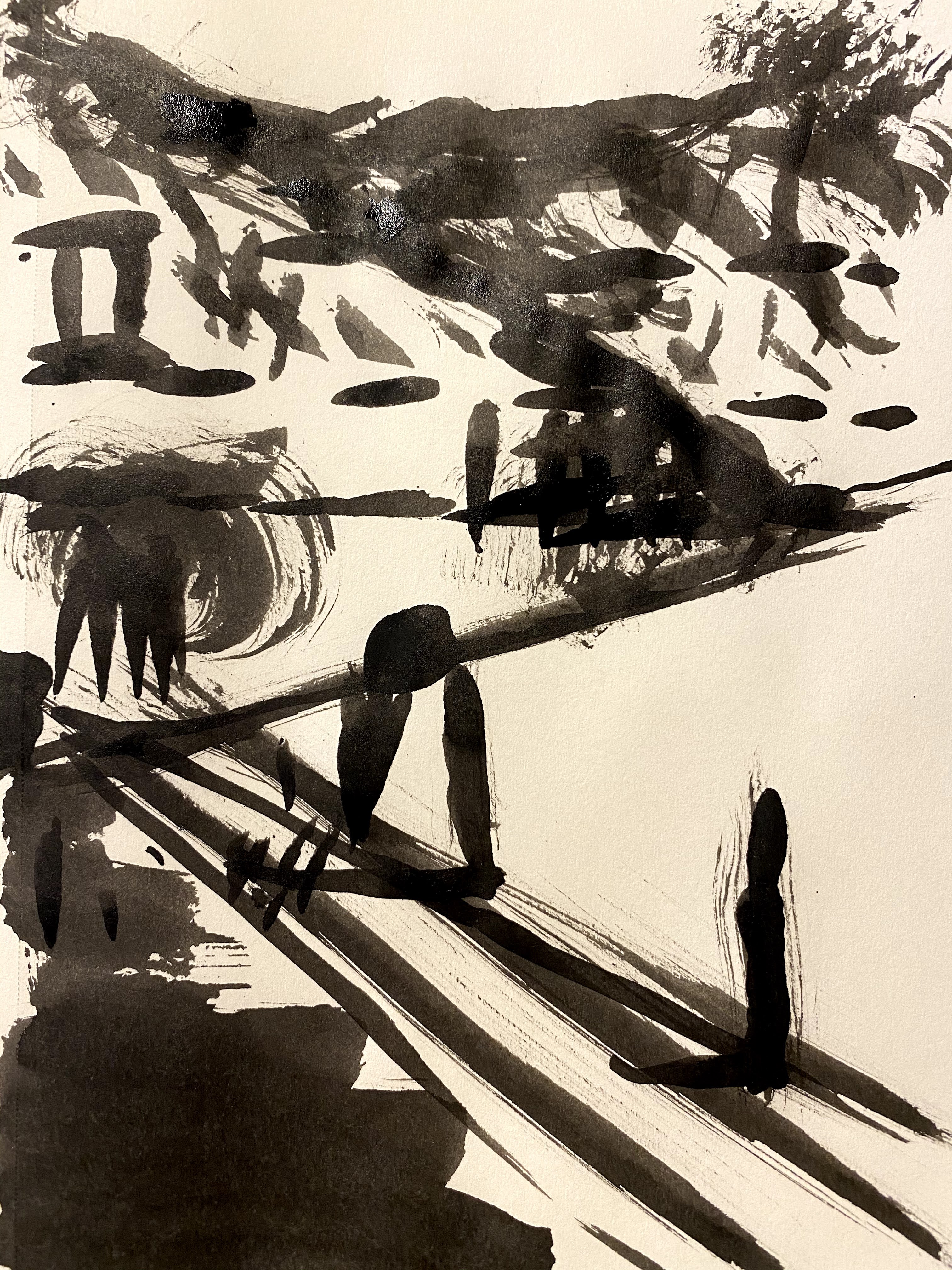
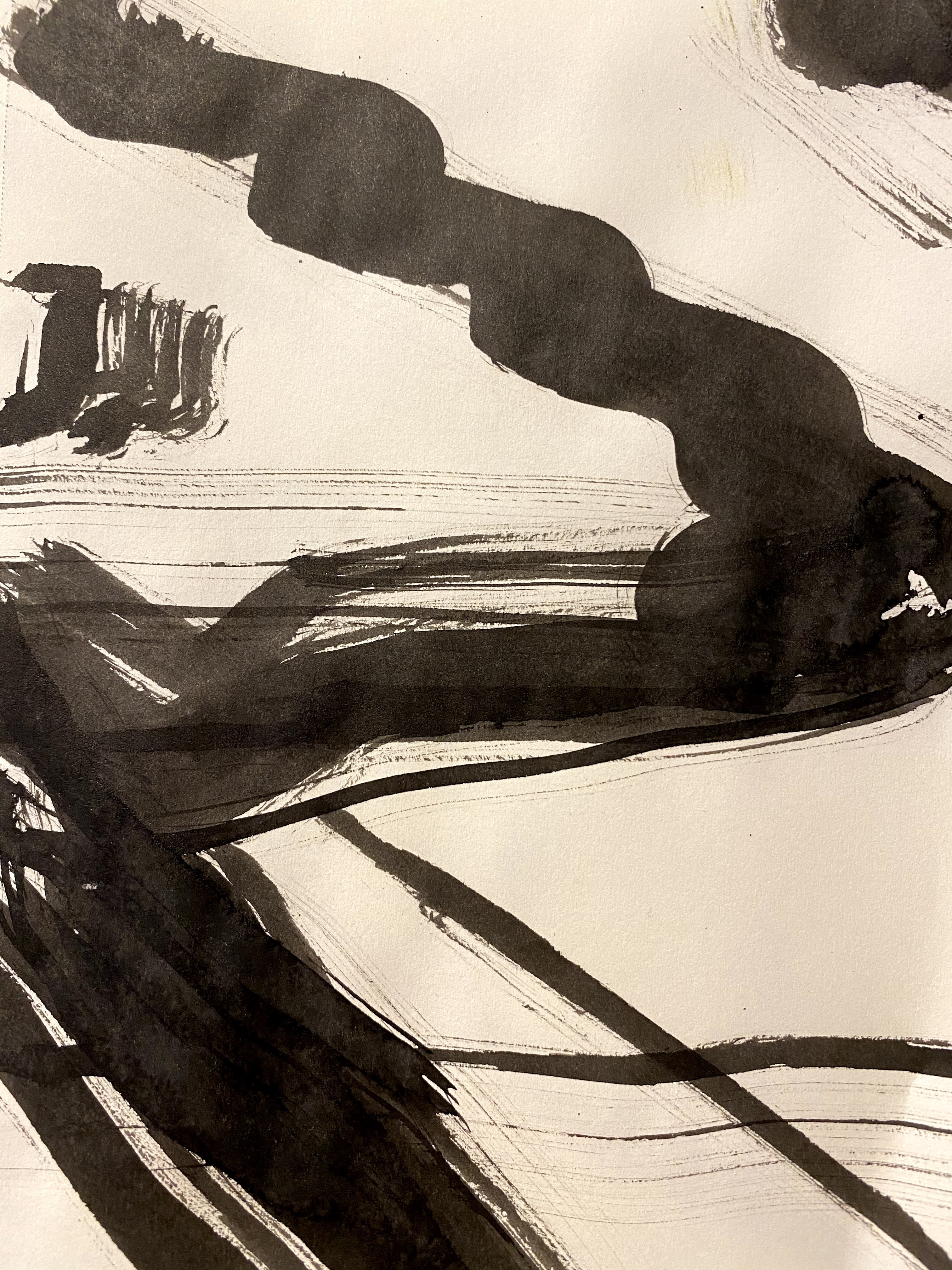
These are my notes for paintings that I am working on in an art course on The Value of Design taught by Michael Orwick through the Oregon Society of Artists
I started this fourth week by finishing off a painting of the Oregon mountains, using a tonalist style. I liked working on tonalism and decided to continue using this style for our next assignment.
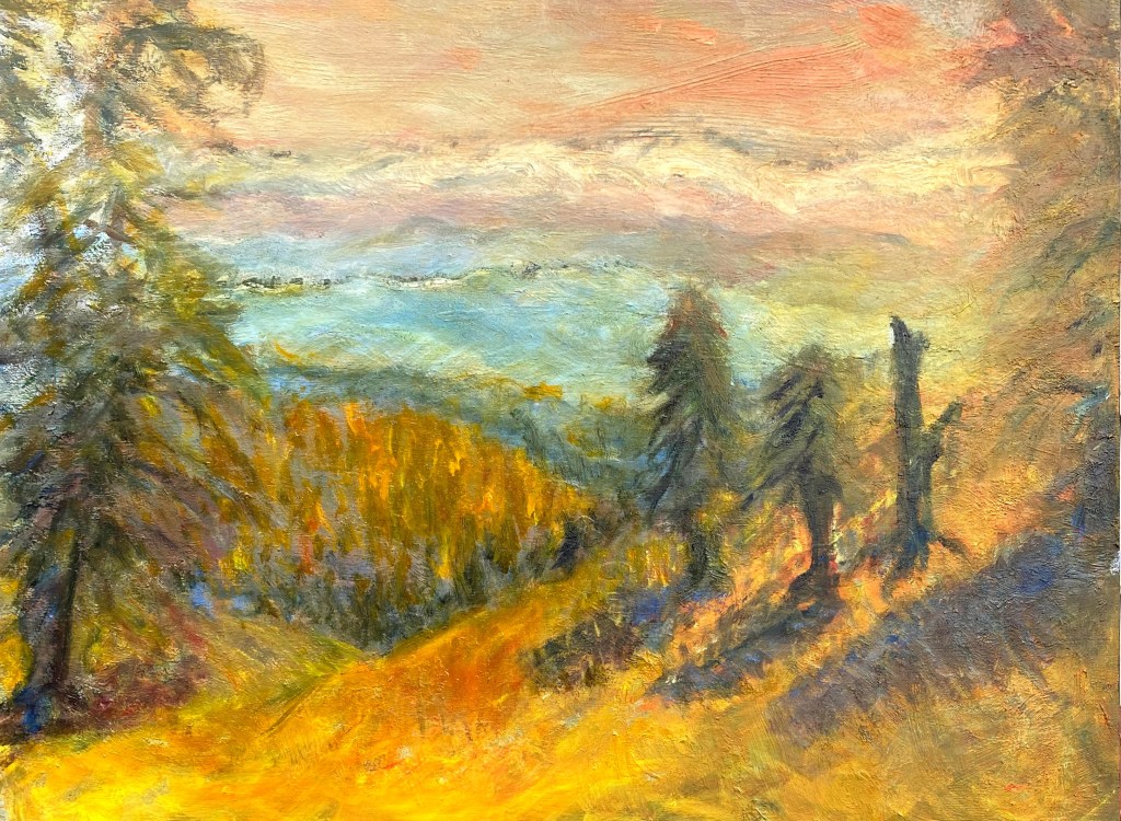
Our goal is that by the end of the fourth week of this class to complete a painting while going through all of the steps we have learned thus far.
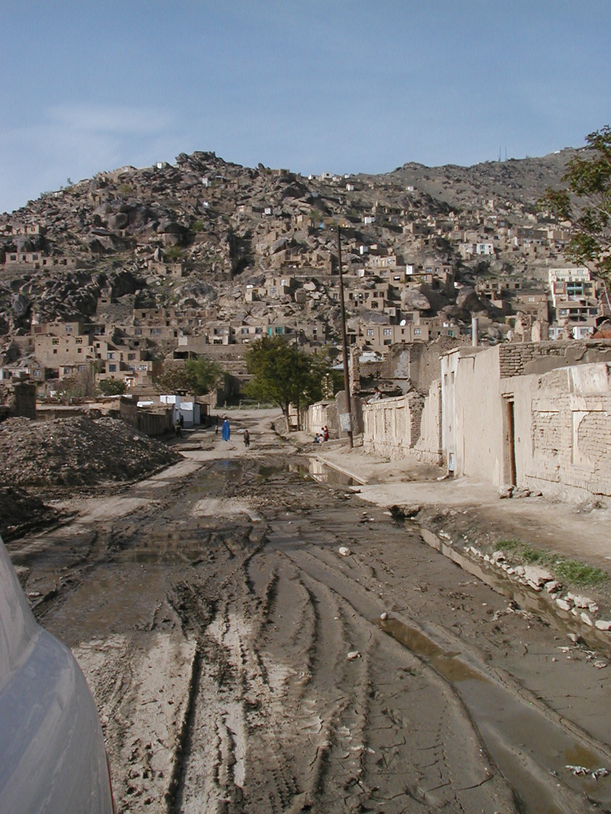
For this assignment, I choose a landscape photo that I had taken while in Afghanistan for my next painting.
In May 2003, I led a United Nations statistical mission to Afghanistan in order to review a proposal for a census program for the war-torn country. Our team worked on this project for several weeks. The team was comprised of national statisticians from a number of countries, staying in a relatively secure location, but still very aware that we were in areas where heavy fighting occurs. It was a complicated mission, with difficult decisions, yet we could not but look up from our work and around at the ancient beauty of this city, this country, gateway to Europe and Asia. Kabul is a city of many languages, many ethnic groups, many years of sophisticated history.
It is worth noting that the earliest example of an oil painting was found in Afghanistan in caves near the ancient Buddhas that were recently destroyed by the Taliban. Scientists confirmed that some of the paintings were completed in as early as the fifth century, long before any other civilizations used oils for painting. The art history of Afghanistan is long and fascinating.
Looking up into the foothills surrounding Kabul, I cannot tell where the housing stops, and the hills begin. The soft tonal colors of the boulders up on the foothills mix with the angular shapes of homes. Higher homes have been hastily built as safe havens from street fighting occurring below. They are built at times without the privilege of electricity or septics, some with only walls up, windows and doors still hollowed out. Homes, to hide in, to tuck away in, as war and street-fighting have torn at this nation.
Our class has been discussing the art of tonalism, and since I wanted to paint a landscape, I decided to try working on a picture of an Afghani settlement in the foothills of Kabul. The soft pastels that of Afghanistan’s hills and valleys are often dotted with the bright blues of women’s robes (burkahs) as the women often wear them when walking outdoors in public. Soft greens of trees and fields are seen in the valleys of the Hindu Kush Mountains, often cut by a moving mountain stream flowing through. If one sees soft beige, slight pinks and purples, the observer is probably looking slightly upward at the foothills and the homes made out of a combination of handmade bricks, soft grey-brown mud, and some cement often sheltered by grey and purple foothills. The shockingly high mountains are differentiated mainly through varying shades of white snow, which I was not going to depict in this painting.
In a previous blog where I sketched out my plan, I decided to name this painting “Upwards”. I chose that title because upwards seemed to be where everybody was going. I thought I should photograph the two distinct kinds of urban settlements we mainly saw. There were those that were settled into the valley, and those headed “upwards”. We needed to learn as much as we could about Afghani settlements, as census-taking, world-wide, still includes the ancient science and art of counting and recording characteristics of every household and individual in a country.
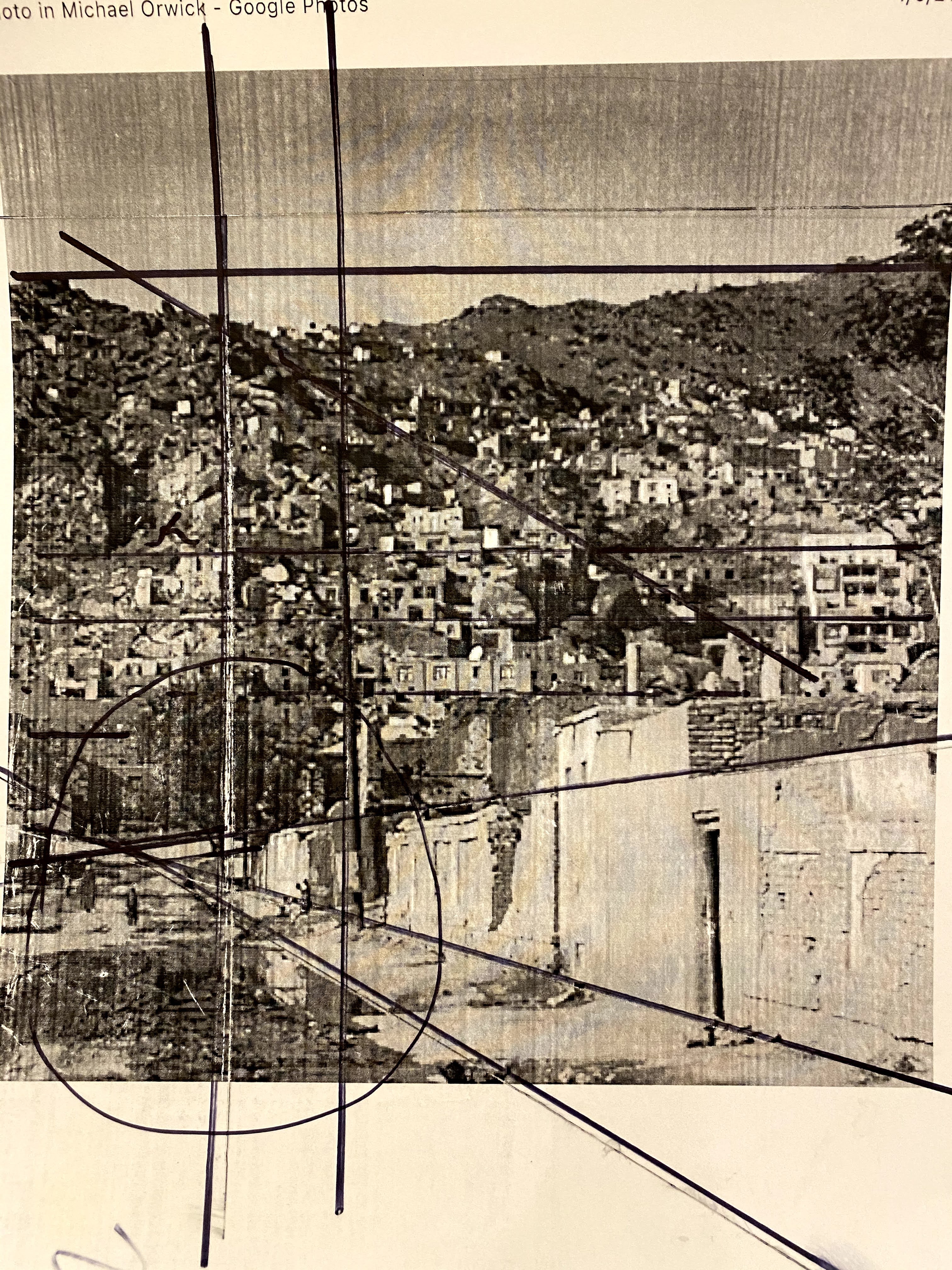
I started with a copy of the uncut, unedited photo that I used for my inspiration for the painting, I do not plan to follow the photo in its entirety, but wish to use it as a reminder of how I felt at the time. My husband Joseph and I had lived in parts of south and western Asia for a number of years, and this place felt familiar, and welcoming to me. It is an amazing amalgam of a number of nearby cultures from the ancient lands of Persia to the Bay of Bengal.
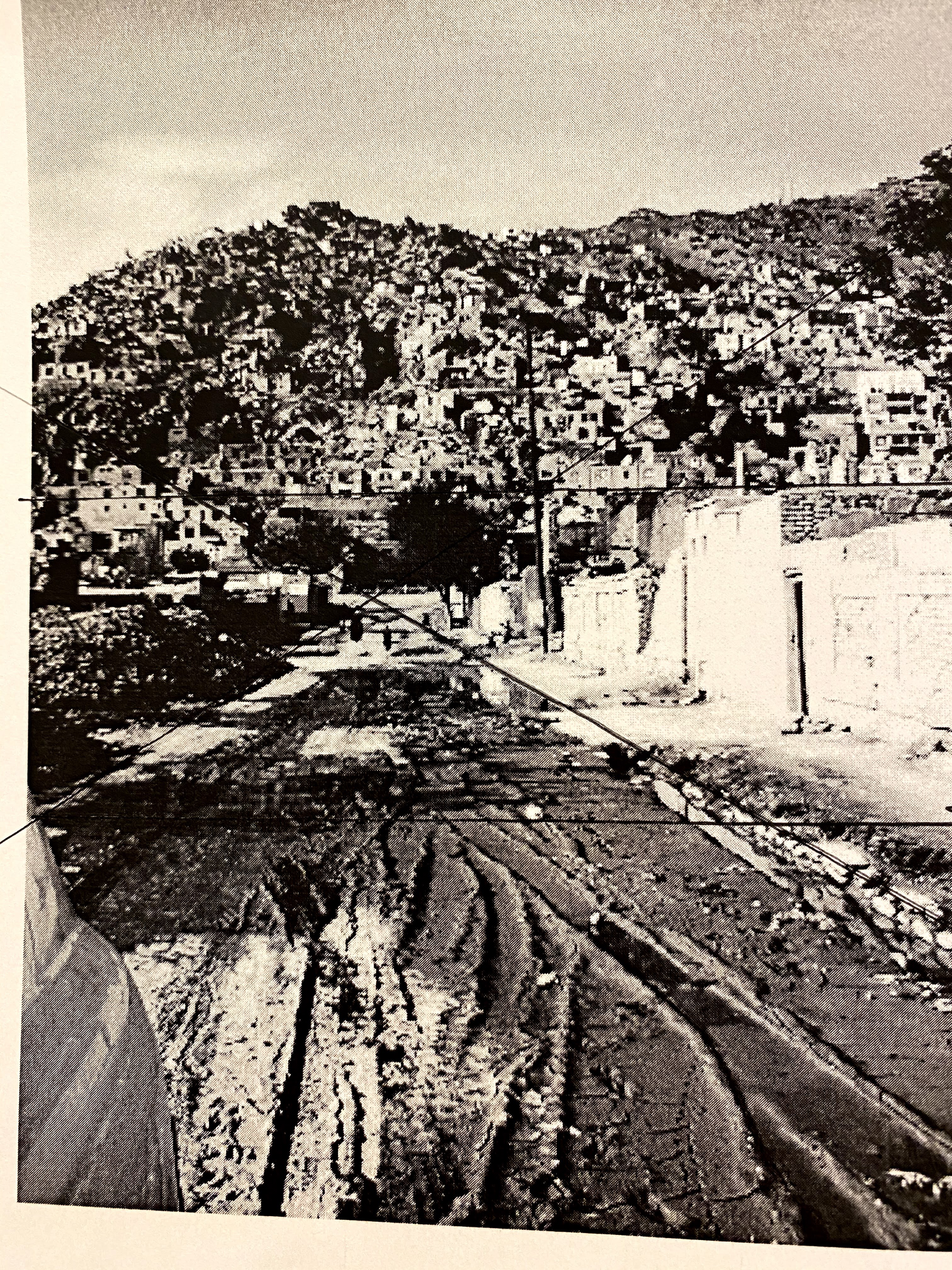
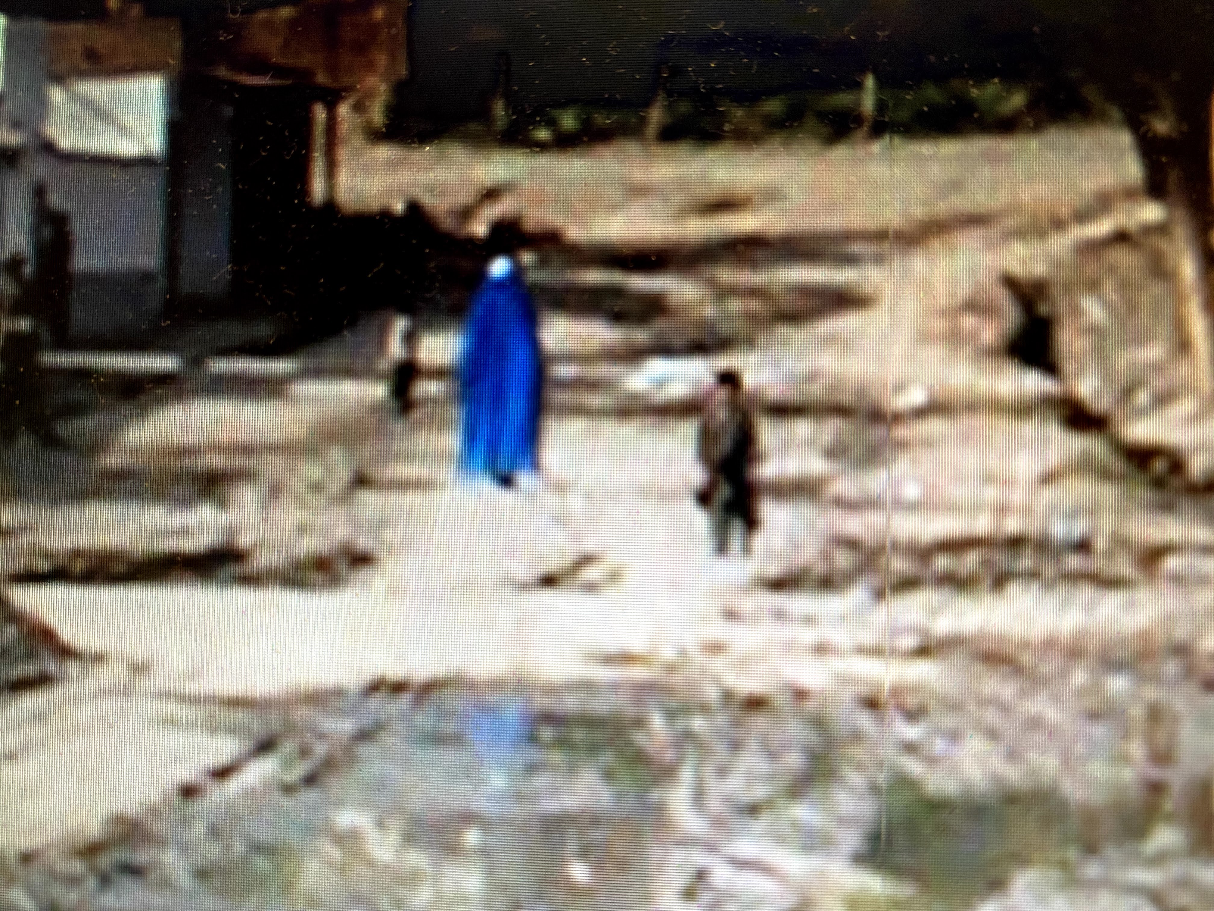
In the process of deciding what aspect of these settlements to paint, I played around with photo cropping and sketching in order to see the big shapes and values better. I also hoped to highlight an Afghani woman walking with a child, her bright blue burkah flowing around her. It is always such a contrast with the softer colors of the streets.
Had I chosen to paint the entire photo, I would have used a diamond shape as my big shape, as seen in the slide show above. But instead, I placed the woman and the little boy off to the side, letting the light come to them. This made the larger shape of the painting more like a Z.
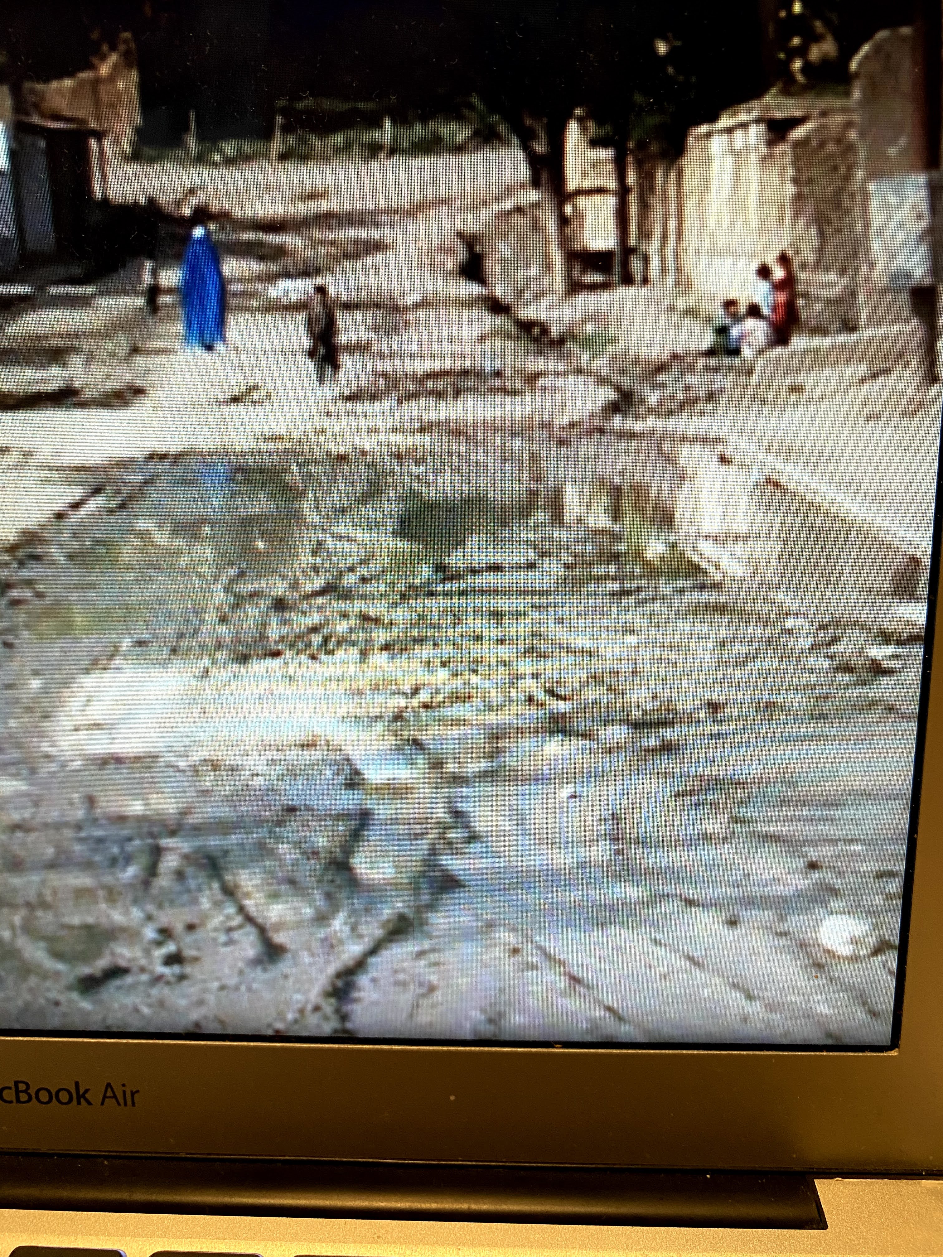
The spilled water on the road was a challenge and I wondered how to include it pouring down the open gutters and into the street, leaving reflections of nearby buildings, rather than the usual flowing rivers that slip through natural landscape paintings.
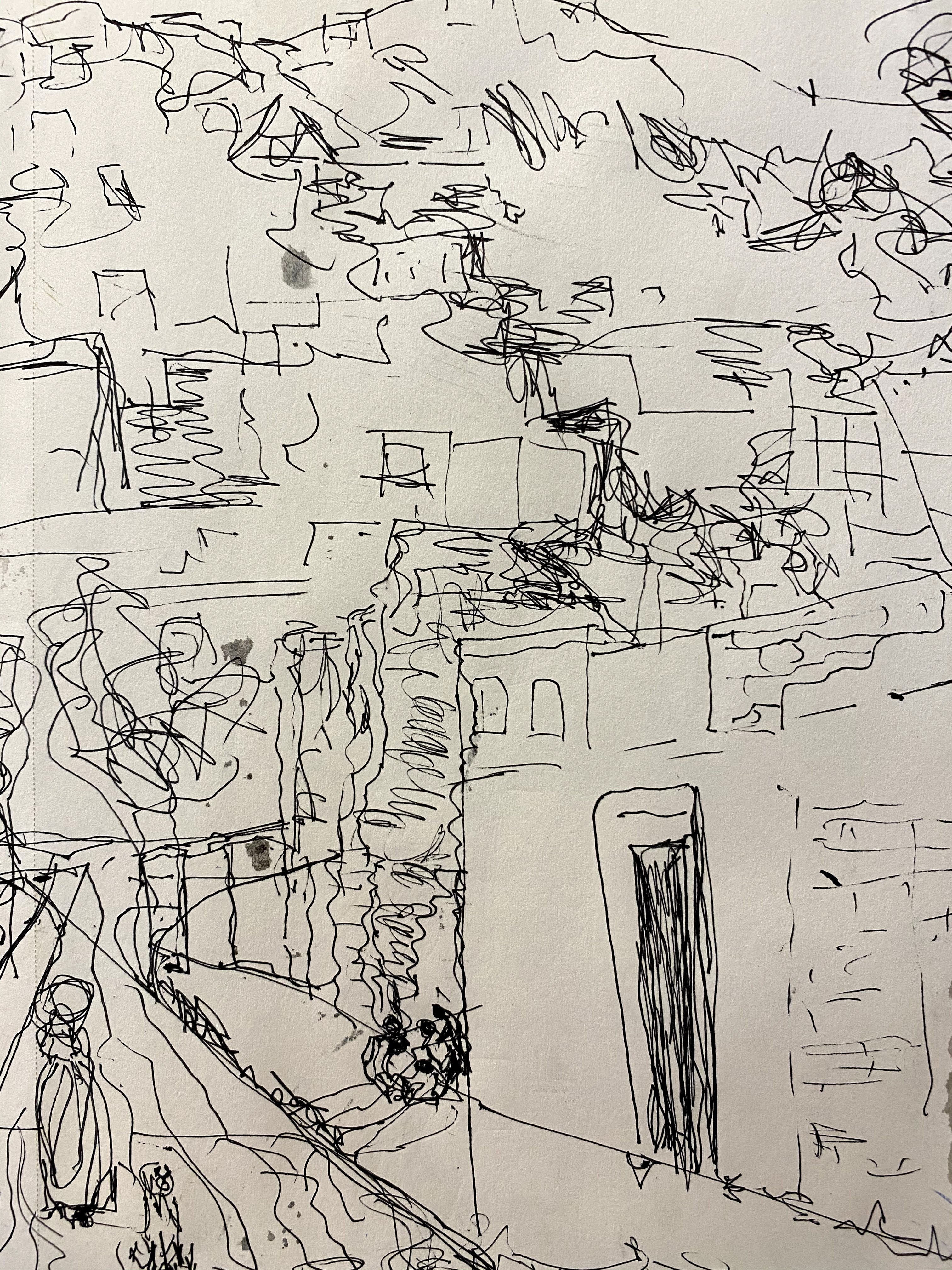
I started by sketching a variety of scenes, from a simple notan to short sketches of what I hoped to paint. From these sketches, I began to see a clear pattern of shadows highlighting hill homes and big boulders that cover the sides of the hills. I feel that it is important to simply this picture while still keeping the feeling of what it was like to be there.
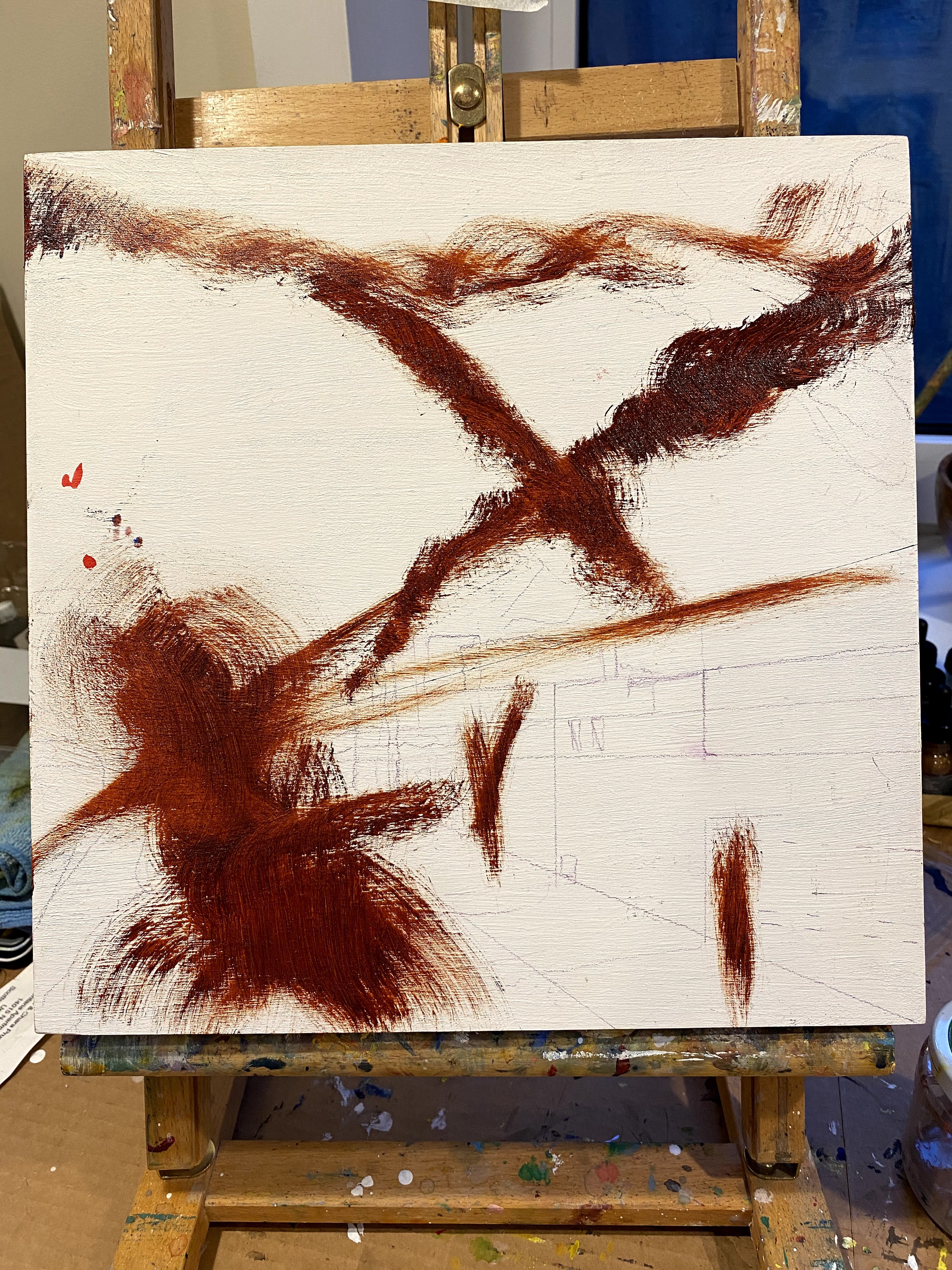
At some level, I liked it so much I didn’t feel like adding any more paint. But, given that this is a learning device, once it was dry, I proceeded to the next step of adding oil colors over the sketch. I am hoping also, to keep the wood grain of my birch wood canvas showing in the painting, when it is useful to the scene.
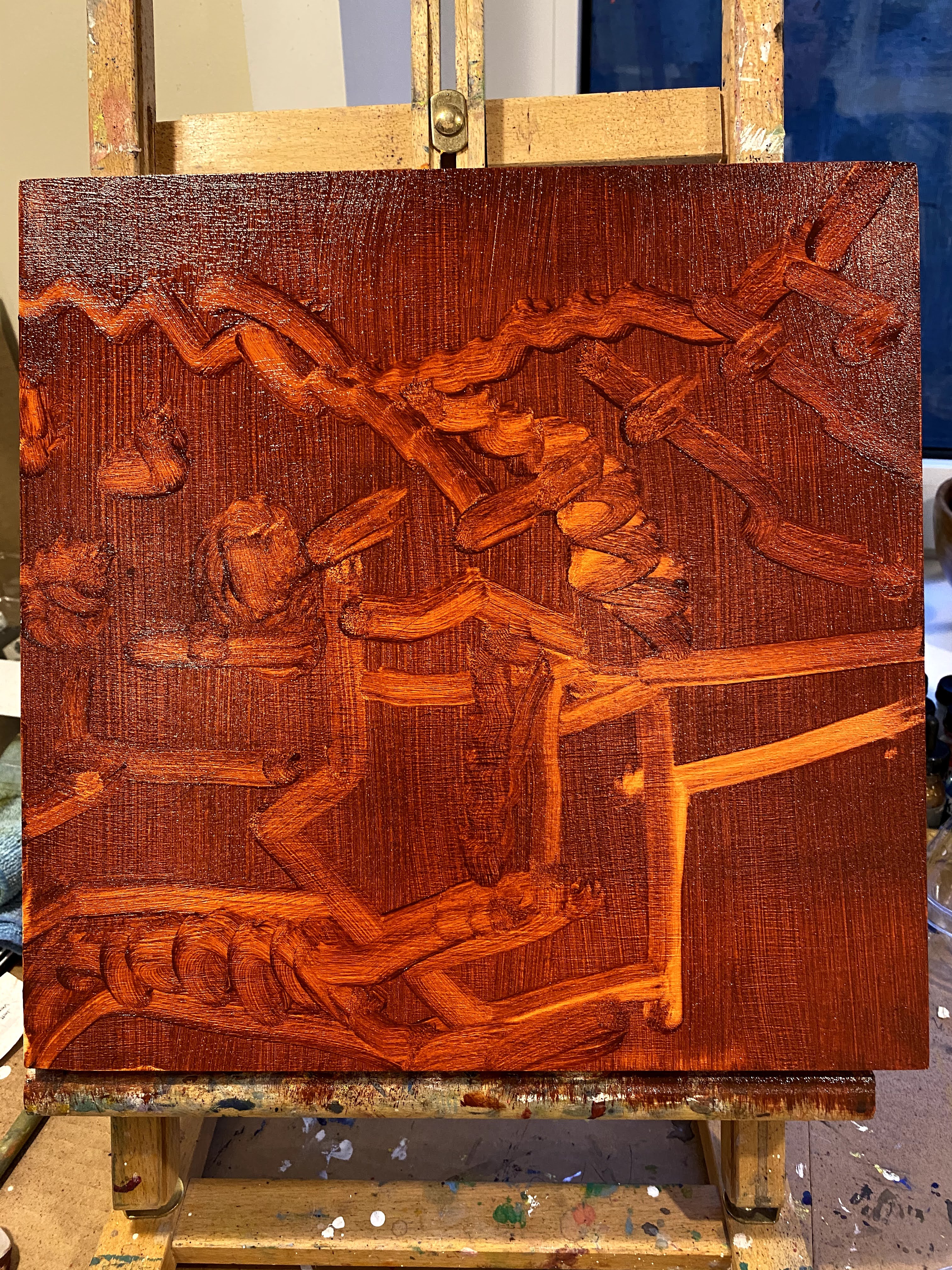
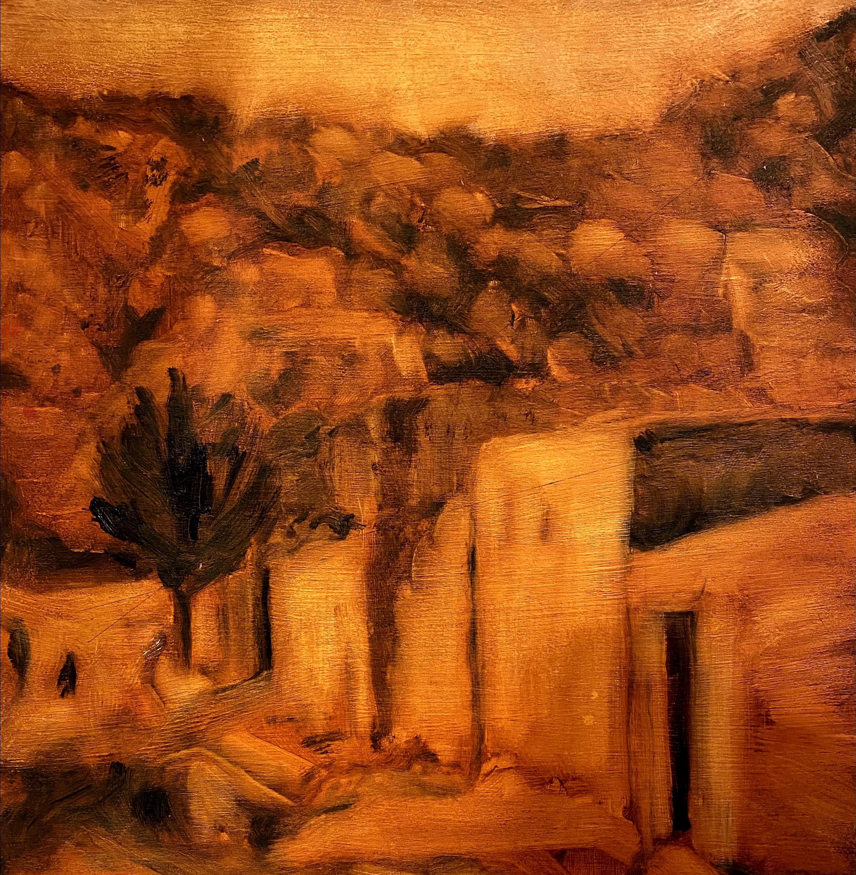 Using the method we had earlier learned of placing transparent paint onto the canvas and then using rags or paper towels to remove some of the paint to leave big shapes and values, I ended up this this sketch for my intended oil painting.
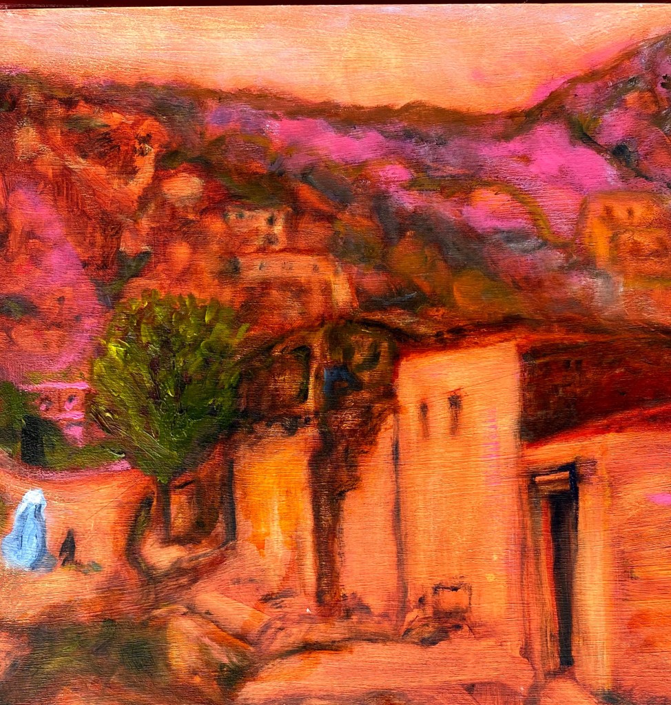
This is as far as I got with the idea this week. No doubt, I will work on it some more after it is completely dry. I am interested in trying out various glazings, perhaps an earth red and a mixed blue-grey, to soften some of the bright pink hues of the foothills.
