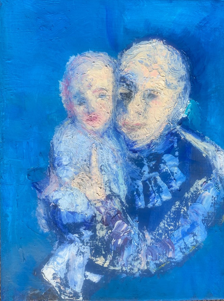
I wanted to paint the quiet emotion I saw between a grandmother and her granddaughter. What I visualized in painting them was peace, identity, pride and love, expressed in shades of yellows, blues and pinks, surrounded by soft, fractured textures. It felt best to carve out their contours and shapes with oils using a palette knife, showing their presence, their intensity, their closeness as a bright splash onto blue backgrounds. This was quick work, often described as “alla prima”, but in fact, also using photography to remember some little details.
Art is my muse. From art, I receive an endless supply of inspiration.While I like to think that I an in charge of the creative process and am inspiring the painting, I am finding instead that the creative process of art is actually inspiring me.
Here is an example.
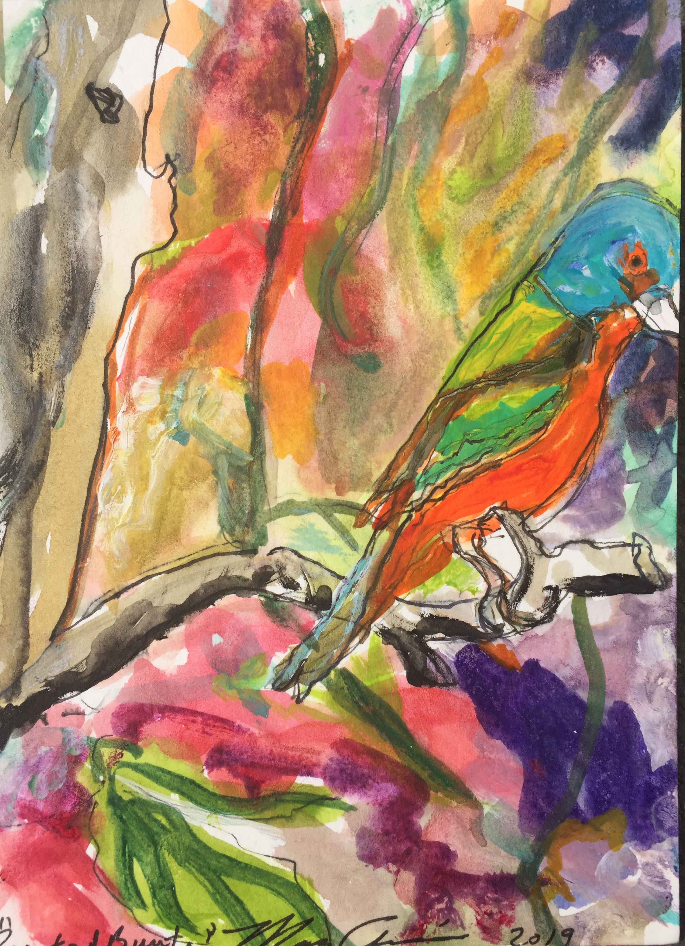
The idea of painting a bird series started when I was doing a small watercolor on one of those commercially produced blank watercolor cards that I planned to send to a friend (Perspective 1). Unexpectedly, this small watercolor painting on a greeting card became a source of inspiration for an exploratory series of paintings experimenting with alternative media.
At first I asked, how might this painting have looked if I had used oils instead of watercolors?
Perspective 1: Watercolor and ink, 4” x 6”
When I first noticed the birds, they were running as a glorious team in front of ocean waves softly rolling into the beach, the birds hurriedly capturing their meal of tiny fishes and bugs from the sand as the waves rushed back to the sea.
It was a few hours before winter sunset on the Abacos islands. The birds and I were standing on the beach in the sharp shadows and strongly contrasting light of early dusk. As I stepped closer to them, the birds fearlessly continued to shift back and forth with the waves, their legs moving quickly and in unison. It was fascinating to watch them perform with such measured uniformity of step. When I walked a bit too close for their comfort they started to skitter away.
And it is that particular moment, when they shifted their attention, that I wanted to paint.
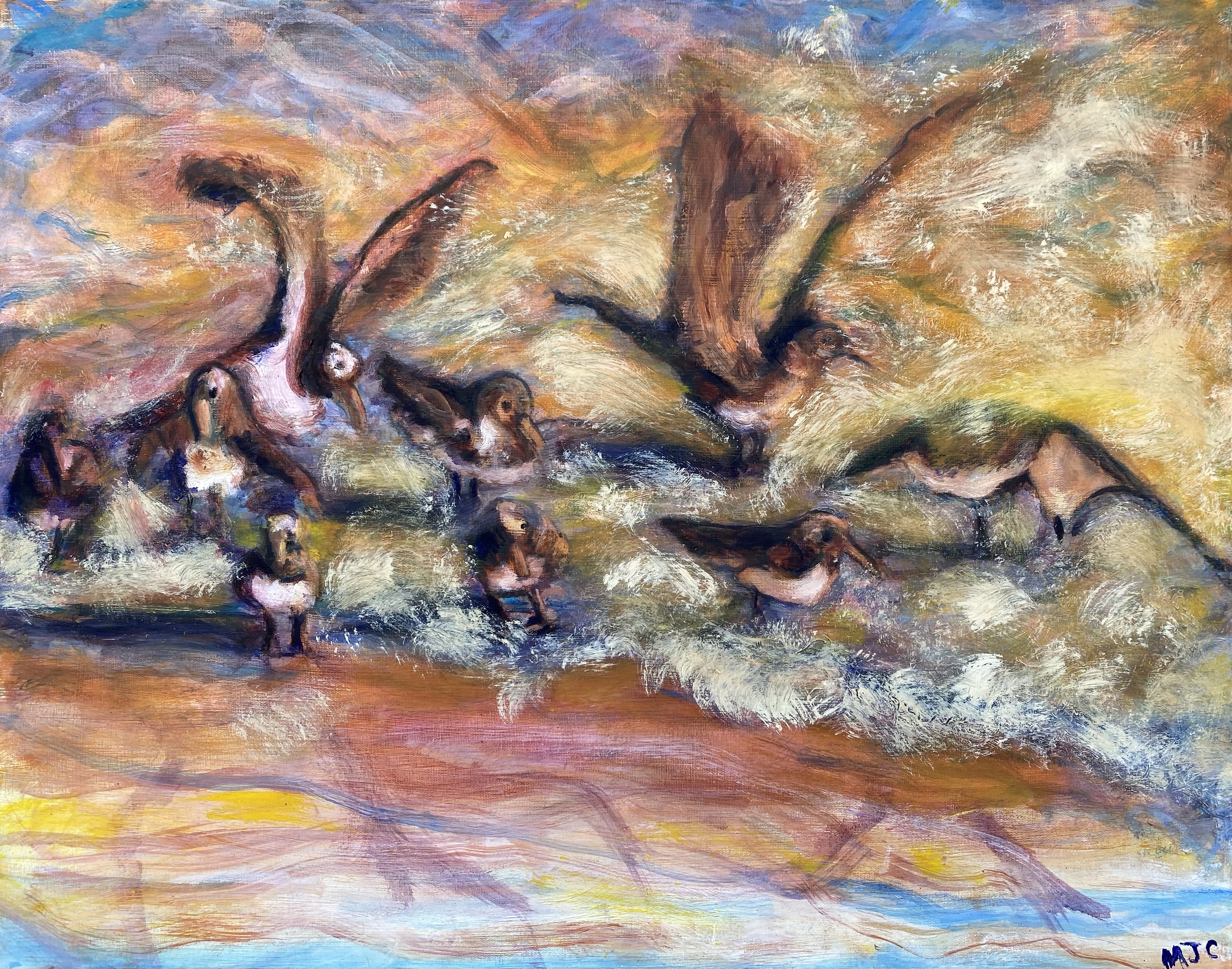
Perspective 2: Oil painting, 22” x 28”
After completing the small watercolor sketch (Perspective 1), I decided to try again in oils on canvas, this time with greater attention to the late afternoon ocean colors, but still using a similar structure for the painting, resulting in Perspective 2. This oil painting reflected more stillness with most of the movement being from the waves washing against the shore while the birds stayed in position enjoying feeding time while small waves washed over them.
I decided to try the painting again and increase the commotion in the picture.
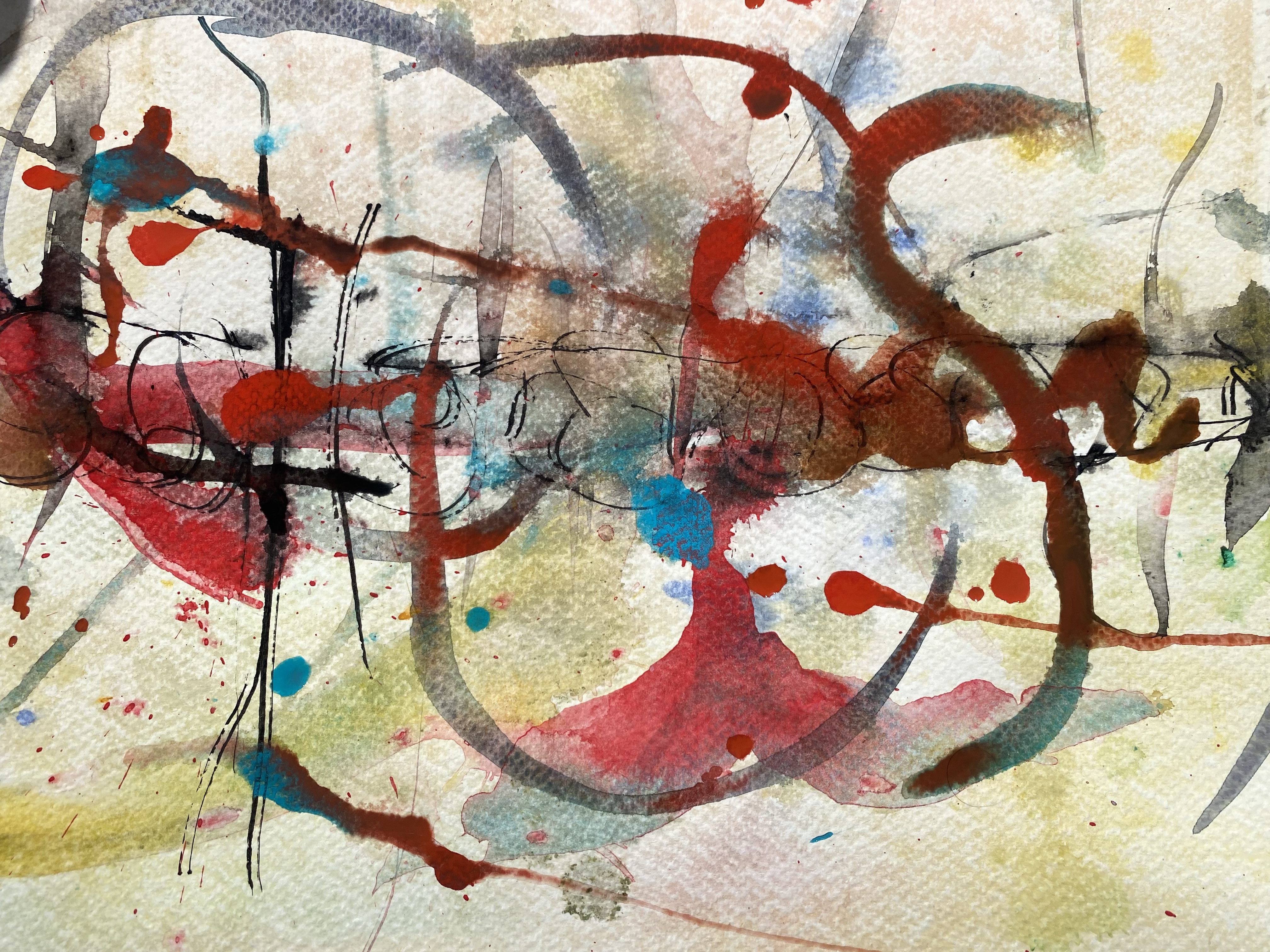
Wet- on- wet background in watercolor
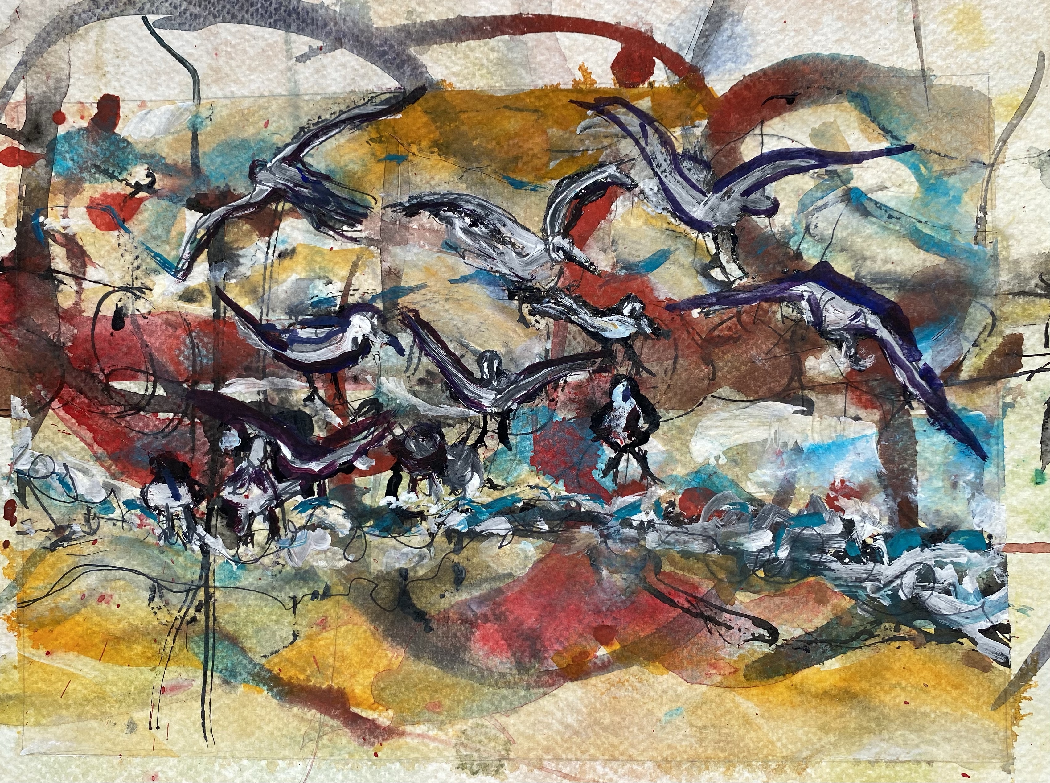
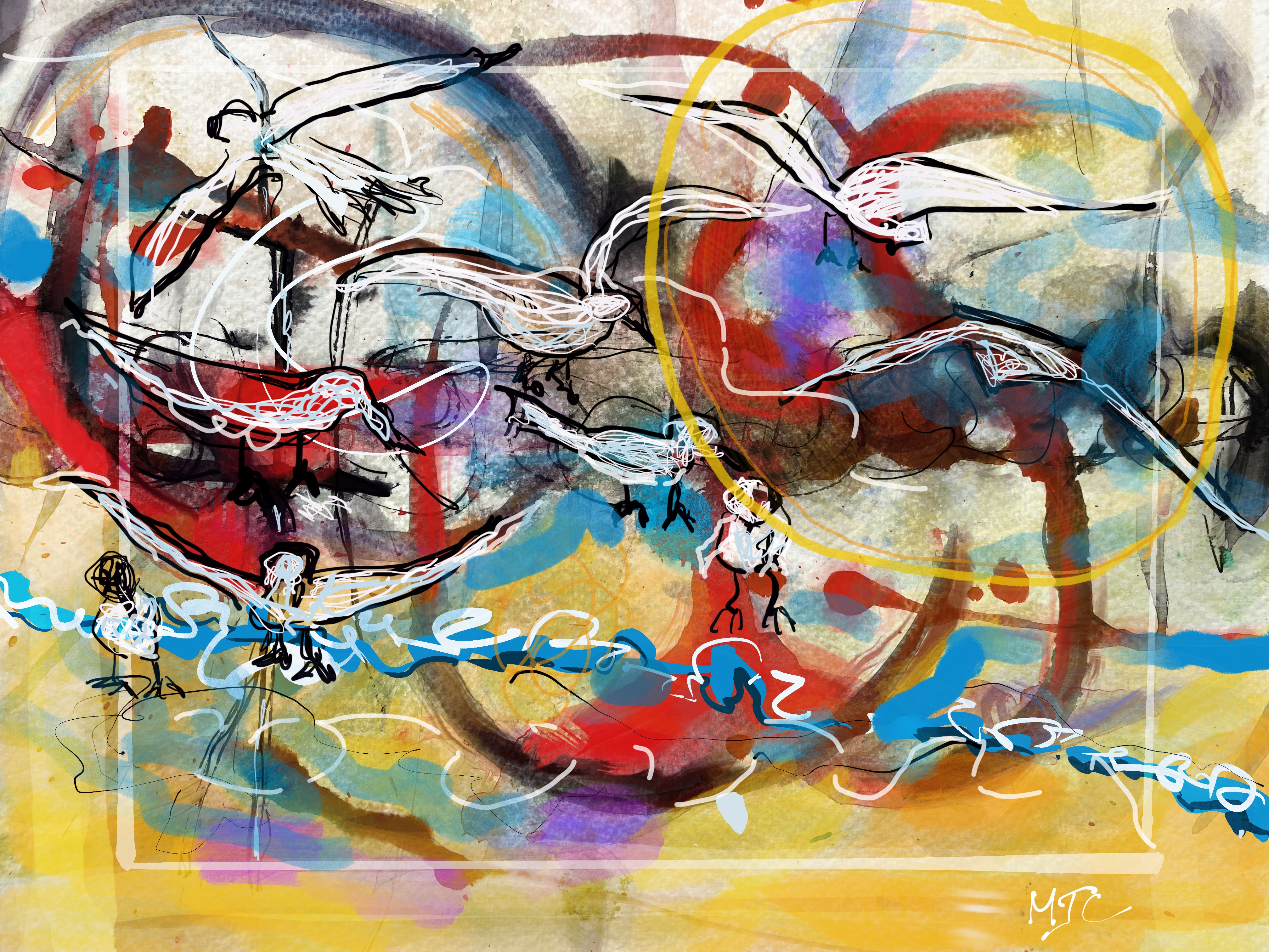
To do this, I started by preparing a background of wet-on-wet watercolors on paper. Once this dried, I then watercolored over it and also used ink to complete the painting. The resultant painting called Perspective 3 is below. It did have the desired feel of commotion while also adding new lines and shades of interpretation.
.
Perspective 3: Watercolor on paper, 8” x 11”
Moving on, I tried again, this time asking, can I replicate this painting using a digital arts package such as Procreate?
I started by using a photo of the same wet-on-wet watercolor background that was used for painting Perspective 3 and super-imposed graphics over it. The birds were superimposed over the photo as were shades of color and selected lines. This was experimental on my part and was a first attempt at actually using digital arts for a painting . Here is what happened (Perspective 4).
Perspective 4: Digital Art using Procreate on an I-Pad
It struck me as odd that the only way I could produce Perspective 4 was to print it out, or I would have no physical evidence of my art piece. But that is the nature of digital design.
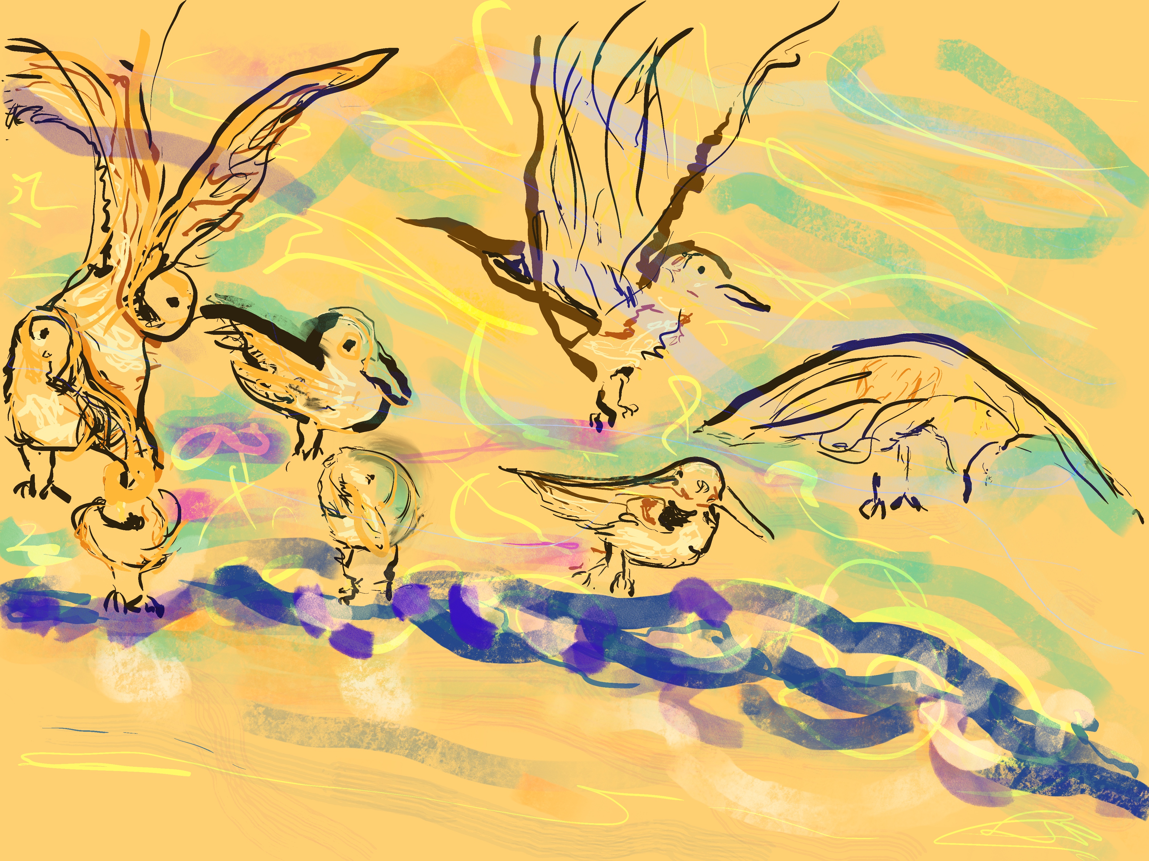
I also did one piece that was digital only, just for fun and it is Perspective 5. This time I focused attention to the birds’ positioning, letting the motion be implied by the waves .
Perspective 5: Digital Art
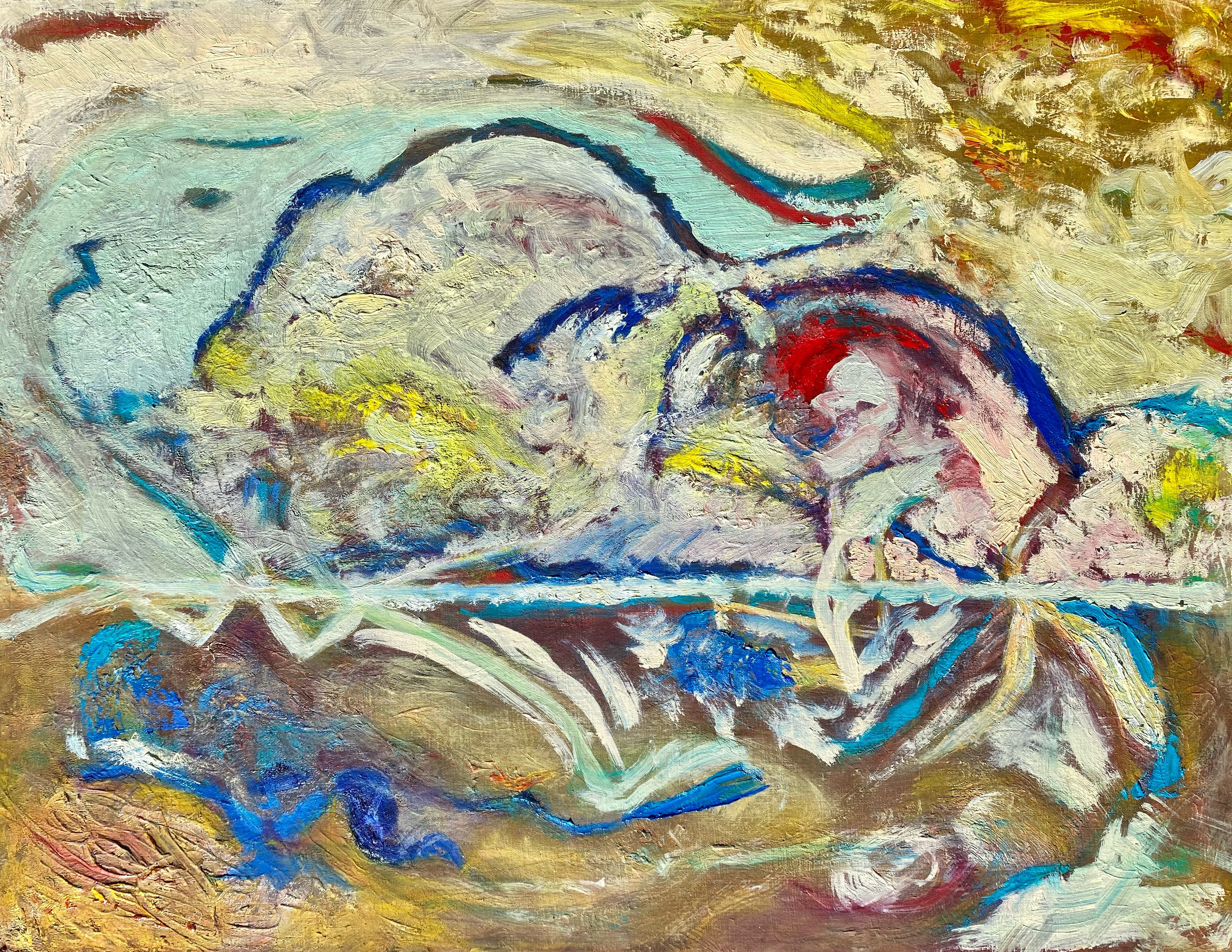
Finally, I returned to the physicality of oil paints and canvas and tried the same idea as an abstraction and this is what happened.
I continued to keep a similar structure in my mind while attempting to tell the story of the birds through color variations, brush movements and paint textures. My goal was to leave the feeling of moving water and birds without actually painting them as objects, resulting in Perspective 6.
This was also a challenge for me as I have struggled to reach all the way to abstraction and beyond impressionism. This time I think I made it.
Perspective 6: Oil painting on canvas,” 22’ x 28”
What did I learn from all these variations on the same painting?
What I learned is that the perspective that I take affects the outcome more that I ever might expect, even when the goal or intention of the painting is roughly the same.
As an analogy, if I were writing a story and I choose to write it in the first person, or the third person, it changes the orientation of the story. If I choose this actor or that actor to play the part in a play, or make a remark, the perspective of the story subtly shifts. If I choose these words over others, the entire mood of the short story may change.
The resultant stories that we tell or write have their own lives, independent of the writer’s or the story teller’s original intention. This is true, as well for art.
I believe that this is why it feels so daring to paint and why sometimes people may initially shy away from trying it. It is because each piece of art has a life of its own. It is because of what we may reveal in the process and may not necessarily expect. Perhaps we don’t even initially know this is going to be the painting we have in mind. But now that it is completed we see it as a real and independent construct that may, perhaps, be scrutinized by others, reinterpreted and possibly shared in new ways.
It is very daring to go through this creative endeavor, almost always resulting in further development and inspiration.
Landscapes we paint, no matter how big or small, are wondrous moments witnessed through our abstraction.
When thought of this way, there is nothing real about a landscape, other than the fact that light is shifting, objects are reflecting and atmosphere hovering, and we experience constant movement of ideas and thought, while traveling through these variable, natural compositions.
Nature is for painters, our most wild and beautiful challenge. Lucky for us, nature is everything, and we have many opportunities to paint, to write, or simply observe its amazing show.
There is no right or wrong painting or poem as all abstractions are personal.
Knowing this, brings freedom of our own thoughts and choices of shifting moments we remember.
Below are photos, sketches and paintings that I prepared for our class called Creative Color and Luminescence taught by Michael Orwick offered through the Oregon Society of Artists.
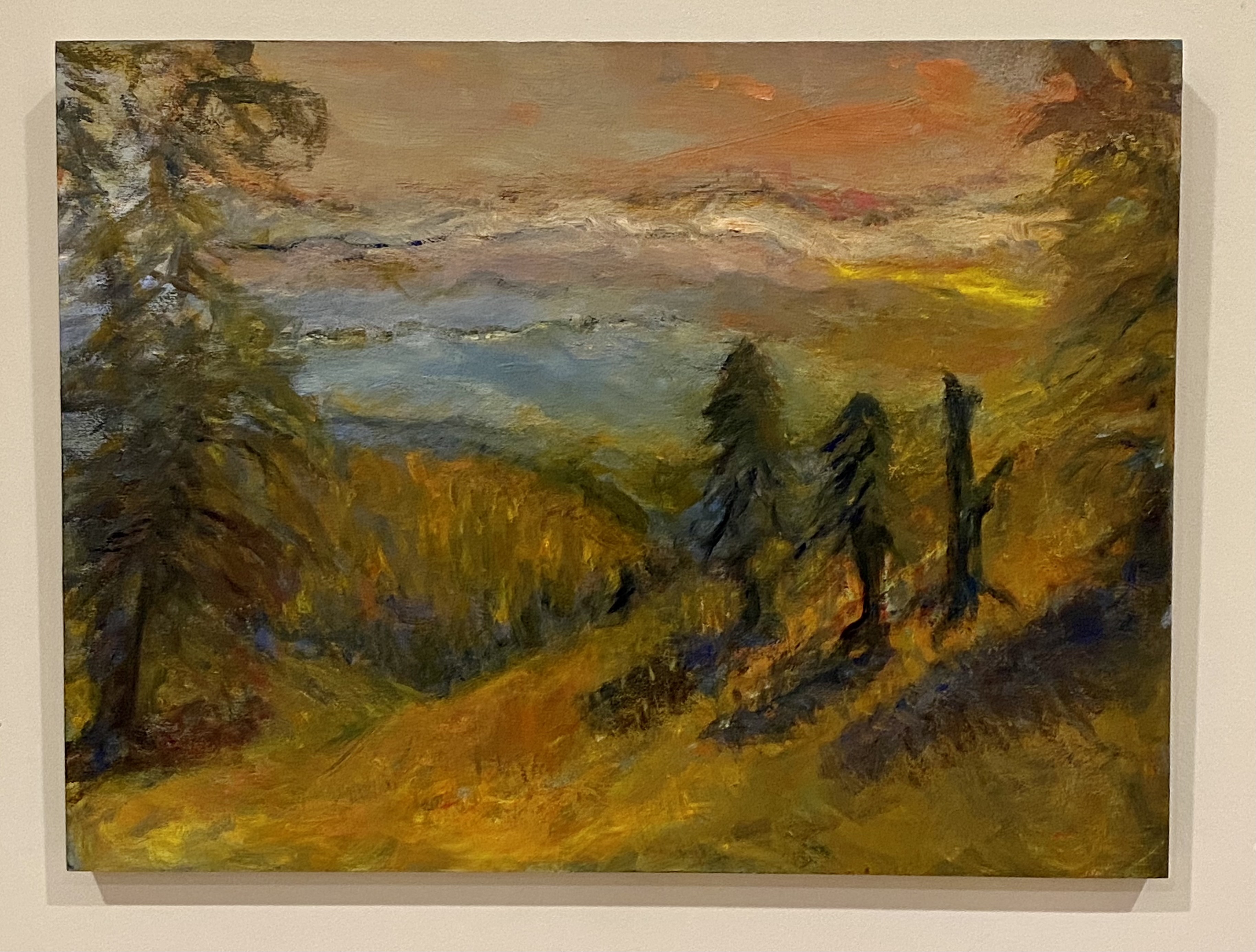
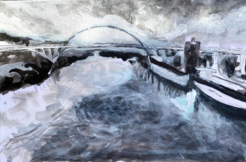
This is an unfinished painting. I have ideas how to soften the red water on the right side and want to do some glazing to smooth out certain parts. For now, I am not touching the painting because it needs to dry a bit before proceeding.
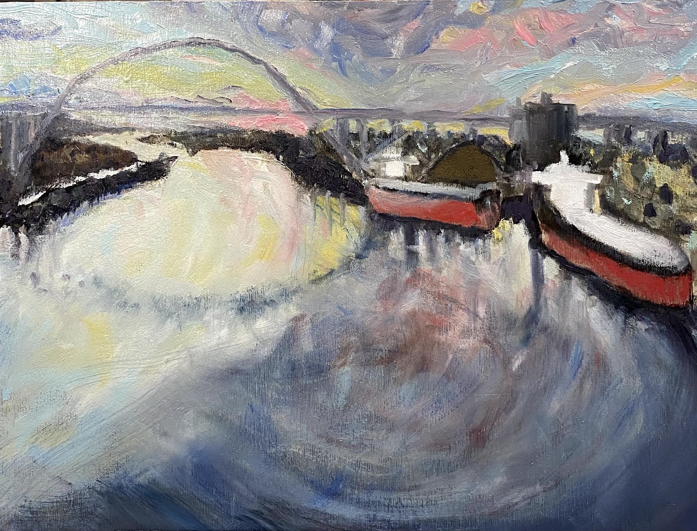
This painting is of a Portland bridge that I started sketching back in January when I prepared ink sketches of it for variations in Michael Orwick’s earlier course on design and composition. I have now carried these earlier sketches into the current class on Creative Color and have begun painting it using oil paints on a birchwood panel.
Portland Bridge, unfinished oil painting on birchwood panel
This week we turned our attention to color value and as an assignment, we broke down colors on our palette into gradations between very light and very dark values of the same color. We also began painting color perspectives of our planned composition. Michael Orwick spent three hours with us on zoom, detailing ideas and illustrating color value. It was a very good explanation and I learned a lot.
He asked us to summarize our aha moment and here’s mine.
In landscape paintings, clouds are a big part of the sky’s atmospheric infrastructure, bending light and casting shadows altering colors and their hues. Similarly, on the ground, trees, buildings, hills and mountains are important parts of land’s infrastructure again bending light, casting shadows, altering colors and their hues. Paying attention to the horizon helps to illuminate how these big natural infrastructures interact when light is infused into the picture.
We use our paints to sculpt and make textures while also measuring brightness and shadows. The system of mixing colors for specific purposes may create moods, alter reflections, enhance shades and encourage brightness and may intentionally create feelings of harmony or disharmony, as needed. We spent time considering how color does this, by shifting values, varying brushwork or color marks and color mixing. Here is my takeaway from this week.
Color is all about perspective.
Colors may have value which can be deepened or softened according to whether they are:
in the sky;
their proximity to the horizon;
how light is being infused (i.e. angle of the sun); and
according to the shapes and angles of objects around them.
Understanding this about color, we ask as we plan a painting:
Where is my horizon;
Where is my light source;
What is my color harmony (could be seasonal, time of day, mood, feeling.; and finally,
What is my mother color? Reference to mother color summarizes the predominant color of a perspective.
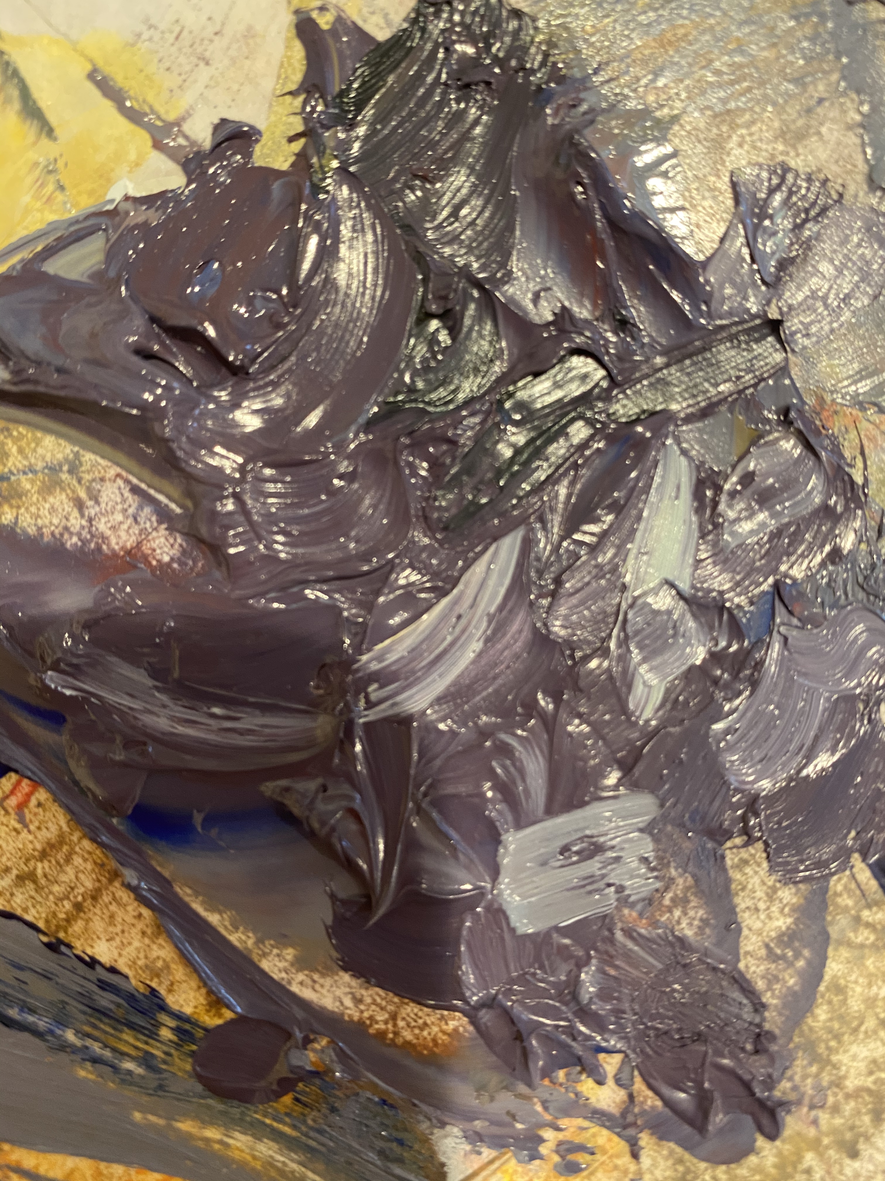
If I understand correctly, the mother color is not a “true” color based on the facts of an observation. It is instead, the color we might choose to mix in all the other colors of the palette while painting, to encourage harmony. In the case of my painting up above, I consider purple to be the mother color. I mixed up all the colors in this painting to see what color I would get, and here it is. This would indicate that I will get soft shadows from the palette I have chosen. It is late afternoon in this painting, and the soft purple light over the Willamette River pervades.
Learning to use color in a painting is like learning how to drive a car. One’s beginning understanding may be that we must know how to turn on the car, stop, go, and turn the steering wheel. With time, we learn the necessity of checking our mirrors and estimating angles of the car to comprehend where we are and how moving our car will impact on others and their locations.
Color, like design and composition, complicate art in the most wonderful ways. It is much the same way mirrors complicate driving…but also improve the experience.
I expect to add glazing to this painting for harmonizing colors and will prepare some speculative drawings for figuring out options on the glazes.
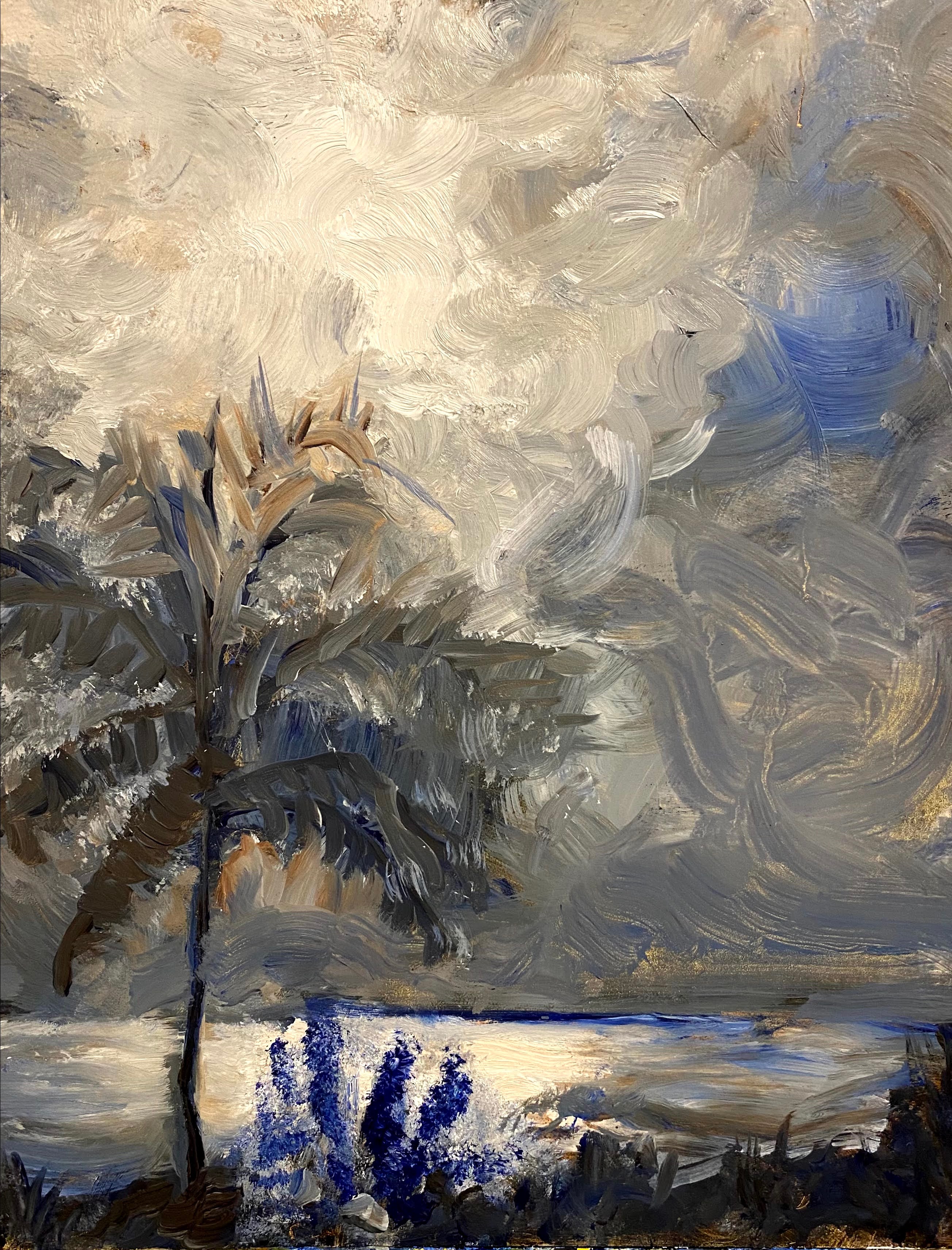
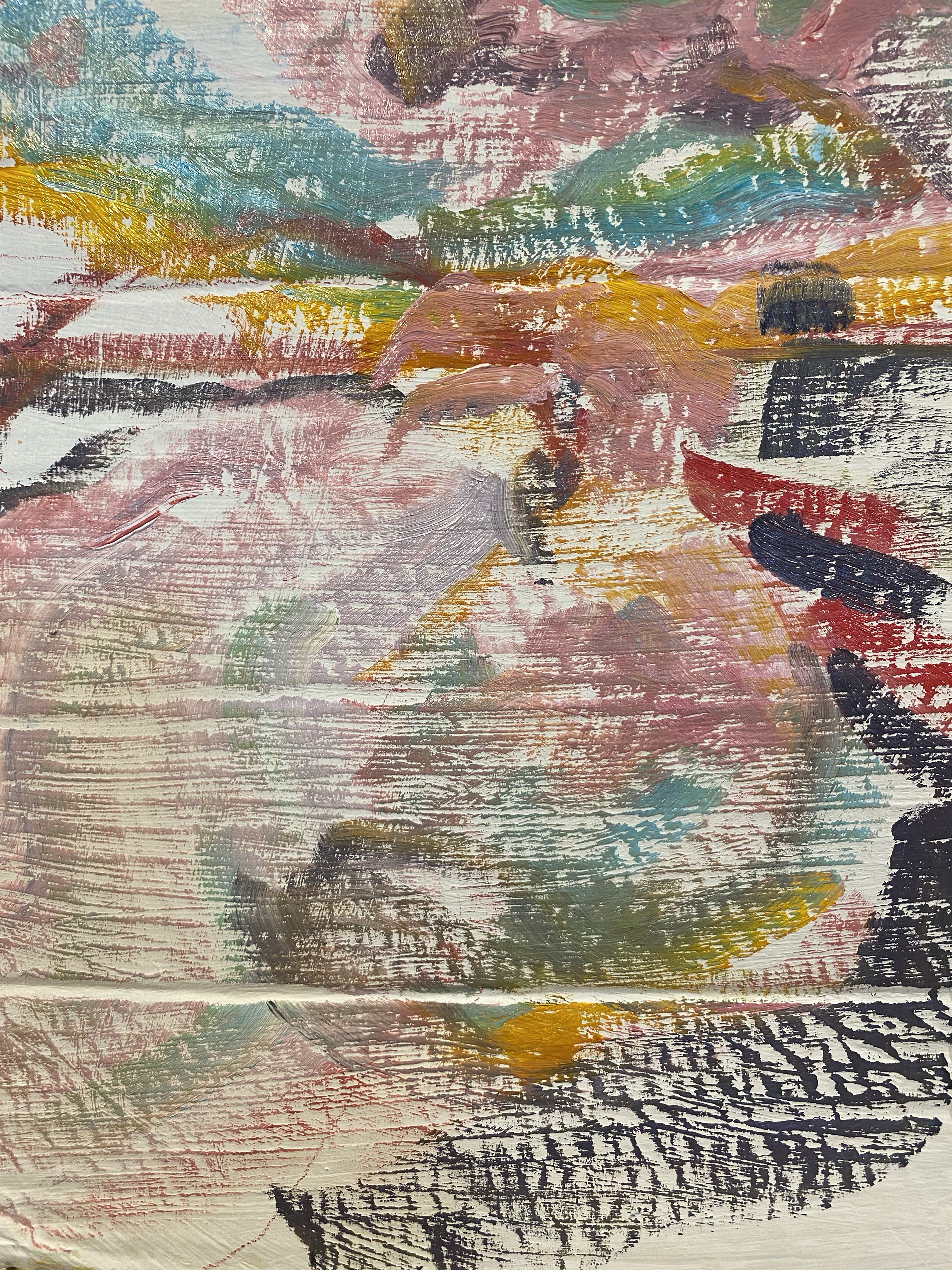
Sketch paintings and glazing options appear below. I have prepared them on on cardboard since I do not plan to keep them, except for this planning stage.
Color options for painting
Color options for painting
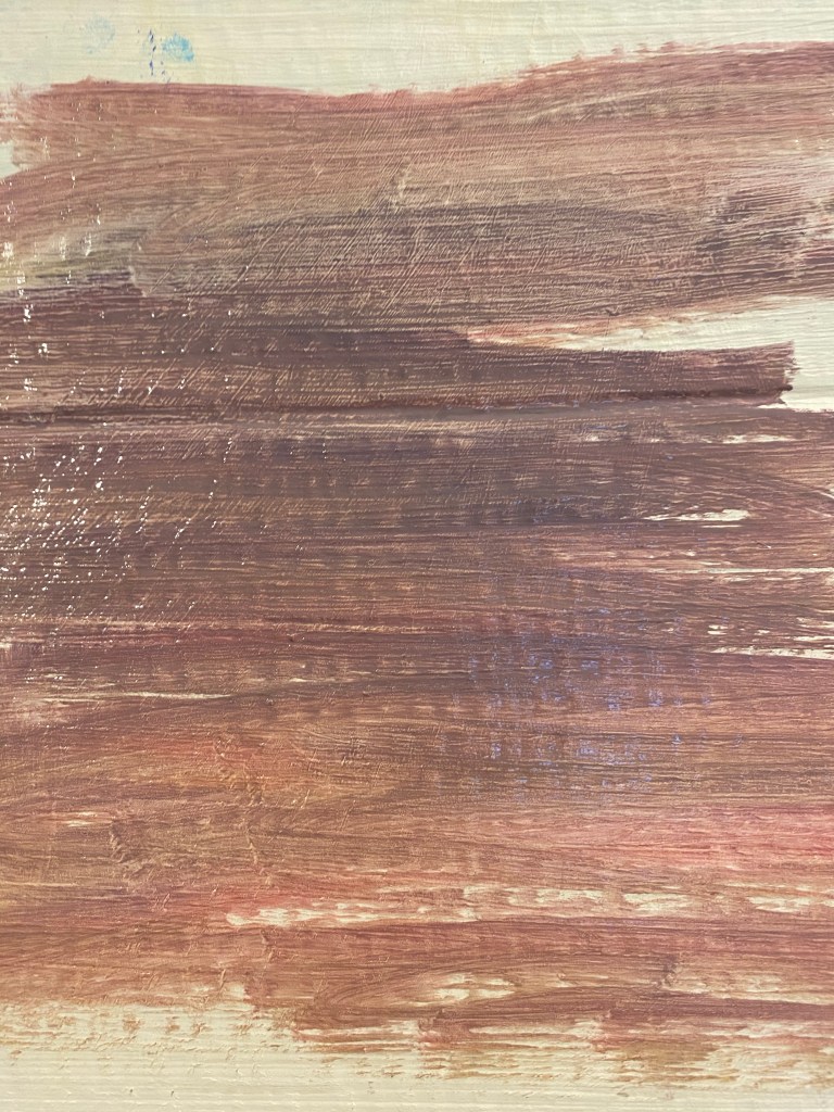
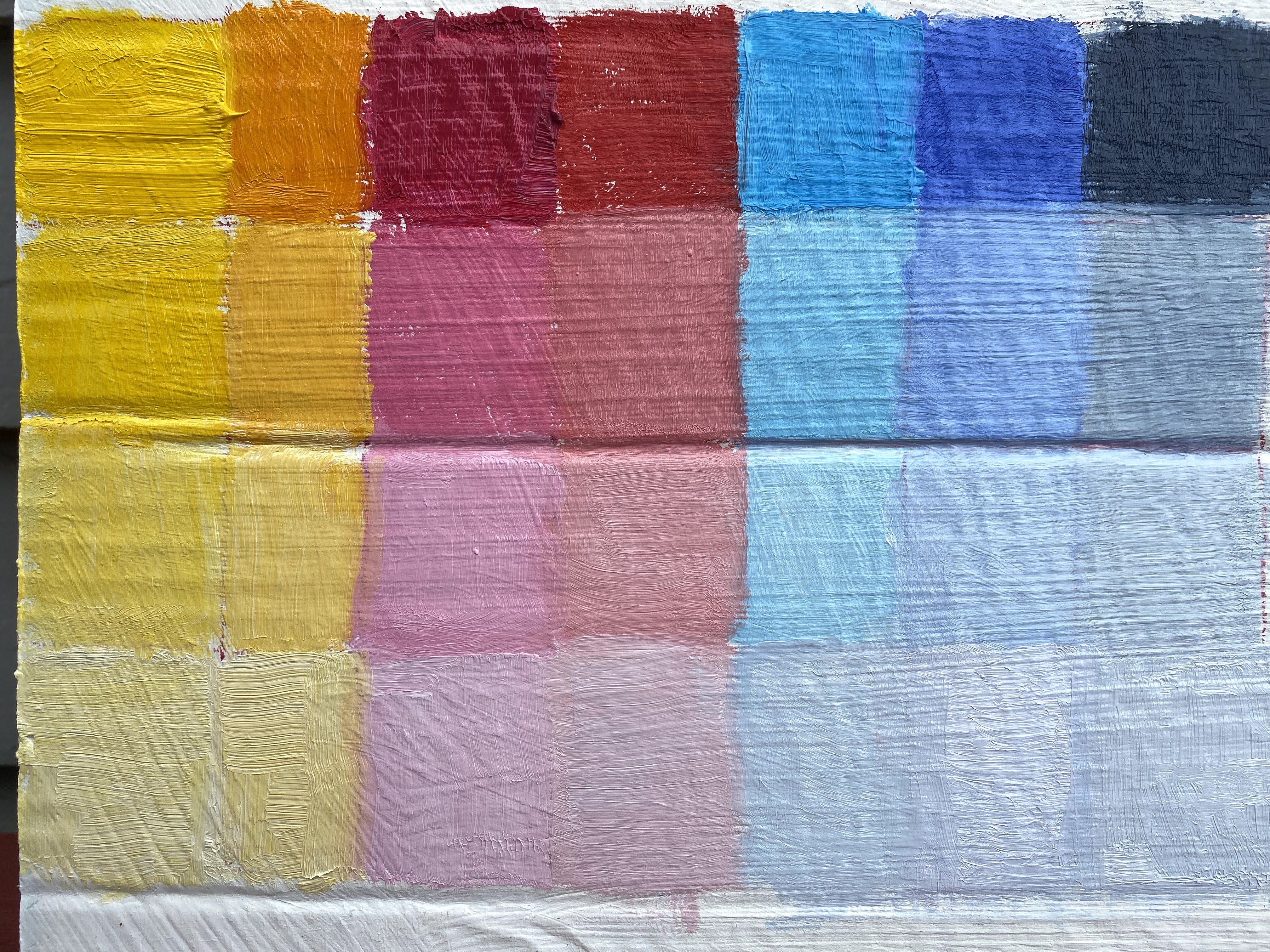
Below, is the graph that I prepared for the class showing four possible variations in color value for each color in the palette.
Illustrative example of color value changes prepared for the course as an assignment.
It is turning out to be very useful that the same painting ideas I chose for the first course are being carried through the next course, so that I continue to work on the painting across the big art concepts that we are being taught. We did not have to do this, but I chose to, as a learning experience and I would recommend doing it again.