Watercolor, with one big brush on a large piece of paper while thinking about a garden image that plays repeatedly in my head. A small amount of detail was put in toward the end of the painting overlaid with a second, smaller brush with special attention to white flowers.
The idea behind this piece is loosely defined mostly by brush movement over multiple watercolor layers with drying times in between.
In the process of doing this larger painting, I also completed a smaller garden piece where I paid more attention to some fine detail, even using a single hair from the larger brush for some of the painted lines in the second piece.
Variation 2, Watercolor 6″ x 9″
I am not completely sure where I am going with these variations, but am mostly working colors with brush, while varying access to water, and holding an approximate structural thought.
Below, is the first one that I completed in acrylic. It was done on a black background which does seem to highlight colors well.
Variation 3, acrylic, 6″ x “9
This project started because I wanted to learn what would happen if I were to try repainting this acrylic painting (Variation 3) that I had done earlier and liked, into a larger abstract watercolor (Variation 1).
What have I learned from the project? Paintings are moving targets. Each has its own character and wit. Even when I think that I am repeating myself, I am not. Variations of a painting are a wonderful way to experiment with technique, while holding a longer thought regarding the structure.
This is a layered, transparent watercolor prepared while applying the operable idea that instead of erasing or starting over when one wants change, one would add paint and brushstrokes to get the desired effect, leading to iterations of darker and lighter colors while allowing drying time in between each iteration.
In the process, the painting may shift moods several times.
For example,
I’m still wondering what I have learned from adding these layers.
Multilayering does encourage the idea that change is inevitable, that opportunities for reinventing the painting are plentiful and it certainly reduces one’s attention to feelings of regret, or focusing on flaws while feeling that nothing can be done about it.
I also see from this exercise how many opportunities crop up when you keep playing with a painting.
By adding layers, it may not always be a better painting, but it will at least be different. It may solve one problem while discovering another. It may also lead one to look into the painting by analyzing the many layers as they emerge, potentially leading to new techniques to be applied more consistently in the future. Or perhaps one might learn to be more exacting and touch the paper only once, much more deliberately.
Sometimes, when observing or painting in watercolors, I find that I have a choice of viewpoints. There is the artist’s view of the painting and then there is the outside reviewer’s perspective.
Is it what the artist sees or is it the perception of others that one hopes to illuminate?
Does the artist aim at controlling the observer’s reaction to a painting or should the artist aim to express their innermost thoughts vis a vis their art without regard to the observer?
How might one strike a balance? And why would one do so?
I have come up with my own approach to this balancing act.
I develop my own idea of what I want to paint.
I paint what’s on my mind.
Once drafted, an outside observer may comment on it or ask a question about the meaning or appearance of the painting.
At that point, I am interested in listening to what they are saying
I try to better comprehend what their observation or question means, in light of what I intend for the painting.
I have learned that when an observer focuses on one aspect of a painting, I may look at the picture elsewhere in order to adjust what they see.
If they say, for example, that an area seems too dark, I may look at other areas of the painting to improve on how colors contrast or how depth of color might be adjusted to better highlight the painting.
These interactions and reactions lead to changes in the painting that are often very beneficial.
If I simply modify something based on the observer’s comments without any analysis, I have lost an opportunity to interact with them and learn more about what they see in the painting and to ask what are the mechanisms in my painting that cause them to see this.
If instead, when I listen to their observations and then analyze them while considering my own intentions for the painting prior to changing anything, I usually gain a clearer understanding of the relationship between my painting (myself) and an outside observer’s viewpoint.
This is beginning to sound like an existential analysis of a painting.
Perhaps that is what it is?
I paint, therefore I am?
You view the painting, therefore you are?
The painting is our interaction.
Much like music and writing, we learn through our exchanges.
It may be useful to conduct multiple interactions before concluding a painting
And now, back to my painting, with these thoughts still in my mind.
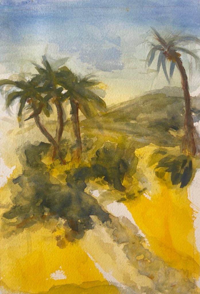
Since the beginning of the year I shifted from oils to watercolors. I am currently staying on an island in the Abacos, Bahamas and while painting, I am trying to to use as few chemicals as possible for cleaning up in order to minimize damaging the fragile environment.
What I love most about this island it it’s natural beauty and am personally hoping to disturb it as little as possible with unnatural chemicals, turpentines, gamsols and other chemically derived substances that are hard to remove from water systems.
When I shifted to watercolors after working in oils and acrylics, it felt like going from using a lot of make up on one’s face to going without wearing any. It takes a while to figure it out. But once figured, interesting results do emerge.
In watercolors, I find that not doing something is often planned way ahead of time and may make a stronger artistic statement than doing something. Less may be more. Soft touches and the timidity of watercolors can sometimes offer big results.
I think this may be why transparency watercolorists try so hard to maximize their use of the paper they are painting on by using the pure color of paper white. It is because they are trying to maximize interest in the painting through the things they do not touch.
Oil painters, on the other hand, enhance their paintings substantially by adding plenty of paint for depth of color, texture and brushwork. This may leave little empty canvas behind, with nothing untouched, to tell the artist’s story. In this case, the paint is the story.
My expectations have had to change when I shift to paper and watercolors. It is a different temperament to work in.
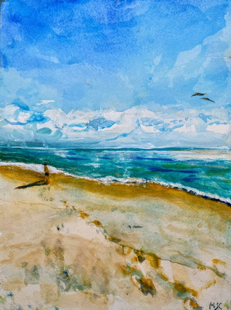
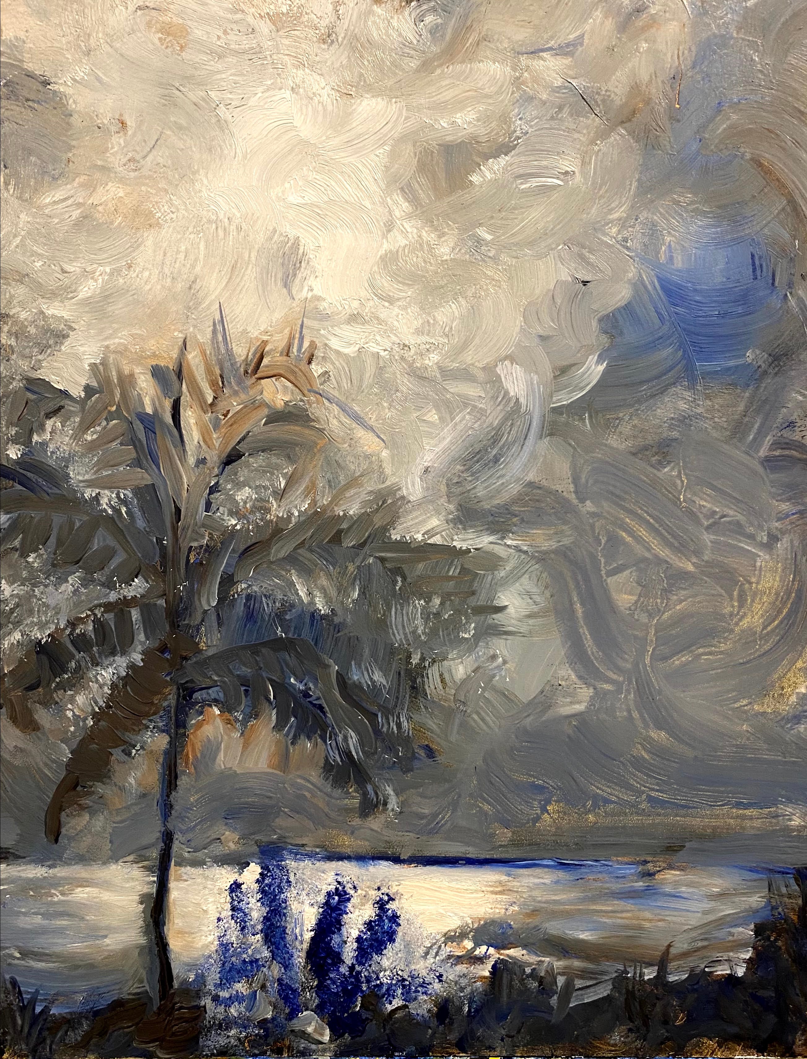
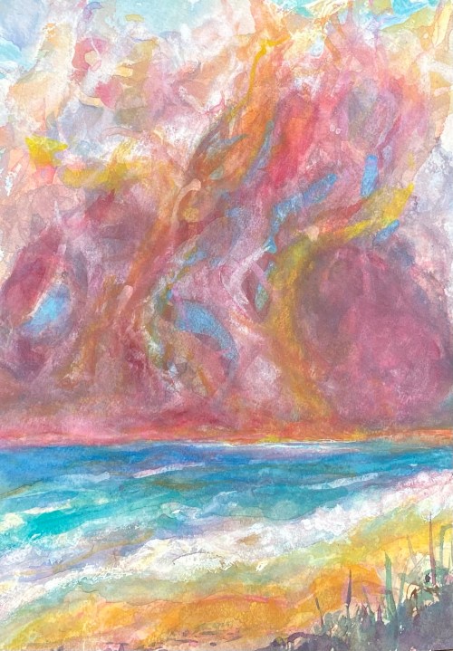
Beach Blue, a watercolorStorm Coming, watercolor
The other challenge is that on our island, the constantly shifting combinations of water, atmosphere and light makes one feel a unity, a oneness about them, that may not necessarily be felt so as vividly in other environments. Here, distinctions between sky, the ocean, and that of light may be blurred, leaving the mind completely boggled by the sudden shift felt in moods and color emphasis of the whole arrangement.
Colors can jump into gear on a second’s notice.
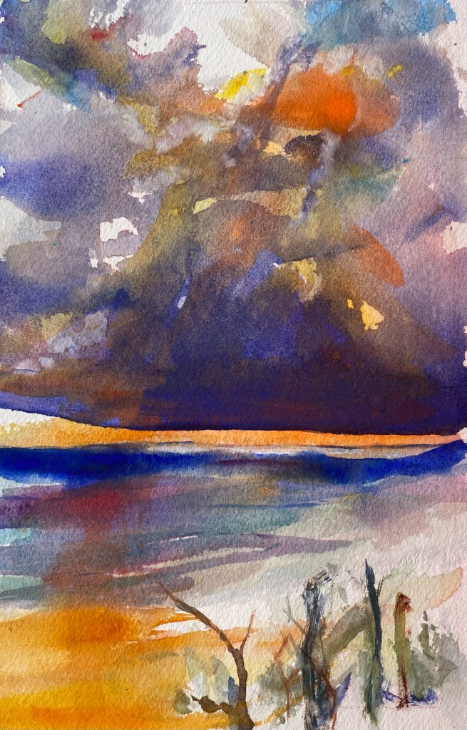
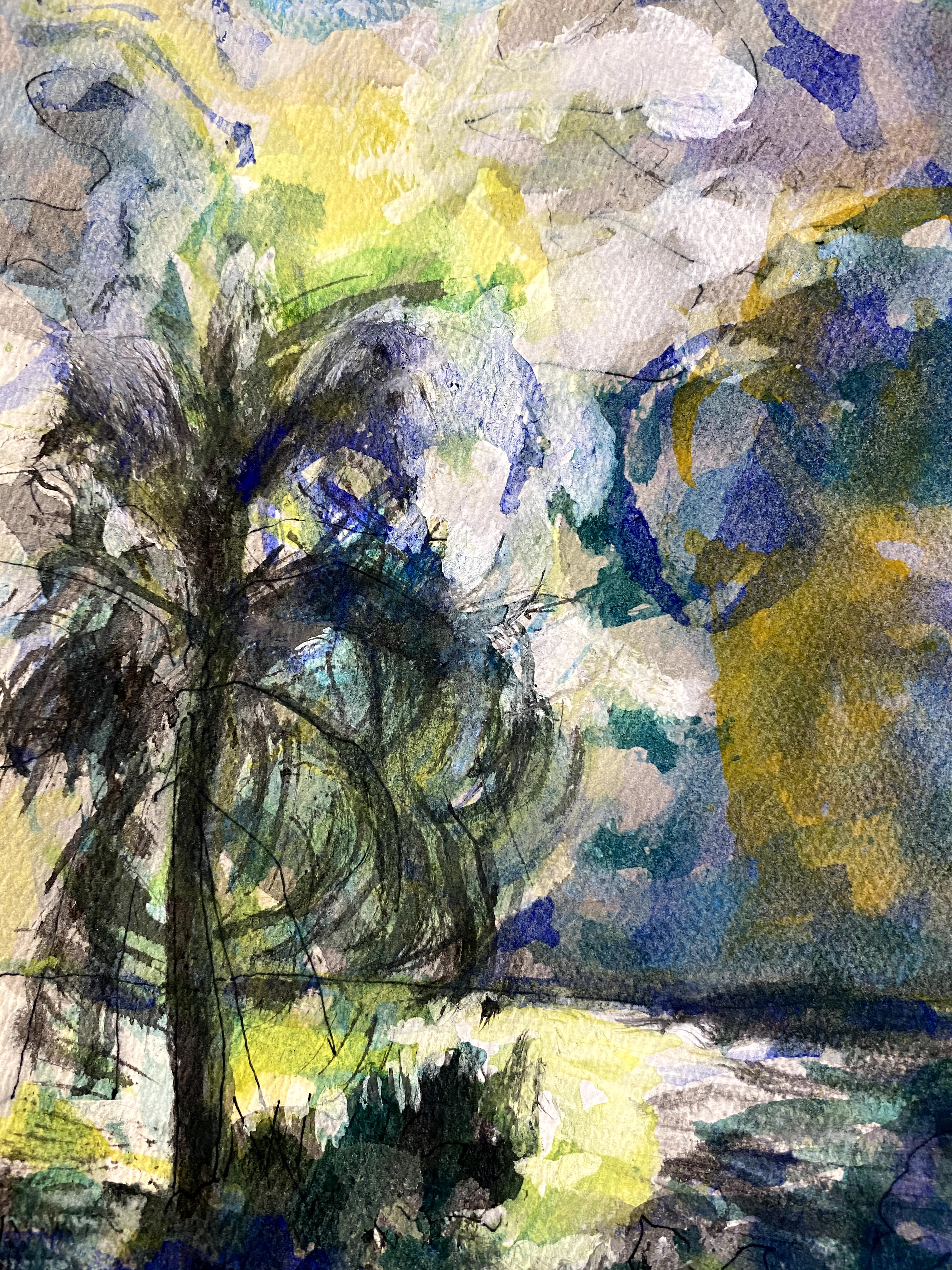
Storm Leaving, watercolorFront Yard, watercolor
Common scenes are rearranged by nature’s dynamic, moods are shifted through rapid transitions in light and humidity, our observations bouncing about from rising and lowering tides and winds. This whole sense is ephemeral, further feeding into our awe of all the temporary beauty.
Here I am, with my watercolor paints, brushes and paper, reflecting on this.
Art is my muse. From art, I receive an endless supply of inspiration.While I like to think that I an in charge of the creative process and am inspiring the painting, I am finding instead that the creative process of art is actually inspiring me.
Here is an example.
The idea of painting a bird series started when I was doing a small watercolor on one of those commercially produced blank watercolor cards that I planned to send to a friend (Perspective 1). Unexpectedly, this small watercolor painting on a greeting card became a source of inspiration for an exploratory series of paintings experimenting with alternative media.
At first I asked, how might this painting have looked if I had used oils instead of watercolors?
Perspective 1: Watercolor and ink, 4” x 6”
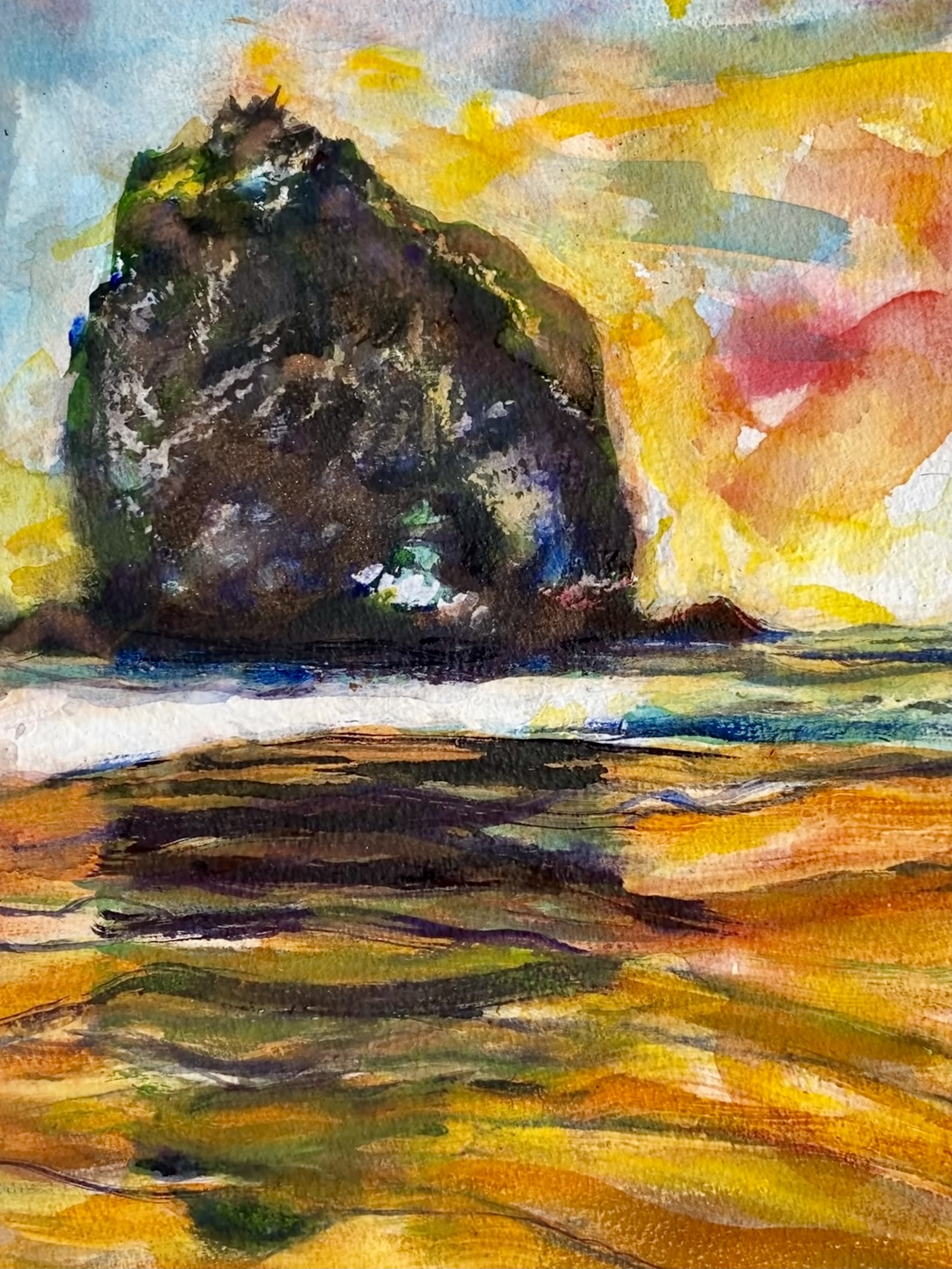
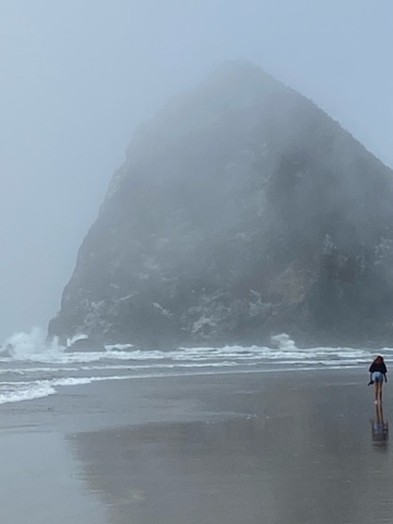
When I first noticed the birds, they were running as a glorious team in front of ocean waves softly rolling into the beach, the birds hurriedly capturing their meal of tiny fishes and bugs from the sand as the waves rushed back to the sea.
It was a few hours before winter sunset on the Abacos islands. The birds and I were standing on the beach in the sharp shadows and strongly contrasting light of early dusk. As I stepped closer to them, the birds fearlessly continued to shift back and forth with the waves, their legs moving quickly and in unison. It was fascinating to watch them perform with such measured uniformity of step. When I walked a bit too close for their comfort they started to skitter away.
And it is that particular moment, when they shifted their attention, that I wanted to paint.
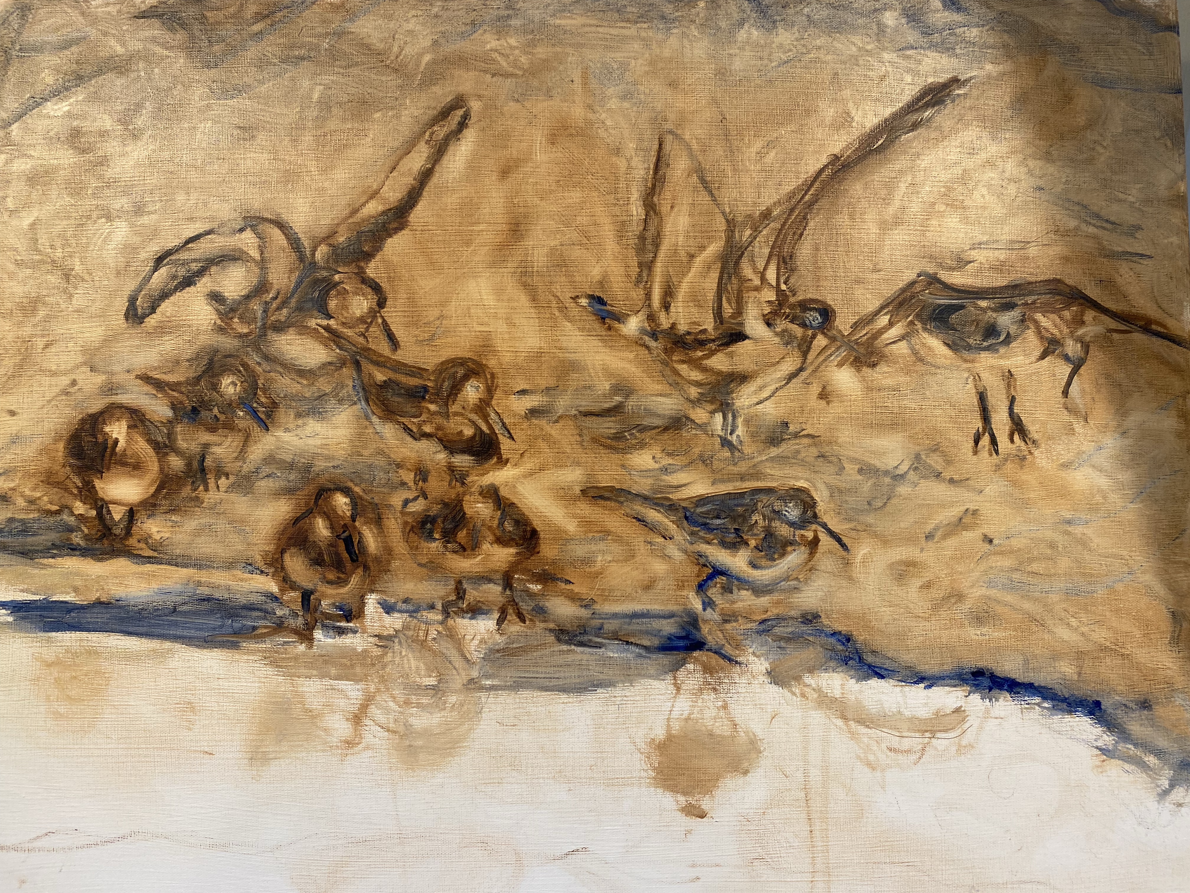
Perspective 2: Oil painting, 22” x 28”
After completing the small watercolor sketch (Perspective 1), I decided to try again in oils on canvas, this time with greater attention to the late afternoon ocean colors, but still using a similar structure for the painting, resulting in Perspective 2. This oil painting reflected more stillness with most of the movement being from the waves washing against the shore while the birds stayed in position enjoying feeding time while small waves washed over them.
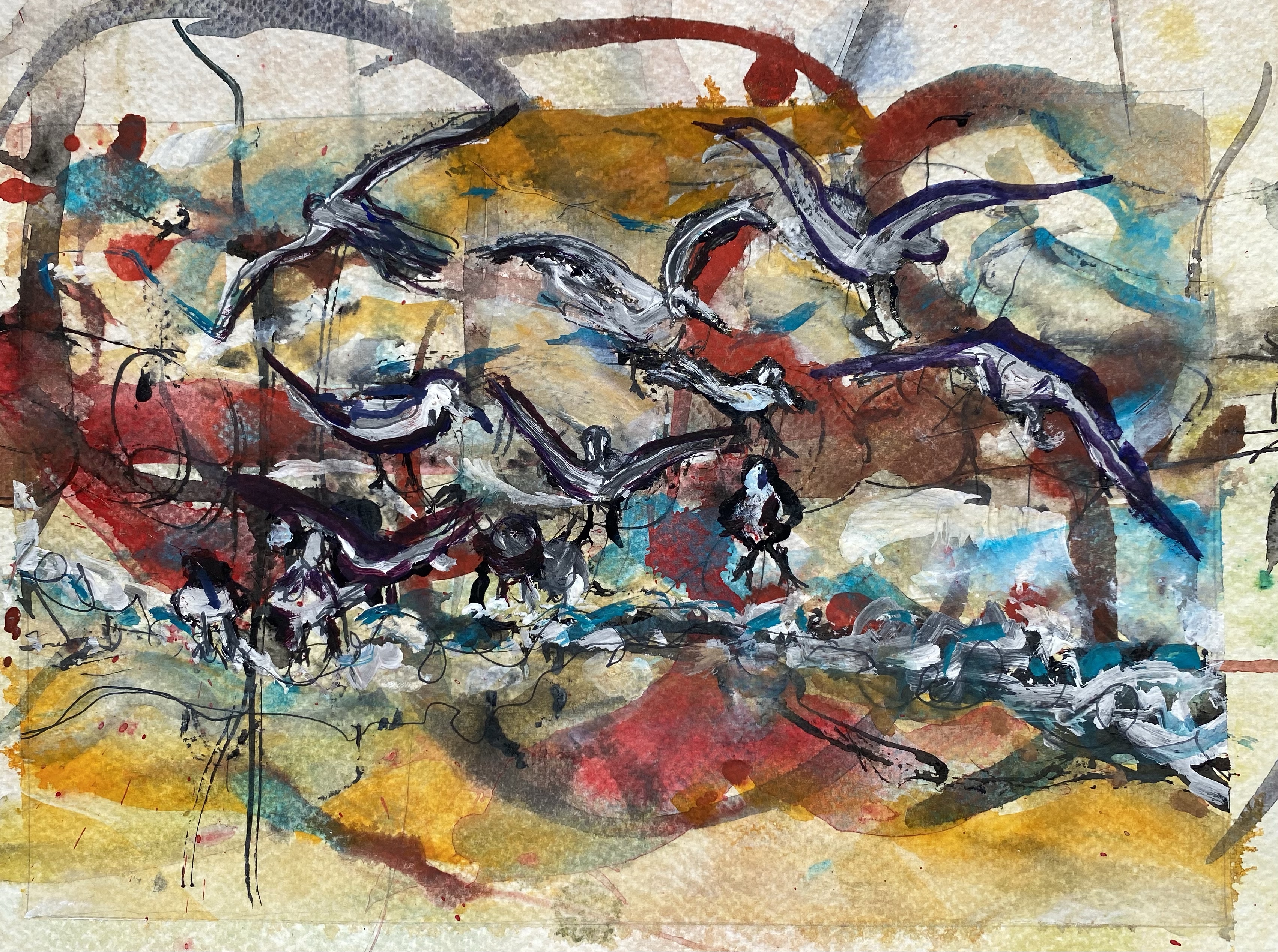
I decided to try the painting again and increase the commotion in the picture.
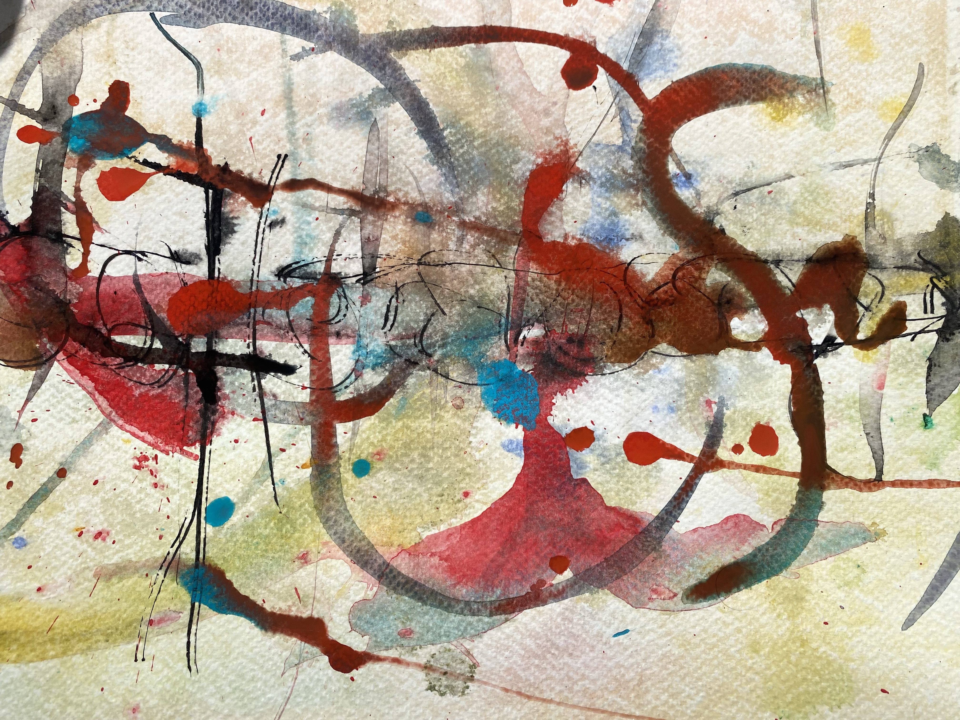
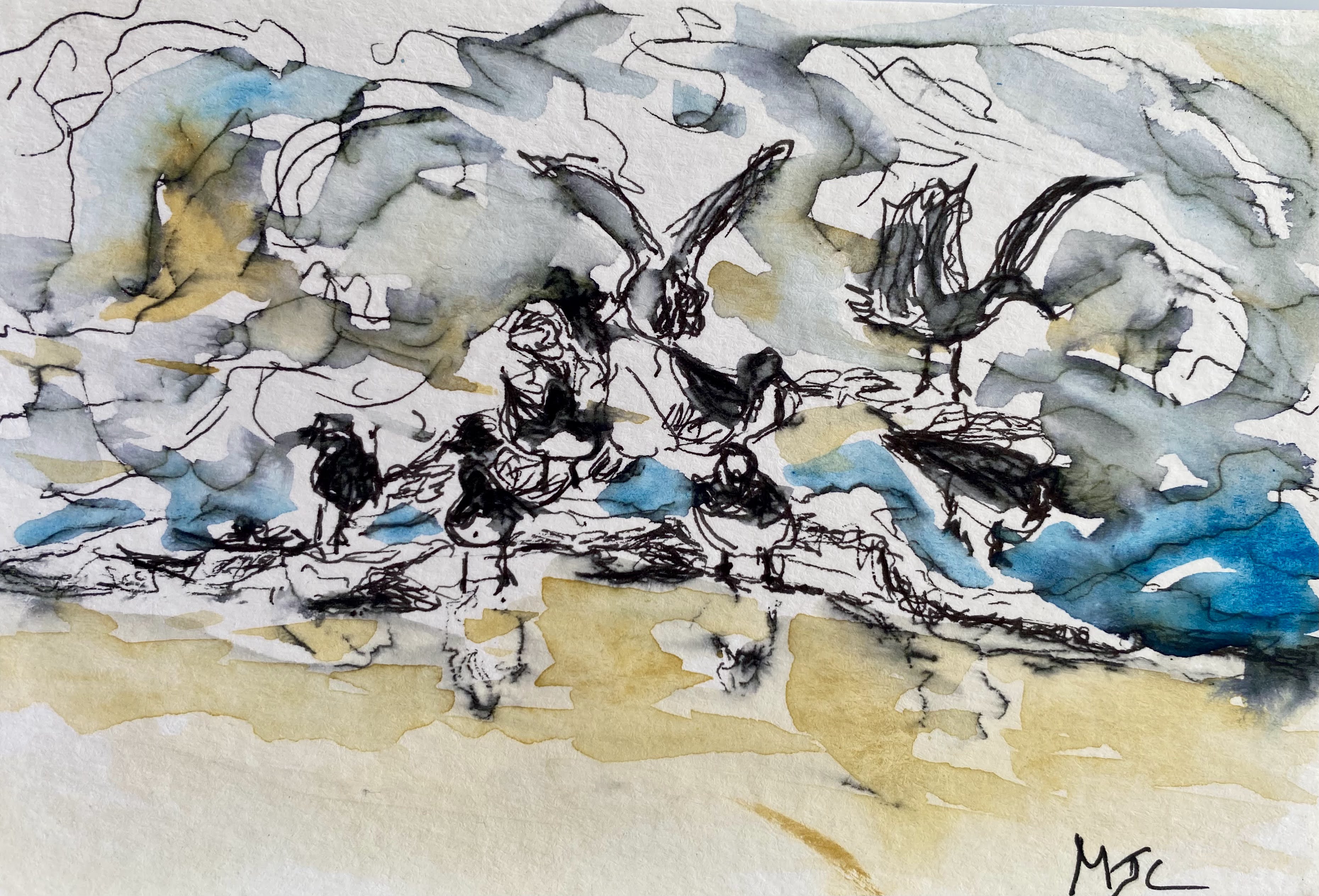
Wet- on- wet background in watercolor
To do this, I started by preparing a background of wet-on-wet watercolors on paper. Once this dried, I then watercolored over it and also used ink to complete the painting. The resultant painting called Perspective 3 is below. It did have the desired feel of commotion while also adding new lines and shades of interpretation.
.
Perspective 3: Watercolor on paper, 8” x 11”
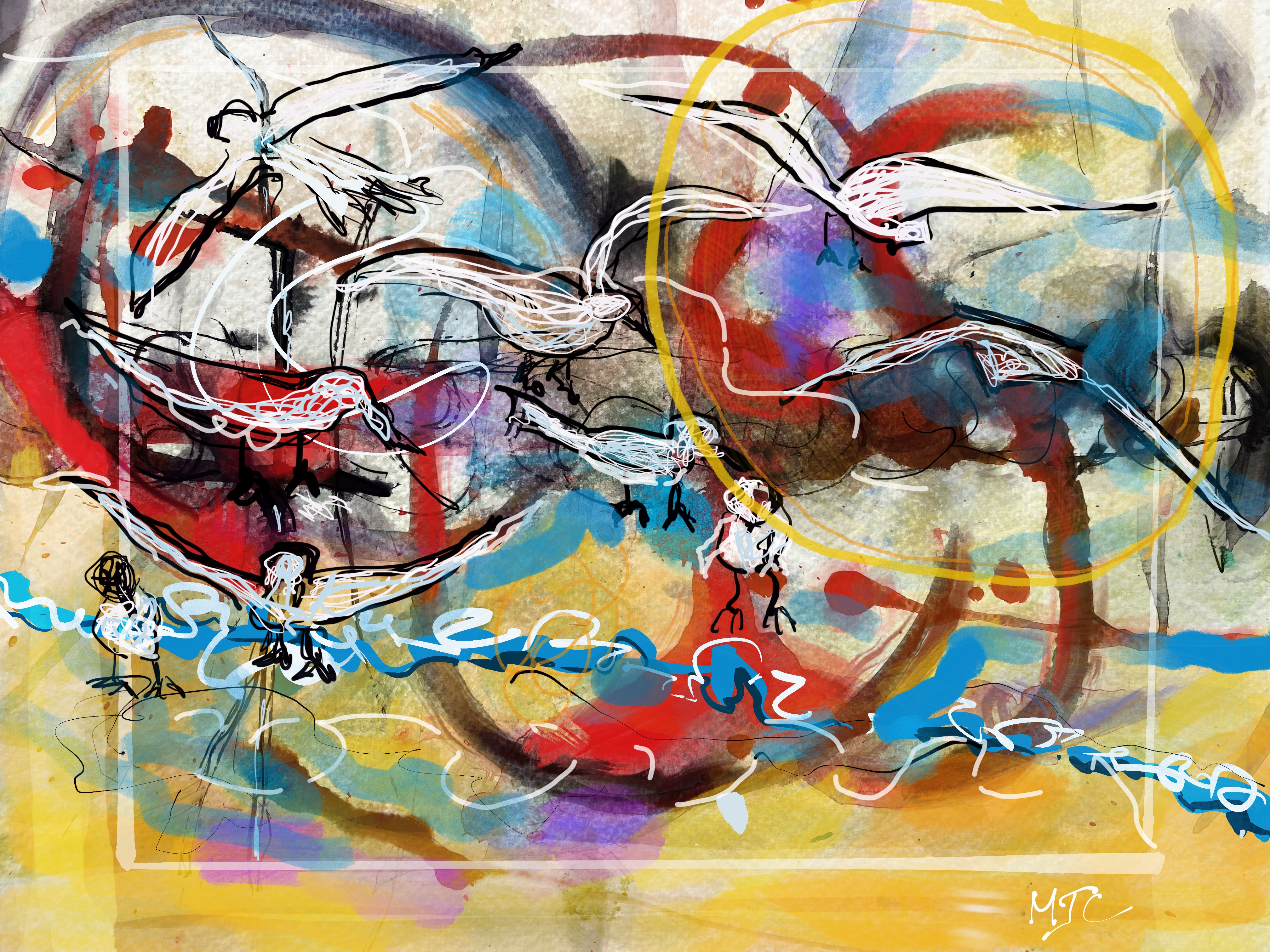
Moving on, I tried again, this time asking, can I replicate this painting using a digital arts package such as Procreate?
I started by using a photo of the same wet-on-wet watercolor background that was used for painting Perspective 3 and super-imposed graphics over it. The birds were superimposed over the photo as were shades of color and selected lines. This was experimental on my part and was a first attempt at actually using digital arts for a painting . Here is what happened (Perspective 4).
Perspective 4: Digital Art using Procreate on an I-Pad
It struck me as odd that the only way I could produce Perspective 4 was to print it out, or I would have no physical evidence of my art piece. But that is the nature of digital design.
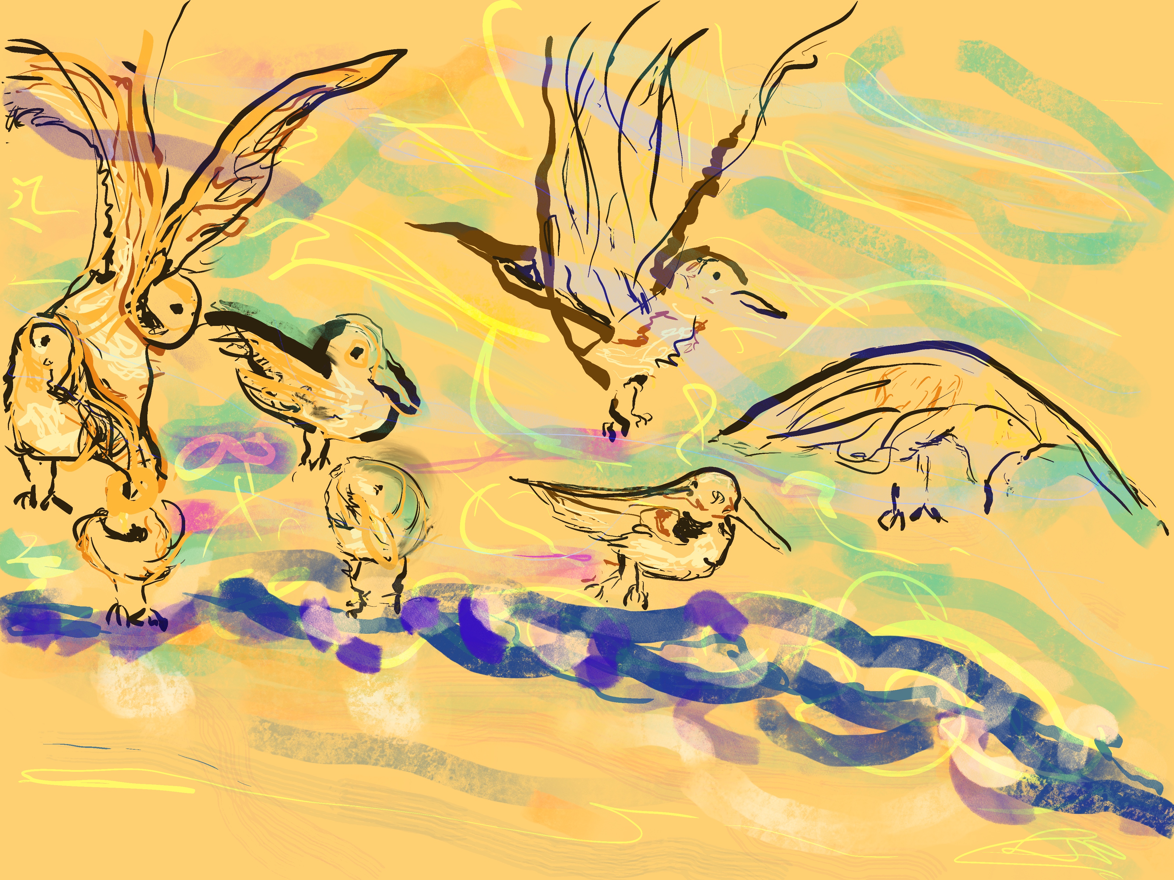
I also did one piece that was digital only, just for fun and it is Perspective 5. This time I focused attention to the birds’ positioning, letting the motion be implied by the waves .
Perspective 5: Digital Art
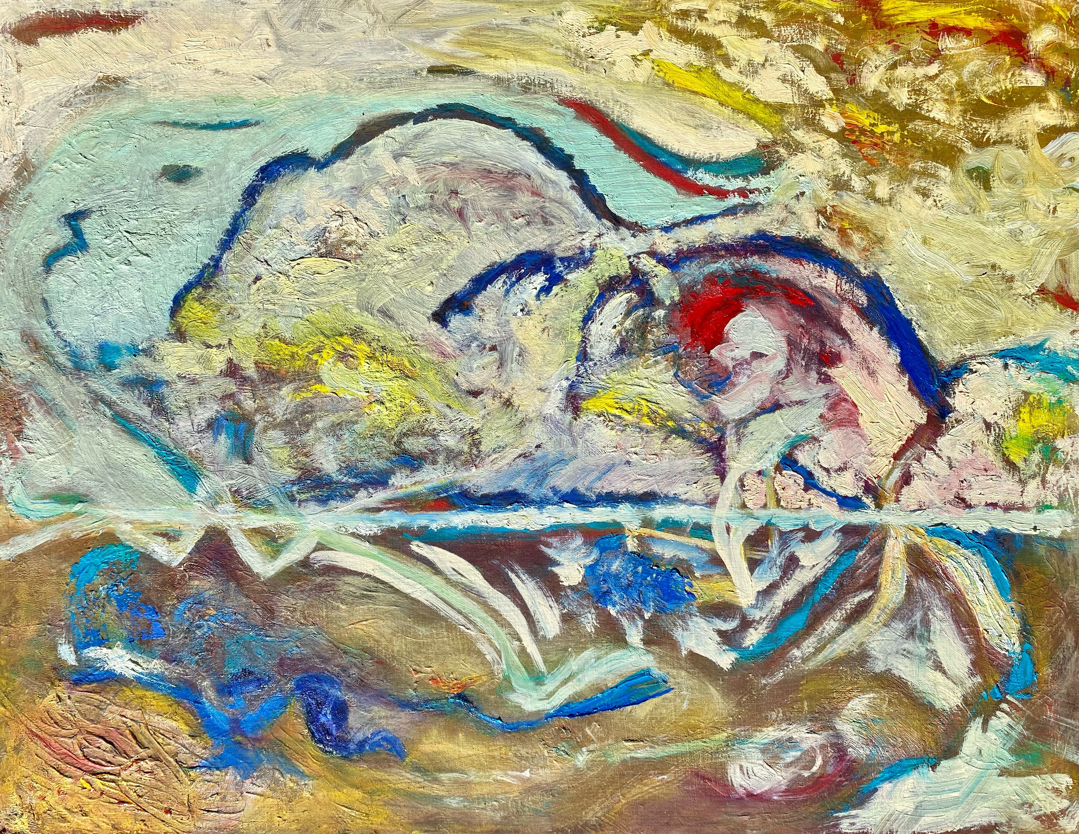
Finally, I returned to the physicality of oil paints and canvas and tried the same idea as an abstraction and this is what happened.
I continued to keep a similar structure in my mind while attempting to tell the story of the birds through color variations, brush movements and paint textures. My goal was to leave the feeling of moving water and birds without actually painting them as objects, resulting in Perspective 6.
This was also a challenge for me as I have struggled to reach all the way to abstraction and beyond impressionism. This time I think I made it.
Perspective 6: Oil painting on canvas,” 22’ x 28”
What did I learn from all these variations on the same painting?
What I learned is that the perspective that I take affects the outcome more that I ever might expect, even when the goal or intention of the painting is roughly the same.
As an analogy, if I were writing a story and I choose to write it in the first person, or the third person, it changes the orientation of the story. If I choose this actor or that actor to play the part in a play, or make a remark, the perspective of the story subtly shifts. If I choose these words over others, the entire mood of the short story may change.
The resultant stories that we tell or write have their own lives, independent of the writer’s or the story teller’s original intention. This is true, as well for art.
I believe that this is why it feels so daring to paint and why sometimes people may initially shy away from trying it. It is because each piece of art has a life of its own. It is because of what we may reveal in the process and may not necessarily expect. Perhaps we don’t even initially know this is going to be the painting we have in mind. But now that it is completed we see it as a real and independent construct that may, perhaps, be scrutinized by others, reinterpreted and possibly shared in new ways.
It is very daring to go through this creative endeavor, almost always resulting in further development and inspiration.
It went through several iterations and is part of a project that I am working on.
Beginnings, in oils on canvas, 22” x 28”
There is a feeling of satisfaction and a type of introspection going on in my head when doing a creative study such as this as I freely put up the colors and textures where I want them, adding them with a joyous sort of freedom.
This is the first abstract I have tried that I sense is complete. It is a complete thought, an idea that I envisioned using a brush and some paints.
I don’t want to touch it.
No mini maneuvering would improve it for me. It is a new beginning, unexplained and free.
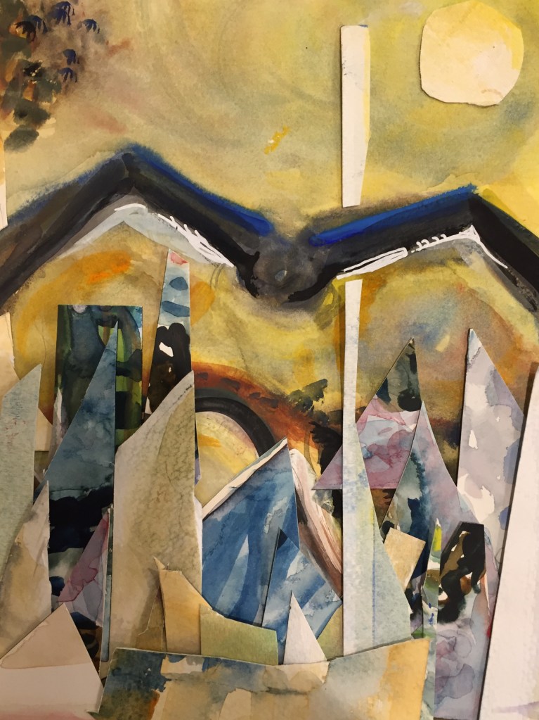
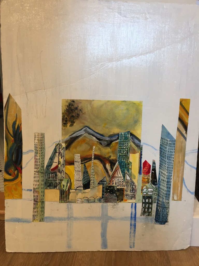
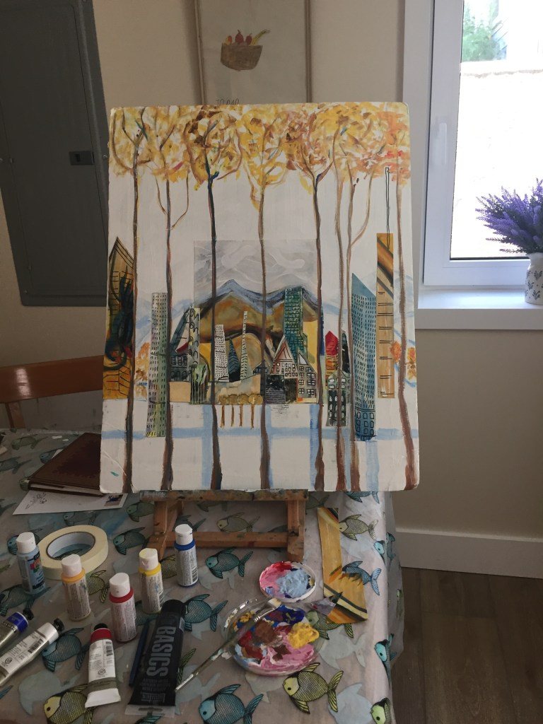
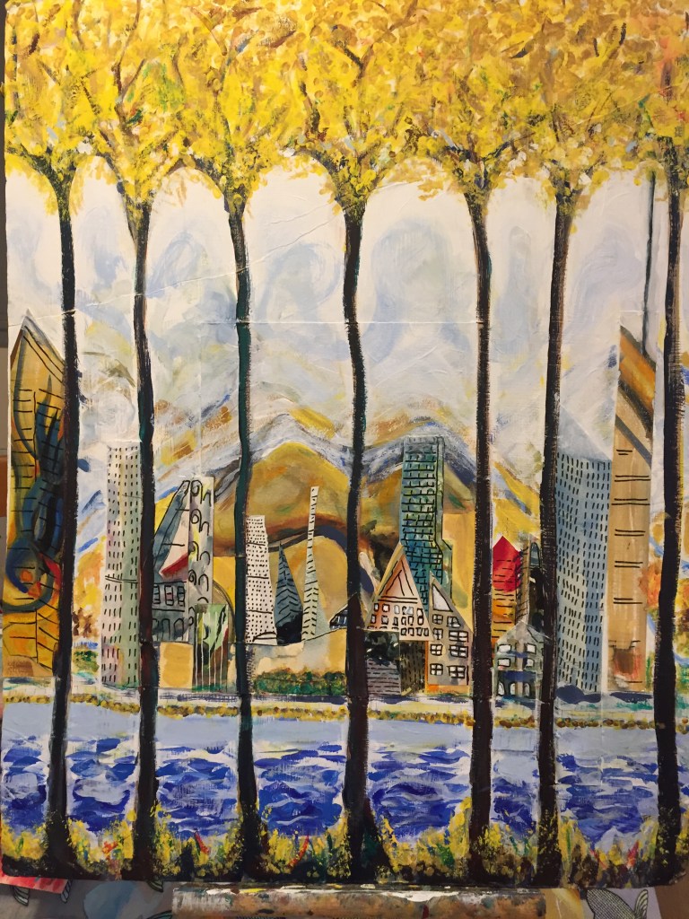
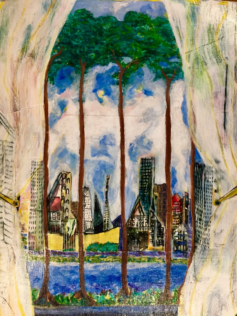
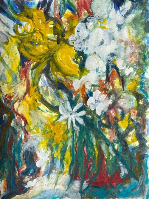
Water color collageCut up pieces of watercolor art glued on poster board
Some time ago when the Global Pandemic was first announced and before there were Covid vaccines, we were in our home for long periods of time. I started taking some zoom art classes. One very enjoyable zoom class was conducted by the artist Poca Kim and was offered through the Oregon Society of Artists.
Painted over with acrylic
Through our zoom meetings, Poca Kim introduced me to the idea of cutting up old watercolor and acrylic paintings to inspire new paintings. I made a number of collages using old paintings that I had no intention of using. I imagined myself peering into cities from what might be a prison, but also might be tree trunks.
At the time that I did these collages, I thought that I was viewing the city from the perspective of the safety of nature. Looking back on these photos, I now see that I was also indirectly messaging the idea of viewing the world from a sort of prison-like setting of a Global Pandemic.
Much like a diary, old paintings tell stories too.
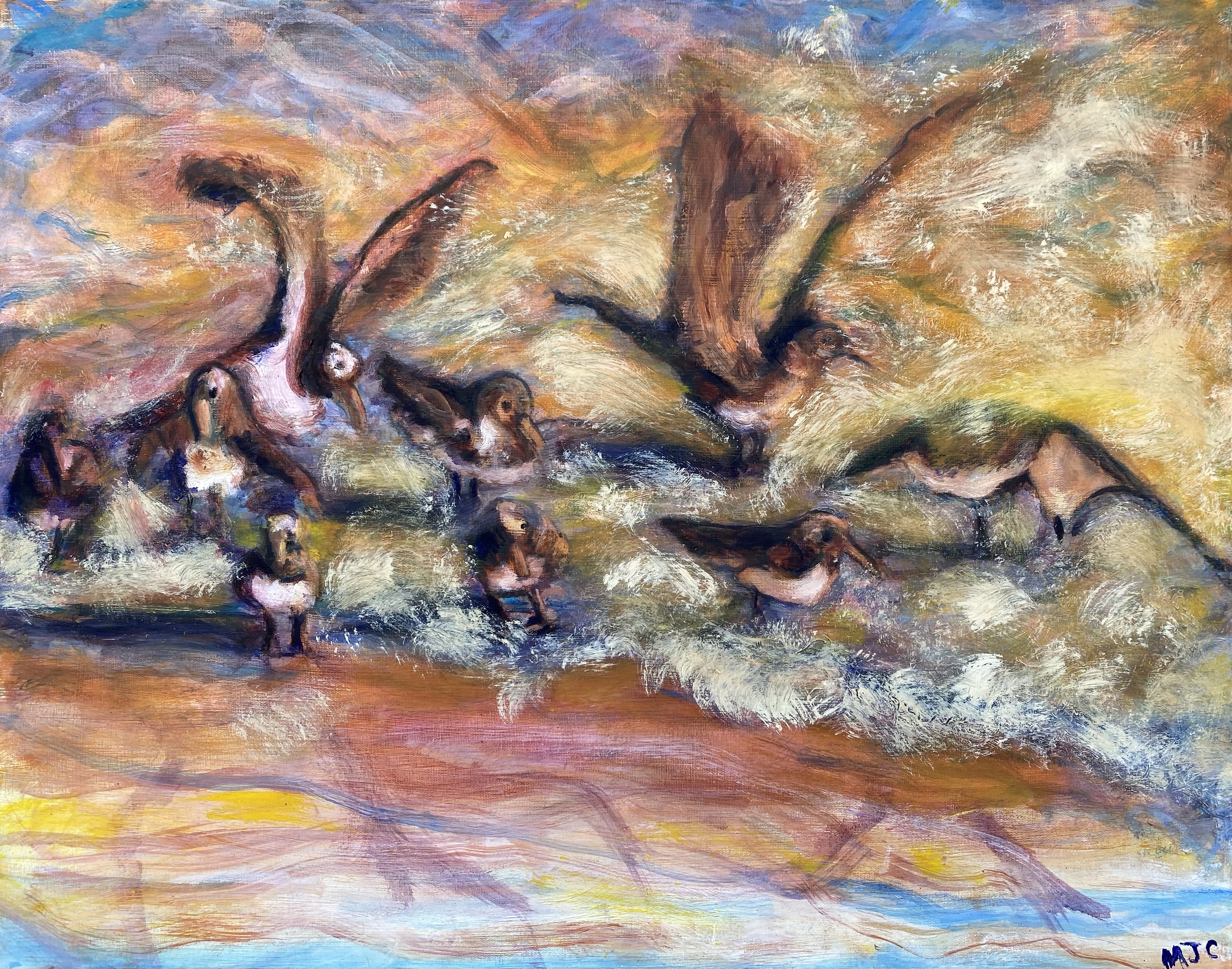
This painting of the birds went through a number of transitions. Each painting that I did on the way, holds personal meaning for me.
I like to paint something using different perspectives, over a period of time. Depending upon my mood and what medium I am using, a painting may be completed in a few minutes. At other times, it may result in a long and more “drawn out” relationship with the subject that has many layers and glazes of paint.
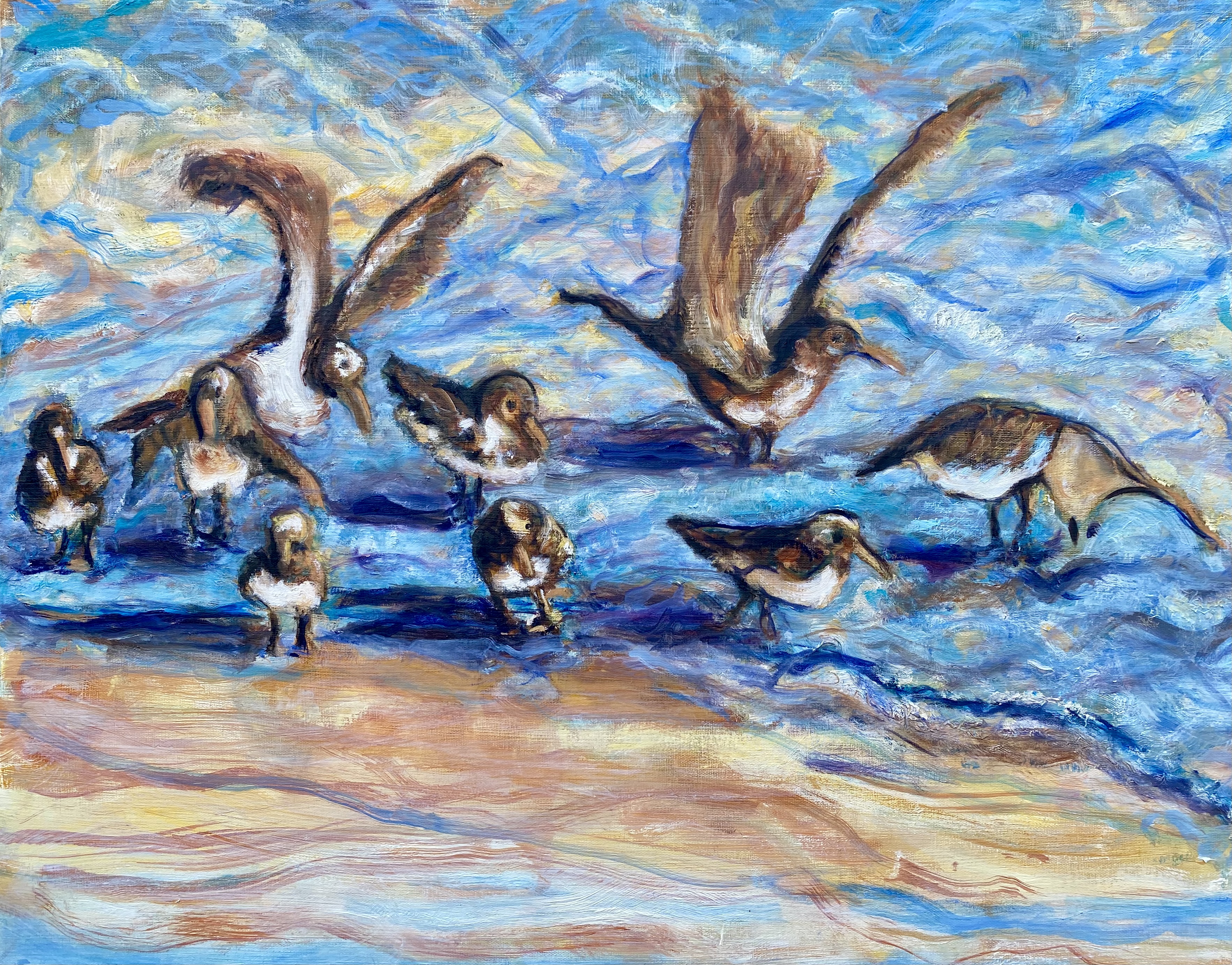
In this water color and ink painting shown immediately below, my relationship with these birds started out in a rather carefree manner. It was a small painting, only 4″ x 6″, and I wanted it to be an inspiration for a larger painting on the same subject. I did this watercolor and ink in a matter of a few minutes.
The Birds (Watercolor and ink)
What is it about this tiny watercolor painting that feels so big and bold? It is actually a very small painting, but I feel that it has the sense of being large. I like the way that the reflections and shadows of the birds dance around in the swirling sand and water. The birds’ dark shadows disrupt the soft blue, reflective water as ocean waves press and pull the birds inward and outward, while they scurry around and search for food.
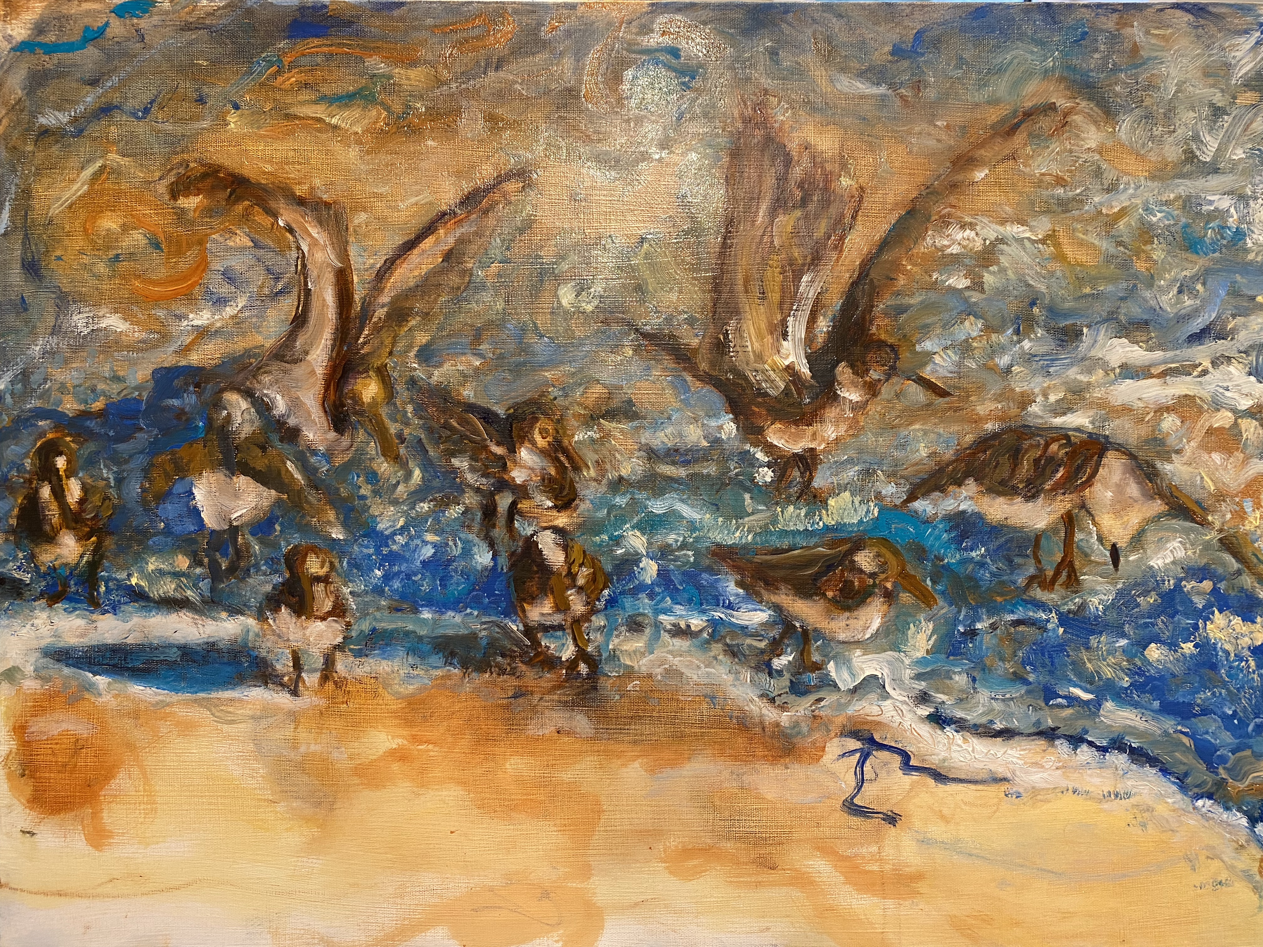
When I paint them again, this time in mostly transparent oils, using a much larger canvas, the mood changes. The birds become steadier, and more firmly geometrically situated, implying a kind of calligraphy on the canvas.
(Oil)
If I had all the canvas and space in the world, I would not continually paint over what I have painted, but would keep each stage as a chapter of a “book painting”.
(Oil)
Moving from moody and earth toned, I start adding brighter oil colors to the proposed calligraphy of birds.
As this process progresses, the version of the painting becomes less calligraphic, but instead allows each bird and wave to be individually reflected upon.
In the end, I chose to leave the final painting lighter, softer, and less moody than how I started, mainly by smoothing out the ocean water’s movements and lightening it up through a series of tonal washers, or glazes. In the finished painting, the beach was a softer, lighter color of browns than the dark brown birds with their white bellies, offering some contrast between them, but not creating strong calligraphic marks as I initially had. Here is the result.
The Birds (Oil)
This dialogue between the birds and me has been prolonged through quiet moments of shifting dispositions and is now turning into several months of visitation. Our conversation is so interesting that I am sure we could continue this dialogue for several months more. However, I am getting restless.
It is now time to move on, to try new ways of thinking with paint.
What did I learn from this painting? I learned that the quick movements of inspiration are hard to keep. But perhaps they are not for keeping. What they do instead, is attract the painter to the idea of the painting. One might stop there. Or one may press forward and consider the depth of the attraction, sometimes realizing that at the end of the painting, there is a relationship over time rather than a single result.
My painting are already abstract, but I hope to play with abstraction even more. The aim is to keep the thought, without committing completely to the shapes, of reality.
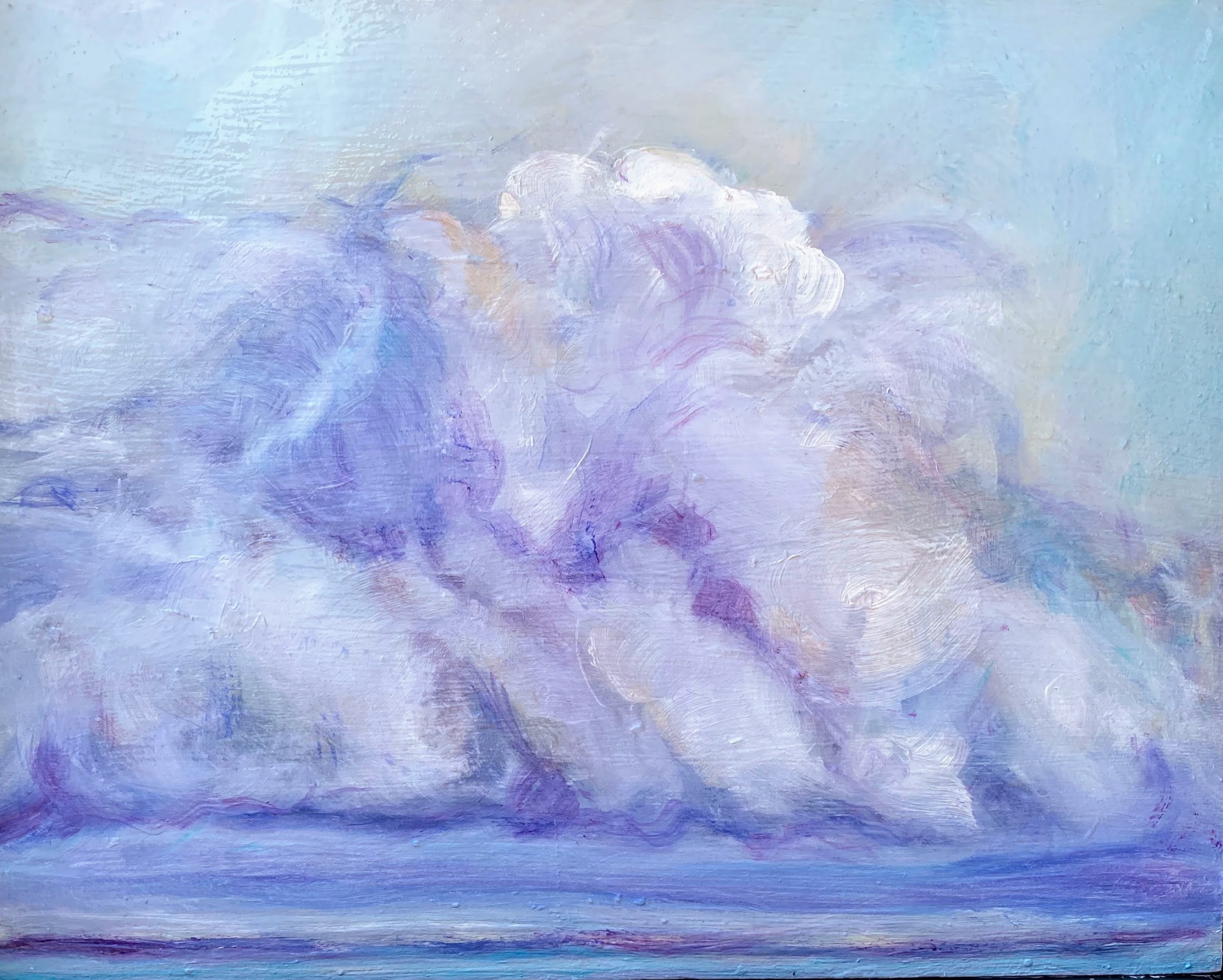
When I was a child, some of the first things I thought to draw were pictures of the sky. It would seem that clouds were the easiest thing to draw in the world. I took my crayon, put up a white oblong shape, perhaps with the yellow sun peeking out, and was done. Voila! I had painted a cloud.
Clouds over Water, oil painting
Now that I am an adult, painting clouds as part of a painting exercise for an art course, I am amazed how elusive, expressive and complicated they are. Where does a cloud begin, and when does it end? How does the sky manage to peek through the clouds in such soft and unimaginably subtle ways? Do I ever really paint a cloud, or rather an allusion to one?
The more I paint them, the more amazed I am with the ephemeral nature of clouds.
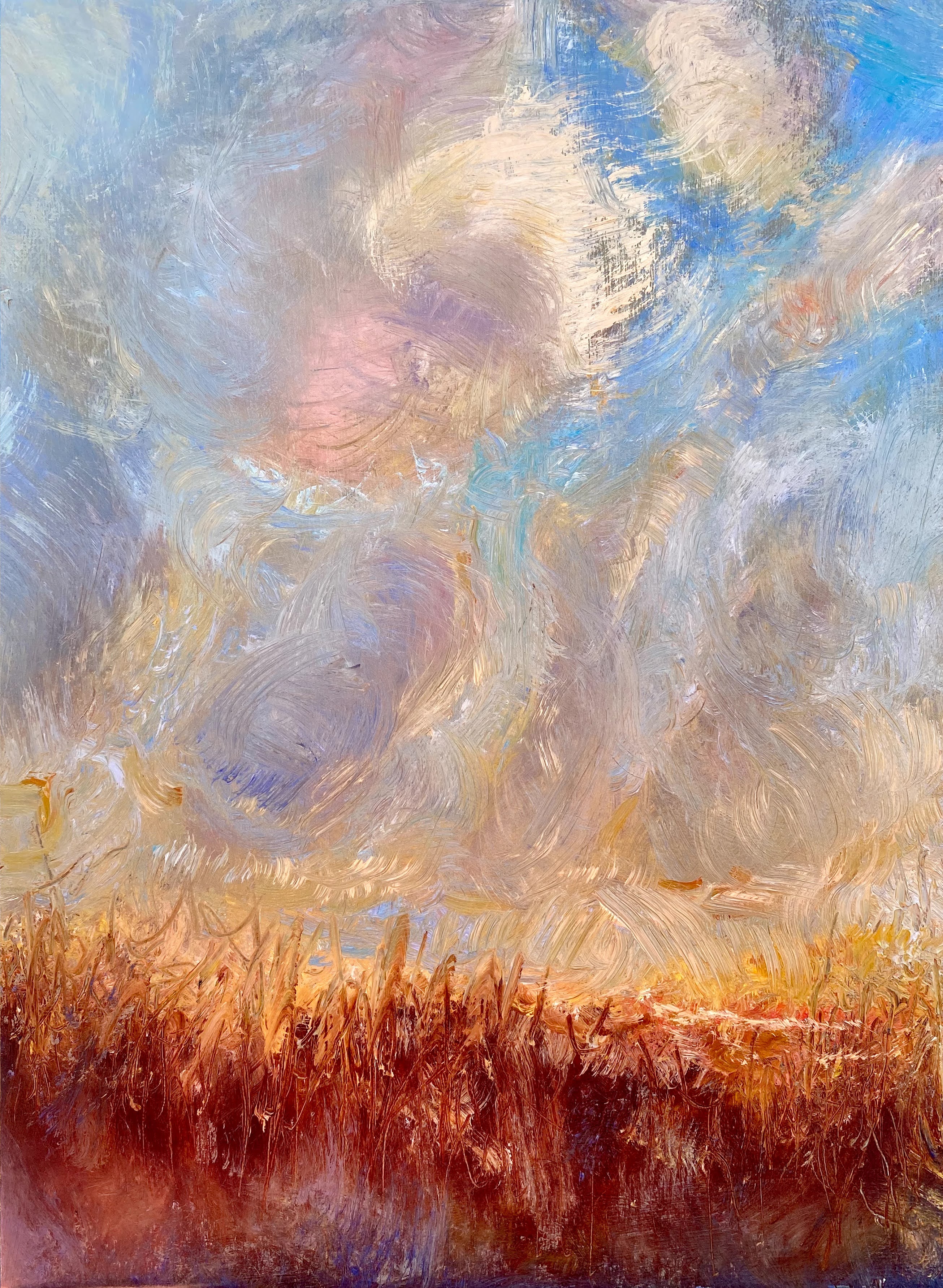
Clouds over Island Sunrise, Oil painting
It is a challenge to use less and less color in a painting, yet still have the colors of the atmosphere roaring through, bouncing everywhere, not respecting boundaries. I think this happens often because of our focus on light streams and reflection, in addition to shape.
This seems to be true, even when painting clouds from the light of the moon.
Clouds in Moon Light, Oil PaintingClouds in Moon Light, Water Color, Ink and Gesso
Now that this idea of painting clouds has become part of my daily art routine, I expect to see many new ways to relate to them with canvas, brushes and paint. Once discovered, never forgotten.
The above paintings were completed this year, during the period of time that I have been taking the art classes of Michael Orwick, offered through the Oregon Society of Artists.


 How might one strike a balance? And why would one do so?